Recent Blue Posts
 Dragonflight Season 4 Content Update Notes
 Dragonflight Season 4 Content Update Notes
 Dragonflight Season 4 Content Update Notes
 MMO-Champion


I am about to redo my entire UI, so I want harsh criticism on my current one so I know what to do and what not to do.
(Somebody thumbnail it for me please, idk how)
 Recent Forum Posts
Thread: Post Your UI
-
2012-08-02, 06:35 PM #7421Warchief


- Join Date
- Jun 2010
- Posts
- 2,025
Last edited by mmocba105e19de; 2012-08-03 at 02:13 PM.
I am not Voting Trump because I support him, its about keeping a Career Criminal out of office that mishandles classified information.
Beta males can cry on how I will not vote for their brood mother.
 Originally Posted by Shinra1

-
2012-08-02, 06:56 PM #7422The Patient
- Join Date
- Aug 2010
- Posts
- 220
To many actionbars especialy if you can track CD's via Cooline or fortexorcist.
Horbile font for combat text
Try to gather info for rotation in one area : cooldowns , procs etc.
You realy need to know and see the dps of 12 ppl in detail all time? imo make dps meter smaler!! ->same for treath meter
If you wana be smart adjust Skada/Recount in that way that you have 1 window that shows Treath in combat and DPS out of combat.
Try to use same borders in UI and skins for your icons.
-
2012-08-02, 07:49 PM #7423Stood in the Fire

- Join Date
- Sep 2008
- Posts
- 441
I don't recognize your mmo-champion name so I don't know how long you've been in the Ui modification game, but, this is definitely showing some inspiration from Duke and myself, and possibly a little of Sov as well Originally Posted by xtothx

What does that say about your Ui and design interpretations/decisions? It says they are pretty great
People have already given you kudos, so, I think I will give you some suggestions :P
1. Upon inspection of your player frame I noticed the right edge of your health and power bar is displayed as 2 pixels wide. Either some paneling is off or your health/power value is a bit low. Not sure how it could be the latter since you have your self selected and your target frame doesn't display the same way.
2. The gloss on your buttons/minimap is a nice addition in order to tie the design in to your unit frames, however, the gloss on your buttons and minimap could be tuned down a tad as it is a bit too intense in its current state. (especially on the minimap)
3. The time stamps make my eyes bleed but I guess if you MUST have them, perhaps at least remove the parenthesis.
4. Unless you use the space to the left of the minimap for your party/raidframes, I would move your meter to that location rather than the top left corner.
5. Where are your buffs and debuffs?
6. Lastly (for now), looking back to your unit frames...find something to line up your text values with. They are currently just floating around inside your frames. You can line them up with your power bar or some of the paneling on the outsides f the frames, but line them up with something.
Great start on the Ui, looking forward to an updated pic.
<3
Ish
-
2012-08-02, 08:21 PM #7424Grunt
- Join Date
- Dec 2011
- Posts
- 19
^
Your UI seeems a bit cluttered don't you think?
-
2012-08-02, 09:08 PM #7425Legendary!

- Join Date
- Feb 2011
- Location
- Tampa, FL
- Posts
- 6,244
I recently redid my UI with the idea of using as much of the default UI as possible, to minimize having my entire UI get messed up with MoP is released or a major patch is released. Most of the addons I'm using with this UI are optional; things like Quartz to track debuffs and have larger cast bars, WeakAuras, a few font/texture packs (mostly for the fonts).
This is what I've come up with. I'm not sure if I like it yet; I'm sorely tempted to use some kind of unit frames as I don't care for the built-in ones, but at the same time I'm skeptical of going with a full-blown UI package again due to often having to customize it per character, and the big risk of it suddenly not working or giving errors when something happens with the API.

-
2012-08-02, 09:13 PM #7426Grunt
- Join Date
- Jan 2010
- Posts
- 18
@Ish
Hey
Wow, thanks for your input, I really appreciate it.
As for inspirations - yes, it was and is mostly influenced by Duke various work. And more recently yours also :3
However this interface has gone through various phases, it started as Santera ui ripoff ;p
1. Yeah that is a weird bug. This gap appears only on low lvl toons, and as my character gets more hp it fixes itself. So around
15 lvl everything is ok
2. You might be right but I like it how it is now. But thanks for tip, I will tweak with it for sure.
3. Hey I like them :P Do they really look so bad ?
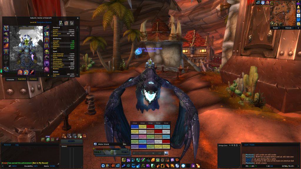
4. Yes it's place for grid. Here's sample from some old screenshot (yeah this banner on map looks horrible ;p) :

5. In top-right corner. And this is what I like about this layout - there is something in every corner and in the center
there's "heart of interface"
6. Whoops. Thanks, I don't know how could I missed that.
Again thanks for those suggestions. I'll post some more screens soon.
-
2012-08-02, 09:22 PM #7427Pandaren Monk

- Join Date
- Jul 2009
- Posts
- 1,966
That's actually not a character i really play all that often. (I really only heal on it) as far as the mana bar goes - i really havent thought of a better way to go about that. It's actually an earlier screenshot that i made while making the UI itself. Originally Posted by Emaias
"Marketing is what you do when your product is no good."
-
2012-08-02, 09:28 PM #7428Bloodsail Admiral

- Join Date
- Oct 2011
- Posts
- 1,147
The more I see of your UI the more I want to tell you to upload it! Originally Posted by xtothx
-
2012-08-03, 01:48 AM #7429Field Marshal

- Join Date
- Jul 2012
- Location
- Darnassus
- Posts
- 87
What addon are you using to bind abilities separate from your action bar? Originally Posted by xtothx
Senit UI -- outdated. Update... soon... maybe...
-
2012-08-03, 04:26 AM #7430Pandaren Monk

- Join Date
- Oct 2009
- Location
- chair infront of the screen
- Posts
- 1,924
agreed. Originally Posted by manu9
Nice work everyone. Love these.“We all know interspecies romance is weird.”
― Tim Burton
-
2012-08-03, 05:17 AM #7431Mechagnome

- Join Date
- Apr 2010
- Location
- Graveyard
- Posts
- 660

^ Click on it, res is being weird here.
Gonna post a raid shot soon. Everything is pixel. Normally go with this look, been doing the same kinda UI for years. I like consolidating everything to the middle
Last edited by mmocba105e19de; 2012-08-03 at 02:15 PM.

When a wild forum troll appears
-
2012-08-03, 05:52 AM #7432Field Marshal

- Join Date
- May 2011
- Location
- Michigan
- Posts
- 67
Pretty standard version of elvUI, just edited to my preference.

Last edited by mmocba105e19de; 2012-08-03 at 02:15 PM.
I fell in love with your sin
-
2012-08-03, 06:29 AM #7433Field Marshal

- Join Date
- Sep 2011
- Posts
- 56
My ui before I got tired of updating it..
And after I succumbed to ElvUI until I want my old one back. (didn't realize I hadn't actually taken a raiding ss of this one yet, you get the general pic.)

Last edited by mmocba105e19de; 2012-08-03 at 02:18 PM.
Life Grip -Sargeras
-
2012-08-03, 05:21 PM #7434Deleted
My attempt at creating a more Minimalistic UI:

5 Man:

Combat:

Last edited by mmoc2c0e080e79; 2012-08-03 at 05:30 PM.
-
2012-08-03, 05:34 PM #7435Dreadlord

- Join Date
- Oct 2011
- Location
- Sweden
- Posts
- 927
-
2012-08-03, 06:10 PM #7436DeletedYeah will definitely do that when I'm happy and this UI layout is finished. I just made it when experimenting with a Minimalistic appearance compared with my other 2 UI's I have uploaded. If people like it enough and I get to a point where I think its finished then I might upload it Originally Posted by Aronaz
-
2012-08-03, 07:29 PM #7437Dreadlord
- Join Date
- Oct 2011
- Location
- Sweden
- Posts
- 927
-
2012-08-04, 02:32 AM #7438Epic!

- Join Date
- Aug 2009
- Location
- Missouri
- Posts
- 1,745
My MoP UI - Beta(updated)
I made some changes to my UI based on some suggestions. Here is my mage, a druid and a DK. Its not 100% complete but it it is closer to where I want it.


Feedback is most welcome.
-
2012-08-04, 02:40 AM #7439Field Marshal
- Join Date
- Jul 2012
- Location
- Darnassus
- Posts
- 87
Didn't you post a different UI a little while back? Similar design, blockier in the center. Map was bottom left. Originally Posted by Ricen
Senit UI -- outdated. Update... soon... maybe...
-
2012-08-04, 05:09 AM #7440Mechagnome
- Join Date
- Apr 2010
- Location
- Graveyard
- Posts
- 660
Yeah all of them are similar looking. But this is for a different computer so i wanted to do a different layout, just been working on how i want everything to look, color, fonts etc. Originally Posted by Senit
When a wild forum troll appears


 Reply With Quote