Recent Blue Posts
 Dragonflight Season 4 Content Update Notes
 Dragonflight Season 4 Content Update Notes
 Dragonflight Season 4 Content Update Notes
 MMO-Champion
Quite a list showing the new class bars of Roth UI (MoP Beta)
~~~~~~~~~~~~~~~~~~~~~~~~~~~~~~~~~
~~~~~~~~~~~~~~~~~~~~~~~~~~~~~~~~~
 Recent Forum Posts
Thread: Post Your UI
-
2012-09-04, 07:32 AM #7821Deleted
Last edited by mmoc48efa32b91; 2012-09-04 at 07:35 AM.
-
2012-09-04, 08:32 AM #7822Stood in the Fire


- Join Date
- May 2010
- Location
- Australia
- Posts
- 410
Download Link? Originally Posted by frantik

 Originally Posted by Aloodanis
-
2012-09-04, 08:58 AM #7823Legendary!

- Join Date
- Mar 2011
- Location
- Denmark
- Posts
- 6,225
Juuust ElvUI and some stuff.
 Hunter Guidewriter for Icy-Veins
Beast Mastery - Marksmanship - Survival
Twitch - YouTube - Hunter Discord - Personal Discord
-
2012-09-04, 10:03 AM #7824Mechagnome


- Join Date
- Nov 2007
- Posts
- 631
You still live? Nice. Originally Posted by twin2
 Looks quite solid. I would change the shadow a bit.
And high five for oUF_Phanx fellow. Btw, which raid frames are these?
Except the Rune Bar, beautiful. I love the Demonic Fury bar, damn. Originally Posted by zorker
Last edited by Lyn; 2012-09-04 at 10:05 AM.
— oh, honey.
-
2012-09-04, 10:26 AM #7825High Overlord
- Join Date
- Feb 2011
- Posts
- 119
Yep, i still lurk around a little bit. =) Originally Posted by Lyn
In what way would you change it? i like the shadow, im still playing around with color of it though.
Raidframes are coded in the oUF layout.
-
2012-09-04, 10:29 AM #7826Mechagnome
- Join Date
- Nov 2007
- Posts
- 631
And I thought Skada looks nearly the same as Recount. My bad. :P Originally Posted by Pixil
— oh, honey.
-
2012-09-04, 10:31 AM #7827Mechagnome
- Join Date
- Nov 2007
- Posts
- 631
I like it, too. It is just a bit "too much", a bit less would look a bit better, I guess. Or maybe just less alpha. Originally Posted by twin2
ORLY? Which oUF? Phanx? I don't have any raid frames.. or in Free UI?— oh, honey.
-
2012-09-04, 09:24 PM #7828High Overlord
- Join Date
- Feb 2011
- Posts
- 119
I've added the raidframes in oUF_Phanx Originally Posted by Lyn
-
2012-09-05, 03:03 PM #7829High Overlord

- Join Date
- Jun 2011
- Location
- Scotland
- Posts
- 148
I have uploaded my UI to wowinterface here. The UI is very much a personal thing though so I won't be taking requests unless they are beneficial to myself or the UI as a whole. This also means I might not be updating it all to often, only for major patches or if something is completely broken. Originally Posted by gunhound45
Enjoy
-
2012-09-05, 09:40 PM #7830Blademaster

- Join Date
- Dec 2010
- Posts
- 39
Thanks! I honestly think the Ruben texture for the health/energy bars makes the largest difference, visually. Originally Posted by Pixil
Technically, no, I don't. But removing that panel would result in other panels taking up too much room, or screwing with the position of other panels, and making it look awkward. Plus, there are times when my left hand is occupied (with food/drink, you dirty-minded people), and I'm too lazy to move my right hand to the keyboard. Originally Posted by Pixil
However, I could probably remove the micro menu, slide the action bar panel to the right, and move the grid panel to the left-hand side. Hmm. I'll experiment with that.
Though not visible in either screenshot, I use OmniCC for tracking the majority of my cooldowns. As such, not having the bar(s) visible would impede my knowledge of something about to come off cooldown, without cluttering up viewable game space. Originally Posted by Pixil
Yeah, I originally aligned everything by eye, and so I didn't notice the grid panel being off until later. I then went into the config and made sure every panel had the same height and y-coordinate. Originally Posted by Pixil
When I first got MSBT, I wasn't used to my combat info being in a different place. After adjusting to that, I found that sometimes I wouldn't notice whether I was in melee range (I tend to zoom as far out as possible on most fights, and with other effects going on, exact positioning can be hard to determine), so I kept Blizzard's default numbers up so I would know my auto attacks were hitting. Originally Posted by Pixil
After thinking about it more, I realize I hardly ever use MSBT for knowing about abilities that land. I think I'll adjust it to only show abilities/white hits that don't land (miss, dodge, block, parry, absorb, etc.), as that will be far more useful knowledge. I'll likely also change the incoming heals/damage to filter out overhealing.
I'm almost the exact opposite. I prefer UIs that look sleek, and tend to have repeated information, so that if my attention is elsewhere on the screen, I can still gather info I need (combo points are shown in the center, as well as on the nameplate, energy is found in two locations, etc.). Originally Posted by Pixil
Thank you for your feedback! I appreciate the suggestions. I'll probably post an update once I've made more changes.
-
2012-09-05, 11:21 PM #7831Brewmaster
- Join Date
- Aug 2009
- Posts
- 1,479
Last edited by mmocba105e19de; 2012-09-06 at 12:10 AM.
-
2012-09-06, 05:55 AM #7832Legendary!
- Join Date
- Mar 2011
- Location
- Denmark
- Posts
- 6,225
Originally Posted by defer09
Very neat, very clean for an UI based on ElvUI.
I do like.Hunter Guidewriter for Icy-Veins
Beast Mastery - Marksmanship - Survival
Twitch - YouTube - Hunter Discord - Personal Discord
-
2012-09-06, 07:15 AM #7833Mechagnome
- Join Date
- Nov 2007
- Posts
- 631
Originally Posted by defer09
When you look at his/her minimap, it isn't clean anymore. Originally Posted by Metaphoric
And I also think it doesn't look clean in combat.— oh, honey.
-
2012-09-06, 08:11 AM #7834Deleted
I don't like afk shots either. They just don't tell anything. Well they do...if you play the game being afk.
-
2012-09-06, 08:48 AM #7835Deleted
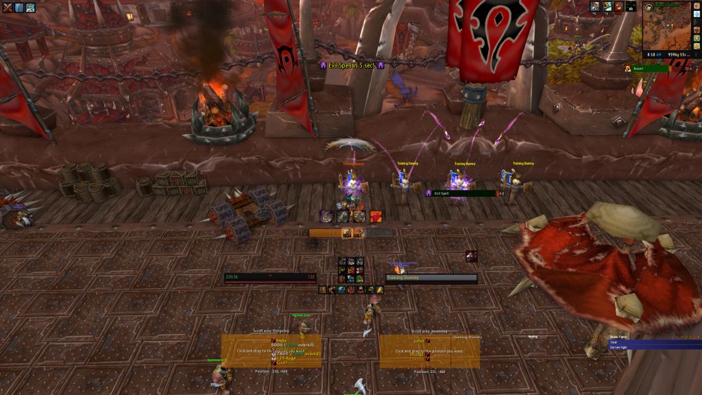
Made some minor changes to mine ->
NTK timers, bar2 (only shows in combat, middle right), castbar and my duration tracking bar of a murder of crows (left of the actionbar attached to skada)

Raid/BG

Last edited by mmocba105e19de; 2012-09-06 at 12:12 PM.
-
2012-09-06, 09:27 AM #7836Mechagnome
- Join Date
- Nov 2007
- Posts
- 631
Haha, true. Originally Posted by zorker
Problem I have with your UI is, I dunno if someone is dead or not. Your statusbar foreground color is so dark, nearly same as their background color. You can see it in your Grid. Originally Posted by Rusk
It's a cute UI, but .. not very functional.Last edited by mmocba105e19de; 2012-09-06 at 12:13 PM.
— oh, honey.
-
2012-09-06, 03:29 PM #7837Brewmaster
- Join Date
- Aug 2009
- Posts
- 1,479
Thank you Originally Posted by Metaphoric
I actually already have them hidden. I started with a fresh WTF and interface folder so I had not gotten to that :P Originally Posted by Lyn
As for being clean in combat, look below...
Originally Posted by zorker
On the bottom right I have a skada DPS meter, a skada healing meter and Omen.
The left parrot box is outgoing damage and the right is incoming damage.
The 9 button actionbar is temporary while I learn the new layout on my G600. Once I know the layout well enough, that action bar will be gone.
The Shield block and Shield Barrier powerauras appear when I have the rage to use them and a count down appears when they are active to display the time left on them.Last edited by mmocba105e19de; 2012-09-07 at 02:46 AM.
-
2012-09-06, 03:30 PM #7838DeletedLooks TOO minimalistic. Originally Posted by Rusk
-
2012-09-06, 04:23 PM #7839DeletedIt can never get to minimalistic Originally Posted by Joyful
-
2012-09-06, 05:47 PM #7840Stood in the Fire
- Join Date
- Sep 2008
- Posts
- 441
pure and utter blasphemy. Originally Posted by Joyful
Meanwhile...APPARENTLY I am going to have to force myself to learn Raven or something of the sort because SBF seems to have finally kicked the bucket if I am not mistaken. /sigh
Will probably upload an updated Ui once everything is reworked with new addon updates.

 Reply With Quote