Thread: Post Your UI

  1. #9141
    Quote Originally Posted by carebear View Post
    So I went back to 1x multisampling and my borders are nice and crisp.. (: (ignore the filters, just minimap, buffs and unit-frames)


    I like the crisp border but I hate playing with 1x multisampling; so I have a dilemma! I'll probably have to switch to 1x multisampling just for screenshots in the future ^^
    Buffs below your player frame are a little out, other than that, looks nice and sharp now, that font does suit the ui better than a pixel font

  2. #9142
    Quote Originally Posted by carebear View Post
    So I went back to 1x multisampling and my borders are nice and crisp.. (: (ignore the filters, just minimap, buffs and unit-frames)


    I like the crisp border but I hate playing with 1x multisampling; so I have a dilemma! I'll probably have to switch to 1x multisampling just for screenshots in the future ^^
    Quote Originally Posted by Drayarr View Post
    Buffs below your player frame are a little out, other than that, looks nice and sharp now, that font does suit the ui better than a pixel font
    NO! I so mad that everyone thinks that the regular shadowy outline with a non-pixel font looks better! I WILL IMPOSE MY OPINION ON EVERYONE AND YOU WILL ALL ACCEPT IT!

    But in all seriousness, a pixel font with monochrome outline looks so much more "solid" with the 1-pixel borders than regular non-pixel font with 1-pixel borders. It just looks silly.
    Of course I'm joking with the first part of this message, but in my opinion the font you're using now just doesn't "fit in". Sorry guize.

    Bring on the angry replies!

  3. #9143
    Quote Originally Posted by Pixil View Post
    But in all seriousness, a pixel font with monochrome outline looks so much more "solid" with the 1-pixel borders than regular non-pixel font with 1-pixel borders. It just looks silly.
    Wrong. But it's okay, it's your opinion.
    oh, honey.

  4. #9144
    Quote Originally Posted by Lyn View Post
    Wrong. But it's okay, it's your opinion.
    Not sure if trolling or doesn't understand that opinions are subjective and cannot be wrong D:
    Either way; an argument for why I am wrong would be helpful.

  5. #9145
    Quote Originally Posted by Lyn View Post
    Wrong. But it's okay, it's your opinion.
    Nah, you're wrong brah.
    But you see I don't have to supply any sort of argument.. You're just wrong.

  6. #9146
    Deleted
    Quote Originally Posted by carebear View Post
    Unfortunately I couldn't disagree more with you. I've been using CoolLine now on and off for about two years. It's a very handy cooldown tracker and if you position it correctly you can see what's on cooldown with just a quick glimpse. Again, if positioned correctly you won't miss when an ability comes off cooldown either. Mine is placed in a position so that I can see the icon when it flashes in the corner of my eye without taking my eyes away from the position of my character. (see here) Not only that, but I also have a general idea of when an ability is coming off cooldown because I'm so used to the rotation and abilities of the class.
    You must be pretty amazing at the game then. Regardless where you put it, unless you are a top-notch player, you will miss stuff. Most players aren't good enough to check a cooldown bar every 2-4 second or notice it with their peripheral vision.

    You can understand this if you look at the very top arena players. Even they miss casts from their focus target or they notice it very late. And that's multi-rank 1 calibre players we're talking about.

    You can't see with a quick glimpse how long there is left of a spell because you have to look at the line, find your icon in the mess of icons and then see where on the line it is.

  7. #9147
    Quote Originally Posted by Rusk View Post
    1920x1080


    Alright, here's the interface + WTF
    I have never uploaded an UI before but i made a profile for each addon so all you should need to do is load it.
    The profile is named "all" so load it in ->

    /Kgpanels config
    /Bar
    /sldt global
    /Acb (profile named halven here)
    /Chinchilla
    /Grid

    Chatter and weakauras(?) is something you will need to fix yourself, also bar 3,9 and 10 are on always hidded in the visibility tab.
    Or can you simply just change the name of the server and character in the wtf?
    If you do it this way rename "Halven" to your character name.
    You set your UI scale real low right?

  8. #9148


    I'm probably going to change to SUF soon. Also what buff addons are recommended, I've heard good stuff about raven. Oh and can I reconfigure my DBM timers at all?

    EDIT: Uh.... How do I shrink it?
    Last edited by mmocba105e19de; 2012-12-20 at 06:20 AM.

  9. #9149
    I use raven and if you've seen any of my screenshots in the last couple of pages it's highly customizable (recently added TukUI/ElvUI detection to skin and match the UI's).

  10. #9150
    Quote Originally Posted by bOOURNS View Post
    Updated with some font changes. I also greatly reduced what is displayed in my MSBT to just a few things (I'll get an in combat SS after reset)


    **SS is large so make sure to clicky the magnifying glass to fully zoom in to proper size**
    LOL dude it's Weedsz! You must be from KJ.

  11. #9151
    Quote Originally Posted by OriginalVocalMix View Post
    If you're using CleanIcons Thin, it should skin the MSBT icons as they'll be pulled from the default ones.
    I had CleanIcons Crisp installed (left over from using pre pixelperfect mode in ElvUI) just tried CleanIcons Thin and still no go, also doesn't work with DBM's raid warnings.

    Quote Originally Posted by Talindra View Post
    LOL dude it's Weedsz! You must be from KJ.
    I am indeed.

  12. #9152
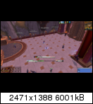
    Not sure how to thumbnail it and make it clickable for a full-size image, but I'm stuck between two UIs! The latter is the one I'm using at the moment. So give me some feedback!


    Last edited by mmocba105e19de; 2012-12-20 at 06:21 AM.

  13. #9153
    Quote Originally Posted by carebear View Post
    Unfortunately I couldn't disagree more with you. I've been using CoolLine now on and off for about two years. It's a very handy cooldown tracker and if you position it correctly you can see what's on cooldown with just a quick glimpse. Again, if positioned correctly you won't miss when an ability comes off cooldown either. Mine is placed in a position so that I can see the icon when it flashes in the corner of my eye without taking my eyes away from the position of my character. (see here) Not only that, but I also have a general idea of when an ability is coming off cooldown because I'm so used to the rotation and abilities of the class.

    On-topic. I'll give the borders a mix and match. I need to do something with them but this monitor resolution is a pain. Got work in 10 minutes and then a whole weekend of late shifts (yay, /sigh) so I won't be doing much UI messing.

    please to be having your UI sirs?

  14. #9154
    Adjusted my Unitframes some based on feedback.

    All font the same font.
    Moved target level, classification(Rare, Elite, Boss tagges) and Tapped tag to the upper top right.
    Got rid of current power line.
    Adjusted the power bar.
    Moved power percent to the right next to the power bar.


  15. #9155
    Deleted

  16. #9156
    Quote Originally Posted by solvexx View Post
    Nah, you're wrong brah.
    But you see I don't have to supply any sort of argument.. You're just wrong.
    Oh, nice try, kid. Now please go and play with your teddy.

    Quote Originally Posted by Pixil View Post
    Not sure if trolling or doesn't understand that opinions are subjective and cannot be wrong D:
    Either way; an argument for why I am wrong would be helpful.
    Ah, sure, an argument. I knew I forgot something. I was half trolling, half serious. So, sorry, if it sounds kinda harsh or so. Bad day, etc.
    About the argument: A 1px border with a non-pixel font isn't generally non fitting. There are enough examples, where it does. I - for example - am happy that carebear finally ditched pixel fonts. It was just bad with them (true, it was all crispy and such) but that was all. And yes, MY opinion, too. You can now say I am wrong etc, too. It's just ... a big screen and some mini unit frames with a font you can't really read when you are sitting ~50cm away from the screen isn't functional. It's just it.

    That's why I was gone from all kinds of interface forums for some years: always worshipping same style over and over again. I rarely saw something new, something good. Always the same: minimal - not always functional - unit frames with a shitload of pixel fonts. I miss the "old" days with tapestry, led's GOOD uis, rdji, ooom's, etc pp.

    Edit: I may add another one or two paragraphs. Mostly memorys or trying to explain things I write. But dunno. Maybe not.

    (And I know most of you don't like me, or what I say, but tbh, I don't care.)
    Last edited by Lyn; 2012-12-20 at 09:23 AM.
    oh, honey.

  17. #9157
    I personally hate any type of Pixel font. Hell, I even hate pixel art.
    Whenever I tried it in my own UI; it made me cringe, and it gave me this nervous twitch that kept trying to put a gun to my own head. I had to get rid of it.
    Most UI's just work better without it. In my own, superior, awesome opinion.

  18. #9158
    Deleted
    Quote Originally Posted by Crummy View Post
    I personally hate any type of Pixel font. Hell, I even hate pixel art.
    Whenever I tried it in my own UI; it made me cringe, and it gave me this nervous twitch that kept trying to put a gun to my own head. I had to get rid of it.
    Most UI's just work better without it. In my own, superior, awesome opinion.
    I used to agree with you; but I also see why they do get used. When you spend ages creating that pixel-perfect UI where everything is lined up properly and you've spent far too long ensuring they are, nothing screws it up like a round font which looks out of place. Pixel fonts work very well (imo, anyway) in these setups.

  19. #9159
    Epic!
    10+ Year Old Account
    Join Date
    Jul 2010
    Location
    United Kingdom
    Posts
    1,661
    Quote Originally Posted by Ariadne View Post
    Most players aren't good enough to check a cooldown bar every 2-4 second or notice it with their peripheral vision.

    You can't see with a quick glimpse how long there is left of a spell because you have to look at the line, find your icon in the mess of icons and then see where on the line it is.
    I can see how long I have something left with a quick glimpse, but that's me and that's why I use CoolLine. It may not work for other players and they may not be 'good enough' but I know that I am.

    Quote Originally Posted by Pixil View Post
    NO! I so mad that everyone thinks that the regular shadowy outline with a non-pixel font looks better! I WILL IMPOSE MY OPINION ON EVERYONE AND YOU WILL ALL ACCEPT IT!

    But in all seriousness, a pixel font with monochrome outline looks so much more "solid" with the 1-pixel borders than regular non-pixel font with 1-pixel borders. It just looks silly.
    Of course I'm joking with the first part of this message, but in my opinion the font you're using now just doesn't "fit in". Sorry guize.

    Bring on the angry replies!
    I totally agree with you. I don't like using the 1pixel border without the pixel font. They are a match made in heaven! (or hell depending on how you look at it). I hate playing on 1x multisampling too which is why I went to a messy border with messy font. If I sort out having pixel perfection on a high multisampling at 2560x1440 then I will give it another go, but for now I'm just going to mess around with a few things until I get something I like :P
    Quote Originally Posted by lyn View Post
    (and i know most of you don't like me, or what i say, but tbh, i don't care.)
    i love you lyn. Long times!

    Let's have enough of the arguments and disagreements now, to each their own! We need more pictures and to have some love in this thread, like my love for Lyn and the many years of great addons/UIs created!
    Last edited by Hulari; 2012-12-20 at 11:51 AM.

  20. #9160
    Quote Originally Posted by Lyn View Post
    Oh, nice try, kid. Now please go and play with your teddy.


    Ah, sure, an argument. I knew I forgot something. I was half trolling, half serious. So, sorry, if it sounds kinda harsh or so. Bad day, etc.
    About the argument: A 1px border with a non-pixel font isn't generally non fitting. There are enough examples, where it does. I - for example - am happy that carebear finally ditched pixel fonts. It was just bad with them (true, it was all crispy and such) but that was all. And yes, MY opinion, too. You can now say I am wrong etc, too. It's just ... a big screen and some mini unit frames with a font you can't really read when you are sitting ~50cm away from the screen isn't functional. It's just it.

    That's why I was gone from all kinds of interface forums for some years: always worshipping same style over and over again. I rarely saw something new, something good. Always the same: minimal - not always functional - unit frames with a shitload of pixel fonts. I miss the "old" days with tapestry, led's GOOD uis, rdji, ooom's, etc pp.

    Edit: I may add another one or two paragraphs. Mostly memorys or trying to explain things I write. But dunno. Maybe not.

    (And I know most of you don't like me, or what I say, but tbh, I don't care.)
    Nostalgia is a form of destruction.

    Don't know why you'd think people dislike you. You've always had amazing UI's and your bluntness isn't really that harsh. My secondary art teacher had harsher words to say about my designs. :P

Posting Permissions

  • You may not post new threads
  • You may not post replies
  • You may not post attachments
  • You may not edit your posts
  •