M+ Dreaming Hero Title -- Updated April 16
 M+ Dreaming Hero Title -- Updated 16 April
 Sign Up To Test The War Within
 Rank the Dragonflight Dungeons (beyond knee-jerk reactions)
 MMO-Champion


Assuming the green bar in the middle of your screen is a rage bar?Originally Posted by Adsertif

If so, you could disable rage showing on your Unitframes
I prefer those raid frames over the "old" ones
Floating Combat Text still seems a bit...spammy.
Other than that its cleaner and more "readable" for me at least
 Recent Blue Posts
 Recent Forum Posts
Thread: Post Your UI
-
2013-01-21, 12:36 AM #9681Epic!

- Join Date
- Oct 2012
- Posts
- 1,559
-
2013-01-21, 02:25 AM #9682Mechagnome

- Join Date
- May 2010
- Posts
- 526
This is the one I'm using right now
http://i.imgur.com/kGwGHxJ.jpg
I'll disable the power bar on my player frame, it does seem unnecessary. I disabled the health deficit, it just happened to be everyone was at full health at the time. :x_________________________________________CPU: i5 2500k @3.3Ghz; GPU: MSi GTX560Ti Twin Frozr II
RAM: 8GB 1600Mhz Corsair Vengeance; MB: MSi Z68-G45 G3
-
2013-01-21, 04:15 AM #9683The Patient

- Join Date
- Sep 2012
- Posts
- 345
I'd like to suggest if you know your keybinds well enough turn off the keybind/macro texts on your action bars. It tends to add a lot of clutter on them with that text + cooldown time remaining text. Originally Posted by Adsertif
-
2013-01-21, 08:06 AM #9684Field Marshal

- Join Date
- Feb 2010
- Location
- Sweden
- Posts
- 75
Personally I'd add a border around the boss timers. Especially since there is a slight hint of a background on them. Originally Posted by Adsertif
---------- Post added 2013-01-21 at 09:07 AM ----------
This is fantastic. I'm toodling off to change my progress bars. Originally Posted by bOOURNS
---------- Post added 2013-01-21 at 09:08 AM ----------
I know, I was trying to be ironic, obviously that did not translate too well in the written word Originally Posted by Drayarr

-
2013-01-21, 09:22 AM #9685The Patient
- Join Date
- Sep 2012
- Posts
- 345
Update on a couple changes I've made recently.
After seeing Jeremypwnz screenshots I really liked the "shadows" on some of his frames, so I've taken that idea and added them into my UI.
Other change has been that I cleaned up the tags in my unit frames.
-Health percent and Power percents are on each side instead of side by side.
-Health current / max was changed to just current and moved to the middle.
and
-split up my buff groups (top right) into short(less than 2min) and long (more than 2min) as it used to be all one large group for all. (this change was due to how i had to add the shadows on my buff/debuff frames)
Last edited by bOOURNS; 2013-01-21 at 09:25 AM.
-
2013-01-21, 10:20 AM #9686Grunt
- Join Date
- Jul 2011
- Posts
- 24
How did you add the shadows? Originally Posted by bOOURNS
-
2013-01-21, 11:31 AM #9687Epic!
- Join Date
- Jul 2010
- Location
- United Kingdom
- Posts
- 1,661
- Personally I'm really not a fan of the rectangle things it really makes the UI look stretched to some bizarre resolution (or are you playing at a bizarre resolution?). Originally Posted by bOOURNS
- You also have timers on the auras with a countdown and a bar underneath that takes up what could be 1/5th of the icon, which could be removed to slim them down.
- The minimap and buffs themselves seem to take up quite a lot of room in the top right corner of the UI too. Do you look at them that much that they need to be that big?
- I'd also say that you've quite a lot of text covering your health bars which makes them seem to be a bit messy and cluttered!
-
2013-01-21, 02:56 PM #9688High Overlord

- Join Date
- Nov 2012
- Location
- US
- Posts
- 117
Any recommendations for my UI, there's lots of room for improvement I beleive? Like to keep things simple so I'm just using mainly blizz ui elements for now..
I'd like to add/refine things like
-Good square minimap
-Smooth unit frames
-"elegant" raid frames such as elvui raid frames. But without using elvui.
Here it is now: http://i.imgur.com/6bO2jaB.jpg
Taking all recommendations!Last edited by Icycoldd; 2013-01-21 at 03:00 PM.
-
2013-01-21, 03:12 PM #9689Epic!
- Join Date
- Jul 2010
- Location
- United Kingdom
- Posts
- 1,661
I like it because it's simple and it has the elements needed. You'd need to download a few addons to get where you want and you say you like to keep it simple and that you use blizz elements so I would recommend to you to try this layout: http://www.wowinterface.com/download...81-NeavUI.html Originally Posted by Icycoldd
It's a very good default UI alternative and I think it might fit you well.
-
2013-01-21, 03:13 PM #9690High Overlord
- Join Date
- Mar 2011
- Posts
- 110
I like using Chinchilla and Minimap Button Frame (http://i.imgur.com/AxKOdNC.png) altough I could have done a better job at managing the spacing. Originally Posted by Icycoldd
My other suggestion would be that you could make your actionbar to the left on the screen invisible (Or 40% opacity until you get used to it) unless mouseover. Same thing with your micromenu. Then I'd just stretch out your micromenu to one column or row and put it to the edge of the screen as well.
The only thing other than the unitframes that I would suggest would be a chat addon.
-
2013-01-21, 05:09 PM #9691The Patient
- Join Date
- Sep 2012
- Posts
- 345
1: I've been posting my screens for some time now and you've commented in the past on them did you really just notice I had rectangle icons just now? It's not some odd resolution, they are rectangle on purpose. Originally Posted by carebear
2: Again it's on purpose the icons are rectangle and the status bar underneath the icons are for design. (also something I've had in my screenshots for ages) The author liked the idea so much when I first asked how I could make the edit for rectangle icons he actually added it into the addon itself as a feature, so I'm not that crazy.
3: The minimap and buffs really don't take up as much space as it looks. Again this is something that's been this way for ever and never commented about.
4: Are you kidding me? I get rid of text and then you tell me there is too much? You sir are on glue.
---------- Post added 2013-01-21 at 10:11 AM ----------
I added most of them with kgpanels, shadows around Weakaura progress bar and my Raven buffs/debuffs are done within the addon through border options. Originally Posted by saami
Last edited by bOOURNS; 2013-01-21 at 05:12 PM.
-
2013-01-21, 05:51 PM #9692High Overlord

- Join Date
- Jul 2009
- Posts
- 122
I'm not sure why you continue to post your screenshots, honestly. Anytime you receive actual constructive criticism you respond with catty retorts. The only time you've responded to someone's feedback is if that person has spent half the post telling you how great you are. Originally Posted by bOOURNS
At the very least, respond cordially - which means not making the person giving feedback sound like an unobservant idiot or by telling them they're "on glue." Or just continue posting screenshots and enjoy a complete lack of responses because, unless it's someone patting you on the back, no one is going to want to add any suggestions.
/resume lurk
-
2013-01-21, 06:05 PM #9693Epic!
- Join Date
- Jul 2010
- Location
- United Kingdom
- Posts
- 1,661
This is the first time I personally know of commenting on your UI and I don't look at every screenshot that everybody posts when quite a few of them show the most minor changes. Originally Posted by bOOURNS
I never said you're crazy, I just asked why it is you have two sets of timers on your icons, one of which makes them look bloated and irregular.
You should learn to take feedback a little better too as referring that someone is 'on glue' isn't really respectable.
-
2013-01-21, 06:11 PM #9694The Patient
- Join Date
- Sep 2012
- Posts
- 345
I'm only giving reasons why things are the way they are. I have no problems with feedback when any of it makes sense. Saying things like there's too much text in the unit frames after I JUST removed text from them (when the previous frames that had MORE text were never brought up) is just plain silly and sounds more like trolling. Originally Posted by Quse
But you're right I will stop posting screenshots as the UI gods in here apparently are never pleased.
-
2013-01-21, 06:12 PM #9695DeletedI would recommend Shadowed Unit Frames as they are easy to use once you've been messing with the settings for a while. I've been using them for years. I tried getting into Pitbull but didn't like them as it felt much more confusing to get use to and they did not have some features such as being able to put the indicators exactly where you want them... not sure if they have been changed since then though. Any other UF addon just didn't feel as good. I know oUF is good but only if your prepared to edit them in the lua files they come with. Originally Posted by Icycoldd
The only other thing I would say is to get a chat addon such as chatter or the much more light weight and simple "BasicChatMods" which I am currently using. Chatter seems very big for what I need it for. I also use nibChatTabs to stylize up the chat tabs a bit better and remove the background etc. BasicChatMods comes with nice features such as removing the buttons on the left, making it possible to click on website links and copy the URL when linked in the chat box, and many more small but nice things. I just like the fact that it lets you move it lower than the blizzard default chat box lets you so you can put it right in the corner rather than slightly hard up. But I am a very picky person lol.
For minimaps I would say either SexyMap or qMinimap. SexyMap has a built in GUI and I'm mostly sure that qMinimap has to be edited in the .lua file but its easy and there isn't much that needs changing. I made my own Minimap addon so I don't use either though.
You have done a nice job making your bars look nicer but I recommend keeping the style consistent with your buffs. I use PhanxBuffs to do this with Masque.
I know I ramble on a lot so I will end it here lol.
-
2013-01-21, 06:18 PM #9696DeletedDont try to slam the door because you're just making yourself look like even more of an idiot here. At least act maturely when you're being told down, rather than making a snarky retort. You really need to grow up good sir, you're acting like a 15 year old ego-maniac and it's quite frankly annoying quite a few people. You've been told why it's annoying people and you need to go away and think about what you're doing which has peeved quite a few people off in these forums, rather than sulking. Originally Posted by bOOURNS
-
2013-01-21, 06:51 PM #9697High Overlord
- Join Date
- Mar 2011
- Posts
- 110
Since this is going offtopic very fast and I don't see this coming to an end I'd like to say something as well. The quality of an UI is almost always personal preferences, with a few guidelines and a few design choices that almost everybody agrees on. Originally Posted by Cark
I wanna give bOOURNS some credit since he's been very helpful the last couple of days (probably longer, but that's how long I've been around) and I also want to say that if you don't like the feedback people give to your UI, you can simply respond with "I personally prefer it this way".
Now, I hope we can just move on and not get any more off-topic
-
2013-01-21, 07:02 PM #9698Deleted
For the last time. Disagreement over whether another person's UI is cluttered, lacking information, badly colored or whatever is not a reason to insult others.
-
2013-01-21, 07:21 PM #9699The Patient
- Join Date
- Sep 2012
- Posts
- 345
The "are you on glue" was meant as a joke, because i had written in the description of the changes I made that text was removed and then the comment of there being too much just struck me as funny. Not everything gets translated in writing as they are intended I guess.
My intentions aren't to be closed off from feedback but to mearly give reasons backing up choices made. I have numerous times even added or found a middle ground from feedback everyone seems to think I'm just being so negative on.
Anyways,
@Icycoldd
To touch on what Pharrax said about your icons. If you want to keep with less addons you can add an icon pack CleanIcons Thin and they will skin the default buff/debuff and I believe actionbar icons without adding an addon.Last edited by bOOURNS; 2013-01-21 at 07:24 PM.
-
2013-01-21, 07:38 PM #9700DeletedWhat border are you using for almost everything (the grey one)? And is it Kgpanels around the chat/minimap etc? Originally Posted by bOOURNS
If so, did you simply make 2 borders for each? The grey one and the shadow?
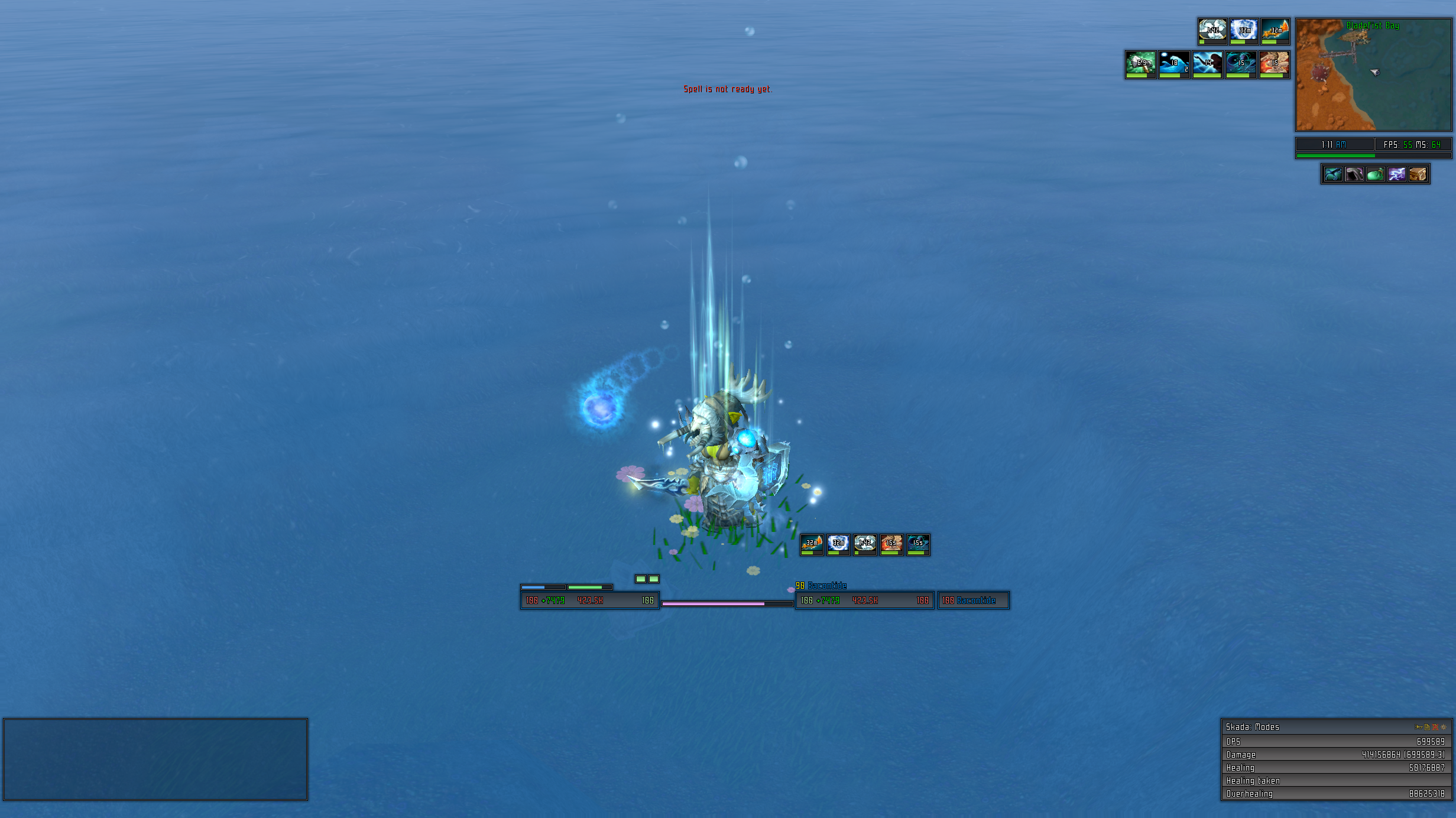
Also, what statusbar are you using for the unitframes and skada?

 Reply With Quote
 My CD's are 36 auras and that's just for resto spec, add in more for enhance specific ones to replace resto specific ones. Also needs to be done for each and every class you play on top of specs. >_< Not exactly efficient but looks good