Yet another Timewalking loot post ( As directed by GM)
 Opened timewalking Cache before hotfix
 AI-generated Fan Art Megathread - Create and share your character!
 Did Blizzard just hotfix an ilvl requirement onto Awakened LFR?
 Best way to farm Tusks of Mannoroth?
 MMO-Champion


That's pretty much why I do it beyond the first kill of anything. For the cool loot.Originally Posted by -Skye

 Recent Blue Posts
 Recent Forum Posts
Thread: Armor Sets going downhill
-
2016-04-02, 09:42 PM #21The Lightbringer


- Join Date
- Aug 2009
- Posts
- 3,646
Cheerful lack of self-preservation
-
2016-04-02, 09:43 PM #22Deleted
I must confess, they look like trash indeed.
Transmogrification must have really tuned them down on bringing awesome designs in.
-
2016-04-02, 09:43 PM #23Banned

- Join Date
- Aug 2009
- Posts
- 8,380
I think the new WoD sets look insane, however I agree with you. The way I see it, the game doesn't look or feel like Warcraft anymore. That might be nostalgia, but I think its a real thing. Its got to do a lot with the moving parts as you said. Characters are so flashy now compared to even just Cataclysm or MoP. Originally Posted by NoobistTV-Metro
That said, I like the Legion models for armour.
I think Blizzard needs to seriously be careful with adding a ton of moving parts on gear, or risk the game being unrecognisable as WoW.
Just as a tangent, can any of you tell me what this game is:
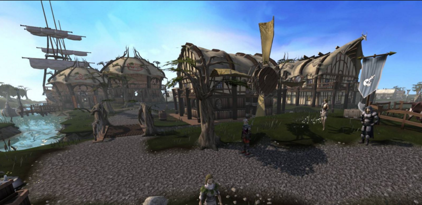
If you haven't played it for awhile, I would be very surprised if you could recognize it. This is the extent that graphic changes can accumulate to.
Its Runescape.Last edited by Sliske; 2016-04-02 at 09:56 PM.
-
2016-04-02, 09:43 PM #24The Lightbringer

- Join Date
- Aug 2011
- Location
- Commiefornia
- Posts
- 3,896
maybe not exactly 48.. but a bit more effort than we have seen in the last 3 expansions. i wish they took the effort put into shetty garrisons and made better gears sets honestly. give sets that look one way for males, and a much more feminine way for females. add some depth and better design. really, garrisons were a complete waste of effort given how shallow and generic they turned out. Originally Posted by Netherspark
imo: now that we have transmog, that should be motivation to the artists to design more appealing sets. i mean if i was an artist i would want my newly designed set to be more popular or at the very least as popular as past sets. this has not been the case since transmog was introduced, the artists got hella lazy with their designs, because "Meh, they can just mog over them if they dont like them..."Last edited by Sinndra; 2016-04-02 at 09:47 PM.
Originally Posted by ablib
-
2016-04-02, 09:49 PM #25Mechagnome


- Join Date
- Apr 2015
- Posts
- 733
Totally agree it seems mmo-champion has just become the site on the internet where everybody hates everything. Originally Posted by Imnick
-
2016-04-02, 09:55 PM #26Herald of the Titans
- Join Date
- Jun 2015
- Posts
- 2,973
The sets have looked like shit since cataclysm, it's why we have transmog.
-
2016-04-02, 09:56 PM #27The Lightbringer
- Join Date
- Aug 2009
- Posts
- 3,646
Tier and PvP were the same but recolored in BC (with minor changes, like T4/S1 Hunter chest being more revealing in T4, or one of the Shaman sets were robes in tier and legs in PvP). Originally Posted by Rue-7
In every season since, except for Warlords Season 3, they have been different.Cheerful lack of self-preservation
-
2016-04-02, 09:58 PM #28Stood in the Fire

- Join Date
- Sep 2011
- Posts
- 493
You should try visiting the North Korean version of MMO-Champ if you have a problem with negative opinions. "Blizzard has yet again blessed us with glorious armor models, we praise thy name." Originally Posted by mhdoe
-
2016-04-02, 09:59 PM #29The Lightbringer
- Join Date
- Aug 2009
- Posts
- 3,646
Ironically, I find T17 Mythic as a whole has some of the best-designed sets in the game. Everything except Druid is spectacular. Originally Posted by Sinndra
Cheerful lack of self-preservation
-
2016-04-02, 10:01 PM #30Immortal

- Join Date
- Jan 2015
- Location
- Empire of Man
- Posts
- 7,074
Some people actually do. The sentence" I really need to get into mythic and Mannoroth for those pants" has been said by one of my raiders, who is pushing for mythic content. Originally Posted by -Skye
-
2016-04-02, 10:04 PM #31The Unstoppable Force

- Join Date
- Feb 2010
- Location
- Arkon-III
- Posts
- 20,131
While priest M T17 has nice shoulders and an interesting headpiece, the color scheme is absolutely fugly. >.< Originally Posted by Veredyn
HC >>>>>>>>>> Mythic.
-
2016-04-02, 10:07 PM #32Stood in the Fire


- Join Date
- Dec 2008
- Posts
- 415
Every time something new comes, people start crying on the forums. "new armor set is ugly, old ones were cool", "new expansion is shit, previous was best ever", etc. Originally Posted by Zoludar
It's called nostalgia - it tricks your mind into thinking that new things are bad and things in the past were good./Zetsumei
-
2016-04-02, 10:08 PM #33The Lightbringer
- Join Date
- Aug 2011
- Location
- Commiefornia
- Posts
- 3,896
if the artists put more effort into gear design, i could accept your feelings towards some tiers. like thats how it should be. i dunno, i just feel like the artists got bummed out when transmog was added in such a way that each tier is designed with a "ho~hum, they can just t-mog it if they dont like it..." kind of attitude. Originally Posted by Veredyn
sure sure, somebody WILL inevitably love the set, but somebody else will hate it, as an artist i would strive to get my set worn more than others, so i would look at what sets are most popular, then try to enhance or play off of those sets, maybe occasionally asking the community for input (as in designing a dark ranger look because its been forever since we've had one). Originally Posted by ablib
-
2016-04-02, 10:11 PM #34Void Lord

- Join Date
- Jul 2011
- Location
- In some Sanctuaryesque place or a Haven
- Posts
- 44,683

I believe Art is the biggest development bottleneck. I don't know how big the Art team for WoW is but I'd assume if it wasn't big or decent size development would take longer.
#TeamLegion #UnderEarthofAzerothexpansion plz #Arathor4Alliance #TeamNoBlueHorde
Warrior-Magi
-
2016-04-02, 10:13 PM #35Deleted
Comes and goes... I feel they tried to try sets to much into fel themes for mythic tier. Classes can look evil and look good but not everyone looks good with a legion theme.
-
2016-04-02, 10:13 PM #36Mechagnome
- Join Date
- Sep 2015
- Posts
- 544
i think blizz should make armors like vanilla
-
2016-04-02, 10:16 PM #37DeletedThe worst thing is that the OP is posting on an alt to hide the shame of this stupid thread ;p Originally Posted by Imnick
-
2016-04-02, 10:20 PM #38Titan

- Join Date
- Feb 2012
- Posts
- 13,993
Some of them look ok, and it seems that two of the recolors of each set have additional detail like a stronger glow or bigger spikes.
I honestly think the design has been shit for the past few years with no exception, which has been a problem since in the past they at least showed some variation. Legion is the first time where I am seeing a couple of sets/colors that I would actually use.
-
2016-04-02, 10:20 PM #39Stood in the Fire

- Join Date
- Sep 2011
- Posts
- 461
To each their own. Some people like the sets, some hate them, some don't care, it's all down to personal taste. So saying armor set are going downhill because you don't like them is way to biased and makes me think you just want to find people to agree with that statement.
In any case, in my opinion (based on my taste) I love the look of T19 sets and I wonder if they'll keep making Mythics sets to be like T17/MoP CM sets with special effects on them.
-
2016-04-02, 10:21 PM #40The Unstoppable Force
- Join Date
- Feb 2010
- Location
- Arkon-III
- Posts
- 20,131
Naah I don't think so. Originally Posted by Sinndra
Imho it's some general shift that occurred. Hence most cloth designs now have this ugly primitive / giant stitches look etc. You didn't have that in TBC or classic.
I'm most familiar with priest sets, so here are the ones I like in chronmological order:
T2, T3, T4 (<3), T5, T6, T10 (white color), T11, T15 (cool for shadow), T17 (red version)
Meh
T7, T8, T12, T16 (shoulders fugly on Draenei)
Dislike
T9, T13, T14, T19 (completely lacks vision/creativity)
WTF is this shit?!
T18 (What a lame ass revamp of T16 lol)
So yeah. Each expansions has it's ups and downs.
Now hunter sets .... erm... they are all ugly as shite. I pity them hunters.

 Reply With Quote