Dark Heart PTR Development Notes
 Dark Heart PTR Development Notes
 Should money be account-wide?
 Are we approaching a Solo Raid WoW Experience?
 MMO-Champion


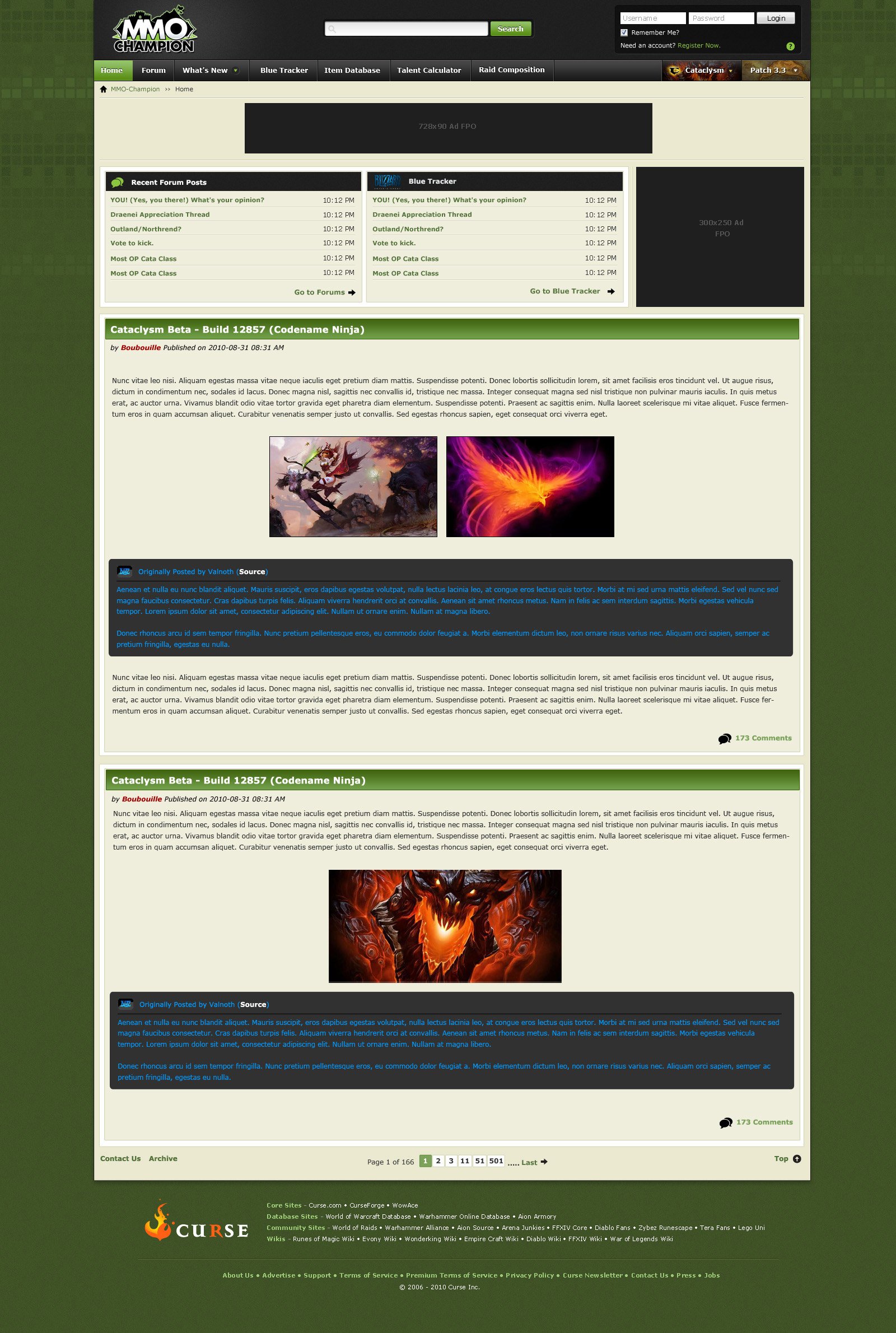
My lovely new tech team is working on a new design for the site and I figured it could be nice to ask for your opinion while things are still in development.
Important
- No, we're not reducing the amount of news posts on the front page to 2, it will remain the same old super-long front page.
- I'm mostly looking for people who have good idea on how to improve things, if you really hate something try to elaborate and offer ways to do things better.
- It's a 1680x1050 screenshot because this is the most used resolution on the website, it should work fine on lower res.
 Recent Blue Posts
 Recent Forum Posts
View Poll Results: What do you think of the new theme?
- Voters
- 1468. This poll is closed
-
It's awesome!
851 57.97% -
I like it, but it could be improved.
493 33.58% -
Meh.
90 6.13% -
I hate it!
34 2.32%
Thread: New Website Design - Feedback
-
2010-09-03, 06:35 AM #1Administrator


- Join Date
- Mar 2007
- Posts
- 5,795
New Website Design - Feedback
Last edited by Boubouille; 2010-09-03 at 06:45 AM.
-
2010-09-03, 06:40 AM #2Field Marshal


- Join Date
- Aug 2009
- Location
- Canada
- Posts
- 93
-
2010-09-03, 06:40 AM #3Brewmaster

- Join Date
- Dec 2009
- Location
- Camped outside Dark Portal
- Posts
- 1,331


I like it very much.

-
2010-09-03, 06:41 AM #4Grunt
- Join Date
- Jun 2007
- Posts
- 15
Looks awesome, just hope its optimized for a 1024x768 resolution. Im cursed with a small monitor
-
2010-09-03, 06:41 AM #5Stood in the Fire

- Join Date
- Sep 2010
- Location
- Somewhere
- Posts
- 497
So far, I think it's nice. I think you should use sidebars again like you're currently using with the old design. Other then that.. it looks great!
-D2
-
2010-09-03, 06:41 AM #6High Overlord

- Join Date
- Jun 2010
- Posts
- 164
Is there still going to be a new news frame at or near the top? I am extremely lazy and hate scrolling down the super-long front page searching for 3-4 day old info.
Other than that I likes it!
Also your Dummy text took me some time to figure out.....Last edited by Starsack; 2010-09-03 at 06:44 AM.
Signature goes here.
-
2010-09-03, 06:41 AM #7Stood in the Fire

- Join Date
- Mar 2009
- Posts
- 434
It's very awesome Bibi
-
2010-09-03, 06:42 AM #8Stood in the Fire

- Join Date
- Sep 2008
- Posts
- 386
I'm sad to see the mmo-champion guy go. You should put him in there but a more sexy version.
Overall I like it, although I think the green background is a little dark. Also the bar at top wasn't very noticeable at first."Please find my dear friends.
Dead or Alive" -redmakoto
-
2010-09-03, 06:42 AM #9Pit Lord

- Join Date
- May 2010
- Posts
- 2,347
Very Sleek and Simple. Like the color Scheme, and... well... All around sexy.
-
2010-09-03, 06:43 AM #10Mechagnome

- Join Date
- Jun 2008
- Location
- Hidden somewhere in Stonetalon Mts.
- Posts
- 703
I like it...But what of the fate of the handy sidebars? Will they stay?
"Whether the world's greatest gnats, or the world's greatest heroes, you are still only mortal."
"You fear that which you cannot control. But can you control your fear?"
-
2010-09-03, 06:44 AM #11Field Marshal
- Join Date
- May 2008
- Posts
- 87
Looks very good!
Although I'm wondering, I'm using IE7 and a not-so-good computer at work, when I visit a website like curse.com, it takes ages to load, because the website is so bloated, I hope this won't happen with MMO-Champion. (It already went slower since the switch to vBulletin.)
-
2010-09-03, 06:45 AM #12Deleted
I like it!
-
2010-09-03, 06:45 AM #13Stood in the Fire
- Join Date
- Sep 2008
- Posts
- 386
The sidebar looks like it's a top bar now. I think some of those top options look like they pull down. Originally Posted by DaShaman
 "Please find my dear friends.
Dead or Alive" -redmakoto
-
2010-09-03, 06:46 AM #14High Overlord

- Join Date
- Mar 2009
- Location
- Somewhere between over here and over there
- Posts
- 177
Looking nice. I think the MMO-Champion guy needs to stay though.

-
2010-09-03, 06:46 AM #15Stood in the Fire
- Join Date
- Apr 2009
- Posts
- 410
Very aesthetically pleasing so far. Side bars aren't needed, and frankly would kill the overall design flow of the new site. I'm assuming the tab where Patch 3.3 and Cataclysm respectively are drop down menus that would act like the old side bar? I'd so, that's the way to go.
-
2010-09-03, 06:46 AM #16Blademaster

- Join Date
- Jan 2008
- Posts
- 45
Banner ad is bearable, but having another ad right below it beside the forum topics will make the page look too cluttered.
-
2010-09-03, 06:47 AM #17Mechagnome
- Join Date
- Jun 2008
- Location
- Hidden somewhere in Stonetalon Mts.
- Posts
- 703
Gasp. I did not see that. Originally Posted by toychristopher
In which case I approve.Last edited by DaShaman; 2010-09-03 at 06:47 AM. Reason: Added second line.
"Whether the world's greatest gnats, or the world's greatest heroes, you are still only mortal."
"You fear that which you cannot control. But can you control your fear?"
-
2010-09-03, 06:48 AM #18The Lightbringer

- Join Date
- Jun 2009
- Posts
- 3,319
I think I remember that Bibi once said "the sidebar (yes - the thing you don't use)"
I think the Sidebar is not important, if cataclysm would be live now, I guess 95% of the people who use the sidebar now wouldn't use it anymore.
Oh and OT: looks sexy, nice to see the bright green go.
But keep the MMO-Champion guy/girl.Last edited by Pope; 2010-09-03 at 06:50 AM.
Originally Posted by Genganger
-
2010-09-03, 06:48 AM #19Stood in the Fire
- Join Date
- Sep 2008
- Posts
- 386
I think it's kind of easy to miss. I didn't see it at first either. Originally Posted by DaShaman
"Please find my dear friends.
Dead or Alive" -redmakoto
-
2010-09-03, 06:49 AM #20Field Marshal

- Join Date
- Aug 2009
- Posts
- 55
Awesome new design. Implement this asap!
You Betcha!