Currency Conversions Coming with Patch 4.4.0 on 1 May
 Currency Conversions Coming with Patch 4.4.0 on April 30
 The WoW Companion App is Retiring
 Did Blizzard just hotfix an ilvl requirement onto Awakened LFR?
 MMO-Champion


Hey,
So it's saturday night in Sweden, I'm bored as hell and I'm feeling creative, so I decided to do some Photoshop for fun.
So Basically I have this silly picture of me here:
Then I added this pic as a background:
And putting those two pics together with a couple of effects added, I managed to pull of something like this:
Any Suggestions of what I can do to make it look better?
Maybe add, or remove something? Better lightning/color correction? Or maybe just finish the picture with an epic quote somewhere? :P
Thanks in advance !
 Recent Blue Posts
 Recent Forum Posts
Thread: Judge my Photoshop skills!
-
2012-08-26, 01:07 AM #1Stood in the Fire


- Join Date
- Nov 2010
- Location
- Sweden
- Posts
- 431
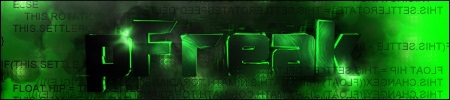
Judge my Photoshop skills!
Last edited by Pivotal; 2012-08-26 at 01:27 AM.
Avatar by Mcfjury
-
2012-08-26, 01:12 AM #2The Patient

- Join Date
- Oct 2011
- Location
- Germany
- Posts
- 261


hmm.. i dont think there is much to judge about. seems pretty basic to me.
i would correct the "helmet". it seems, it is a bit bended.
-
2012-08-26, 01:17 AM #3Stood in the Fire
- Join Date
- Nov 2010
- Location
- Sweden
- Posts
- 431
lol yeah I know, I just put the mask on quickly ^^ Originally Posted by pFreak
 Avatar by Mcfjury
-
2012-08-26, 01:18 AM #4High Overlord

- Join Date
- Mar 2011
- Posts
- 154
I don't have much time for feedback, but one tip for all new PS users: do not use the lens flare. Keep at it though. Graphic design is a field that demands a lot of time for improvement. Not terrible for what you describe as a boredom-killer though.
-
2012-08-26, 01:23 AM #5The Lightbringer

- Join Date
- Apr 2012
- Location
- UK
- Posts
- 3,572
To be honest, your design is not much of a design. It is just some random filters and colour adjustments.
EDIT:
1. Your design seems to be empty in the right side.
2. You've done a bad job at cutting and the blurring was pretty obvious.
3. You've changed your skin too much, it looks now like mud.
4. No flare it is a bad filter.
The only positive thing about your design is your model (you?) who has a relatively cute body. Also, you could look up some Photoshop tutorials to familiarize yourself with the interface/options.Last edited by N-7; 2012-08-26 at 01:29 AM.
-
2012-08-26, 01:26 AM #6Stood in the Fire
- Join Date
- Nov 2010
- Location
- Sweden
- Posts
- 431
1. Maybe, but then again that's why I'm coming here - to look for things to add and/or remove Originally Posted by N-7
2. Alright, I'm no pro at this (obviously) but thanks for the feedback
3. same answer as 2.
4. Ok I'll try to edit/remove the flare, thanks.
About the Only positive thing: Oh stop it you!
Last edited by Pivotal; 2012-08-26 at 01:38 AM.
Avatar by Mcfjury
-
2012-08-26, 01:50 AM #7High Overlord

- Join Date
- Jun 2011
- Posts
- 191
* Decide if your final image is to be used horizontal or vertical. Square shapes are not as dynamic.
* Focal point isn't defined properly. The arm is getting all the attention. (The arm should be cropped or faded significantly)
* Too much dead space. The "negative space" should be the area of context for your defined focal point(s). Everything is just out there somewhere. . .hanging.
Example:
http://imgur.com/GW4w7
Edit: Cool helmet!
* * *Last edited by Troodi; 2012-08-26 at 01:53 AM.
-
2012-08-26, 02:09 AM #8Stood in the Fire
- Join Date
- Nov 2010
- Location
- Sweden
- Posts
- 431
*My final image will be used horizontal, I want it to be wide when finished. Originally Posted by Troodi
*Hm, yeah you got a point, the arm is kinda getting all the attention, I should definitely do something about it.
* Yeah I know, too much dead space has been mentioned, but as I want the image to be wide when it's finished I kinda want more space than the image you linked (btw nice work!). Think of it as a Facebook timeline header, That's how wide I'd like it to be. I'm thinking of putting some sort of background and some objects to the picture, just to fill the dead space up, I dunno.
EDIT: Thanks for the useful feedback =)Avatar by Mcfjury
-
2012-08-26, 02:28 AM #9High Overlord
- Join Date
- Jun 2011
- Posts
- 191
Don't just fill the dead space with stuff, everything in the image should have a reason to be in it, even if the reason is it just looks nice. It'll look right when it fits.
Even dead space should have a reason to be.
If you just have your head/helmet and the flare in the banner, that really is all you need. It will be more dramatic with the one focus.
* * *
-
2012-08-26, 03:18 AM #10I am Murloc!


- Join Date
- Jul 2008
- Posts
- 5,522
The image lacks depth. Everything is at the same level (everything being the flare + yourself, obviously). To be fair, it has a small amount of depth, but that's because the flare appears to be above/before you. But that's kind of the reverse of what you want. The flare has way too much attention being given to it: 1) It's very saturated (meaning the color is too intense and pure), 2) it's visually closer in the picture plane*, 3) it has an awkwardly placed and unnecessary bright spot that draws a lot of attention, and 4) the way it approaches at your body is a little odd (it is kind of "tentacle-y").
Points 1 and 2 can both be corrected by doing one or more of the following to the flare:
* Make it darker.
* Add slightly more grey or slightly more yellow to its hue (either will make it appear to fall back into the picture plane). Yellow is the compliment of purple. Combining the two creates a "mute" which is significantly less vibrant than either of the two pure colors.
* Have the rays go behind (rather than in front of) yourself.
-
2012-08-26, 03:51 AM #11Titan

- Join Date
- Dec 2009
- Posts
- 12,416
Way better then I could do.
-
2012-08-26, 03:53 AM #12LOAD"*",8,1

- Join Date
- Nov 2008
- Location
- Legion of Doom Headquarters
- Posts
- 20,245
I'm gonna move this to fun stuff. It's more appropriate there.
-
2012-08-26, 04:13 AM #13Pit Lord

- Join Date
- Mar 2011
- Location
- New York City
- Posts
- 2,350
Skill level... beginner.


 Reply With Quote