 Dark Heart PTR Development Notes
 Dark Heart PTR Development Notes
 Should money be account-wide?
 MMO-Champion


T12 works amazingly with the store flaming horns hat.
 Recent Blue Posts
 Recent Forum Posts
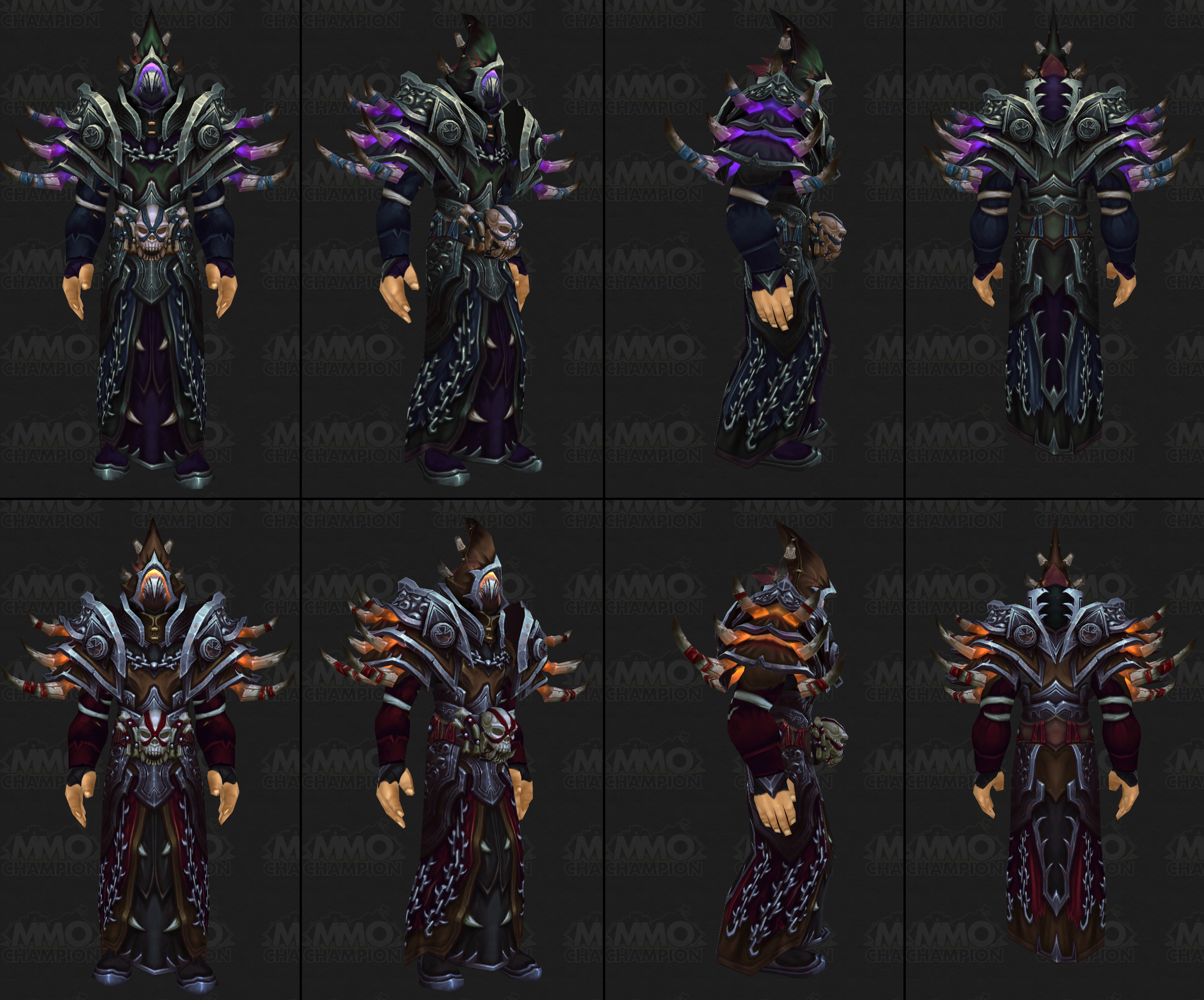
Thread: Warlock Mythic T17
-
2014-06-25, 08:49 PM #121Moderator of the Storm


- Join Date
- Jun 2010
- Posts
- 19,636
-
2014-06-25, 08:52 PM #122Pandaren Monk

- Join Date
- Jan 2011
- Posts
- 1,802
As a worgen, the hair and snout ruin so many head pieces from sets.
Those flaming horns are the salvation for so many of my transmogs.
-
2014-06-25, 09:02 PM #123The Patient
- Join Date
- Apr 2014
- Posts
- 229
I probably won't run the helm, but this looks like so much fun!
-
2014-06-26, 09:32 AM #124Epic!

- Join Date
- Apr 2013
- Location
- Behind Salandrin
- Posts
- 1,683
Look at it on 3d model viewer with worgen!
Awesomesauce!!!
-
2014-06-26, 09:38 AM #125Field Marshal

- Join Date
- Jun 2010
- Posts
- 56
I loooooooooooooooooove this set. It will be mine ASAP!
-
2014-06-29, 12:03 AM #126Blademaster


- Join Date
- Jun 2014
- Location
- The land of unicorns
- Posts
- 40
The set looks so nice, love it *__*
-
2014-07-03, 02:03 PM #127Stood in the Fire


- Join Date
- Sep 2008
- Posts
- 463
Wait...what....um....new version of Warlock Mythic T17 posted today on MMO-Champion home page looks A LOT less Mythic. No skulls on shoulders. Helm looks wimpy. WTF. Back to X-Mog I guess. /sigh.
Last edited by Kashii; 2014-07-03 at 02:06 PM.
-
2014-07-03, 02:05 PM #128Dreadlord

- Join Date
- Nov 2013
- Posts
- 923
That's not the mythic set.
-
2014-07-03, 02:08 PM #129Stood in the Fire
- Join Date
- Sep 2008
- Posts
- 463
Ah yeah...just caught that. Confused b/c others posted above it were Mythic. Crisis averted. Originally Posted by striderZA

-
2014-07-03, 02:33 PM #130Field Marshal

- Join Date
- Mar 2011
- Posts
- 77
So, my plan is to take the red normal version (I like the chain across the chest more than what's on the mythic version), mix it with the mythic version T17 (especially the shoulders and belt), and then throw in the CM helm from MoP. Enormous Illidan horns, wings, and shoulders with skulls impaled on spikes. Does anything sound more warlock appropriate?
-
2014-07-03, 04:29 PM #131Epic!

- Join Date
- Aug 2012
- Posts
- 1,680
Since we brought the T17 N version, which one are which mode? I'm guessing purple is Flex (live) and orange is Normal?
I'd like it to be purple N and orange Flex.
-
2014-07-03, 07:44 PM #132Stood in the Fire

- Join Date
- Jan 2009
- Posts
- 361
Why does T17 N look so ugly? I feel like they made the Mythic set first, then said "now we just need to somehow make this set look absolutely TERRIBLE, and then we'll throw that one in normal/heroic mode"
Mythic looks incredible. And normal just looks like a failed remake of T13. It's probably because of the helm... I sure hope they change it.
-
2014-07-04, 12:54 AM #133Grunt
- Join Date
- Jun 2014
- Posts
- 15
It reminds me of a caster from the Warhammer Chaos army.
-
2014-07-04, 01:18 AM #134Epic!
- Join Date
- Jun 2010
- Posts
- 1,717
Keep in mind those pics are on a male human, the literal worst race/gender combo for lock armor. It actually looks pretty fuckin sweet on the new undead male model. Originally Posted by Bridius
-
2014-07-04, 03:19 AM #135Brewmaster

- Join Date
- Feb 2014
- Posts
- 1,353
I am going to use Mythic set but replace the helm with the non-Mythic helm. Perfect Gul'dan wannabe....
-
2014-07-05, 08:26 AM #136Deleted
I like the normal version aswell. SO SAVAGE.
Although i'm not a big fan of long, pointy hats. They tend to reach out too far, ruining the overall look. They really have a strange scaling in size for some races. So, i wish they gave us a decent hood with the normal version, but... well. Might go for the Priest Mythic helm, that one's got a nice look to it.

 Reply With Quote


