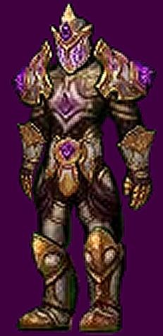
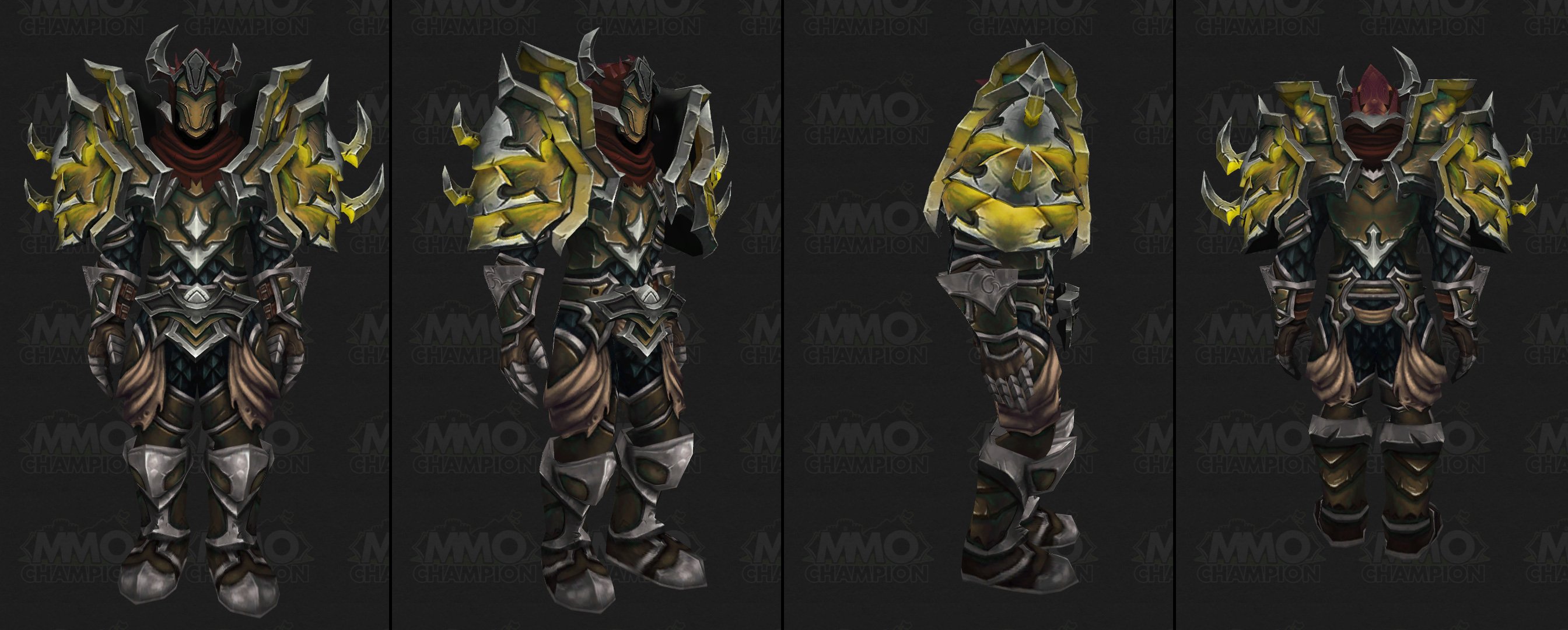
Apparently, every class now needs to look like a tank. They must have heavy metal shoulders, big helms (preferrably with horns of some kind) and huge spikey things. What in the world are you thinking, Blizzard? Each class needs to have individuality, not just another version of the big-bad-armor-model.
Of all the models, the monk set stands out as being the worst. Monks should be graceful and poised, dexterous and lithe. The next tier set, apparently, wants to turn them into Paladins. It is built from, what appears to be about 150 pounds of steel (and on a leather class, for shame!), a fair amount of which is in the belt and shoulders. How in the world is a monk supposed to be graceful when their belts weigh more than their body weight?
All of the classes have a great individuality and a wonderful presence, game-wise. Blizzard seems to have lost that spirit and given them all huge, heavy, clunky armor. When I look at a pair of Warlock tier shoulders in a model viewer and expect them to look good on a DK.. Sad. Not to mention the priest set who gets tank gear with a cloth robe.
Granted, it's far too late to change this tier, but I beg of you Blizzard.... Bring back some class feel and let each class feel like they have their own style that matches their character, not just "everyone looks like a tank, but a few of you get a cloth robe". Armor doesn't HAVE to be massive to be cool. I'd much rather see some delicate Mage gear that feels arcane than 50 pounds of metal, even if it does look tough and 'leet.
- Kev
-
2014-07-03, 05:36 AM #1Keyboard Turner


- Join Date
- Apr 2011
- Posts
- 6
New armor sets - What are you thinking, Blizzard
-
2014-07-03, 05:37 AM #2
We saw the concept art for this back at Blizzcon.
FFXIV - Maduin (Dynamis DC)
-
2014-07-03, 05:39 AM #3
Eh, they have themes to their tiers. Who knows what the next one will be? I don't like all the sets they've presented. I like this one a lot more than the Pandaria Style of the last tier, though.
-
2014-07-03, 05:40 AM #4
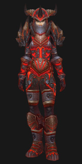
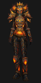
I don't really know what is blizzard thinking , look at how good T17 looks and then we get to see season 16
Paladin t17
Paladin season 16
-
2014-07-03, 06:56 AM #5
Monks have God-Hands. The Fomor are obscenely powerful creatures, and monks are just as much about being fierce and powerful as they are about "grace." You had your flowy robes and beer hats. You've left pandaria, find something new to tap into. I'm very happy with sets so far. I'm super pumped that we have no idea what Tier 2 draenor's going to be about, and i know it'll be as un predictable as the thunder king/Amani were pre MoP. Awesome will ensue.
-
2014-07-03, 06:58 AM #6
We're dealing with a very deadly, vicious force here and Warlords is far more 'gritty' than Pandaria.
It's all part of the theme. I think some of them look amazing!
-
2014-07-03, 06:58 AM #7
-
2014-07-03, 07:01 AM #8
It never fails.
"Terror, darkness, power? The Forsaken crave not these things; the Forsaken ARE these things."
-
2014-07-03, 07:05 AM #9
The team's artists are being told that "bigger is better" when it comes to armor. Now we have ridiculous things like animated chainsaws and spinning gears on shoulderpads. Some of the most popular sets are minimalistic, and people love transmoging into them.
Seems Blizzard doesn't get it.
 Sythis - Vicious Cycle
-
2014-07-03, 07:06 AM #10Deleted
I think the mythic sets are supposed to be ridiculously over the top. That said, I do agree we haven't seen small shoulderpads in a while. The overall art quality however has been really great. They look amazing, even if too big.
-
2014-07-03, 07:11 AM #11
-
2014-07-03, 07:15 AM #12Deleted
Most of the sets are pretty toned down tbh. The only noticeable difference I've really seen between T17 and the mop tiers is belt size and design. I don't like any of my classes tiers but thats easily fixed by transmogging them.
-
2014-07-03, 07:18 AM #13
I really like the sets, so far, only the warrior and monk sets have jumped out at me. I think the rest are pretty cool.
-
2014-07-03, 07:18 AM #14
I quite like the high-fantasy/super tech sets in WoW because its not a "realistic" looking MMO. Until Blizzard changes their armor system to each slot being an actual 3D piece (FF14 does this beautifully), I rather they stick to the plate-looking sets.
Tikki tikki tembo, Usagi no Yojimbo, chari bari ruchi pip peri pembo!
-
2014-07-03, 07:46 AM #15
I'm not a fan of the new tiers either.
Monk isn't that bad, but honestly I dislike those types of gloves so much. Every tier set seems to have them and it just ugh So bulky!
Though thank goodness for transmog I guess. Still would like something new to use.
Edit: Well besides the looks, I do like the colours. I understand 'Iron Horde' so there won't be more light or white colours. Still would be nice
Edit Edit: I actually checked out the tiers in model viewer, they look a lotbetter. Well at least the human fem monk gloves aren't bulky.Last edited by lMishka; 2014-07-03 at 04:19 PM.
-
2014-07-03, 08:04 AM #16
-
2014-07-03, 08:06 AM #17
-
2014-07-03, 08:09 AM #18“Do not lose time on daily trivialities. Do not dwell on petty detail. For all of these things melt away and drift apart within the obscure traffic of time. Live well and live broadly. You are alive and living now. Now is the envy of all of the dead.” ~ Emily3, World of Tomorrow
Words to live by.
-
2014-07-03, 08:18 AM #19
i think they all look very cool tbh, opinions are just that; opinions.
This is a signature, there are many like it, but this one is mine.
-
2014-07-03, 08:23 AM #20

 Recent Blue Posts
 Recent Forum Posts
 Sign Up To Test The War Within
 Rank the Dragonflight Dungeons (beyond knee-jerk reactions)
 Can I ask why have moderators if blatant harassment doesn't get dealt with?
 MMO-Champion


 Reply With Quote


