 Recent Blue Posts
 Dragonflight Season 4 Content Update Notes
 Dragonflight Season 4 Content Update Notes
 Dragonflight Season 4 Content Update Notes
 MMO-Champion


Switzerland.
"Why do you like Switzerland?"
"Well, the flag is a big plus".
 Recent Forum Posts
Thread: Best Flag
-
2015-08-13, 09:40 PM #41Immortal


- Join Date
- Feb 2011
- Location
- Thessaloniki, Greece
- Posts
- 7,052
-
2015-08-13, 09:50 PM #42Deleted

I like the flag that crushes the US spirit, the good old East India Trading Company one.
-
2015-08-14, 11:56 AM #43Immortal
- Join Date
- Dec 2009
- Posts
- 7,276
Amsterdam without a doubt.
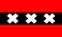
Simple, strong symbolism, no lettering, multiple applications, incredibly distinct from anything else.
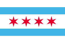
Close runner ups
Chicago
Canada

Turkey

Last edited by nextormento; 2015-08-14 at 11:59 AM.
-
2015-08-14, 12:01 PM #44Legendary!

- Join Date
- Sep 2012
- Posts
- 6,112
They are almost all ugly, only decent one being Angola:
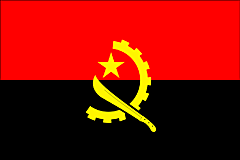
Its black and red (woooow) and has a machete on it (2x woooow)Last edited by Kurioxan; 2015-08-14 at 12:13 PM.
-
2015-08-14, 12:08 PM #45The Undying

- Join Date
- Nov 2010
- Location
- Iowa - Franconia
- Posts
- 31,500
 "The pen is mightier than the sword.. and considerably easier to write with."
-
2015-08-14, 12:44 PM #46The Unstoppable Force


- Join Date
- Jan 2009
- Location
- Finland
- Posts
- 23,401
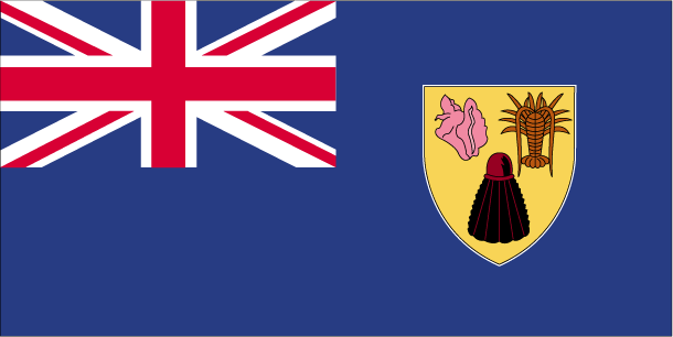
The Turks and Caicos Islands. It has a salt shaker, an alien and a vagina on it. That's my interpretation anyway.
 Originally Posted by derpkitteh
 Originally Posted by derpkitteh
-
2015-08-14, 12:53 PM #47Elemental Lord

- Join Date
- Nov 2011
- Location
- Scotland
- Posts
- 8,054
It's no competition really.
-
2015-08-14, 12:54 PM #48Brewmaster
- Join Date
- Oct 2011
- Posts
- 1,433
The southpark town flag.

Last edited by matt4pack; 2015-08-14 at 12:58 PM.
-
2015-08-14, 12:56 PM #49Deleted
The flag to rule them all:
-
2015-08-14, 01:09 PM #50The Undying
- Join Date
- Nov 2010
- Location
- Iowa - Franconia
- Posts
- 31,500
Reading comprehension? Originally Posted by matt4pack

Official flags, no fiction stuff."The pen is mightier than the sword.. and considerably easier to write with."
-
2015-08-14, 01:13 PM #51Brewmaster


- Join Date
- Jun 2015
- Location
- Wisconsin
- Posts
- 1,410

Always liked this flag.
-
2015-08-14, 01:29 PM #52Deleted
I liked the old one of Libya (got changed in 2011).
Last edited by mmoc48c29aaf6e; 2015-08-14 at 01:33 PM.
-
2015-08-14, 01:31 PM #53The Unstoppable Force
- Join Date
- Jan 2009
- Location
- Finland
- Posts
- 23,401
It's Libya. Originally Posted by Forsta
Originally Posted by derpkitteh
Originally Posted by derpkitteh
-
2015-08-14, 01:33 PM #54DeletedThanks Mr. Dickbutt Pluto, /corrected. Originally Posted by Puupi
-
2015-08-14, 01:34 PM #55The Unstoppable Force
- Join Date
- Jan 2009
- Location
- Finland
- Posts
- 23,401
You are welcome! Originally Posted by Forsta
Originally Posted by derpkitteh
Originally Posted by derpkitteh
-
2015-08-14, 01:46 PM #56Scarab Lord

- Join Date
- Mar 2010
- Location
- The Unvanquished City of Porto, Portugal
- Posts
- 4,136
I've always been quite partial to my country's flag, here's our last monarchic flag (blue and white) and the current republican one (red and green)


-
2015-08-14, 01:50 PM #57The Insane

- Join Date
- Oct 2010
- Location
- Belgium, Flanders
- Posts
- 18,230
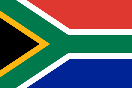
Color combination wise i always found the south african one to be the most interesting.
-
2015-08-14, 02:09 PM #58Stood in the Fire
- Join Date
- Apr 2014
- Location
- 'Merica
- Posts
- 402
US flag personally. Canada is a very close second. UK was third, until I someone mentioned diagonals are off center, now it's garbage.
But NY State flag is best flag
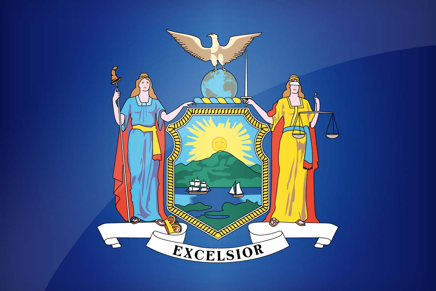
The NY Coat of arms is simply magnificent. Look at the fucking sun. It's so grumpy. You would never expect a grumpy sun on a coat of arms.
Seriously though, I really do like the NY State Flag
-
2015-08-14, 02:13 PM #59The Undying

- Join Date
- Jul 2012
- Location
- Στην Κυπρο
- Posts
- 32,390
Why are the US regional flags so badly drawn?
They look like third runner-up in a school art competition.


-
2015-08-14, 02:15 PM #60Void Lord

- Join Date
- Oct 2012
- Location
- Aelia Capitolina
- Posts
- 59,345
The Union Jack, by far.
Originally Posted by Marjane Satrapi

 Reply With Quote


