Righteous Orbs no longer dropping
 Righteous Orbs no longer dropping
 War Within Internal Alpha - Here's the Beef
 Rank the Dragonflight Dungeons (beyond knee-jerk reactions)
 Can I ask why have moderators if blatant harassment doesn't get dealt with?
 MMO-Champion


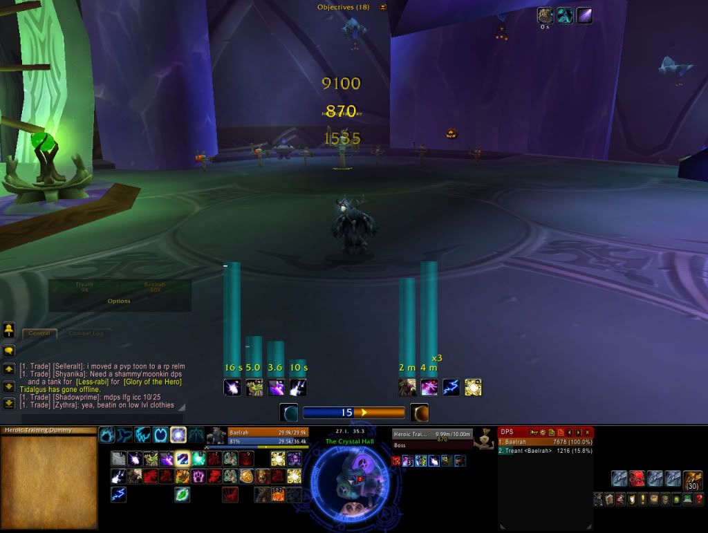
I'm not sure what to do with my Pet bar, since it would be in the way of my raid frames in the center if I raided on my shaman.
Any tips/suggestions are welcome though!
edit: can't post links =(
edit2: if someone can help me with the code for those bottom buttons so that when I mouseover them, they are the same color, I'd love you forever!
 Recent Blue Posts
 Recent Forum Posts
Thread: Post Your UI
-
2011-05-25, 10:46 PM #4181Keyboard Turner

- Join Date
- May 2008
- Posts
- 4
Last edited by mmocba105e19de; 2011-05-26 at 05:59 AM.
-
2011-05-26, 03:29 AM #4182Mechagnome

- Join Date
- Mar 2009
- Location
- Minnesnowta
- Posts
- 668
New UI (still making minor tweaks). Let me know what you think so far!

Last edited by mmocba105e19de; 2011-05-26 at 05:59 AM.
-
2011-05-26, 03:36 AM #4183Blademaster

- Join Date
- May 2009
- Location
- The worlds arm pit
- Posts
- 38
My current UILast edited by mmocba105e19de; 2011-05-26 at 06:00 AM.
-
2011-05-26, 09:01 AM #4184High Overlord

- Join Date
- Sep 2010
- Location
- Newport Beach, CA
- Posts
- 158
 Originally Posted by Eradication

oof. that is just.... not good at all. =(
-
2011-05-26, 09:01 AM #4185Blademaster

- Join Date
- Feb 2011
- Posts
- 45
I would either make the pet bar visible only on mouseover, or resize it and place it just above your pet's health frame. Originally Posted by Hiller316
-
2011-05-26, 12:30 PM #4186Mechagnome
- Join Date
- Mar 2009
- Location
- Minnesnowta
- Posts
- 668
No offense, but it seems really chaotic with your abilities being different sizes and surrounding your name plate. I think it would look much better if you moved them down to the bottom of your viewport, rather than the top (unless you're a clicker). Also, it would look much better if you changed the background/borders of both Omen and Recount to either Black or 0% opacity (this includes the title bars), this way they will blend in with your viewport. Originally Posted by Eradication
-
2011-05-26, 01:37 PM #4187Blademaster
- Join Date
- Aug 2010
- Posts
- 45
I would do all the above and then also; move your mini-map to the right hand side, and completely hide, or only make your bag and mico-menu visible on a mouse over. Then re-center your buttons, so things don't look so lop sided. Use Grid for unit frames if that is what you are going for, not heal bot. Get Prat, so you can edit your chat box, and remove all those stupid looking blizzard buttons, and lock the thing, so it doesn't look like a mess. Then finally get a buff addon, so you can move your buffs to the corner of your screen, so they aren't floating out in the middle of no where because the mini map is no longer acting as a border. Originally Posted by Eradication
-
2011-05-26, 02:19 PM #4188Blademaster
- Join Date
- Feb 2011
- Posts
- 45
I would move the ability bars where your minimap is, then move omen to the right of recount. The rest is mentioned in the above posts. I can see which look you are going for, it just looks a bit messy right now Originally Posted by Eradication

Edit: i also noticed you have 2 different addons tracking your debuffs on the target, and the druid nature/arcane damage bar thingy. I would change the minimap border to something more simple as well.Last edited by Telys; 2011-05-26 at 02:23 PM.
-
2011-05-26, 02:22 PM #4189The Patient

- Join Date
- Jan 2009
- Location
- Holland
- Posts
- 243
My own edit of Tukui

Last edited by mmocba105e19de; 2011-05-26 at 02:30 PM.
-
2011-05-26, 02:26 PM #4190High Overlord
- Join Date
- Jan 2011
- Posts
- 191
Originally Posted by jasje
Do you have any idea what addon makes your heals looks nice like that? The default text is annoying to meLast edited by mmocba105e19de; 2011-05-26 at 02:30 PM.
http://eu.battle.net/wow/en/characte...imtor/advanced
Grimtor - Protection warrior - The maelstrom EU.
-
2011-05-26, 03:03 PM #4191I am Murloc!
- Join Date
- Apr 2008
- Location
- Iowa
- Posts
- 5,203
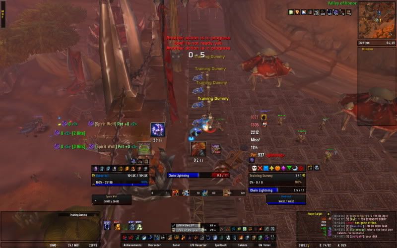
This is a slightly modified version of FreeUI

Image quality is bad. Had to printscreen this off of our forums
Ignore the bindings, I had to switch to heals at the last second for that fight and most everything is bound to Clique.
-
2011-05-27, 08:15 AM #4192DeletedYour raidframes are out of position it seems. Originally Posted by Ayure
-
2011-05-27, 09:07 AM #4193Blademaster
- Join Date
- May 2011
- Posts
- 43
i think it's ok, some ppl just don't like having frames in the middle of the screen Originally Posted by Led ++

-
2011-05-27, 09:45 AM #4194Over 9000!

- Join Date
- Apr 2010
- Location
- Moonglade
- Posts
- 9,407
As in, not aligned pixel-perfect with the Player frame? Originally Posted by Led ++

-
2011-05-27, 12:20 PM #4195I am Murloc!
- Join Date
- Apr 2008
- Location
- Iowa
- Posts
- 5,203
Yeah, it is an old screenshot. I had to edit the LUA just as we pulled to get it over where I liked it, so I guesstimated. Originally Posted by Led ++
-
2011-05-27, 12:44 PM #4196The Patient
- Join Date
- Jan 2009
- Posts
- 201
Is it possible to get DBM looking like yours without using FreeUi?
And another question: Which font are you using for the buttons and the buffs?
Currently I'm using buttonfacade: caith but i'm bored of it.Last edited by Brother; 2011-05-27 at 12:46 PM.
-
2011-05-27, 03:55 PM #4197Mechagnome

- Join Date
- Oct 2010
- Location
- The Maelstrom (EU)
- Posts
- 599
Been messing with my UI for the last few days and finally settled on this:
Idle/solo
Raid/combat
As a note, the combat pic is taken with pretty much everything going on at once for an idea of layout, it's not always that cluttered.
I absolutely love the very minimalistic looks of some of the UI's posted here, but, even after weeks, i just cannot get used to playing with that setup, and the only way i feel i can play is with the oh-so-frowned-upon closed off bar at the bottom. I don't know, maybe i'm just getting too old and set in my ways xD
A few things i'm still not happy about:
Need to remove half the stuff in MSBT, it's just not needed and adds to the clutter.
Want to find a way that shows aggro on my raid frames - not too happy with pitbull's inbuilt aggro - border would be ideal, but it doesn't show very clearly at all.
Still toying with the idea to make player/target unit frames smaller.
Want to move Target's target unit frame, possibly to the right of target and MUCH smaller.
Comments and criticism welcomed!
-
2011-05-27, 07:10 PM #4198DeletedI like it, Its very similar to my moonkin Ui. only thing I'd change is organise your bars, they seem all over the place to me, but I keep mine pretty neat. The vertical timers are very cool, nice idea. Originally Posted by Eradication
-
2011-05-27, 09:00 PM #4199Blademaster
- Join Date
- May 2011
- Posts
- 43
what's that comanding shout\sunder armor addon? Originally Posted by Ammeg
btw good UI, but i don't like unit framse to be in the middle) but it's my own pref.
-
2011-05-27, 09:36 PM #4200Mechagnome
- Join Date
- Oct 2010
- Location
- The Maelstrom (EU)
- Posts
- 599
That'll be ForteXorcist. Took me a while trying to configure it, in the end i just tuned off all the default buffs/debuffs/enchants/trinkets etc and just created my own to get the specifics of what's shown. Originally Posted by Kykypyka
Target: Rend/demo shout/sunder/Thunderclap/shockwave/charge stun/interven/concussion blow/disarm (going to add in all the other debuffs such as curse of weakness that share the same debuff as mine
Player: SnB/Shouts/Trinkets/Shield wall/Last stan/Rallying cry etc - going to add other cd's such as guardian spirit/pain suppression etc etc
Only reason i actually have my frames in the middle is because i find i tend to actually use my cooldowns more efficiently as i can keep an eye on my health more easily. Target frame's there because i likt symmetry :<

 Reply With Quote