 Recent Blue Posts
 Dark Heart PTR Development Notes
 Dark Heart PTR Development Notes
 Recent Forum Posts
 The War Within - Alpha Press Preview
 MMO-Champion
Thread: Post Your UI
-
2009-05-09, 04:00 AM #321High Overlord

- Join Date
- May 2009
- Posts
- 100
Re: [Healers] Post your UI Part 2
-
2009-05-09, 06:28 AM #322Keyboard Turner

- Join Date
- Apr 2009
- Posts
- 4
Re: [Healers] Post your UI Part 2
I really like your UI Saonserey! Could you post a link to DL it or give a list of the mods used Originally Posted by Saonserey
 ?
?
-
2009-05-09, 08:06 AM #323High Overlord
- Join Date
- May 2009
- Posts
- 100
Re: [Healers] Post your UI Part 2
It's changed a little since then, but I use Dominos, Pitbull, KGpanels, ButtonFacade, Carbonite, Grid, Quartz, Prat, PoMTracker and ClearFont2. Omen, Recount, Outfitter and DBM for other essential functions. Originally Posted by Reconcile
-
2009-05-09, 11:18 AM #324Blademaster
- Join Date
- Apr 2009
- Posts
- 34
Re: Post Your UI
[img width=400]http://i40.tinypic.com/2yxhgth.jpg[/img]
Nothing fancy, just though I'd post.
-
2009-05-09, 11:48 AM #325High Overlord
- Join Date
- Jun 2007
- Posts
- 160
-
2009-05-09, 11:50 AM #326The Patient
- Join Date
- Nov 2008
- Posts
- 299
Re: Post Your UI
[img width=400]http://i97.photobucket.com/albums/l221/ecwfrk/WoWScrnShot_041309_140624.jpg[/img]
The bar hovering in the middle was a toggle bar I had for doing dailys. I've since replaced it with Quest Clicks which automatically creates a bar with usable items whenever they're in my inventory. The bars on the side can also be toggled on and off via hotkey when I want more screen real estate. I've also dumped Critline since the SS was taken.More knowledge can be gained in an hour of arguing against those who espouse your own beliefs than in a lifetime of blindly agreeing with them. -Me
-
2009-05-09, 01:30 PM #327The Patient

- Join Date
- Jan 2009
- Location
- Holland
- Posts
- 243
Re: Post Your UI
In a Raid and also Main UI for my paladin
[img width=400]http://img135.imageshack.us/img135/2227/wowscrnshot050709215149.jpg[/img]
Casting
[img width=400]http://img135.imageshack.us/img135/8523/wowscrnshot050909142554.jpg[/img]
Test for Healer Interface
[img width=400]http://img135.imageshack.us/img135/3535/wowscrnshot050809182907.jpg[/img]
Test for Healer Interface
[img width=400]http://img135.imageshack.us/img135/7745/wowscrnshot050809190733.jpg[/img]
Test for Healer Interface
[img width=400]http://img135.imageshack.us/img135/116/wowscrnshot050809191002.jpg[/img]
Dl can be found on wowinterface Jasje_UI
-
2009-05-09, 01:31 PM #328Field Marshal
- Join Date
- Dec 2008
- Posts
- 69
Re: Post Your UI
heres a ui i spent quite a few time on...it's inspired by CIderhelm's UI on tankspot
some ppl say it looks cramped but since i use a big wide screen monitor it doesn't bother me at all
in this pic im just doin some dailies on a fine weekend ^_^

http://img7.imageshack.us/img7/8682/...nterfazors.jpg
-
2009-05-09, 10:47 PM #329Stood in the Fire
- Join Date
- Sep 2008
- Posts
- 441
Re: Post Your UI
Okie ladies and gents, time for something new!
Definitely still some things to polish
This is my version of the center stack layout.
ooc in Dalaran
http://hdimage.org/images/0txwg8wqwkzana26cz_new2.jpg
Keepin those Moonbrook hoes in line
http://hdimage.org/images/ekku4qgrw436smnhvzdv_new.jpg
Yes, it will be uploaded when it's done.
And, of course, c/c is always appreciated.
<3
Ish
-
2009-05-10, 12:57 AM #330High Overlord
- Join Date
- Nov 2008
- Posts
- 111
Re: Post Your UI

the giant circle in the middle is "Hud"
-
2009-05-10, 01:49 PM #331Grunt
- Join Date
- Oct 2008
- Posts
- 13
Re: [Healers] Post your UI Part 2
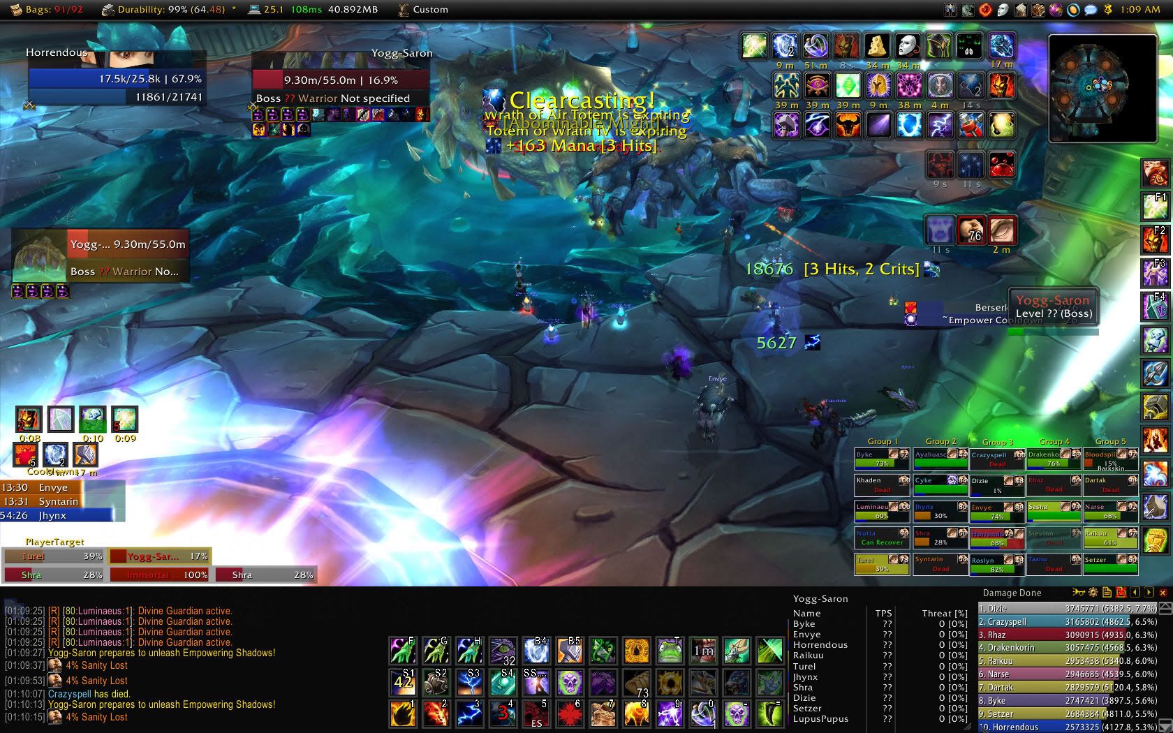
My Ulduar videos can be found here, all in HD: http://www.youtube.com/user/horrendousmg
-
2009-05-10, 02:27 PM #332High Overlord
- Join Date
- Feb 2009
- Posts
- 105
Re: Post Your UI
http://hdimage.org/images/9nt50t45f6...0409233935.jpg
Mage ui, recently updated
gaps at the bottom are filled in raids by grid, omen and other such addons.
edit: Before I get slated for lack of visible keybinds: I've lowered the UI scale, and the size of my dominos bars is such that they are nigh on invisible.
edit2: I have since disabled enchantrix due to it's disgustingly huge icon which refuses to hide with all the others.
-
2009-05-10, 03:49 PM #333High Overlord
- Join Date
- Sep 2007
- Posts
- 148
Re: Post Your UI
New UI, the ideas of which are extracted from this thread and some of my innovation, hope ye like it, took me a while to decide how I wanted it to look, worked out tho; I'm considering making the alpha of the casting bar less so that its not so opaque and interrupting to the portrait. Comments and feedback appreciated.
[img width=570]http://i150.photobucket.com/albums/s87/Adinan_96/WoWScrnShot_051009_173030.jpg?t=1241970190[/img]
[img width=550]http://i150.photobucket.com/albums/s87/Adinan_96/WoWScrnShot_051009_173128.jpg?t=1241970190[/img]
[img width=530]http://i150.photobucket.com/albums/s87/Adinan_96/WoWScrnShot_051009_173213.jpg?t=1241970193[/img]
PS, the pet uf is just like the tot but under the player's portrait in the same way; and the time text in the middle of the 2nd SS and target's casting bar interfering with the border of the target's uf is fixed now, I just didn't notice it until I uploaded the images and cba'd reuploading :P Also, the buffs on the target's aura stop at the tot's border, so it doesn't interfere. Well enjoy.
..:: Adnan ::..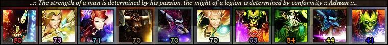
-
2009-05-10, 05:56 PM #334Deleted
Re: Post Your UI
-
2009-05-10, 06:08 PM #335High Overlord
- Join Date
- Sep 2007
- Posts
- 125
Re: Post Your UI
-
2009-05-10, 06:44 PM #336Grunt
- Join Date
- Nov 2008
- Location
- Pittsburgh, PA
- Posts
- 13
Re: Post Your UI
Try again. Thumbnails only.

-
2009-05-10, 11:04 PM #337The Patient
- Join Date
- Sep 2008
- Posts
- 286
Re: Post Your UI
Imo the health bar covering the portrait looks wierd. whats the idea of a portrait you cant see?, Originally Posted by Adnan
remove the border of the UF, reduce the opacity, create a kg panel that works as the border, just only on some of the health bar, so its not over the portrait, but still there behind the HP bar imo it would look quite cool. dont you think?
Same with casting bar, lower opacity, or use another status bar? ex would be Duke G, 20% and no background, creates that cool looking gloss over the portrait
-
2009-05-10, 11:07 PM #338Blademaster
- Join Date
- Apr 2009
- Posts
- 33
Re: Post Your UI
[img width=300]http://www.hdimage.org/images/q2h4fksds4v5vdqdxs_ocrnhot050809232111.jpg[/img]
copied vexiones layout, and changed some things.
-
2009-05-10, 11:44 PM #339Keyboard Turner
- Join Date
- May 2009
- Posts
- 3
Re: [Healers] Post your UI Part 2

-
2009-05-11, 01:17 AM #340Keyboard Turner
- Join Date
- Mar 2009
- Posts
- 5


 Reply With Quote


