Recent Blue Posts
 Hunter adjustments -- April 23
 Crests in Season 4
 Boosting payments.
 MMO-Champion
Hehe. I know what you mean by that and I can see that working as well (I haven't personally tried it). I have everything binded and hidden and just have important spells shown on a seperate bar. Been meaning to try weakaurasOriginally Posted by Drayarr

 Recent Forum Posts
Thread: Post Your UI
-
2012-12-19, 01:08 AM #9121Deleted
-
2012-12-19, 01:42 AM #9122Deleted
I started to re-work mine; thoughts please

Not going for 100% pixel perfect just yet - spent far too long just trying to sort out the WA and new cast bar. Will work on bars, Unit Frames and SBT soon enough.
Old:

New:

-
2012-12-19, 02:18 AM #9123The Patient


- Join Date
- Sep 2012
- Posts
- 345
I forgot to add in the " " around png and the value 10. perhaps that may make it work? Originally Posted by frantik
SET screenshotFormat "png"
SET screenshotQuality "10"
Just seems silly to me saving as jpg, converting an already compressed jpg to png format, you wouldn't gain any of the benefits of the better format.
-
2012-12-19, 04:36 AM #9124High Overlord
- Join Date
- Jan 2012
- Location
- New Zealand
- Posts
- 155
http://abload.de/ Originally Posted by Extra
-
2012-12-19, 06:32 AM #9125Epic!
- Join Date
- Jul 2010
- Location
- United Kingdom
- Posts
- 1,661
Unfortunately I couldn't disagree more with you. I've been using CoolLine now on and off for about two years. It's a very handy cooldown tracker and if you position it correctly you can see what's on cooldown with just a quick glimpse. Again, if positioned correctly you won't miss when an ability comes off cooldown either. Mine is placed in a position so that I can see the icon when it flashes in the corner of my eye without taking my eyes away from the position of my character. (see here) Not only that, but I also have a general idea of when an ability is coming off cooldown because I'm so used to the rotation and abilities of the class. Originally Posted by Ariadne
On-topic. I'll give the borders a mix and match. I need to do something with them but this monitor resolution is a pain. Got work in 10 minutes and then a whole weekend of late shifts (yay, /sigh) so I won't be doing much UI messing.Last edited by Hulari; 2012-12-19 at 06:35 AM.
-
2012-12-19, 07:51 AM #9126The Patient
- Join Date
- Sep 2012
- Posts
- 345
After many hours of /reloading in font's into sharedmedia i finally found one i can use pretty much across the board. I also added in bars on my cd's on the bottom. (which is 100% done in WeakAuras)
Raid25 DPS (zoom in all the way to see it in it's full res)
Now if i can figure out how to add 1px borders to MSBT icons and also get rid of the stupid black shadow on Skada bars (why do they have that when the title bar for Skada doesn't?! /sigh)
-
2012-12-19, 08:07 AM #9127Brewmaster

- Join Date
- Sep 2011
- Posts
- 1,267
Looks awesome, but the energy text ever so slightly touching the bar gets to me. I would move the energy text down just a px. Originally Posted by bOOURNS
-
2012-12-19, 08:11 AM #9128High Overlord
- Join Date
- Feb 2011
- Posts
- 119
Skadafont is something i just made up, look for where the fonts are added in bardisplay.lua.. don't have access to check myself atm. Originally Posted by bOOURNS
skadafont:SetShadowColor(0, 0, 0, 0)Last edited by twin2; 2012-12-19 at 08:15 AM.
-
2012-12-19, 08:35 AM #9129The Patient
- Join Date
- Sep 2012
- Posts
- 345
Ok fixed. I kinda preferred it touching cause 1px down created a thick black line between the text and bar, so i just moved down 2px. Originally Posted by Jeremypwnz
I love you, but i'd love you more if you also knew how to add 1px borders to MSBT icons Originally Posted by twin2

Above Edits
-
2012-12-19, 09:25 AM #9130Deletedthanks for the info ! Originally Posted by OriginalVocalMix
I've set up the Frostbomb cd tracker wich is pretty straightforward but I'm struggling with the FoF stack tracker.
how did you set that up?
-
2012-12-19, 12:27 PM #9131High Overlord

- Join Date
- Nov 2010
- Posts
- 194
I can't stand that font, readability is horrible. Especially on the unit frames where every font string looks different in height etc :/ Originally Posted by bOOURNS
-
2012-12-19, 12:48 PM #9132The Patient
- Join Date
- Sep 2012
- Posts
- 345
Not sure what you mean by the horrible readability. The font is thin and crisp. My monitor is 27" so it's very easy to read.(Perhaps you did not view the image at its full res). I have since changed the font on the numbers in the unit frame to the same thats used everywhere else (in that SS the numbers are a diff font). Either way, sorry that your preference doesn't match what's in my UI. Originally Posted by Stanzilla
Last edited by bOOURNS; 2012-12-19 at 01:13 PM.
-
2012-12-19, 01:30 PM #9133Brewmaster
- Join Date
- Sep 2011
- Posts
- 1,267
He has slight truth in his words. But I only have trouble with unit health and the damage done on your damage meter. The unit health, I just can't really tell where the decimal is, so it's like.. 7509m health.. I see there's a gap but at a quick glance I would not be able to tell unless I've been using the font for a while. And the damage meter, I have mine condensed so I'm just not used to seeing lots of digits. Probably just me on both and I blindly agree'd. Everything aside from those 2 are crisp and clear. (Trying not to imagine the zeroes with the cross hanging out next to an eight, that would be absolute hell for me) Originally Posted by bOOURNS
-
2012-12-19, 01:32 PM #9134Epic!
- Join Date
- Oct 2012
- Posts
- 1,559
On a big reso that font is fine, personally everything is a little too big, scale wise. i like smaller ui's. Originally Posted by bOOURNS
However, i do quite like what you've done with this.
-
2012-12-19, 01:55 PM #9135The Patient
- Join Date
- Sep 2012
- Posts
- 345
I agree with you and the decimal point on the health. That's why I've since changed the "numbers" font on my unit franes after that SS was made and the decimal is much easier to see now. As for for the non condensed in Skada, that's just how I've always had meter format since a few months before Wrath launch. Maybe it's time to condense the format now that damage done is ridiculous now. Originally Posted by Jeremypwnz
Last edited by bOOURNS; 2012-12-19 at 01:57 PM.
-
2012-12-19, 05:47 PM #9136High Overlord

- Join Date
- Jun 2011
- Location
- Scotland
- Posts
- 148
Actually you're not converting jpg > png, when you press Print Screen it copies the image on the screen to the clipboard, so what you are pasting into Paint is the raw image file. Originally Posted by bOOURNS
Wanting to revamp my UI but I'm not getting very far with it. Want to try and create something in the same vein as what I'm using in terms of layout/functionality but I really want to make it more nice to look at. It's just very boring right now . Hopefully I can get some work done with it over the next few days and I can get some pictures up.
Last edited by frantik; 2012-12-19 at 05:51 PM.
-
2012-12-19, 06:42 PM #9137Epic!
- Join Date
- Jul 2010
- Location
- United Kingdom
- Posts
- 1,661
So I went back to 1x multisampling and my borders are nice and crisp.. (: (ignore the filters, just minimap, buffs and unit-frames) Originally Posted by Ishtara

I like the crisp border but I hate playing with 1x multisampling; so I have a dilemma! I'll probably have to switch to 1x multisampling just for screenshots in the future ^^Last edited by Hulari; 2012-12-19 at 07:01 PM.
-
2012-12-19, 10:59 PM #9138High Overlord
- Join Date
- Jan 2012
- Location
- New Zealand
- Posts
- 155
If you're using CleanIcons Thin, it should skin the MSBT icons as they'll be pulled from the default ones. Originally Posted by bOOURNS
-
2012-12-19, 11:18 PM #9139Field Marshal

- Join Date
- Dec 2012
- Posts
- 52
I just use the default blizzard buffs, but as far as map addons go, I use Chinchilla and am quite a fan. Originally Posted by Taumma
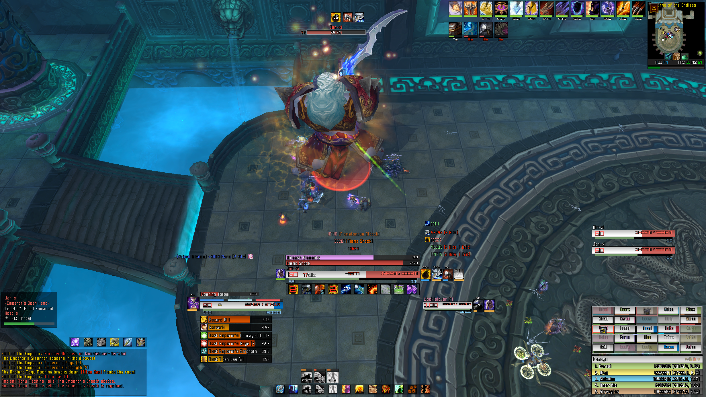
http://i.imgur.com/Jbdzv.jpg
UI was looking like this. Then I decided I wanted to change it toooo.....
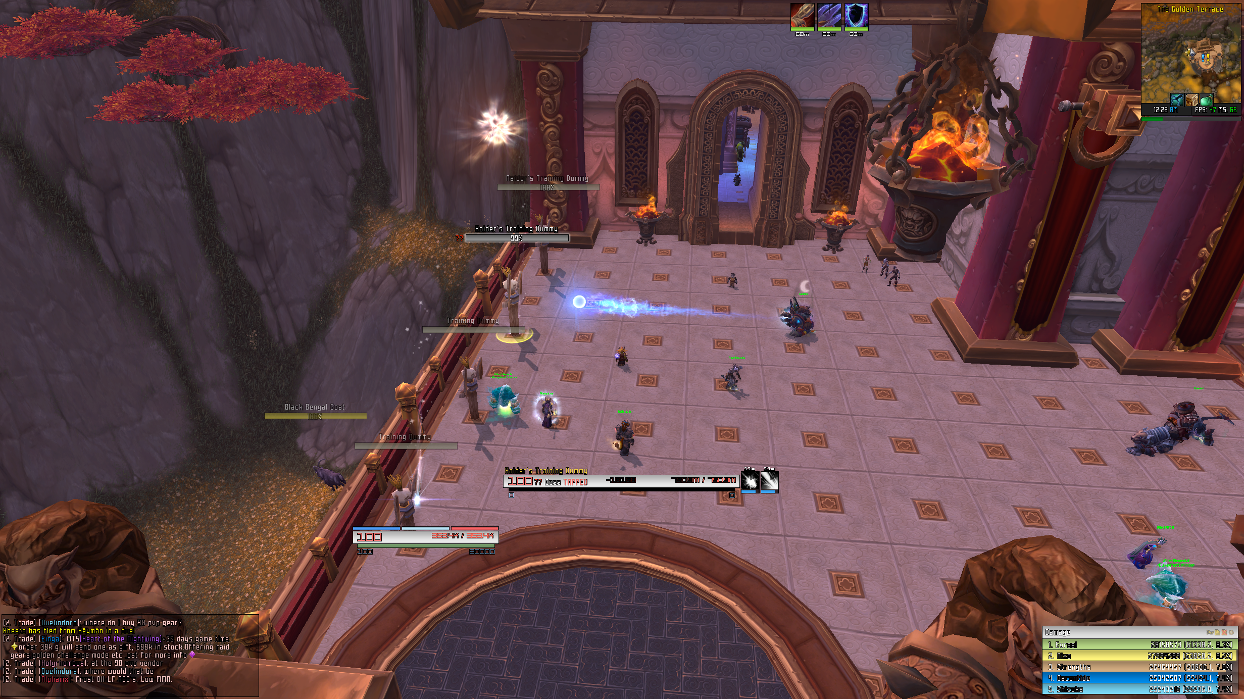
http://i.imgur.com/bFLae.jpg
This.
Although I can't quite decide which one I'll keep ultimately in the end. The placement of things are very different. Other things that aren't seen on the screen. Like cast bars/focus target frame positions/multiple boss frame positions/etc.
I'll probably just switch from time to time. Who knows. I'm very indecisive.
-
2012-12-19, 11:27 PM #9140Blademaster


- Join Date
- Jul 2008
- Posts
- 31
Mostly done but few tweaks to make with regards to the font/positioning and some addon re-skinning.
http://i45.tinypic.com/34gx1r8.jpg


 Reply With Quote