M+ Dreaming Hero Title -- Updated April 16
 M+ Dreaming Hero Title -- Updated 16 April
 May be stop wasting resoures on experiments?
 Rank the Dragonflight Dungeons (beyond knee-jerk reactions)
 MMO-Champion


I've been thinking of doing that as well. Seeing how I don't currently raid anymore, got tired of looking for a heroic guild after mine disbanded. It's hard finding a guild you mesh with, get along with people, etc.Originally Posted by tempest420

It's just so much easier to use elvui though. I'm going to try though. I'm looking into OUF or STUF.
 Recent Blue Posts
 Recent Forum Posts
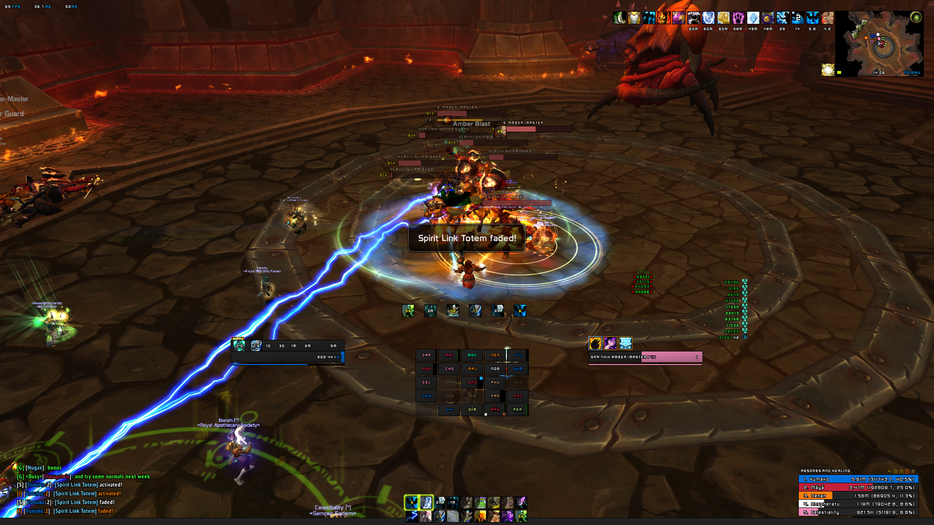
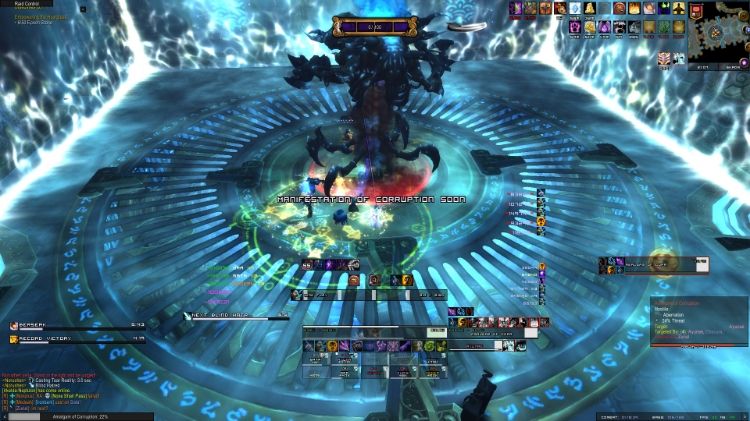
Thread: Post Your UI
-
2014-01-22, 07:31 PM #13501Bloodsail Admiral

- Join Date
- Feb 2012
- Location
- NC
- Posts
- 1,011
-
2014-01-22, 08:01 PM #13502Blademaster

- Join Date
- Jun 2013
- Posts
- 43
Drayarr! You have no idea what that means to me! Thank you so much!
-
2014-01-23, 02:07 PM #13503Epic!
- Join Date
- Oct 2012
- Posts
- 1,559
You're welcome :P Originally Posted by Judgementally
I must say its working well for my little monk alt. Probably make some minor tweaks here and there to make it fit but its pretty damn good. Thanks for the idea
-
2014-01-23, 11:15 PM #13504Blademaster

- Join Date
- Jun 2011
- Location
- Croatia
- Posts
- 40
Might need some tweeks here and there but overall i'm very happy with it.
-
2014-01-24, 03:43 AM #13505Field Marshal
- Join Date
- Oct 2013
- Posts
- 70
The orb shines in black and white when the health downs, like the effect in GW2

Last edited by axlkix; 2014-01-24 at 03:47 AM.
-
2014-01-24, 03:51 AM #13506DeletedRehosted this on imgur for people that want to see full size without clicking 6 times or so: http://i.imgur.com/i6kbb7y.jpg Originally Posted by Sataraism
It's not bad, but you need to fix your fonts. Sizes, outlines, positions, or shadows are not consistent across the entire UI and it drags the quality down a lot.
You should also consider hiding your minimap buttons.
Also, while a matter of preference, since your unitframes are really big I'd consider using a taller font like Semplice if you want to keep with pixelfonts or a condensed sans serif font. I've always found it awkward to have really small fonts on big elements.
-
2014-01-24, 01:59 PM #13507Blademaster
- Join Date
- Jun 2011
- Location
- Croatia
- Posts
- 40
I'm only using two types of fonts, one is for chatt and tooltip because its way more clean that way, and the other for everything else, the same size outlined. Maybe U havent had a closer look=). I prefer small fonts on big frames because I tend to use weak auras for some ablities in it which unfortunately cant be showed on this image. That way the size of font is not covering the aura. Originally Posted by Kyuo
-
2014-01-24, 02:41 PM #13508Dreadlord

- Join Date
- Feb 2010
- Posts
- 782
It's not mainly the font types he's referring to, but the font styles. Take a closer look at these things: Originally Posted by Sataraism
Sans serif fonts:
Chat: Bottom right font shadow, no outline.
Tooltip: No shadow, no outline.
OmniCC: No shadow, thin outline.
Quest watch frame: Bottom right shadow, no outline.
Threat bar: Bottom right shadow, no outline.
Pixel fonts:
Combat text: No shadow, no outline.
Boss mod texts: No shadow, monochrome outline.
Cast bar: Bottom right shadow, monochrome outline.
Unit frames: Top right shadow, monochrome outline.
Healing text on UFs: Bottom right shadow, no outline.
Weak Auras: No shadow, monochrome outline.
Data texts: No shadow, no outline.
Buff bar: Top right shadow, no outline.
Also note that timers made by OmniCC and WA are mixed together although using a different font.
Using different fonts is fine as long as it's not too many types and there's a clear way of dividing them. Sans serif for chat, quest watch frame and tooltips and then pixel for rest is fine but you still have some additional mix with the icon timers and since the threat bar is made with the same design as data texts they should also use the same font. As with font styles I'd use monochrome with no shadow for pixel fonts and thin outline with consistent shadow (shadow on all or none and if using shadow make them all directed the same way) for sans serif fonts.
-
2014-01-24, 04:18 PM #13509Blademaster
- Join Date
- Jun 2011
- Location
- Croatia
- Posts
- 40
Erm, u guys are pushing this far too much. I'm not using omni cc, all u can see there is Elvui with weak auras with ONLY two fonts. I regret posting my ui.
-
2014-01-24, 04:42 PM #13510Blademaster
- Join Date
- Oct 2012
- Posts
- 39
Omni CC is the cool down text on your action bars and some other areas. This is baked into ElvUI. Originally Posted by Sataraism
As for your UI, I like it. Do you? That's all that matters. I wouldn't take the font comments to heart and I believe the suggestions were only made in an effort to improve upon the UI and not bash it.
-
2014-01-24, 04:57 PM #13511DeletedThe only thing I'd suggest is putting a border on your combat text font, since it seems it kinda blends out in the rest of the environment without it, kinda rendering it pointless to have shown if you can't really tell what it says. Originally Posted by Sataraism
Otherwise I really like your UI.
-
2014-01-24, 05:08 PM #13512Blademaster
- Join Date
- Jun 2011
- Location
- Croatia
- Posts
- 40
Oh right, i totaly forgot about that, normaly i would go with normal floating combat text. I gave it a try a few days ago and didnt set to outline. Originally Posted by Joyful
-
2014-01-24, 06:23 PM #13513DeletedWhats that UI Originally Posted by Muncken87
-
2014-01-24, 07:05 PM #13514Deleted
Long time lurker, first time posting.
For the last two expansions I've been using the default UI mostly, and previously used a heavily customised oUF based UI. Started working on a new UI.
Unit Frames WIP
cl.ly/image/3p1e1R43132d (Cannot post links yet).
Inspired by Skullflower's unit frames. They're mostly a work in progress, not finalised what strings I want for the HP/PP/Names yet (I will be hiding my characters name, and possibly HP values on pet/targettarget ). Mainly looking for some more inspiration for positioning and formatting.
Last edited by mmocdcefebf9bb; 2014-01-24 at 07:05 PM. Reason: Typo
-
2014-01-24, 07:42 PM #13515The Patient
- Join Date
- Jul 2009
- Posts
- 321
As a melee or tank I'd highly recommend overlapping either your power or name with your cast bar. It saves a lot of space for an element rarely used. In my UI I actually use a very small (2-3 pixel tall) line that covers up my power bar for my cast bar.
You can see it here: https://dl.dropboxusercontent.com/u/...414_215015.jpg (black bar with blue progress and white for latency on my player frame)
I also went a step further and covered my targets whole frame with a cast bar (bland/grey when non-int, bright color when interruptable) as it draws my immediate attention. That's more a preference for me specifically though.
-
2014-01-24, 10:12 PM #13516High Overlord
- Join Date
- Mar 2010
- Location
- Newcastle, UK
- Posts
- 112
Another Cloud user! Great app. I like the detached power bar. Originally Posted by rippie
-
2014-01-24, 11:28 PM #13517DeletedI kinda liked the detached power bar, it came about with testing the gap between the HP and power, and the detached look kinda stuck! Originally Posted by iuris
-
2014-01-25, 12:24 PM #13518Mechagnome
- Join Date
- Nov 2010
- Posts
- 623

http://i.imgur.com/nOkyNka.jpg

http://i.imgur.com/k1FqVYc.jpg
Edited Elvui, with Clampys WeakAuras customized to my liking. Works great, no issues.
-
2014-01-25, 06:32 PM #13519Deletedtbh, this is just pure genious, and i've tried doing this through elv ui, but some elements always show on top of others, eg the name on target shows infront of cast bar, and my power bar is completely covering my cast bar :< thus: Originally Posted by dementedlogic
any hints?
-
2014-01-25, 07:34 PM #13520High Overlord
- Join Date
- Mar 2010
- Location
- Newcastle, UK
- Posts
- 112
Can you edit or add custom LUA to Elv for text etc? I did the same with Stuf and made it so the targets name is the spell text. Originally Posted by Pwnasaurus Rex

 Reply With Quote