Dark Heart PTR Development Notes
 Dark Heart PTR Development Notes
 The War Within Alpha - Warbands Feature Overview
 MMO-Champion


Might not even be a flaw with the UI since that is just the opinions or needs of one person.Originally Posted by Led ++

Bars vs Icons vs Timers as a very simple example in how the display of durations is very much a personal choice and something which no single UI can cater to really.
That is the reason why both NeedToKnow and TellMeWhen are both popular addons in their own right despite overlapping somewhat in features.
One displays bars while the other displys icons with timers, and therefore will cater to different preferences.
And that is not taking into account the assumptions you make of what someone wants to or needs to know about.
This is one of my biggest arguements against flat-out recommending a premade UI such as a TukUI variant because it was made by a person who is not you.
 Recent Blue Posts
 Recent Forum Posts
Thread: Post Your UI
-
2012-02-26, 02:53 PM #6481The Unstoppable Force


- Join Date
- Apr 2009
- Posts
- 22,348
-
2012-02-26, 03:07 PM #6482DeletedYeah u work best with ur own things, aslong as u can perform 100% using ur ui, u might make its really pretty being very minimal, but u might perform worse just my cent. Originally Posted by ComputerNerd
-
2012-02-26, 03:17 PM #6483Epic!
- Join Date
- Jul 2010
- Location
- United Kingdom
- Posts
- 1,661
I don't think it's down the the role, just the player themselves. Some people can work with the absolute minimum information whilst others need or like to have the information there. Originally Posted by Muncken87
http://i.imgur.com/vUc9O.jpg
http://i.imgur.com/8wzuL.jpg
Two minimal healing UIs that I made and used, the first being less so minimal.
-
2012-02-26, 03:55 PM #6484Deleted
Remake I did of my favorite UI from TBC: Hal's UI
original UI thread @ Hal's old guild: http://www.thepalsforlife.com/punbb/...ic.php?id=2928)
clean:

party:

Last edited by mmocba105e19de; 2012-02-27 at 07:18 AM.
-
2012-02-26, 03:59 PM #6485DeletedI like both of them, im gonna have a try with lfr without any buttons at all, i have a habit of both looking at my buttons and cooldowns so i dont miss anything, since i most of my spells binded, i dont really have a use for my buttons, esp if u have a cooldown addon that hides the spell when its off cooldown, its can be abit annoying when its gone and u have to think what spell was missing now, Originally Posted by carebear
Aslong as the ui works for each person. i was thinking alot about the customisation lately ^^
-
2012-02-26, 04:11 PM #6486The Patient

- Join Date
- Feb 2010
- Posts
- 269
Originally Posted by Muncken87
I've been quite the same, had the habit of looking at my buttons for cd's etc, but now in my latest UI, the bars in the middle is not bound at all, they are simply there to see the cd of my major cd's
I find this is the best way to learn any new keybinds. I don't really need it on my shaman as I know the keybinds in and out, but on any new chars or alts even, I find it to be the best way to force myself to remember my keybinds.Last edited by Speedtrax; 2012-02-26 at 04:11 PM. Reason: fixing grammar...
-
2012-02-26, 04:15 PM #6487Mechagnome


- Join Date
- Jan 2009
- Location
- Portugal
- Posts
- 703
I've been (and still am) a DPS'er, a Tank and a Healer on High End content through all my WoW carreer and I've always used minimalistic UI's.

-
2012-02-26, 04:19 PM #6488DeletedI got 2 bars for my spells, 4 major cds there, but rest is almost utility, and then ontop of my healingframes i got 7-8 cds that i track also, even if i dont look at them always i tend to look at both those and my buttons, incase i miss something. Originally Posted by Speedtrax
I tried a lfr without my bars at all, and just cooldown buttons and it feels abit empty, ofc it take time to get used to it, but if i cant do my best id just rather stick to my default setting.
I think its rather nice having cooldowns that dissapears and buttons that still show, cause at some point u will be stuck with all ur cooldowns used, and u dont want to lose 2-3 sec thinking hmm what spell havent i casted now, just cause u disabled ur buttons, it can be a lifesafer just being able to see it.
Some uis they are showing like 8 buttons of their 8 most used spells, do they really have the other 20+ spells bound , or do they have to hover over a hidden bar to click it, wouldnt be so good imo, losing time there also. This is all personal preference ofc
-
2012-02-26, 07:52 PM #6489Grunt
- Join Date
- Oct 2011
- Posts
- 20
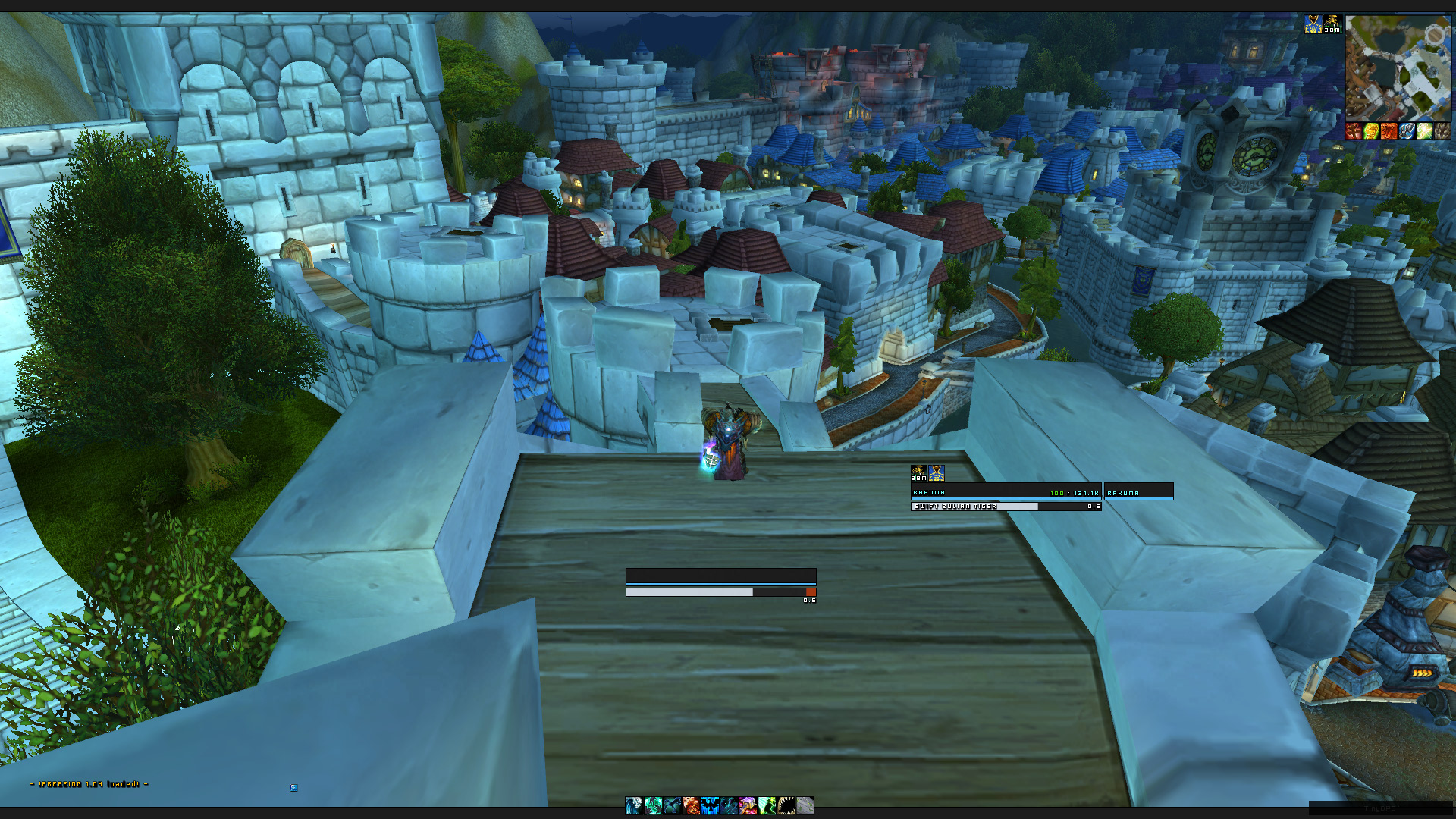
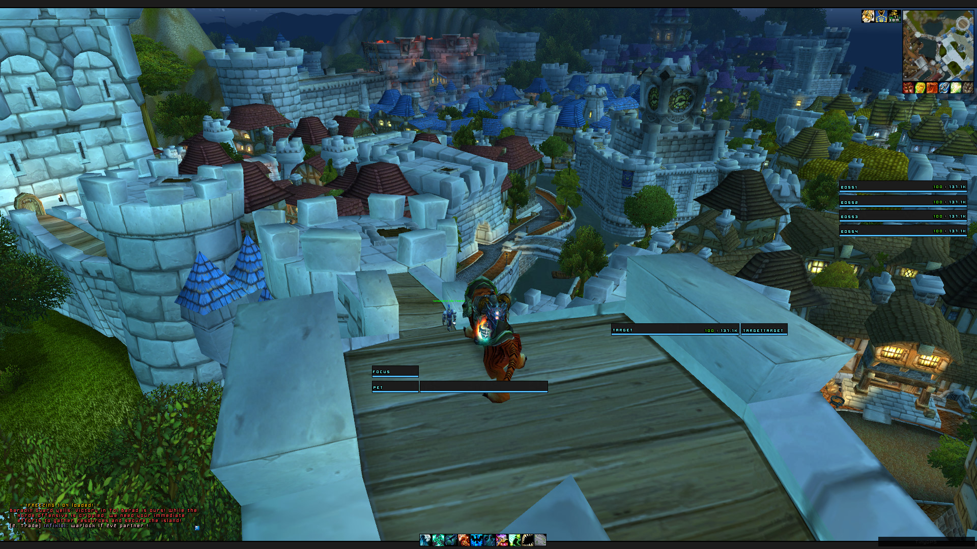
This is my edited version of qulight UI. I try to keep the UI minimalistic, informal but also aesthetic.
Screenshot of my clean setup on my rogue (Idle).

Screenshot of the setup on my DK, showing bar timers over the player frame (Combat).

I still consider it a work in process, so please post ideas and feedback!Last edited by lawomous; 2012-02-26 at 10:38 PM.
-
2012-02-26, 11:16 PM #6490DeletedProbably because less people do hard modes, and out of the people actually doing hardmodes there are probably only a few who really care about minimal UI's. Originally Posted by Muncken87
I mean, I hate around 90% of the UI's people use for normal raiding too. I doubt that when you play hard modes you suddenly need massive amounts of extra information anyway.
-
2012-02-27, 12:10 AM #6491The Patient
- Join Date
- Feb 2010
- Posts
- 269
Okey, decided to make a new profile and completely re-do the design (Led++) style
I finally figured out how to make the borders look good in stuf, just had to put some touches on them with kgpanel :P
However, there is one thing I haven't figured out yet and that is how to trunctate or abbriviate the text so it doesn't overlap the frames.
Idle
Config Mode
-
2012-02-27, 11:29 AM #6492DeletedI dont think u need more information, i think u tend to get more, cant find the word, but u look more often at timers and when things are off cooldown. Originally Posted by Led ++
---------- Post added 2012-02-27 at 12:31 PM ----------
Originally Posted by Speedtrax
I had the same problem with truncate in stuf, just make the width smaller on the text and it should work out, after u do that try target some random ppl with long names, and then short names and see if the text fitsLast edited by mmoc2569500d57; 2012-02-27 at 11:32 AM.
-
2012-02-27, 11:46 AM #6493The Patient
- Join Date
- Feb 2010
- Posts
- 269
Oh yeah, you are right, totally forgot about that, I usually do it with the castbar *bonks self in the noggin', doh!*I had the same problem with truncate in stuf, just make the width smaller on the text and it should work out, after u do that try target some random ppl with long names, and then short names and see if the text fits
-
2012-02-27, 02:20 PM #6494Stood in the Fire
- Join Date
- Sep 2008
- Posts
- 441
Too lazy to post screenshots? Not that I wan't to see one of ElvUi, lord knows everyone sees it enough. Originally Posted by turbe
1. The timers on your buff icons up top can be bumped to the right a couple pixels. Originally Posted by Speedtrax
2. Im not in love with the totembar location
3. Black borders on your upper and lower panels and your minimap are 2px instead of 1px
4. When I used AzCastbar, I used only the bar part and disabled all the texts and then used the castbar texts from stuf to easily match the fontflags as AzCastbar has no fontflag in game for outline monochrome without a shadow. You could change it in the lua ofcourse if you want, but I found my cheat to be easier
<3
Ish
-
2012-02-27, 02:26 PM #6495The Patient
- Join Date
- Feb 2010
- Posts
- 269
1. Updated! Originally Posted by Ishtara
2. Yeah, stupid totem bar just making things awkward, needs to be fixed, probably just have it on mouseover or something :P
3.Right you are, I'll get that fixed.
4. Never thought about that, consider it done!
5. Thanks for the feedback!
6. Also changing the shadowoffset on unitframes text to 0 ^^Last edited by Speedtrax; 2012-02-27 at 02:34 PM.
-
2012-02-27, 02:32 PM #6496Dreadlord
- Join Date
- Dec 2011
- Posts
- 885
That looks real nice, sure would like to use it, have you uploaded a 4.3 version if it anyplace? Originally Posted by drglenn
-
2012-02-27, 02:34 PM #6497DeletedSolution, play a different class Originally Posted by Speedtrax

-
2012-02-27, 03:13 PM #6498Deleted
I got the lua file for azcastbar if u want outlinemonochrome
-
2012-02-27, 05:55 PM #6499Stood in the Fire
- Join Date
- Sep 2008
- Posts
- 441
... Originally Posted by Joyful
...
That's not really a solution. Its a suggestion, and a bad one at that. Shamans are the best! :P
Keeping this on topic, an old screenshot:

I miss my legendary mace bubbles
Anyway! I think I'm going to make a new Ui with 4px wide borders instead of 3px wide borders (like the borders in the ss above) and maybe use some class color paneling for the borders instead of gray.
And use a much simpler layout, perhaps one closer to this:

<3
IshLast edited by Ishtara; 2012-02-27 at 06:38 PM.
-
2012-02-27, 07:32 PM #6500Grunt
- Join Date
- Feb 2012
- Posts
- 14
Still very much so a work in progress but always up for some constructive criticism.
http://i.imgur.com/ATH9p.jpg

 Reply With Quote