Recent Blue Posts
 Feedback: Death Knight Updates
 Feedback: Death Knight Updates
 Season of Discovery - Class Changes Feedback
 Are we approaching a Solo Raid WoW Experience?
 MMO-Champion
Made some minor changes to my UI, added a power frame for my target and changed + minimized my pets health bar, i also changed the look on my NTK timers and the size/position of my castbar.
Idle with target
Combat with NTK and castbar visable
How Bigwigs looks, really hate that there is no borders for it and that you can't anchor/parent any KGpanels to them.

 Recent Forum Posts
Thread: Post Your UI
-
2012-07-28, 03:08 PM #7361Deleted
Last edited by mmocba105e19de; 2012-07-29 at 03:47 PM.
-
2012-07-28, 05:01 PM #7362DeletedMe? It's Chinchilla with KGpanels around.
 Originally Posted by Wapetufo

-
2012-07-28, 05:15 PM #7363Deletedyea ive reduced it all slightly, this the first time ive used ELVUI and this is an alt ;p (trust me to have a lock alt with a clusterfuck set of abilities, im not used to the lock much so i gotta have all things showin for now lol)... always try new UIs on an alt before your main lol, saves a lot of hassle if you dont like it. Originally Posted by Metaphoric
-
2012-07-28, 07:14 PM #7364The Patient

- Join Date
- Apr 2011
- Posts
- 296
Criticism appreciated! Here is my current rework of my old UI. Couple things I'm not happy with... such as the placement of vuhdo, the randomness of my big wigs, and, the thorn that is always in my side, target buffs/debuffs. Help please


Last edited by Adinora; 2012-07-28 at 07:35 PM.
-
2012-07-28, 08:09 PM #7365Deleted
Updated affinitii's ui so it works for Mistweavers on Beta, ive added a few changes and some weak auras for monks, all credit goes out to Affinitii for compiling the UI and all the addon creators.
-Ghost <Immersion>Last edited by mmocba105e19de; 2012-07-29 at 03:48 PM.
-
2012-07-28, 10:05 PM #7366The Patient

- Join Date
- Jul 2012
- Posts
- 293
Damnit! I was happy with my UI until I saw this. Now I need to make adjustments Originally Posted by Rusk

Curse you and your awesome UI!
-
2012-07-28, 10:34 PM #7367DeletedThanks mate Originally Posted by Pixil

-
2012-07-28, 11:23 PM #7368Field Marshal

- Join Date
- Jul 2012
- Location
- Darnassus
- Posts
- 87
-
2012-07-28, 11:35 PM #7369DeletedYour UI leaves me with a few questions: Originally Posted by Wapetufo
- Where are you raid frames placed? Feels like you have no good spot to place raid frames with that UI.
- How do you track enemy debuffs? Or do you feel you don't need to do that?
- Where do you track your cooldowns? By watching the actionbar at the bottom right?
- Don't you think your "box" of information in the middle is a bit too high up, making you unable to see things below your character such as fires, raid members etc.?
- Why do you click on your focus target? Just takes unneccessary space to put it right in the middle for no good reason.
- How do you see shit with those large nameplates?
- Last but not least, where is your damage meter?=)
Last edited by mmoc9f3c8526e6; 2012-07-28 at 11:38 PM.
-
2012-07-28, 11:56 PM #7370The Patient
- Join Date
- Jul 2012
- Posts
- 293
I'd like to add 'Where is your mini-map?' to this list :P Originally Posted by Ariadne
I would assume the answer would be "It's not important". However, finding out where the elemental mob spawns on Hagara for example, would be a pain without a mini-map showing you which way is North :PLast edited by Pixil; 2012-07-29 at 12:10 AM.
-
2012-07-29, 12:42 AM #7371The Patient

- Join Date
- Feb 2011
- Location
- Oslo, Norway
- Posts
- 289
Great, great UI. Seen it on his stream. Do you know where to download it/is it updated? Originally Posted by deusDEX
Also, are there any hidden actionbars in that screenshot? Would like a third actionbar (Guessing this is hidden, and to the right somewhere?)Last edited by mmocba105e19de; 2012-07-29 at 03:48 PM.
AkA Companiet !
#Wildstar2013
-
2012-07-29, 09:20 AM #7372Deletedhttp://lmgtfy.com/?q=affinitii+ui Originally Posted by Companiet
-
2012-07-29, 10:08 AM #7373Deleted Originally Posted by Wapetufo
- Having your raid frames tucked away in a corner will take unnecessary amount of attention to keep track of the raid's health. I've noticed that people having their raid frames like that don't notice when people die instantly.
This is especially true for combat ressers. I am not saying it is impossible to see when someone dies but most people I know that have good awareness in raids don't have their raid frames like that. You will notice that some combat ressers are like ready to ress you before you die because they are constantly keeping tabs on each raid memeber's health and as soon as you die they will cast ress.
- If you don't track debuffs, how do you see Earth and Moon from Boomkins? How do you see which adds are already dotted from other players? How do you track important boss buffs?
- Don't Affliction Warlock track Demon Soul, Shadowflame, trinkets, Bane of Doom?
- Ok.
- Why not use target macros or focus macros? /target focus for example.
- Your screen being large does not take away the fact that your nameplates cover up a larger area than "normal" nameplates, making you unable to see what is behind them.
- I don't know if you do progression raiding but being able to see how you perform after every try is crucial to performing at top level. Also being able to see who did damage to adds, how much they did to them is also very good.
- Having your raid frames tucked away in a corner will take unnecessary amount of attention to keep track of the raid's health. I've noticed that people having their raid frames like that don't notice when people die instantly.
-
2012-07-29, 11:07 AM #7374DeletedFor them to call ress in Ventrilo, it will take you at least 3 seconds to ress them. Maybe for you it is OK but in my opinion it is just horrible. You shove your raid farames near the middle because you are not playing a solo game. Knowing what is happening around you is crucial. Originally Posted by Wapetufo
You enable the ones you need? Where are they placed? The same place as your DoTs? So you are tracking DoTs from all other classes?
What if Shadowflame is used, like on Ultraxion? Where do you track cooldowns like BoD and trinkets?
I am making a point because you have the largest focus frame I've seen covering the middle of your screen for no reason. You don't even need to show focus frame yet you have it in the worst place ever. That is why you use macros instead. It is like having your actionbars right in the middle because you click spells instead of binding them. But maybe you click all your macros?
You wrote a post "showing" people how to make a clean UI and how it should look like. However, having an UI like yours will most likely lead to sub-optimal play. Just because you don't care about not knowing your raid member's status does not make it useless information. You being OK with combat ressing people 5 seconds after they die doesn't make placing your raid frames in a corner good. Just because you are fine with it doesn't make it right and I think it is quite silly that you try to give others advice about how a clean UI should look like.
-
2012-07-29, 12:04 PM #7375DeletedNice to see that you removed most of your first post. You seem to make stuff up as we go along... Originally Posted by Wapetufo
I am using an edited version of Tukui.
-
2012-07-29, 12:31 PM #7376DeletedTukui, cohesioN's edit. Originally Posted by Wapetufo
-
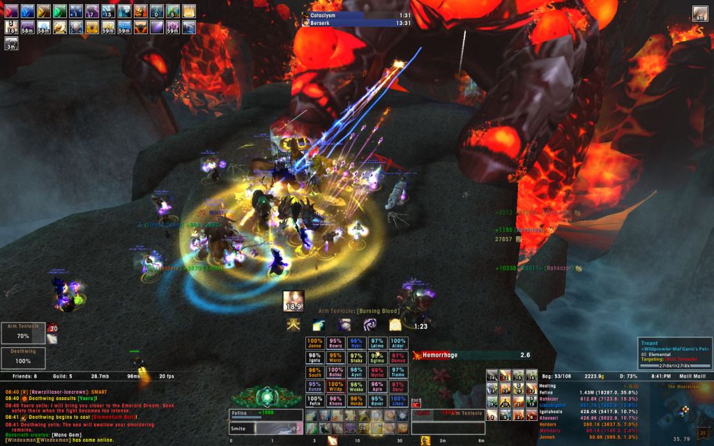
2012-07-29, 02:27 PM #7377Deleted
Here is one with raid frames and targets castbar.

As you can see there's a small pixel error on the right side on the targets castbar, this is a bug and sometimes it's good and sometimes not.
Annoying as hell but there's nothing to be done about it:<Last edited by mmocba105e19de; 2012-07-29 at 03:50 PM.
-
2012-07-29, 07:24 PM #7378The Patient

- Join Date
- Feb 2011
- Location
- New Hampshire, USA
- Posts
- 263
I really like this. Did you make it yourself or is it a premade UI edit?(like TUK, etc.) Originally Posted by Rusk

Add me on LoL: jries
Add me on XBL: jries1
-
2012-07-29, 07:33 PM #7379Field Marshal
- Join Date
- Jul 2012
- Location
- Darnassus
- Posts
- 87
What are you using for your unit frames? Originally Posted by Rusk
Senit UI -- outdated. Update... soon... maybe...
-
2012-07-29, 08:55 PM #7380Deleted
I made the UI myself and the unit frames are STUF.
Made some more minor changes, managed to get the enemy castbar to look better and i changed the targets buffs so the omnicc text dont go in to each other.
A download will be up on wowinterface.com in the near future for the following resolutions -> 1280 x 1024, 1680 x 1050 and 1920 x 1080.

Last edited by mmocba105e19de; 2012-07-30 at 02:42 PM.


 Reply With Quote