Recent Blue Posts
 The War Within Alpha Development Notes
 Professions Update: Concentration in The War Within
 Should money be account-wide?
 MMO-Champion


Work in progress

 Recent Forum Posts
Thread: Post Your UI
-
2013-02-01, 07:01 AM #9901Stood in the Fire


- Join Date
- Apr 2011
- Location
- Finland
- Posts
- 387
-
2013-02-01, 08:14 AM #9902Epic!

- Join Date
- Aug 2009
- Location
- Missouri
- Posts
- 1,745
I kind of just threw up a quick screenshot of my UI a few weeks ago with no real comments or explanations, so I thought I would post a better one and see what you guys think.

I built the unit frames in oUF (Raid Frame is Grid... why reinvent the wheel). The panels are all built in kgpanels and are class colored (the border around the raid frames is white because I was having an issue with it not resizing and had to change it manually but didn't do a /reloadui. It is since solved and it stays class colored). Target frame takes its class color from the target. I am using Dominos for my action bar replacement and my Buffs/Debuffs/Cooldowns is Raven. I am using Skada for threat and dps meters. I like having a lot of information and not searching for it so the text stuff at the bottom is DataBroker modules (using StatBlockCore for the LDB display). Nameplates is a slightly modified Tidyplates:Graphite in headline mode and the font is Neuropol.
I look forward to your comments and if anyone has any questions about what something is, feel free to ask.
-
2013-02-01, 08:52 AM #9903The Patient

- Join Date
- Sep 2012
- Posts
- 345
RECTANGLE ICONS!!!! Originally Posted by wolftech

 at last I'm not the only one doing this, though yours need fixing. They are still "square" left to right and often have gaps between the icons and border.
On the topic of borders. The borders on your Omen/Skada bars all seem to overlap, 1-2 more on the spacing should fix that.
On the topic of your meters. Your Skada is 2px shorter vertically (1 on top and 1 on the bottom) than your Omen, and same goes for the actionbar on the right is the same compared to your Skada.
That's a ton of debuffs being displayed, don't think 40+ is needed, 10 to 20(max) should suffice.
Boss mod bar also is overlapping to the right of those debuffs.
-
2013-02-01, 09:59 AM #9904The Patient
- Join Date
- Sep 2011
- Posts
- 233
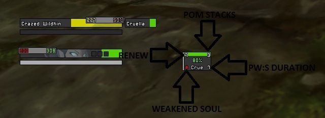
There's no real point tracking Weakened Soul while PW:S is up. Especially if you're not even tracking the duration of it. Originally Posted by Coldkil
That's why a lot of disc configs have those two displays overlapping with Weakened Soul only showing once PW:S is down
-
2013-02-01, 10:51 AM #9905Epic!
- Join Date
- Jul 2010
- Location
- United Kingdom
- Posts
- 1,661
If you want access to some healing classes just PM me, I have every class at 85-90 (monk is 80). I'm on holiday at the moment and can't log into wow. A friend is looking after my account so my auth isn't enabled at the moment. Originally Posted by Coldkil
Wish i could check the UIs, using my phone to browse the forums briefly. Its 32 degrees in the sun here, not bad for February!
-
2013-02-01, 10:56 AM #9906Fluffy Kitten


- Join Date
- Apr 2009
- Posts
- 17,226
Can do it, atm i'm going for simple timers. Merging them would be the next step. Could do pw:S duration if active, else ws duration (in red) Originally Posted by Kaytemoss
---------- Post added 2013-02-01 at 11:57 AM ----------
Thankas for the offer, if i need it i will contact you asap Originally Posted by carebear
 Non ti fidar di me se il cuor ti manca.
-
2013-02-01, 04:23 PM #9907DeletedThis is awesome, i usually hate UI's where both the target and unitframe are in the middle but this actually makes me want ro rebuild my current UI. Originally Posted by Ishtara
A question tho, is it ElvUI? If not, what borders and font are you using? And what addon is tracking holypower?
And do you have any raid screenshot?
Thanks!Last edited by mmocf4ab73a1dd; 2013-02-01 at 04:27 PM.
-
2013-02-01, 07:21 PM #9908Stood in the Fire
- Join Date
- Sep 2008
- Posts
- 441
Glad you like it and feel inspired Originally Posted by Rusk
This is not ElvUi. While I applaud Tuk and Elv's coding abilities, the aesthetic and function design choices of Tuk&Elv Ui were originally made by other designers like myself and Caith and then adopted by very good coders that made the Ui designs more "fool-proof" -for lack of a better term- for the masses. Originally Posted by Rusk
The borders are kgpanel layers. Originally Posted by Rusk
The font I will have to look up when I am at home, but it can certainly be found in my currently available IshtaraMedia.
The addon that I was using in that screenshot for holy power was nibpointdisplay, but sadly it is no longer supported.
A raid screen shot of this Ui does not exist b/c I never finished making the Ui.
Although, once I am done with the current ui I am working on with my monk, I will probably finish that paladin's Ui after.
<3
Ish
-
2013-02-01, 07:50 PM #9909Deleted
Imgur y u make image blurry!?

general tips/suggestions? Still feels a bit clunky.
Also, wtb new/better image uploader than Imgur!

Edit: Stance bar is now mouse-over.Last edited by mmoc37caee976f; 2013-02-01 at 08:04 PM.
-
2013-02-01, 08:01 PM #9910DeletedAh okay, do you think you could upload those borders? I would be forever grateful<3 Originally Posted by Ishtara
-
2013-02-01, 08:15 PM #9911Dreadlord

- Join Date
- Dec 2010
- Posts
- 815
Because it's been resized very slightly. Originally Posted by Xenlol
-
2013-02-01, 08:20 PM #9912Stood in the Fire
- Join Date
- Sep 2008
- Posts
- 441
I don't think I described it accurately enough the first go around. Originally Posted by Rusk
Let's say your unit frame is 160 pixels wide and 20 pixels high.
1st. Make one kgpanel as 162 pixels wide & 22 pixels high. Parent it and place it directly behind the unit frame. Color this panel black. It will give you a 1px black border around your unit frame.
2nd. Do the same exact thing with a second kgpanel, except make this one 164x24 and color it whatever color you want your border to be (gray for example).
3rd. Make the last kgpanel as 166x26 and make this one black again.
Just make sure that you have the correct levels for each panel so that the unitframe is farthest to the front and the third panel is farthest to the back.
-
2013-02-01, 08:51 PM #9913DeletedAh okay, never thought about doing it that way, cheers mate! Originally Posted by Ishtara
-
2013-02-02, 12:40 AM #9914Stood in the Fire

- Join Date
- Oct 2012
- Location
- England
- Posts
- 411

My UI! Click for Larger Image.
-
2013-02-02, 12:49 AM #9915The Patient
- Join Date
- Sep 2012
- Posts
- 345
@Fractalize
Get an addon called Square Minimap Bar/Buttons to helps match your addon buttons below your map to the rest of ElvUI.
http://www.tukui.org/addons/index.php?act=view&id=125
Also the font on your buffs (top right) is too small, thus makes it look funny (seen by the 5 looking like a 9 and the middle line on the "m" is shifted to the right and not in the middle.)
Other than that is standard stock ElvUI.Last edited by bOOURNS; 2013-02-02 at 12:52 AM.
-
2013-02-02, 03:45 AM #9916Stood in the Fire
- Join Date
- Oct 2012
- Location
- England
- Posts
- 411
Well I would of posted a Screenshot of me in Combat with Omen showing, My Weak Auras and other addons but I don't have 1 of this UI in combat. Originally Posted by bOOURNS
And I would hardly call it stock I've changed most settings.
-
2013-02-02, 07:06 AM #9917The Patient
- Join Date
- Sep 2012
- Posts
- 345
Changing a few settings still can mean it's stock. It's like saying because you chose a green Honda Civic instead of a blue one means it's no longer a stock Civic because the one pictured in the brochure is blue. It's all standard "factory" options. Originally Posted by Fractalize
Anyways, I never said it was bad, just IMO boring.
At least you didn't say "Here is my edit of ElvUI"
I've seen that in the past on various forums, it's not an edit when only a few boxes where unchecked and something slightly moved in the toggle anchors option.Last edited by bOOURNS; 2013-02-02 at 07:20 AM.
-
2013-02-02, 09:00 AM #9918Brewmaster

- Join Date
- Sep 2011
- Posts
- 1,267

New idea on damage meter. 0 alpha background/border on the main frame. Each individual person's bar has a border with spacing between each bar.
I'll probably make the bars 1px taller so the text isn't going through the border or making it look thicker than it is with the font outline.
-
2013-02-03, 11:49 PM #9919The Patient

- Join Date
- Jul 2012
- Posts
- 293
Decided to take my badly geared DK to ICC to pay a little visit to Marrowgar(25)
Recorded it so you guys can get a glimpse of what it's like in action.
BEWARE of the music. It's not to everyone's taste.
Let me know what you think!
-
2013-02-04, 12:19 AM #9920High Overlord

- Join Date
- Nov 2009
- Location
- TwitchTV
- Posts
- 150
Looks good! I would personally add a 1px space separating the damage meter and the minimap (maybe make it not as long?) A 1px space between the aura bars and target frame, and the bars/player frame as well. Originally Posted by Pixil

. The Artist also known as Epiphany .


 Reply With Quote