Recent Blue Posts
 The War Within Alpha Development Notes
 Professions Update: Concentration in The War Within
 The Blood Elves discussion thread
 MMO-Champion
Time and effort reallyOriginally Posted by crazypearce


Some experience as well.
 Recent Forum Posts
Thread: Post Your UI
-
2013-05-05, 04:10 PM #10861Deleted
-
2013-05-05, 04:39 PM #10862Deleted+ Creativity Originally Posted by Joyful

-
2013-05-05, 08:11 PM #10863Bloodsail Admiral

- Join Date
- Feb 2012
- Location
- NC
- Posts
- 1,011
Skullflower modified? Originally Posted by Xintic
-
2013-05-05, 08:21 PM #10864The Unstoppable Force

- Join Date
- Apr 2009
- Posts
- 22,348
The problem being most authors have their own approach, their own ideas as to the styling or interface for their addon. Originally Posted by crazypearce
Very few unless by the same author, and often not in that case also will share much in the way of consistency or at least the ability to make them look consistent.
If you can remove much of the distinctiveness from an addon, then something like kgPanels or Masque can offer a consistent border or icon across suitable addons.
-
2013-05-05, 10:27 PM #10865DeletedIt is not. Originally Posted by Bryce
-
2013-05-05, 10:31 PM #10866Bloodsail Admiral
- Join Date
- Feb 2012
- Location
- NC
- Posts
- 1,011
Ah. Looked like it to me =/. Was going to try and recreate it if it was lol.
I need to stop changing my UI every other day it gets annoying re-setting up weakauras, etc to fit with it.
-
2013-05-05, 10:57 PM #10867The Patient
- Join Date
- Dec 2011
- Posts
- 201
Honestly, I think we all follow this thread to see Joyful's latest avatar/sigs and then install RealUI (or other high-quality package). The screenshots are just there to keep the thread alive. Originally Posted by crazypearce
-
2013-05-05, 11:53 PM #10868DeletedHahha Originally Posted by Daagar

-
2013-05-06, 12:01 AM #10869The Patient

- Join Date
- Feb 2010
- Posts
- 269
Still working with this layout, I think it's really starting to get places now, and it's mostly just small stuff I need to sort out (atleast that I can see, maybe you guys have more ideas?)
I've added
- Rep/exp bar
- New Alternate power bar ( not shown in these pictures)
- Teksloot
Thought I'd post screenshot from another point of view than my warrior, so priest it is!
Things I need to sort out:
- Skin icon border for Teksloot
- Add a monochrome outline to dbm bars (ripped from Care's UI <3)
- Anything else, that I don't see? :P
-
2013-05-06, 12:13 AM #10870DeletedNot sure if this have been brought up before, but the damage meter seems very compact, bit too compact =/ Originally Posted by Speedtrax
-
2013-05-06, 12:17 AM #10871The Patient
- Join Date
- Feb 2010
- Posts
- 269
That's a good point, my idea with the dmg meter was that I didn't want it to steal too much attention, so I decided to make it quite small, but I can see how it might be better for the overall look to maybe make it a bit less compact. Originally Posted by Joyful
-
2013-05-06, 12:33 AM #10872Epic!
- Join Date
- Oct 2012
- Posts
- 1,559
Personally I would put the names inside the frames and anchor the powerbars to the bottom Originally Posted by Speedtrax
-
2013-05-06, 04:56 AM #10873Grunt

- Join Date
- Mar 2013
- Posts
- 14
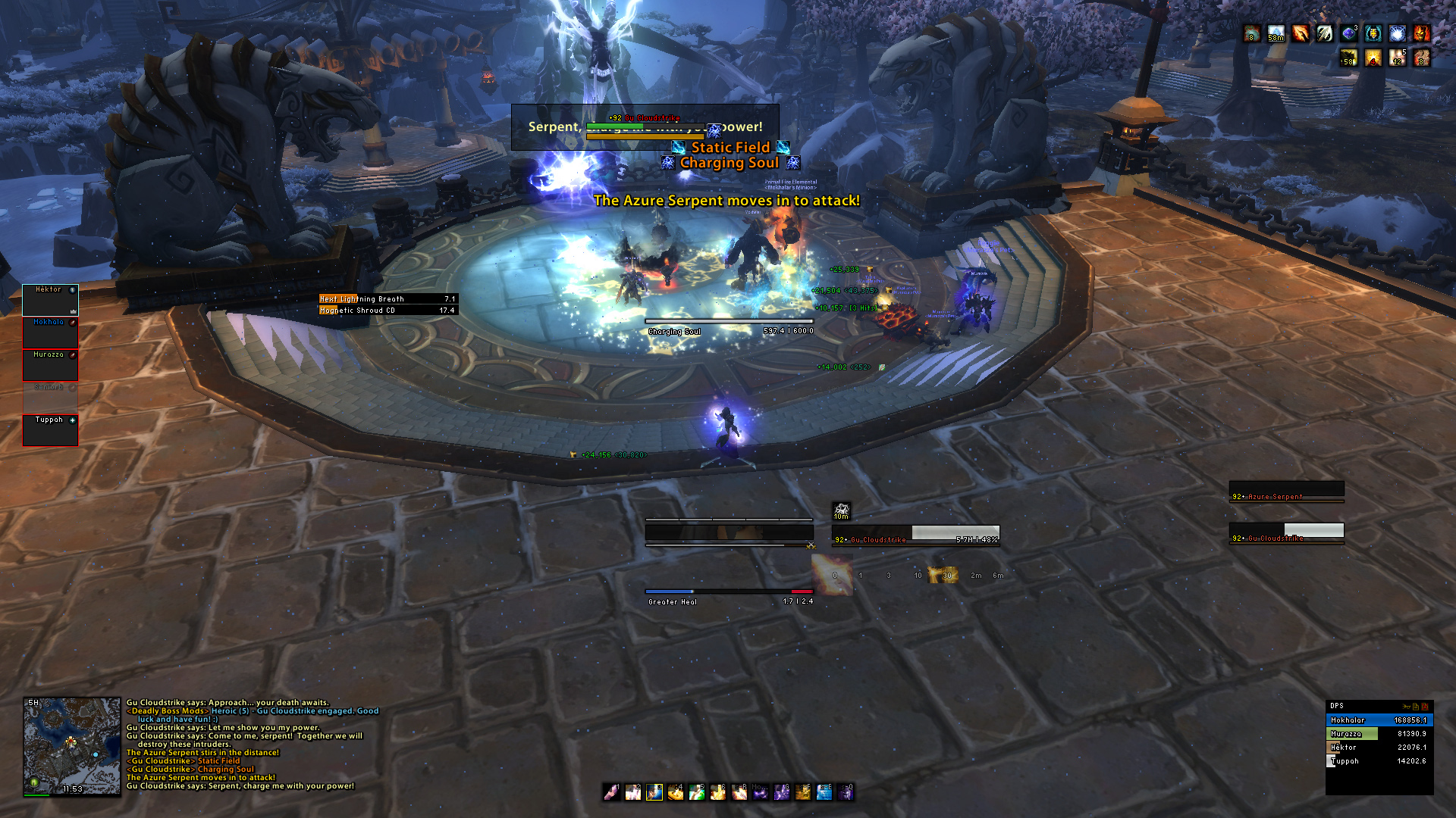
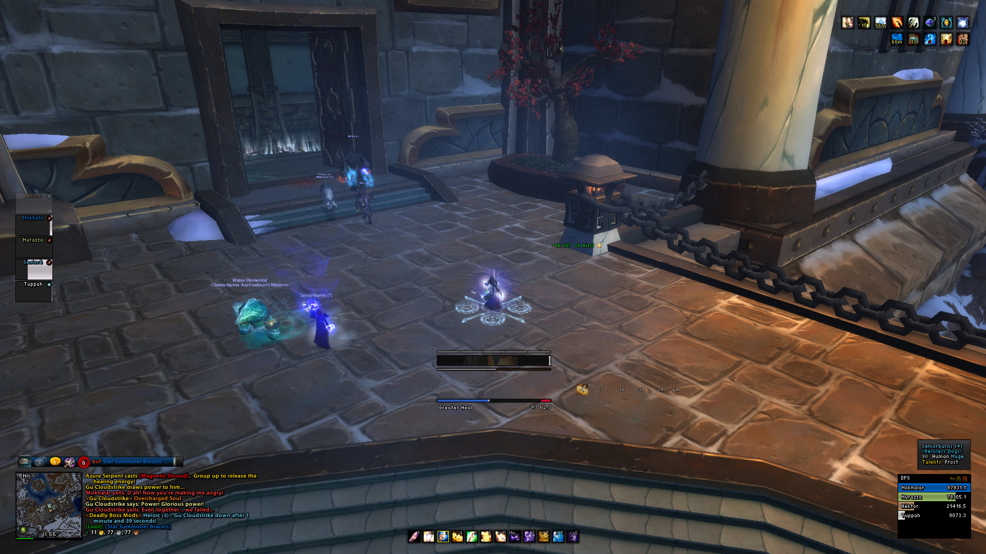
Ok, so I grabbed a few more screenies tonight from the raid. I got my weakaura's figured out and added them. The first SS is an OOC pic from the raid, and the 2nd one is in combat during trash. The only difference b/w trash and a boss is my DBM which shows up right next to my dmg meter in the top left. Big fan of minimalistic UI's, so thats the route I'm going.

http://imageshack.us/a/img197/8125/icraidsetting.jpg
Anyones thoughts or suggestions on what else could be done or changed let me know!
Last edited by mmocba105e19de; 2013-05-06 at 05:48 AM.
-
2013-05-06, 04:57 AM #10874Stood in the Fire

- Join Date
- Sep 2008
- Posts
- 441
thnx Originally Posted by lydude
and yes, kgpanels is what is to blame for all the borders
I cleaned up the nameplates so they match the rest of the Ui, still working on the buffbar color scheme :\

<3
Ish
-
2013-05-06, 08:21 AM #10875DeletedVery nice mate, gj! Originally Posted by Ishtara
Did you do the borders the same way you taught me? 3 x panels with diefferent stratas that is?
If so, out of curiosity i must ask, how many panels are there for the combopoints bar?
-
2013-05-06, 09:11 AM #10876DeletedNo idea how you can see your health and your target's health. The very bottom of the screen and using 2 shades of black for current and missing health? Pretty sure you know your own name too. Originally Posted by cupofcheese

-
2013-05-06, 09:20 AM #10877Grunt

- Join Date
- Apr 2010
- Location
- Poland, Lipno
- Posts
- 21

yt com/watch?v=0CAeOQvEDjw
Inspired on Emery's UI I decided to make something like that.
(I cant post links yet.)
looking forward for some criticism
-
2013-05-06, 09:30 AM #10878DeletedWow, that is very sexy. I'd really dig using those nameplates. Originally Posted by Ishtara
-
2013-05-06, 10:10 AM #10879Dreadlord

- Join Date
- Sep 2009
- Location
- United Kingdom
- Posts
- 931
Does anyone know a good simplistic name plates addon? Tidy plates for me atm is acting really strange, its using like 10mb of addon memory which is very strange because as I recall it only used to use like a 10th of that. Basically aslong as the addon functions like tidy plates, i.e shows my dots, a nice clean name plate bar that also the colour represents different classes (light blue = mage, yellow = rogue etc.)
-
2013-05-06, 10:20 AM #10880Elemental Lord

- Join Date
- Feb 2010
- Location
- Hyrule
- Posts
- 8,864
Damage meter is most important meter Originally Posted by Joyful


 Reply With Quote