Recent Blue Posts
 This Week in WoW: 19 April, 2024
 Feedback: Death Knight Updates
 The War Within Alpha - Warbands Feature Overview
 MMO-Champion


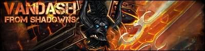
Blurry, and looks LQOriginally Posted by ql1max

 Recent Forum Posts
-
2011-07-26, 04:59 PM #29701Mechagnome


- Join Date
- Nov 2010
- Location
- Maryland
- Posts
- 667

Ending it is all I fucking think about, that's the shit I think about
All alone, bawling 'til my mothafuckin' eyes bleed
-
2011-07-26, 05:06 PM #29702The Patient

- Join Date
- Oct 2010
- Location
- VE
- Posts
- 281
updated w/ a better quality version Originally Posted by CryptFiend
-
2011-07-26, 06:21 PM #29703The Patient

- Join Date
- Jul 2011
- Posts
- 313
Both are amazing. Nice Job! Originally Posted by ql1max
-
2011-07-26, 06:49 PM #29704The Lightbringer

- Join Date
- Jul 2009
- Location
- Ner'zhul
- Posts
- 3,814
Putt-putting through my queue 8D ...


I toootally messed up on this one D: ... I accidentally put "Enzo" at first. Thank Goodness I save the editable file until I get a confirmation back from the requester XD! And thank Goodness for my patient requester!
-
2011-07-26, 06:54 PM #29705Deleted


Two versions of a new wallpaper.
-
2011-07-26, 06:59 PM #29706Mechagnome
- Join Date
- Nov 2010
- Location
- Maryland
- Posts
- 667
Dragon Tag - The left side is boring and empty, try resizing or adding a stock background, Originally Posted by ql1max
Ranger/Archer tag- Doesnt really have a focal and also looks LQ
Ending it is all I fucking think about, that's the shit I think about
All alone, bawling 'til my mothafuckin' eyes bleed
-
2011-07-26, 07:00 PM #29707Field Marshal

- Join Date
- Feb 2011
- Posts
- 93
PMR
-
2011-07-26, 07:14 PM #29708The Patient
- Join Date
- Jul 2011
- Posts
- 313
I couldn't disagree more. Originally Posted by CryptFiend
-
2011-07-26, 07:18 PM #29709The Lightbringer
- Join Date
- Jul 2009
- Location
- Ner'zhul
- Posts
- 3,814
If you're going to disagree I think you need to ... state a reason or something haha. Originally Posted by rainbowflutterpie
Anyway.
The images and effects are well rendered, they really are, but it seems you need to double check your exporting options because the images aren't as clear as they could be. You do have places in the images that look empty, which could be used for text. The text you do have is small, and almost invisible. I think you're afraid of losing any detail in covering up something with larger text or font options. That's normal, but you grow out of it, you just have to plan for the text and adjust for it or it'll be lost and the signature will just look like an image that's been cropped down.
Besides that, I really really like your current signature set, the blues and greens are fantastic!Last edited by Uennie; 2011-07-26 at 07:21 PM.
-
2011-07-26, 07:32 PM #29710Mechagnome
- Join Date
- Nov 2010
- Location
- Maryland
- Posts
- 667
And why is that? Originally Posted by rainbowflutterpie
 When you're making a tag you have to Take the size and flow and quality of the Render/stock in to consideration...
Last edited by CryptFiend; 2011-07-26 at 07:41 PM.
Ending it is all I fucking think about, that's the shit I think about
All alone, bawling 'til my mothafuckin' eyes bleed
-
2011-07-26, 07:47 PM #29711The Patient
- Join Date
- Jul 2011
- Posts
- 313
Because I think he did a really nice job and they don't look low quality to me? I'm not sure why I'm being attacked for appreciating his art.
-
2011-07-26, 07:51 PM #29712Pandaren Monk


- Join Date
- Nov 2007
- Location
- Somewhere
- Posts
- 1,981
May just be me, but it always seems like you're a bit too.. abrasive with your criticism. You have to understand that everyone here starts somewhere, and when you were starting, how would you have liked someone to talk to you? Most certainly not the way you do currently. I get a little disheartened just reading what you say to other people, can't imagine how it must feel to them. Originally Posted by CryptFiend
But, about the sigs that ql1max did, I think what could be done with the Sindragosa one is maybe move the text into that empty space in the top left. I generally prefer to have the text in a relatively clear area, so it's easier to read. Other than that, the effects look really neat on it. Same with the Ashe sig, the effects look really good, but probably more zoomed in would help a bit. The quality looks good on both, just a bit more tinkering and you'd have it perfect.
-
2011-07-26, 07:57 PM #29713Brewmaster

- Join Date
- Feb 2011
- Posts
- 1,434
Hey guys,
can you rate my avatar? It's my first attempt to create an avatar. First real attempt, other that I did were copy-paste-crop.
 c
c
I'd like to receive constructive criticism
Last edited by Radeghost; 2011-07-26 at 07:59 PM.
-
2011-07-26, 07:57 PM #29714Mechagnome
- Join Date
- Nov 2010
- Location
- Maryland
- Posts
- 667
Stop playing the victim roll, NO ONE ATTACKED YOU.. We simply asked why you said you disagreed and to state a reason Originally Posted by rainbowflutterpie
---------- Post added 2011-07-26 at 03:59 PM ----------
Also, I'm a straight to the point kinda person, I don't pussy foot around subjects... And If the way criticizing peoples work really hurts there feelings then I would hate to see how they act when criticized in real life. Originally Posted by Eis
---------- Post added 2011-07-26 at 04:02 PM ----------
When Resizing hold down the Shift Key and drag from the edges Originally Posted by Radeghost
Last edited by CryptFiend; 2011-07-26 at 08:00 PM.
Ending it is all I fucking think about, that's the shit I think about
All alone, bawling 'til my mothafuckin' eyes bleed
-
2011-07-26, 08:04 PM #29715Brewmaster
- Join Date
- Feb 2011
- Posts
- 1,434
@up
I resized LK correctly, with locked aspect ratio.
And that's the same thing :P
-
2011-07-26, 08:05 PM #29716Mechagnome
- Join Date
- Nov 2010
- Location
- Maryland
- Posts
- 667
K just making sure =D Originally Posted by Radeghost
Ending it is all I fucking think about, that's the shit I think about
All alone, bawling 'til my mothafuckin' eyes bleed
-
2011-07-26, 08:07 PM #29717Brewmaster
- Join Date
- Feb 2011
- Posts
- 1,434
Yes, I wanted to do that
 2 LK layers are smudged. Above 2 smudged layers, there's blurred one.
Above blurred one: sharped LK (filter Sharpen, didnt look so good) with "Lighter Color" blending.
---------- Post added 2011-07-26 at 08:10 PM ----------
By the way, how do you export WMV models with transparency (to make a sig/av of that)? I tried to do that, but, except background, my armor was semi-transparent too
Last edited by Radeghost; 2011-07-26 at 08:11 PM.
-
2011-07-26, 08:19 PM #29718Mechagnome
- Join Date
- Nov 2010
- Location
- Maryland
- Posts
- 667
http://img39.imageshack.us/img39/962/wmvbasics.jpg <----- Will show you how to do it Originally Posted by Radeghost
Ending it is all I fucking think about, that's the shit I think about
All alone, bawling 'til my mothafuckin' eyes bleed
-
2011-07-26, 08:21 PM #29719Brewmaster
- Join Date
- Feb 2011
- Posts
- 1,434
Thanks. I've saved it. Originally Posted by CryptFiend
-
2011-07-26, 08:38 PM #29720Field Marshal

- Join Date
- Mar 2011
- Posts
- 87
PM Request