Dark Heart PTR Development Notes
 Dark Heart PTR Development Notes
 The War Within Alpha - Isle of Dorn Main Story Quest Preview
 MMO-Champion
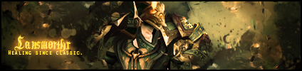
Didn't I make you a signature like a few weeks ago?Originally Posted by Lansworthy
 Recent Blue Posts
 Recent Forum Posts
Thread: Khatsoo's Signature Artwork
-
2010-03-10, 07:28 PM #61Deleted
Re: Khatsoo's Signature Artwork
-
2010-03-10, 07:37 PM #62Bloodsail Admiral


- Join Date
- Jan 2010
- Posts
- 1,233
Re: Khatsoo's Signature Artwork
You did hon. Here it is.. Originally Posted by Caiti
Originally Posted by Caiti

-
2010-03-10, 07:59 PM #63Warchief

- Join Date
- Aug 2009
- Location
- Relocating from Sera to Skyrim.
- Posts
- 2,065
Re: Khatsoo's Signature Artwork
I lost it, thanks safhira for posting it I forgot what page it was on Originally Posted by Caiti
>>This is where I'd put a witty quote for my Signature<<
IF I HAD ONE
-
2010-03-10, 08:02 PM #64Brewmaster

- Join Date
- Feb 2010
- Posts
- 1,476
Re: Khatsoo's Signature Artwork
I'm no graphic artist, so ignore me if I'm talking rubbish, but .. isn't the text the easy part? So maybe leave it out until after the image is resized? Originally Posted by khatsoo
[note: before you go looking at my sig, it's just a screenshot. Nothing fancy at all]
-
2010-03-10, 08:32 PM #65Mechagnome

- Join Date
- Aug 2009
- Location
- The Netherlands
- Posts
- 511
Re: Khatsoo's Signature Artwork
Okay, before actually submitting my request and sending my PM in your queue, I'd like to check if my concept request below would be workable for you. Perhaps I'm having too detailed ideas, or perhaps I should give more info on specific things. If you think some things will likely not work out, I can adjust my idea. Don't treat this as a request yet, I just want to finetune the request before sending it off to your work queue :P
---
Armory link / SS:
Purnissa (Priest)
Purnassia (Druid)
Purninore (Warrior)
Text: "Bloodhoof EU", and character names
Font: Realm name in Palatino Linotype (bold) or similar font.
Background: Partially transparent, partially some natural background (e.g. not something like this. I don't really know what would be cool, but perhaps something like the background on this sig.
Color: No preference, though something which fits the background (e.g. no red grass and no purple mountains)
Shape: Box (100x500 pix) with half transparent, half background.
Pose: Something like this would be nice for my chars, though perhaps a bit less cluttered.
Situation: Multi-character sig.
Additional information:
I made a sketch of my ideas which also shows my epic drawing skills.
References:
The links mentioned above ^^ :P
---
Thanks for your effort so far!
-
2010-03-11, 05:31 PM #66Mechagnome

- Join Date
- Oct 2009
- Location
- Barcelona, Spain
- Posts
- 606
Re: Khatsoo's Signature Artwork
Why ignore you? We can just debate about it. Originally Posted by Aliessil

In my opinion, the text is really important. It's one of the things that transmits most of the information, it has be understandable but not ugly at the same time.
And as a Graphic Designer, typography is one of the most important tools. It can be easier or harder sometimes, but you always have to try and manage well, to take care about it.
Omg what a sh*ty request! Go away beggar! > Originally Posted by Purno

Just joking, that's nearly perfect. I'd do (try) it right now but as you said, I won't treat it as a request, in case you want to make further changes.

-
2010-03-11, 06:00 PM #67Mechagnome
- Join Date
- Aug 2009
- Location
- The Netherlands
- Posts
- 511
Re: Khatsoo's Signature Artwork
Nearly perfect? Well, I guess that'd be above average, so I'll send the PM :P (Thankfully I can quote myself and not having to add links and such again) Originally Posted by khatsoo
EDIT: Request should be sent by PM, but I can't check if it's actually sent. (It's not in Outbox, and I don't have any Sentbox other forums have). Could you tell me if my request hasn't been received by PM?
-
2010-03-13, 06:41 AM #68Keyboard Turner
- Join Date
- Mar 2010
- Posts
- 5
Re: Khatsoo's Signature Artwork
Wow, these sigs are amazing. I have been wanting to get a custom sig made for my toon for a while, but I have zero PS skills. I would really like to have one made up by you, but I noticed under your sig says you are not taking requests till you have gone through your current queue. Would you be able to message me when you open requests back up. I already have my request filled out and saved to send whenever.
-
2010-03-13, 11:46 AM #69High Overlord
- Join Date
- Mar 2010
- Posts
- 127
Re: Khatsoo's Signature Artwork
Thanks for the sweet signature, Khatsoo! I love it.

-
2010-03-18, 11:53 PM #70Keyboard Turner
- Join Date
- Mar 2010
- Posts
- 2
Re: Khatsoo's Signature Artwork
Armory link / SS: http://eu.wowarmory.com/character-sh...ggan&cn=Celtai
Text: Celtai
Font: Creator Campotype
Background: not sure what exatly but would like it to be as like demonic/disease like as you can Smiley
Color:Blueish Black
Shape:
Pose: Undead cast spell or pointing
Situation:
Additional information: love the way the character stands above the background and font.
Cheers x
-
2010-03-20, 09:35 AM #71Grunt
- Join Date
- Jul 2009
- Posts
- 19
Re: Khatsoo's Signature Artwork
can you rate it khatsoo? id rly appreciate it
-
2010-03-20, 12:27 PM #72Mechagnome
- Join Date
- Oct 2009
- Location
- Barcelona, Spain
- Posts
- 606
Re: Khatsoo's Signature Artwork
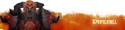
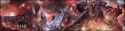
Ok, let's see. There are some points that may be more related to the personal taste of each one, Originally Posted by Defilerll
but I'll say everything I can or that I would change just to help you improve, don't take it in as an offense.
- Background is a bit plane, the texture isn't very rich and you didn't emphasise the shadows either. Find some good pictures to set in the background.
- You have space, use it. The charactar is touching the left edge and the type is set in the far right and in a small size. You could move thing a bit more to the middle and make the type bigger.
- Type is ok, as this font talks by itself, just bigger as I said before and maybe a bit more centered in the height, it's like going too much to the top of the sig, make it important as well.
- The transparency is not bad (it's a bit more difficult with the cloud/splatter thing) but you got too much white areas that would look much worse in another color of background (in another forum, for example). And the small piece of white in the bottom/left edge.. agh, I hate it. It's like if it breaks the base where the sig stands.
- For the character I would seriously recommend to try to get the add-on for Photoshop called Topaz, as it makes them look with much more presence.
- Maybe add some other effects to make the sig more fun and epic, people wants their character to look cool and powerful usually.
- And finally, what I learned during these weeks in here, learn and practice to use sources of light. Use layers in "soft light" or the "burn/dodge" tools to give the character and the surroundings more volume and space, it makes it looks more real and strong.
That's what I'd say if I wanted to give criticism with every point, but if it's your first try, you should be proud of it and keep going, it's not that bad!
I learned a lot in these forums and by making lots of signatures, it's the only way you will really improve, so I hope to see some more of your work around here.
-
2010-03-20, 04:47 PM #73Grunt
- Join Date
- Jul 2009
- Posts
- 19
Re: Khatsoo's Signature Artwork
thanks mate
that means a lot to me and il do the changes you said
-
2010-03-25, 12:09 AM #74Keyboard Turner
- Join Date
- Mar 2010
- Posts
- 5
Re: Khatsoo's Signature Artwork
Quick post to make sure you got my request. It doesn't show up in my outbox that I had sent one.
-
2010-03-25, 01:07 AM #75Stood in the Fire


- Join Date
- Apr 2009
- Location
- Gold Coast, Queensland, Aus.
- Posts
- 428
Re: Khatsoo's Signature Artwork
Khatsoo may take a while to get your sig out because of the massive amount he has to do, but by God it's worth the wait.
Build a man a fire, keep him warm for a day. Set a man on fire, keep him warm for the rest of his life.
-
2010-03-25, 06:31 AM #76Mechagnome
- Join Date
- Aug 2009
- Location
- The Netherlands
- Posts
- 511
Re: Khatsoo's Signature Artwork
I had the same issue once, but khatsoo pointed me out I actually had to check a "Save copy in outbox" box when sending the PM. Kinda confusing of this forum software, but your PM should be sent :P Originally Posted by Desmodian
Agreed. vv Originally Posted by Durenek
-
2010-03-25, 06:02 PM #77Keyboard Turner
- Join Date
- Mar 2010
- Posts
- 5
Re: Khatsoo's Signature Artwork
Yeah, I just wanted to make sure. I didn't want to be waiting without realizing that my request didn't even get sent.
^^ Most def. I'm sure there are quite a few waiting in line. And the results I have seen are quite amazing. Originally Posted by Durenek
-
2010-06-02, 05:55 PM #78Mechagnome

- Join Date
- Jan 2010
- Location
- Blackrock - US
- Posts
- 601
Re: Khatsoo's Signature Artwork
Armory link / SS:
http://img96.imageshack.us/f/hateysigunf.png/
I will upload a picture of just chars without the background when I get home
Text: See SS
Font: Dark and evil for rogue/ fancy and light for priest
Background:
Color: dark rogue side/ light priest side
Shape: see SS, would like same style
Pose: See SS
Situation: both looking at each other with names /background in the middle
Additional information: Thanks! Seems like we have the same style, im just horrible with type and background!
References:
-
2011-05-14, 07:35 PM #79Grunt
- Join Date
- Apr 2011
- Posts
- 14
nice job
)