 Yet another Timewalking loot post ( As directed by GM)
 Opened timewalking Cache before hotfix
 Season 4... Just old dungeons and new ilvl?
 Are we approaching a Solo Raid WoW Experience?
 Void Elf starting pet?
 MMO-Champion
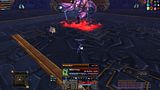
currently, i am using this UI:
<a href="http://s668.photobucket.com/albums/v...4924.jpg"><img src=http://i668.photobucket.com/albums/vv42/nzall/th_WoWScrnShot_042810_204924.jpg ></a>
as you can see, it's very ugly, and i want to rework it a bit. i won't ask to make me an entire UI, but i would still like some suggestions on how i could clear more of the center space.
 Recent Blue Posts
 Recent Forum Posts
-
2010-05-07, 12:51 PM #1Deleted
my UI is too clunky, i can't see half my screen
-
2010-05-07, 12:58 PM #2Stood in the Fire

- Join Date
- Feb 2010
- Posts
- 351

Re: my UI is too clunky, i can't see half my screen
Resize and replace your damage meter to the right bottom, those things to the left can probably be pushed more to the left too, and what's with the bars with cd's above your actionbars?
-
2010-05-07, 01:02 PM #3Deleted
Re: my UI is too clunky, i can't see half my screen
just wanted to add my addonlist: from left to right and from top to bottom:
pallypower
grid
MSBT
Omen
DBM
AVR
forteXorcist
Recount
would it be useful to get bartender so i can rescale my action bars?
-
2010-05-07, 01:03 PM #4Stood in the Fire
- Join Date
- Feb 2010
- Posts
- 351
Re: my UI is too clunky, i can't see half my screen
I myself got domino's to do that for me, but bartender prolly works fine for that too.
-
2010-05-07, 01:09 PM #5The Insane


- Join Date
- Mar 2009
- Posts
- 18,769
Re: my UI is too clunky, i can't see half my screen
./wince
You're obviously running on a pretty big resolution there. Why have all the bars telling you the debuffs on the boss? Are they actually doing anything for you? You could probably turn that completely off, but my primary question is, since you're not running on a tiny resolution, why not just get a fairly clean UI package?
-
2010-05-07, 01:13 PM #6The Patient
- Join Date
- Dec 2008
- Posts
- 268
Re: my UI is too clunky, i can't see half my screen
Try Tidybar for you action bar's. identical to the standard one but half the size and automatically hides the right action bars when not in use - very low impact on memory. This will allow you to place your chat, omen and recount along the bottom of your display.
Also AG_unit frames to give you a tad more control over the you target/raid frames.
Buffalo to move those pesky buffs or simply arrange them better, your debuff counter simply move to one of the sizes or under the mini map, which brings me onto sexymap to allow you to give it a square frame which is just aesthetically more pleasing and allows your debuff counter to go snugly underneath it.
All available from Curse and/or WoW matrix.
<b>Soon</b>: Copyright 2004-2010 Blizzard Entertainment, Inc. All rights reserved. "Soon" does not imply any particular date, time, decade, century, or millennia in the past, present, and certainly not the future. "Soon" shall make no contract or warranty between Blizzard Entertainment and the end user. "Soon" will arrive some day, Blizzard does guarantee that "soon" will be here before the end of time. Maybe. Do not make plans based on "soon" as Blizzard will not be liable for any misuse, use, or even casual glancing at "soon."
-
2010-05-07, 01:20 PM #7Stood in the Fire

- Join Date
- Jan 2010
- Posts
- 445
Re: my UI is too clunky, i can't see half my screen
You can download a threat plugin for Recount. I don't think it's necessary to have both threat and dmg meter at the same time.
Another possibility is to use Skada. It has a threat module and can change between dmg and threat depending on wether you are out of or in combat.
Is ForteExorcist really needed? I personally think that CLCRet is better. Even though it's designed for Ret it also has Prot support, showing you 969 rotation and available cooldowns.
I have a similar UI like you, only with those two changes mentioned above and I don't have the feeling that my UI is too clunky.
-
2010-05-07, 01:21 PM #8Deleted
Re: my UI is too clunky, i can't see half my screen
* close recount in combat
* resize omen, you really don't need to see the 10th person being on 20% threat, max the top 3
* Size Pallypower down big time
* Turn Static / notifications off in MSBT, you don't need them.
* in FX, go into your spelltimer and turn most of those debuffs off (everyone elses Debuffs etc, and multitarget debuffs, only show those that actually matters to you, SoC stacks etc)
* MSBT outgoing, first of, let it go down not up, go to static instead of porky, turn dots off (do you really need to be spammed by stuff like concecration ticks?)
*MSBT ingoing, turn overheals off, maybe hots too, if not the whole package
* Really, don't show your ongoing quest while raiding.. that's just lame.
* "esc" -> Interface -> Buffs -> Consolidate buffs [X]
* chat frame, resize so it fits to the left of your bars (both width & height)
* all your addons, go into config and remove the [X] show on minimap
* Grid, remove background/border, move it to right above your chatframe once you've resized and moved it.
* move your FX cooldown bar to right above your swing timer
* move your spelltimers after they've been redone less clutteris right above your aura bar etc
* redo your DBM timers, the "soon-to-happen" ones closer to the bottom of your screen, that's where your eyes are, maybe make them a bit bigger, move your "long-till-happening" bars to the left side, to the right of were you should move grid
* redo your omen, first off, disable "title bar" next off go to "Bar settings" turn a lot of the stuff on, you really don't need it.
* I'd advice you get a bar addon and arrange your bars so that you have the spam keys on a bar that's a bit bigger than the rest around the middle bottom of your screen so you can always look at 'em. move CDs to another bar that's in a good position for your eyes aswell, maybe beneath the "spam-bar". make a bar or 2 for vanity stuff, and go to "Visibility" and then [X] hide in combat'.
Think that's it for now
-
2010-05-07, 01:25 PM #9Bloodsail Admiral

- Join Date
- Nov 2009
- Posts
- 1,111
Re: my UI is too clunky, i can't see half my screen
Get bartender 4 and get rid of most of the crap from your bottom bars. Remove stuff you dont need, or move them into a corner. DPS meaters are not needed, but if you MUST, then only show top 5. KTM fits nicely next to it. Remove combat text, not needed. Remove quest progress, not needed. And those cooldown bars need to go as well, if u need them, only show your own buffs.
-
2010-05-07, 01:30 PM #10Blademaster
- Join Date
- Apr 2010
- Posts
- 27
Re: my UI is too clunky, i can't see half my screen
One thing that really helps to clean up your UI bar-wise is to use macros that either use modifier keys or unique mouse button clicks to have one button to 3-4 things with 3-4 simple lines in a macro.
One thing i would also suggest is look into how to configuring your add-ons, rather than just allowing them to just be there after you install them. For instance, your omen has just been resized, I am pretty confident your Grid hasn't been touched, you get the point.
Per add-on here is my suggestion.
Grid:
As a tank, I am assuming your major use for grid is to track your raid members, so i propose the following changes, widen the frame and shorten it, then ensure that it will always show their name, and no center icons will show. A more squashed-shaped grid is easier to fit into your UI somewhere.
Omen:
Do you really need to see that many people? As tank all that matter is perhaps at most the top 5 on the aggro table.
Forte:
What are your intentions with this add-on, I sometimes include it in my UI builds, other times I do not. If it is for solely CD tracking, then I would suggest you disable all the extra spell timers, as that is taking up a significant portion of your screen.
DBM:
You can move your timer bars around to make them fit a lot better into your UI.
Recount:
Honestly? Stop using it :P or hide it in combat, your a tank, what do you care? You just sit there and take it from the boss.
Pallypower:
I do not know if you can (i would assume you can though) but hide it in combat. Assuming you need to rebuff mid-way through a fight you have grid to do so, pally power is just meant to help iron out coordination, there is no need for it to be hogging your screen space in-combat.
MSBT
I have not used this specific combat text mod myself, but I do know personally I have my combat text come down in nice neat columns, with a simple, modestly sized font. Really helps with the clutter.
Now overall, what I think you should do is get pallypower and recount out while in-combat, kill the spell-timers, and I think that alone will make a big difference, then i would suggest tweaking grids size and placing it where recount is, flush with your bars. Then I would adjust the omen, placing it right where it is, flush with your bars once again. Move the combat text in the middle top up to the edge of your screen, possibly increasing its size to help off-set it being so distant on your screen. I would then possibly resize your CD bar for Forte, making it larger and more easily legible.
Would also like to suggest Satrina's Buff Frames, to help clean up how much space your buffs take up, and SexyMap to maybe make your map integrate better with your buffs (possibly make it square liek mine :P)
here is a thumbnail of my UI, I do use a few more mods than your (Bartender, Pitbull, Satrina's Buff Frames), but when I log in I am using 9.3MB of memmory for my add-ons, and you can see how customized it is.
 My characters
Triggirfuq - 90 Brewmaster Monk
Taylrswftmnd - 90 Guardian Druid
Triggirhapee - 85 Fire Mage
Triggerhape - 85 Protection Paladin
Triggirhape - 85 Shadow Priest
-
2010-05-07, 08:32 PM #11Field Marshal
- Join Date
- Feb 2010
- Posts
- 78
Re: my UI is too clunky, i can't see half my screen
Triggirhape - what's the unit frames you're using? I like how clean those look!
And for my Crazy Ui! Check out http://www.mmo-champion.com/class-paladin/paladin%27s-post-your-ui!/
I got my inspiration from a UI compilation in there, still tweaking though.
As mentioned, almost all of the info you have can and should be re-sized or minimized during combat.
An action bar mod will help you A LOT, as it'll free up a lot of space near the bottom, so you can move your chat windows, grid, etc etc down. I like to keep a consistent height along the bottom of my screen ie: working from Grid to match my action bar height, chat window height etc.
Turn off your quest tracker, atleast during raids!
Pally power on the far right side if you get rid of those action bars, and stack omen/recount over there ie: keep recount where it is now, and stack omen on top - you really only ever glance at it.
Maybe stick the Forte bars where PP us now? Personally, I like having the area around my character clear and clutter free.
Again, as mentioned, moving your DBM bars down lower is a good idea - perhaps split them to have Soon-to-be on the left/right and the "omg right now" on hte opposite side?
If i finish my UI tonight, I'll post a pic.
Best of luck!
edit: check out Opie - its a great tool, that allows you to creat "key rings" of spells/abilities that you always use, just not in a rotation. IE: i have a ring for all my seals. Easy to swap if req. I have a ring for all my food/pots etc and another for trade skills, Hearth, mounts, etc.
-
2010-05-07, 08:41 PM #12High Overlord
- Join Date
- Aug 2009
- Posts
- 133
Re: my UI is too clunky, i can't see half my screen
I'd reccommend sunnart and sexymap. With sunnart, you get a picture at the bottom that looks really nice, and with dominos/sexymap you can put most of your ui down there. It also resizes your view of the game, so the screen looks less cluttered.
Not sure if anyone said this, but you can turn recount off for bosses, and scale omen down to three people and the threat pull amount. Originally Posted by Moaradin
-
2010-05-07, 09:17 PM #13Deleted
Re: my UI is too clunky, i can't see half my screen
okay, thanks for all the assistance. i'll get on it tomorrow. one more question: is it possible to link addon profiles to specs?
i have Clique with cleanse set to rightclick so i can get an emergency cleanse out (mainly as ret, but sometimes as prot), but currently, i have FoL set to leftclick, but i want left click to be righteous defense while tanking.
i have tried setting them manually between specs, but i often forgot, and taunting a boss is not looked kindly upon.
edit: also, my outgoing dmg is scrolling down, not up it was probably hard to see.
-
2010-05-07, 10:34 PM #14Stood in the Fire
- Join Date
- Sep 2009
- Posts
- 408
Re: my UI is too clunky, i can't see half my screen
One key thing to cut down the amount of room your UI is using is by tossing away the standard actionbars with bartender etc.
This gives you more room on the sides for things like your recount, omen etc. Also, for your forte - uncheck it for everyother class then what you're playing yourselves. If you have it checked for every class you'll get more information then you'll ever need and as you can see yourselves, it takes a hell lot of space.
Here's my UI, it might give you some ideas.

Uploaded with ImageShack.us

Uploaded with ImageShack.us- Trim
-
2010-05-07, 10:40 PM #15Stood in the Fire
- Join Date
- Oct 2009
- Posts
- 436
Re: my UI is too clunky, i can't see half my screen
One thing I suggest is to change that god awful font on MSBT. The standard is so retarded I have no idea how anyone can use it. It alone makes your screen look more cluttered with its random ass nature. Get something sensible in there.
I believe there is an addon you can get to control the "Ability not ready yet" spam too. not sure what tho
-
2010-05-07, 10:47 PM #16Warchief

- Join Date
- Jan 2008
- Posts
- 2,153
Re: my UI is too clunky, i can't see half my screen
LUI v3
Use It. Love It.
It has every addon i've seen on your screen (at least on first glance), just add DBM + AVR/AVRE (and possibly Quartz over reg castbar).
And you're on your way to be EPIC. Originally Posted by Bahumut5
-
2010-05-07, 10:52 PM #17The Patient
- Join Date
- Nov 2008
- Posts
- 345
Re: my UI is too clunky, i can't see half my screen
I am very much loving my new
http://www.spartanui.com/
It is missing some addons but thats where the customization comes in.
(This signature was removed for violation of the Avatar & Signature Guidelines)
-
2010-05-07, 10:55 PM #18Herald of the Titans

- Join Date
- Jul 2007
- Location
- Bloody ol' Germany
- Posts
- 2,957
Re: my UI is too clunky, i can't see half my screen
to do list:
- scale PallyPower down. definitely. And put it somewhere on the sides. not ... "somewhere on the screen"
- scale grid a little bit. make them more wide, but a little more flat. put the mana bar on the bottom, not on the right. put grid somewhere central.
- remove omen from that position. put it right or left of your buttons. show less rows, but make them more wide.
- same for recount. But anyways, you are a tank and with that screen I doubt that you are a raidleader, so why do you need recount? delete it!
(- anyways, skada is better for both omen and recount, and it's only one addon...)
- you are playing a damn paladin. What in god mother's name do you need all those bars for? those who show the debuffs... wth. remove it completely. what you need are bars for your own cooldowns. like your libram uptime. your seal debuff on the mob. vindication for example. your 50% shieldwall when you use it. whatever addon is making those bars currently (it looks like forte excorcist), delete it, you really don't need it. download classtimer and position it how you like it.
- your SCT looks like miks scrolling battle text. use a more clear font, scale everything down.
- bossmods looks like DBM. move those bars around.
- UNTRACK YOUR QUESTS.
- Get two addons:
- Pitbull
- Bartender 4
- take 1hr or something like that and set them up. It a) saves a lot of space on the screen if done correctly and b) shows more information if correclty set up. and it's not really complicated afterall, if you take your time.
a few last words... hey, I gave you some tips how you can clean that MESS up a little bit. But I'm honest with you, for me it really looks like you've downloaded the 25 most popular addons from curse without a) having a clue what they do and what they are for and b) just threw them random on the screen without any idea how your final interface looks like. I gave you some tips how a "standard" UI is set up with what addons you have. I hope, you did not made this mess very deliberately just to see how people react to it... because any person with some brain and a little bit common sense would get a better UI out of all those addons, if he/she woul have taken a couple of minutes.
so far,
xeb
-
2010-05-07, 10:56 PM #19The Patient
- Join Date
- Feb 2010
- Posts
- 279
Re: my UI is too clunky, i can't see half my screen
Simple fix:
Don't be dependent on so many add-ons.
-
2010-05-07, 11:14 PM #20The Patient
- Join Date
- Jan 2010
- Location
- England, West Midlands
- Posts
- 283
Re: my UI is too clunky, i can't see half my screen
Hi there, I used to have many of these problems then i did two things. (PS - to see imgs full screen Rightclick > View image)
1) Build a very Addon heavy UI,

Left to right
Grid, Sexy Map, Bartender, Grid, Santrina's Buff Frames, Recount. I also run DBM. I configured them carefully to maximise space, using this UI for both tanking and DPSing, i noticed an increase in my TPS to 12k sustained and DPS 10-14k because i was so much more aware thus more confident to act in game.
2) I downlooaded TuKUI...and the game changed.

FOR THE AWESOMENESS!? All this is, is TuK ui on a 1440x900 (wide) UI setting, scaled down in video settings with DBM and omen, skinned to perfection. Recount can also be easily skinned like this. I noticed even MORE deepz and teepz increase with this, so give it a go, perhaps it can do the same for u?
Any further questions from anyone feel free and please do contact me Fireslave, Saurfang EU happy to help with UI needs, be it heavy or light settings depending on ur computer ^^Gear Score is a good representation of skill, enchants, and gems...NOH! WAI-....

 Reply With Quote


