 Build of the Month
 Recent Blue Posts
 Yet another Timewalking loot post ( As directed by GM)
 Opened timewalking Cache before hotfix
 Recent Forum Posts
 Embrace Two New Races in Cataclysm Classic
 1.0.7 Known Issues List, Demonic Essences and Treasure Goblins, Friend Invitations Being Looked At, University Relations Q&A, Blue Posts
 Patch 5.2 PTR Official Notes Update Patch 5.2 - PTR Build 16467
 Shaman and Death Knight Tier 15 Armor Sets
The Shaman and Death Knight Tier 15 armor sets were added in tonight's PTR build!


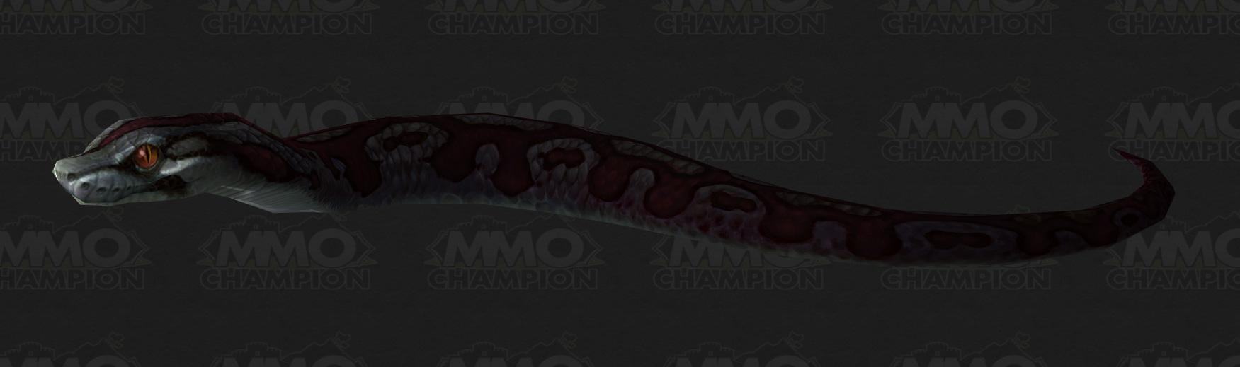
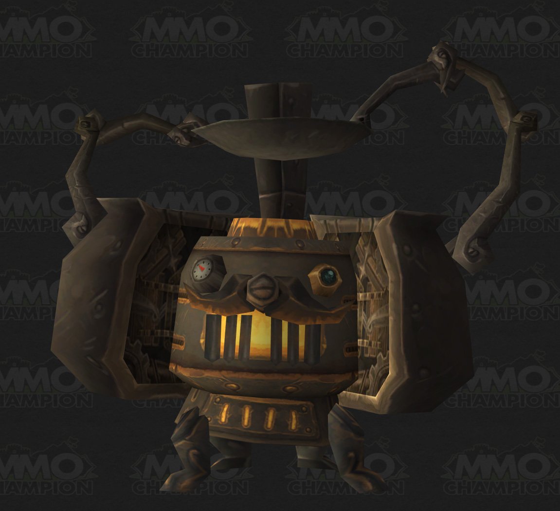
New Pets
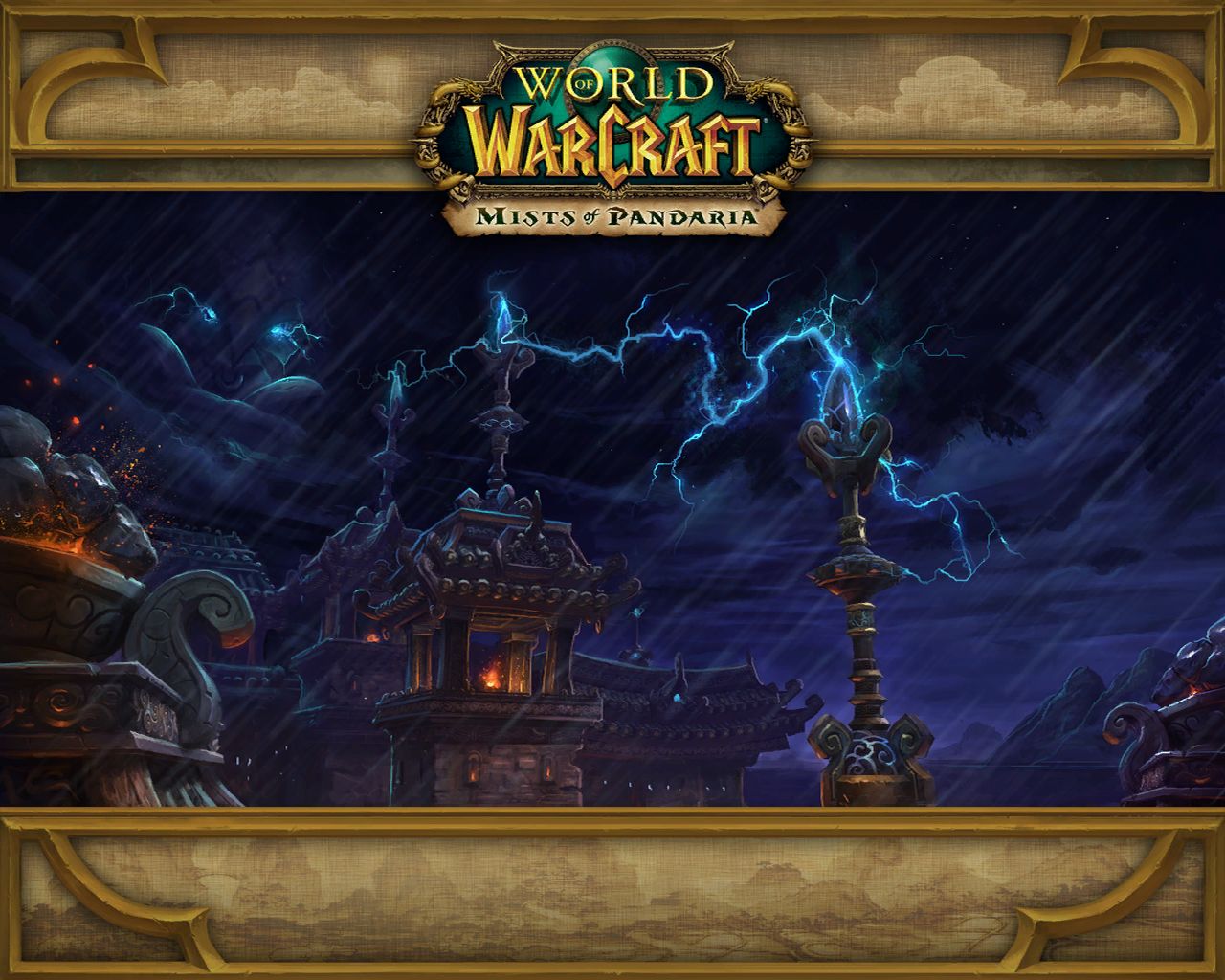
New Loading Screen
Audio Files
New Icons


vBulletin Message