Recent Blue Posts
 Hunter adjustments -- April 23
 Crests in Season 4
 What would you expect the AVERAGE wow player clear in a raid for a season?
 MMO-Champion
lol didn't even notice they were both the same!Originally Posted by Led ++

Yeah I was getting some "Error (403)" for the Dropbox link. But thanks now I can see it and I assume everyone else can from the replies...nice ui btw!
 Recent Forum Posts
Thread: Post Your UI
-
2012-01-28, 10:26 PM #6141Deleted
-
2012-01-29, 12:10 AM #6142Pandaren Monk


- Join Date
- Feb 2011
- Posts
- 1,885
I would lower the alpha of the gray over the portraits so they're slightly more visible, as it stands they may be too subtle. Also might replace the alternate resource with a simple icon of some sort. "Shard Shard Shard" seems a bit awkward. Originally Posted by Coldkil
Originally Posted by unholytestament
Originally Posted by stormcall
-
2012-01-29, 01:39 AM #6143Stood in the Fire

- Join Date
- Sep 2008
- Posts
- 441
fixt :P Originally Posted by kombucha
<3
-
2012-01-29, 01:41 AM #6144The Patient

- Join Date
- Jun 2010
- Location
- Denmark
- Posts
- 215


Holy paladin UiLast edited by lawomous; 2012-01-30 at 12:12 AM.
Arguing with anonymous strangers on the Internet is a sucker's game because they almost always turn out to be—or to be indistinguishable from—self-righteous sixteen-year-olds possessing infinite amounts of free time.
Neal Stephenson, Cryptonomicon
-
2012-01-29, 01:43 AM #6145Deleted
Big SS, and why would you post a healer UI without raid frames showing? :P
-
2012-01-29, 09:05 AM #6146Fluffy Kitten

- Join Date
- Apr 2009
- Posts
- 17,226
Going forward with these suggestion, can you explain better the lining/spacing things? Beware, i'm working on the laptop atm and a1280 reso is absolutely not optimal to work with :P Originally Posted by Ishtara
Non ti fidar di me se il cuor ti manca.
-
2012-01-29, 04:26 PM #6147Stood in the Fire
- Join Date
- Sep 2008
- Posts
- 441
http://img51.imageshack.us/img51/2047/redyx.jpg Originally Posted by Coldkil
-
2012-01-29, 06:57 PM #6148Deleted
Here is my interface:


Last edited by lawomous; 2012-01-30 at 12:13 AM.
-
2012-01-29, 06:59 PM #6149Fluffy Kitten
- Join Date
- Apr 2009
- Posts
- 17,226
Ah ok, i thought it was a bigger problem - yeah i tend to leave the alignement work as the last one, just i want to find a way to make a pixel-perfect script so everytime i change resolution (i play on multiple pcs) i don't have to re-do everything everytime (it's just changing a coupleof numbers, but it's pretty annoying) Originally Posted by Ishtara
Non ti fidar di me se il cuor ti manca.
-
2012-01-29, 07:40 PM #6150Deleted

Something i put together, dont mind the color at the chatframe/skada, my screen is abit strange
Last edited by lawomous; 2012-01-30 at 12:13 AM.
-
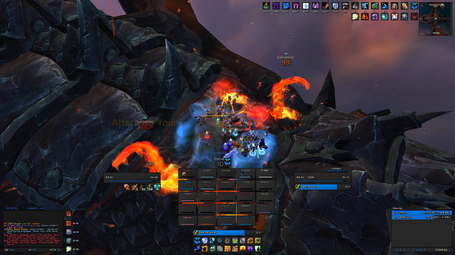
2012-01-29, 11:46 PM #6151DeletedI'd like to see a raid shot in action of this. It's interesting, and I'm interested in seeing your raidframes in action + castbars etc. Originally Posted by Muncken87
Last edited by lawomous; 2012-01-30 at 12:14 AM.
-
2012-01-30, 01:33 AM #6152DeletedGonna see if i can get one later today Originally Posted by Led ++
-
2012-01-30, 11:04 AM #6153Deleteddownloadlink? Originally Posted by Led ++

-
2012-01-30, 01:10 PM #6154Deleted
Nice uis everyone have
-
2012-01-30, 01:10 PM #6155Deleted
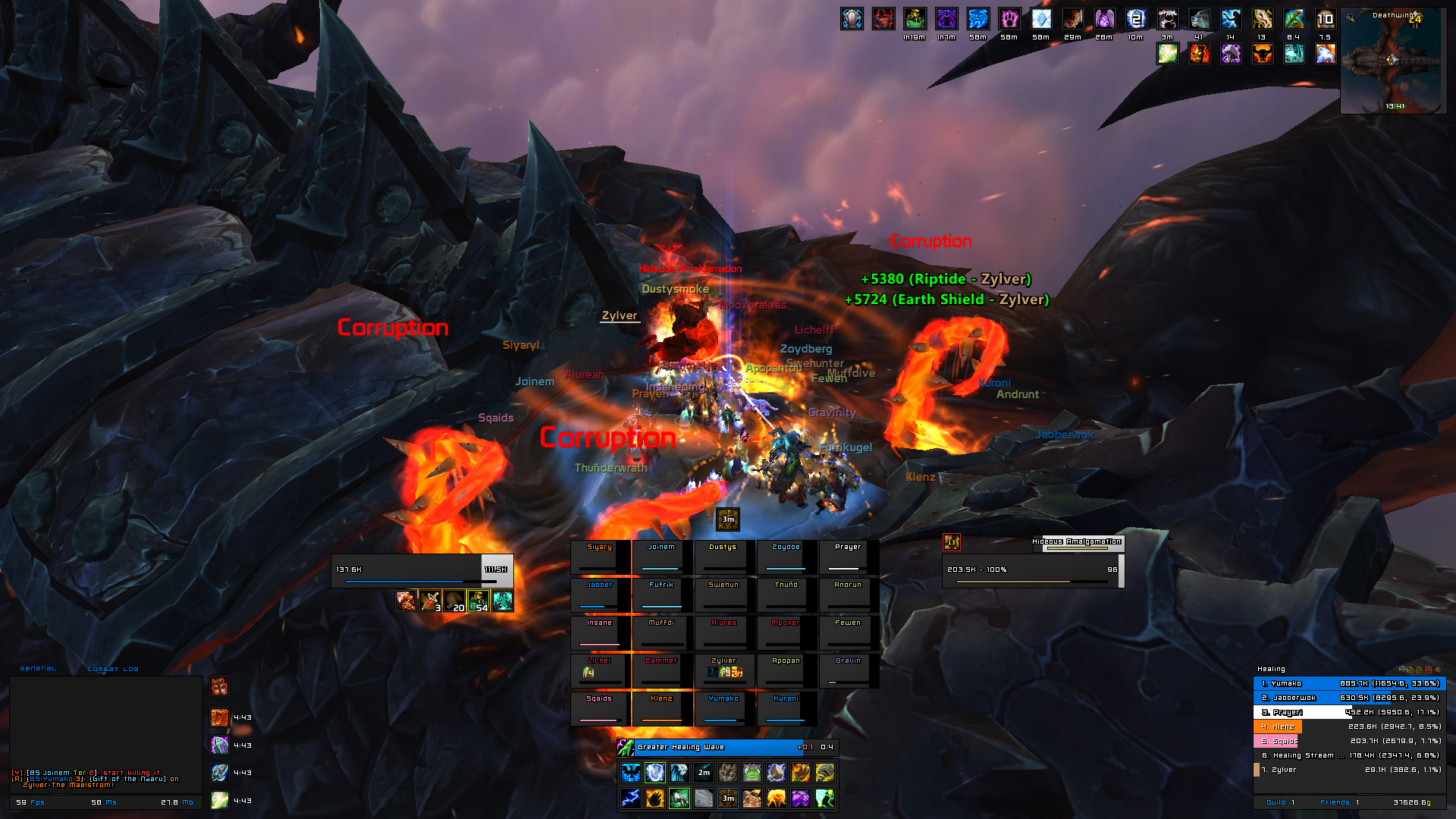
Raidshot, still cant figure out how to change the font on the buff on the raidframes, and stuf doesnt seem to show rage/runic power/etc on the raidframes + to be able to have the 1px around the raidframes i need to have a black background, and if the health goes down, the power bar kinda blends in with the health which can be annoying ...Last edited by mmocba105e19de; 2012-01-30 at 08:38 PM.
-
2012-01-30, 01:15 PM #6156High Overlord
- Join Date
- Aug 2008
- Posts
- 161
my UI:
http://i.imgur.com/DLho5.jpg
Unfortunately, I don't know how to import artwork for kgpanels on a Mac.I posted in the legendary "I found Yogg-Saron" thread and all I got was this lousy signature.
-
2012-01-30, 01:53 PM #6157The Unstoppable Force

- Join Date
- Apr 2009
- Posts
- 22,348
I wouldn't worry about seeing the amount of "power" on non-mana classes really. Originally Posted by Muncken87
While it may "fit" with the rest, you don't need to make decisions on how much of it others have, unlike mana.
-
2012-01-30, 02:06 PM #6158Deleted
Thats true as a healer the mana is mostly the thing i would watch at
-
2012-01-30, 02:22 PM #6159Deleted
This would be mine:

Kinda need to update soon since I made this back in WotLK and some parts isnt like I want them :PLast edited by mmocba105e19de; 2012-01-30 at 08:38 PM.
-
2012-01-30, 05:11 PM #6160DeletedHehe, I stopped playing around a year ago or so. Originally Posted by zecxx
I like it, it's all a bit to big for me, but I like it.Raidshot, still cant figure out how to change the font on the buff on the raidframes, and stuf doesnt seem to show rage/runic power/etc on the raidframes + to be able to have the 1px around the raidframes i need to have a black background, and if the health goes down, the power bar kinda blends in with the health which can be annoying ...
As ComputerNerd said, imo you can just hide the non mana users power. That or you could work with kgPanels and parent them and work with different levels, so your raidframes basically sit on top of a underlying black panel.
That and some minor things, like a relative small chatbox and not having enough seperation between lines.


 Reply With Quote