The release of Shadowlands provided a new opportunity to streamline and redesign the character creation process. Go behind-the-scenes with Senior UI Designer Jeff Liu to learn more about the thought processes behind it.
Greetings, denizens of Azeroth! My name is Jeff Liu, and I’m a Senior UI Designer on the World of Warcraft User Interface Team. I’m here to share some insights into the Character Creation redesign that launched with Shadowlands. With all the great new customization options that have been introduced recently, we thought this was a great time to pull back the curtain and show off a bit more of the behind-the-scenes design choices we’ve made to the user interface (UI).
I previously worked on the Transmogrification System and Auction House redesigns. Revamping old UIs is by far my favorite type of project, so I was incredibly excited to redesign the Character Creation screen.
This was part of the New Player Experience initiative, which included Exile’s Reach, the new player starting zone. Character Creation is the first screen a new player interacts with, so we wanted to modernize it to make a good first impression. The character art team was also in the process of adding lots of new customization options for Shadowlands, so the timing for the UI update was perfect.
The New Layout
For reference, this is what the old Character Creation screen looked like:
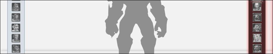
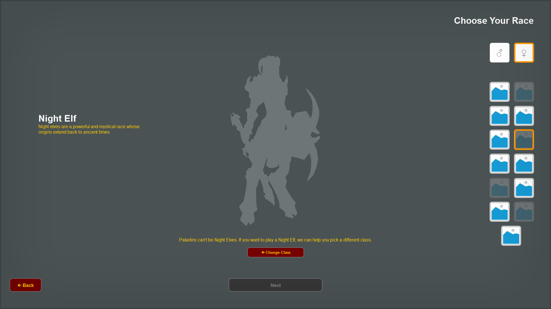
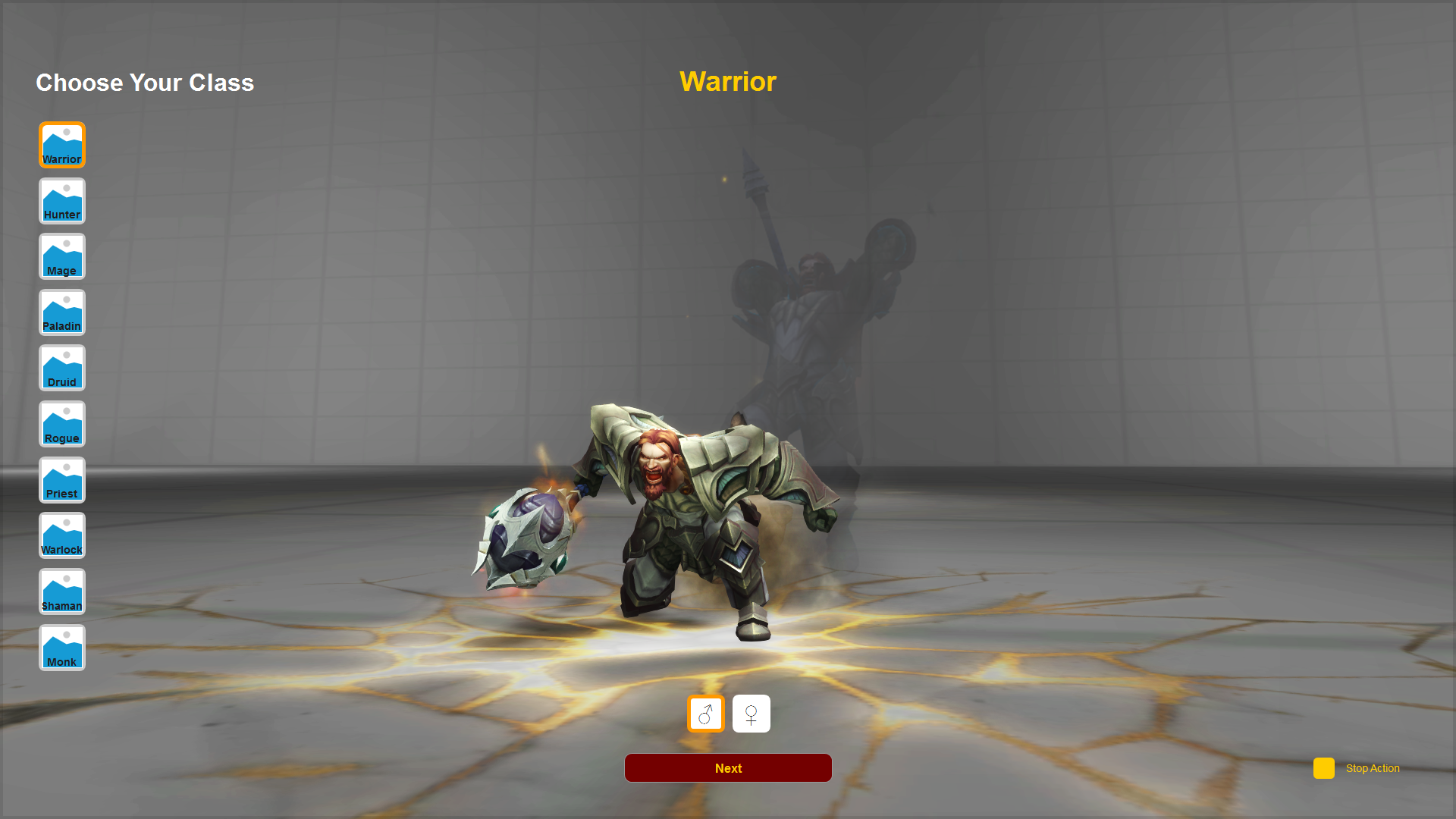
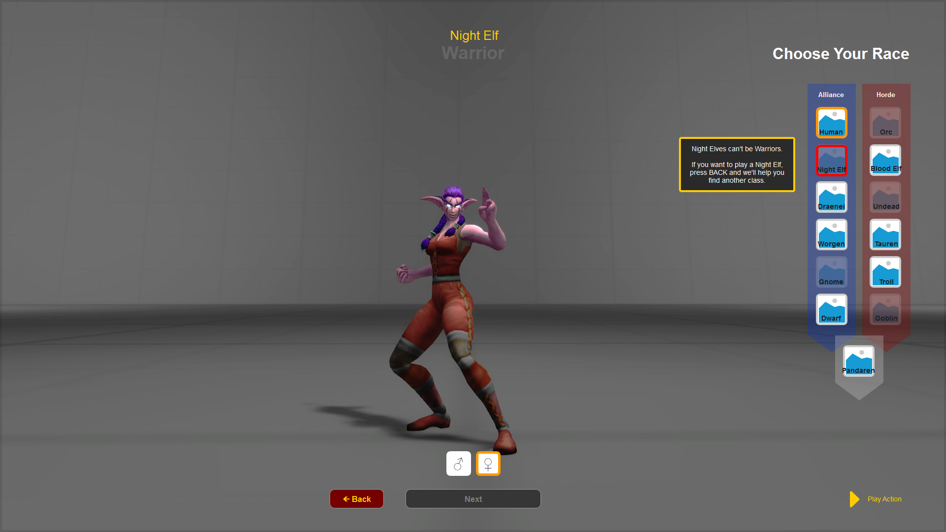
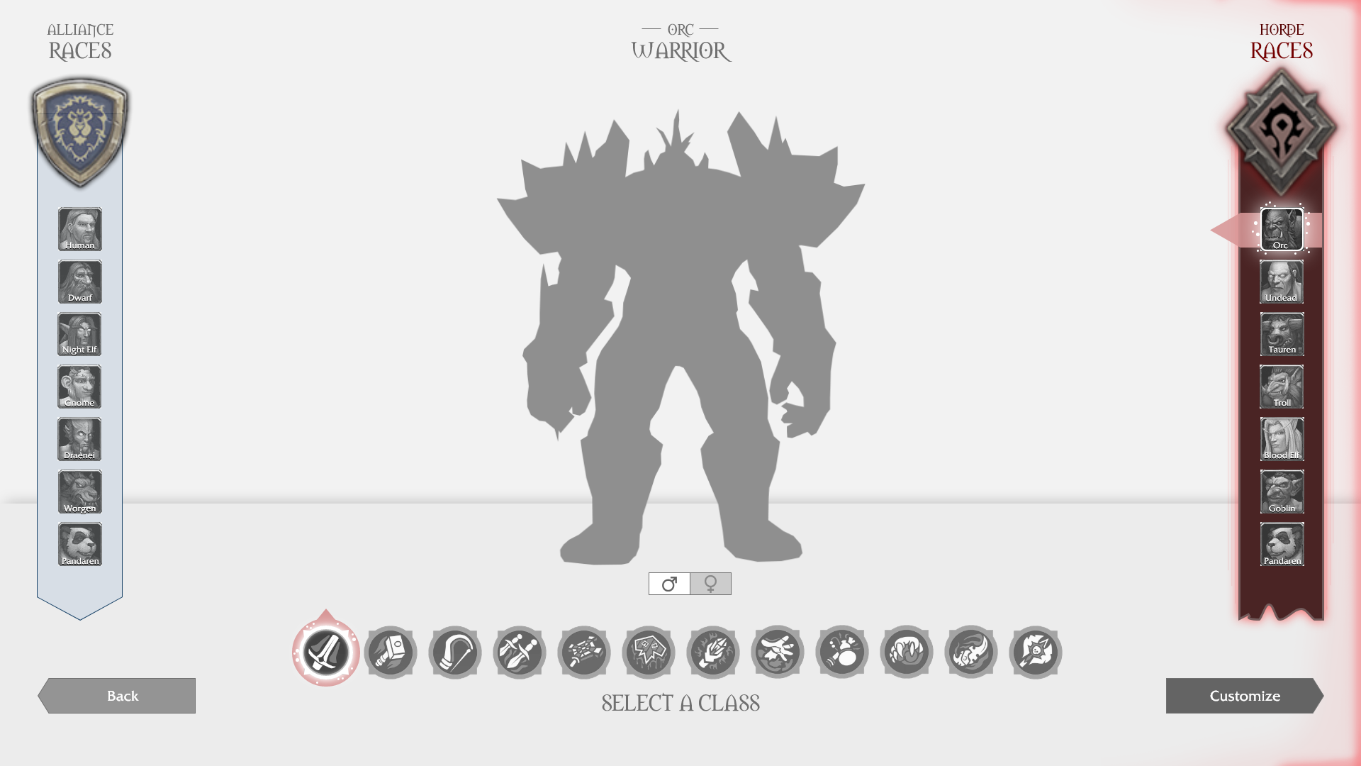
One of the first things we tried was splitting up the class and race selection screens. You would choose your class on the first screen, and your race on the second:
In this example, if you want to play a Night Elf, you’d have to go back to the previous screen, pick a different class, and then keep going back-and-forth between screens to see all your options.
Yeah, it was pretty awkward.
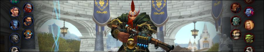
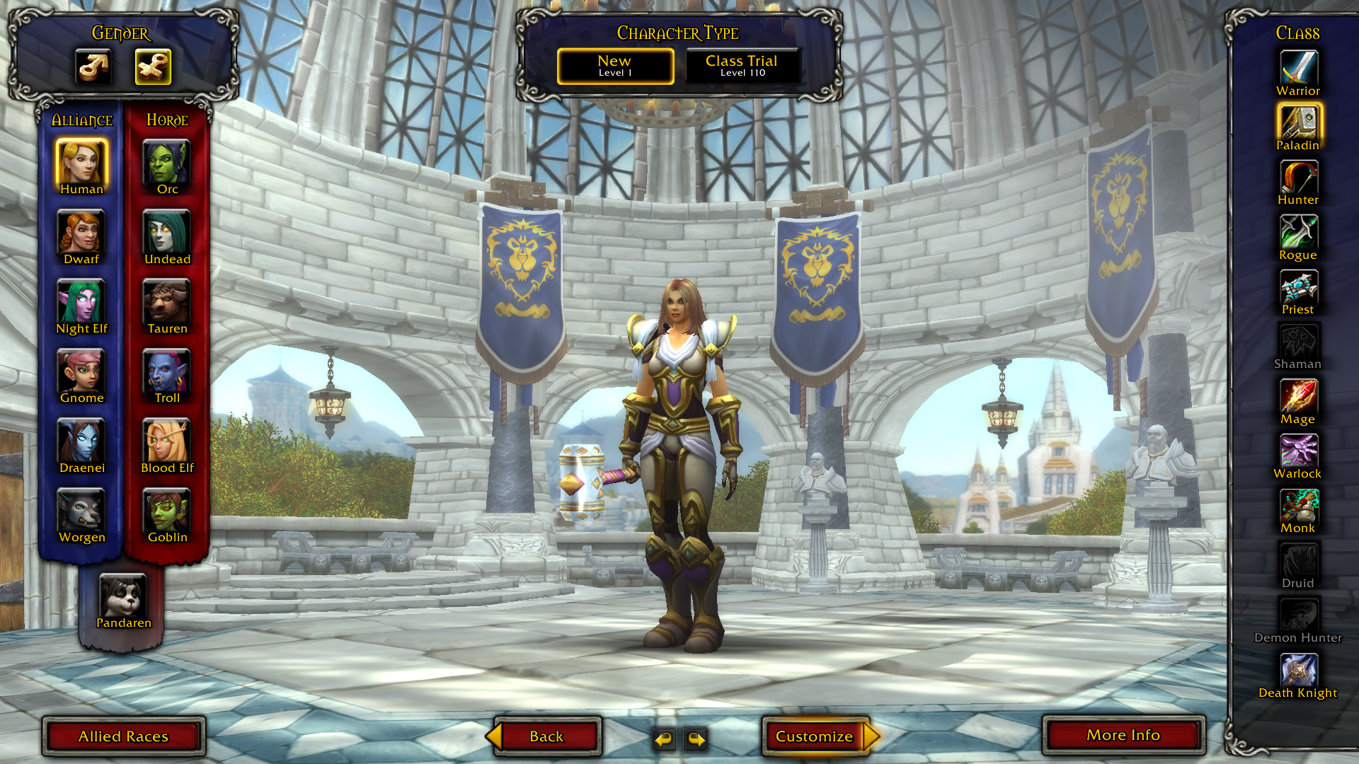
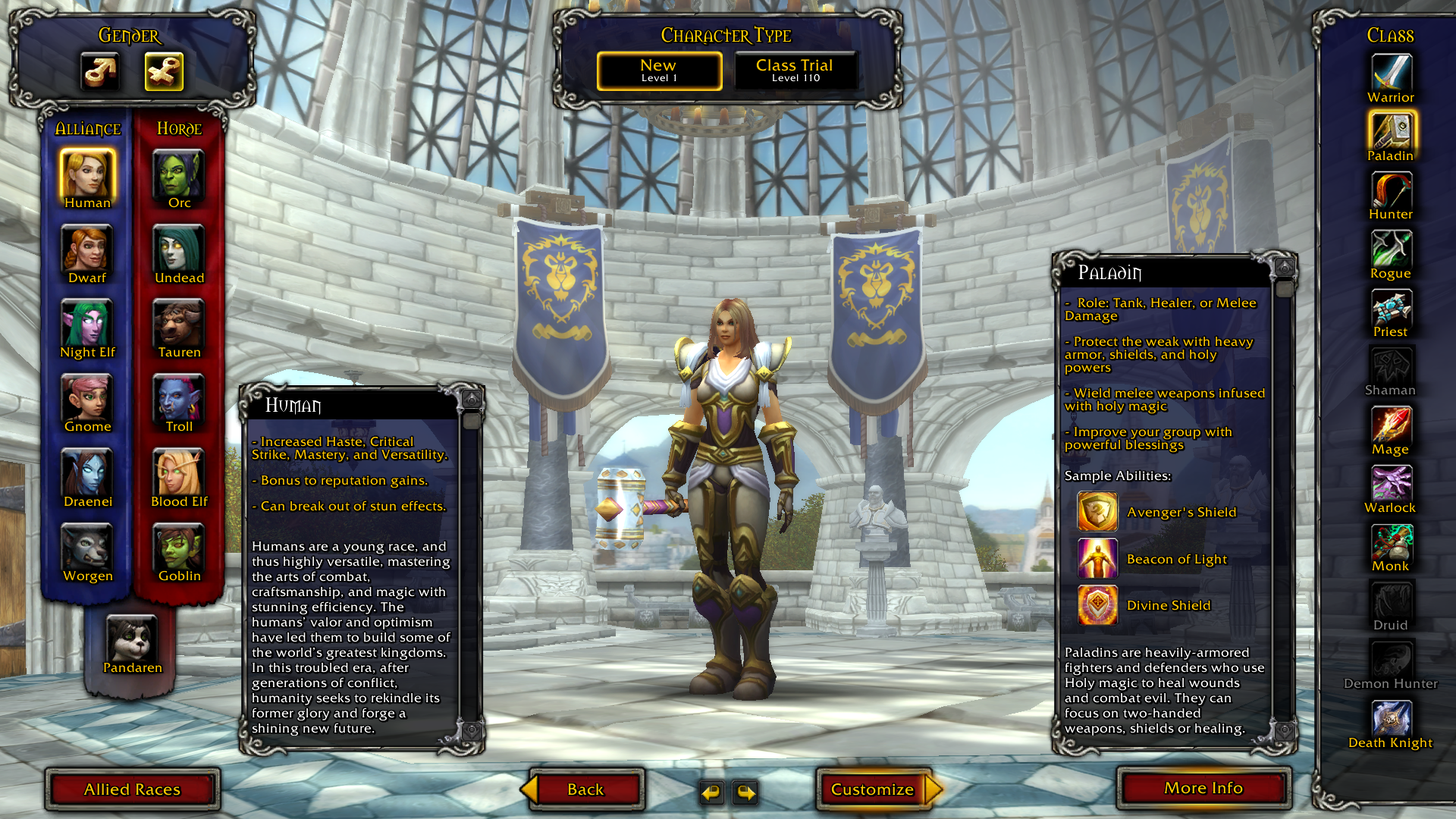
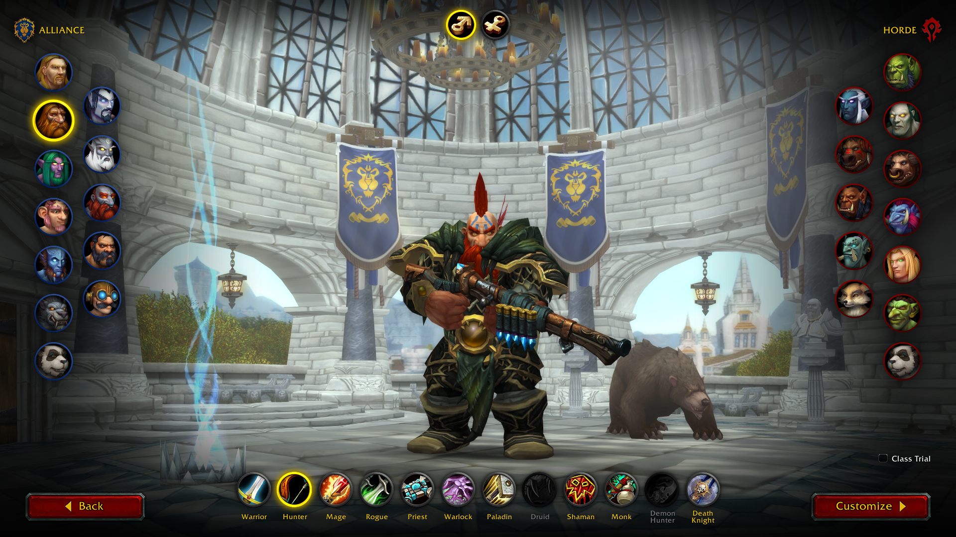
This didn’t work out, so we nearly ended up keeping the old layout and simply updating the art. During a last-minute brainstorm, my fellow UI Designers, Crash Reed and Ray Ocampo pitched a concept where the races were split into opposite sides:
One highlight of this layout is how the face-off between the Horde and Alliance instantly communicates the faction war. We loved the simplicity and freshness of this design, so it was full steam ahead!
Go With Your Gut
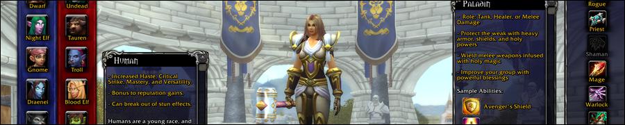
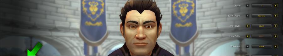
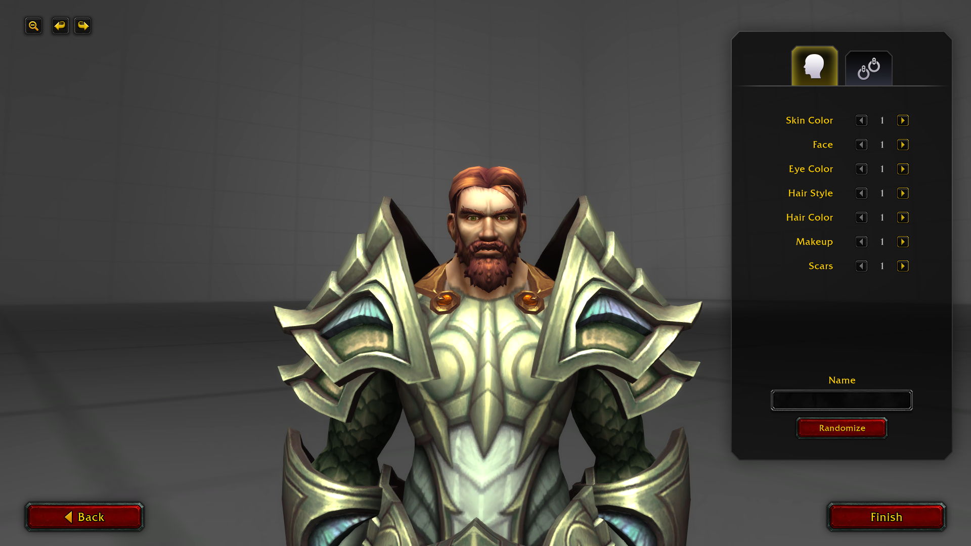
With a new layout in our pocket, I reevaluated the amount of information presented to players on this screen. The old Character Creation screen featured a lot of information in the form of text descriptions:
The harm of presenting too much information (even if it’s useful) is that it can prevent someone from making an otherwise simple choice.
We designed the new Character Creation screen to help new players avoid what’s known as analysis paralysis. We cut down a lot of text and relied on visuals and sound to explain the races and classes. We’d rather show you a mage casting a fireball than describe it to you.
Most new players will already be familiar with these fantasy archetypes through pop culture. It’s commonly understood that a warrior wields a sword, wears relatively heavy armor, and fights in melee range.
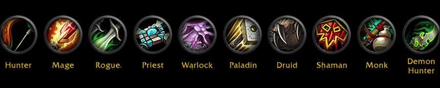
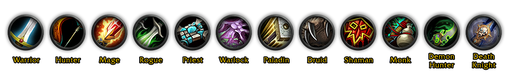
We sorted the classes in an order that would help new players quickly identify a class they’d understand:
The first three are the strongest, most understood archetypes. The next three are slightly less strong. For example, someone who’s never played a video game might not know what a Priest does. After that are the hybrid classes, which are more complex.
It’s important to note that this design choice wasn’t about how hard each class is to play, but rather how easy it is to understand the concepts behind what the class is and what they do without the need for additional explanation.
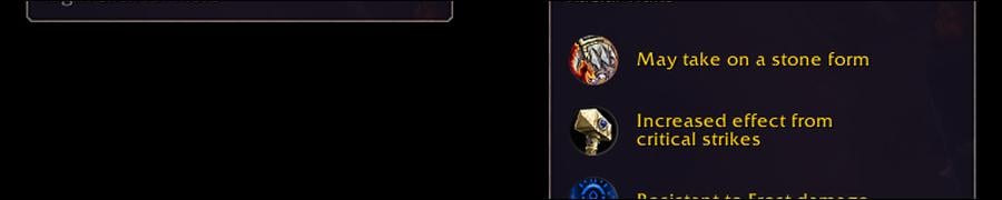
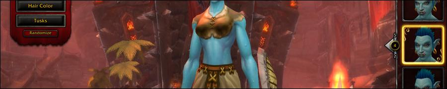
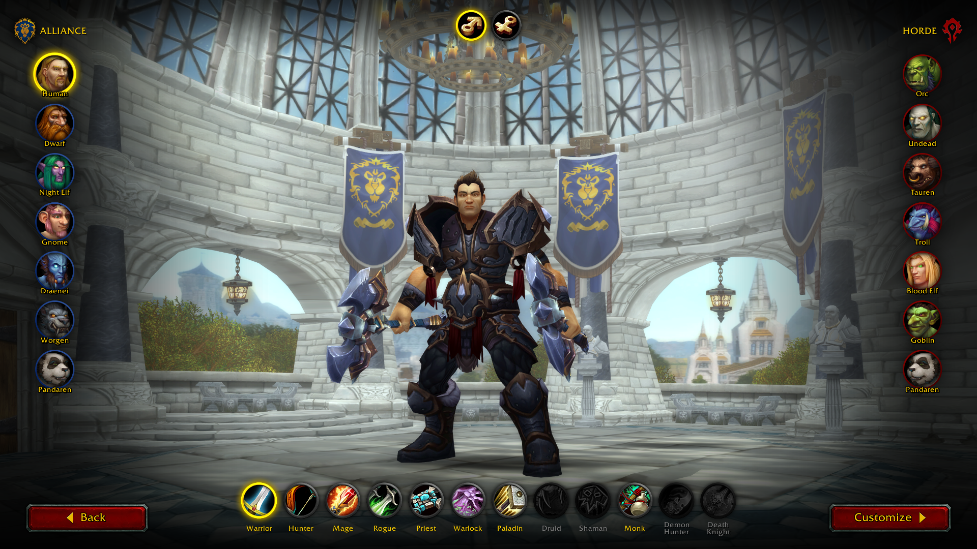
Races are largely an aesthetic choice. We didn’t want new players to worry about racial abilities, so we hid them by default:
For us, it’s ok that a new player doesn’t create their “forever character” on the first go. They’ll learn much more about the races and classes by playing the game than we could ever explain on the Character Creation screen.
All we want new players to do is pick the coolest looking race, pick a favorite class archetype, and go!
Show, Don’t Tell
Now that we removed all that text, we set out to create new animations that could really sell the class fantasy.
We began by exploring how elaborate the animations should be. We were especially mindful about the duration, as we didn’t want it to drag on for too long.
Here were the first mockups created by Lead Animator Ian Lang:
<iframe width="900" height="506" src="https://www.youtube.com/embed/HZD6uZ9bgUM" title="YouTube video player" frameborder="0" allow="accelerometer; autoplay; clipboard-write; encrypted-media; gyroscope; picture-in-picture" allowfullscreen></iframe>
Side note: the last clip shows an early concept we tried of a large, cloth background and your character standing on a pedestal. Here’s another mockup of that:
After we decided on a direction, the animation team created a sequence for each class, working with the FX team to select the right special effects to accompany the shown abilities. When that was completed, a sound designer hooked up sounds to all the animations.
<iframe width="900" height="506" src="https://www.youtube.com/embed/zaTrhmltR2Y" title="YouTube video player" frameborder="0" allow="accelerometer; autoplay; clipboard-write; encrypted-media; gyroscope; picture-in-picture" allowfullscreen></iframe>
I think you’ll agree that the animation, FX, and sound teams did an amazing job making these classes feel heroic. The animations turned out to be one of the biggest highlights of the new Character Creation screen.
Stay Focused
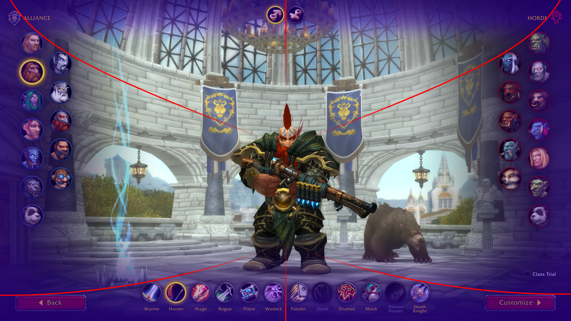
One of our major goals was to have your attention focused on the character model in the middle of the screen. We wanted it to feel like you were designing a superhero. This philosophy guided us on many of the decisions we made in designing this screen.
Instead of the traditional WoW UI art style, we went with a more minimalist aesthetic. We removed elaborate art pieces on the sides, like the old faction banners, as they were too visually distracting and took focus away from your character.
We placed a large shadow on the edge of the screen to give the character a spotlight effect, effectively creating a vignette.
We also positioned the UI elements to draw your eyes toward where we want you to look.
Finally, we blur the background when the camera zooms in during customization mode. This makes the character pop and helps you focus on your character’s features.
<iframe width="900" height="506" src="https://www.youtube.com/embed/1HfvhcbkGC0" title="YouTube video player" frameborder="0" allow="accelerometer; autoplay; clipboard-write; encrypted-media; gyroscope; picture-in-picture" allowfullscreen></iframe>
New Players
New players see a different version of Character Creation than veteran players do. I wanted to curate a simpler, cleaner experience for them.
For example, only the core races are shown, and their names are labeled under the portraits.
Then there are some subtler differences.
The first character you’ll see as a veteran player is an entirely random race/class combo. For new players, the first character they see will always be a Human or Orc Warrior (of a random gender). This goes back to the idea of easing new players into the game by showing them something more relatable.
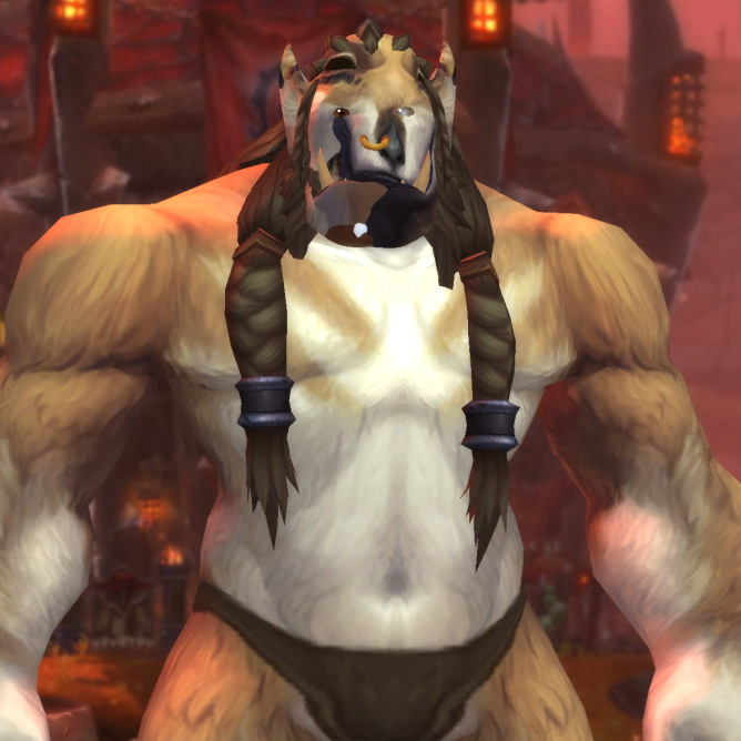
Characters are also randomized a bit differently for new players. Since this might be their first introduction to the Warcraft universe, I felt it was crucial for each race to read well visually. For this reason, we disabled options that obscure the face – such as tattoos, war paint, and headdresses – when the character is randomly generated.
But don’t worry, once the player goes into customization mode, they’re free to choose those options.
Lastly, new players see a tip on the customization screen:
One takeaway we got from user testing was that some new players had anxiety around finalizing their character. It makes sense, right? If you assume this is your last chance to customize your character, you’re going to take your time to make sure it’s perfect. This tip lets them proceed with confidence and get into the game faster.
Character Customization
Speaking of Character Customization, let’s look at some of the early mockups for that screen. You can see how the design evolved from the old layout:
At one point, I experimented with a more free-form layout where the options weren’t contained inside a box:
We disliked how cluttered this looked but liked the openness of it, so I combined it with some of the earlier ideas where we grouped the options into categories:
Now we’re getting close to the final layout!
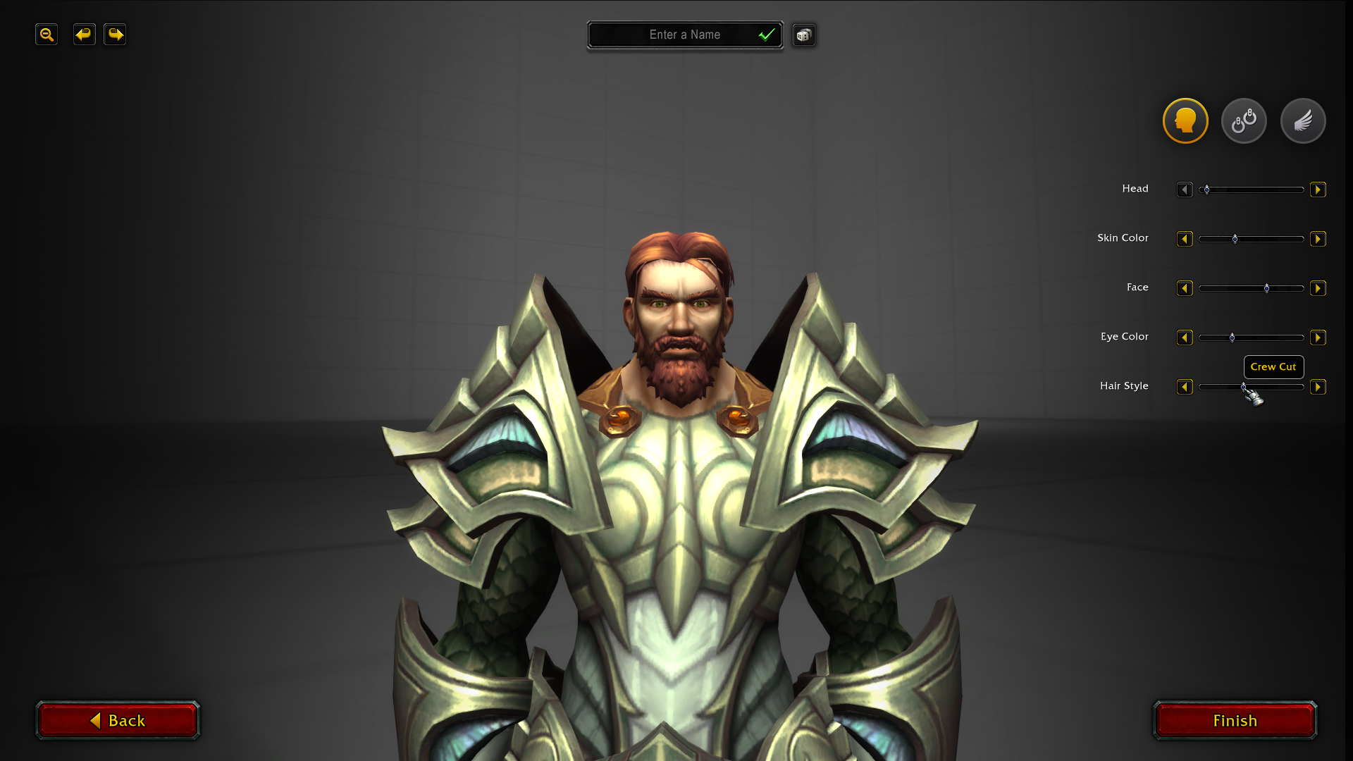
The Option Selector
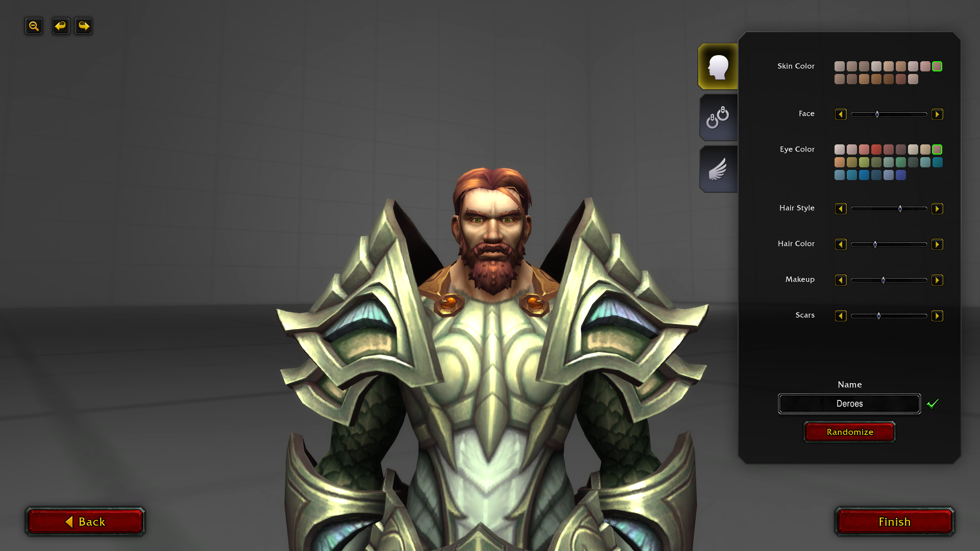
You’ll notice that the options in the last mockup are controlled by sliders. This UI control went through many iterations during development.
The old layout featured large preview portraits on the right. If you look at these examples, it’s difficult to tell the difference between the different face options:
They’re also not very scalable and counter to our goal of focusing on your character in the middle.
So we set out to find a UI control that could replace the portraits.
I didn’t want to use a mix of different controls (like checkboxes, buttons, and color pickers), as I felt it would make the screen look cluttered and overwhelming. I wanted to use a single control that could work for all option types.
However, the most important goal was enabling you to jump between any two options quickly so that you could easily compare them.
The first few iterations didn’t satisfy that requirement, and it was a hassle to navigate between options that were far apart.
Sliders made it possible to jump around quickly, but not precisely. Sliders are also typically used to move between two extremes (like short and tall), which wasn’t the case for most of these options.
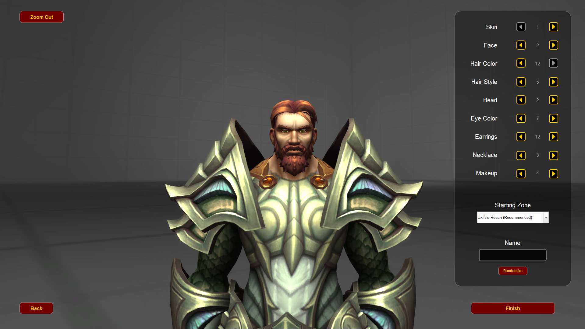
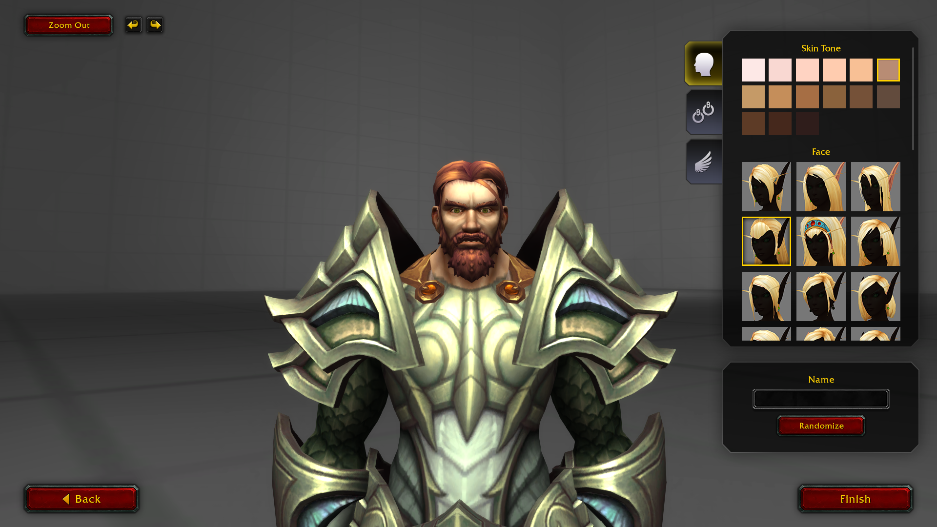
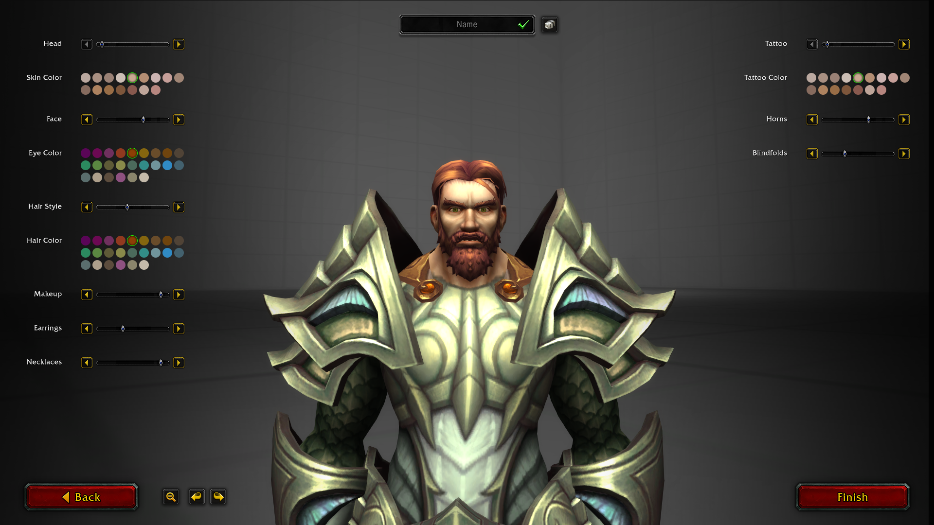
In the end, I came up with a multi-column dropdown that satisfied every goal we had:
- It lets you jump quickly between any two options.
- It lets you see all the options at the same time.
- It’s a single, versatile UI control that can be used for both names and colors. In some cases, we even mix the two types in the same dropdown.
- Your focus is kept on your character in the middle.
- And perhaps the coolest part: it lets you preview options in real-time just by mousing over them.
<iframe width="900" height="506" src="https://www.youtube.com/embed/NWpc4rxtgic" title="YouTube video player" frameborder="0" allow="accelerometer; autoplay; clipboard-write; encrypted-media; gyroscope; picture-in-picture" allowfullscreen></iframe>
Side note: I’m a huge Overwatch fan. How many Overwatch references can you find in the option names?
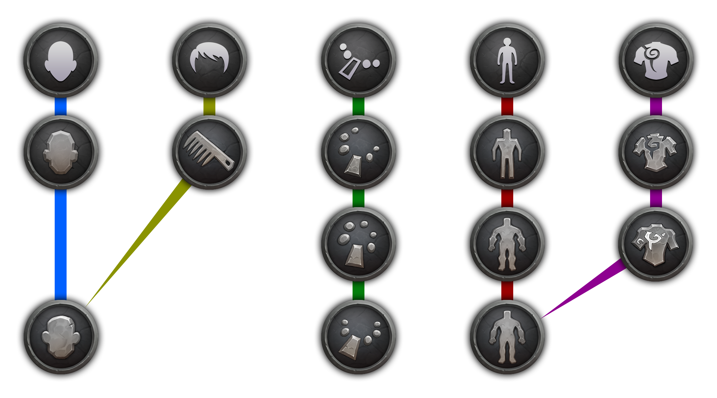
The Category Icons
All of the customization options are contained in one of three categories. Here’s how the categories and their icons evolved:
I originally planned for five categories, but that changed after I tested it in-game.
I felt it was clunky for hair options to be in the second category, since changing your hairstyle is typically one of the first things you do. So I moved them into the first category with the face options.
Most races don’t have many body and tattoo options, so I combined those two categories as well. And that’s how we ended up with the final three.
Barbershop
You might remember that the barbershop used to have a completely different UI from the Character Creation screen. With the redesign, it made a lot of sense for us to use it in both places.
Some barbershops used to be inconveniently dark because the lighting was based on the environment around it. This also made the perception of colors inaccurate in some cases. A green might look yellow, for example.
The art team solved this problem by applying a completely neutral light around your character when you activate the barbershop chair. Now the lighting is both bright and color accurate.
A new feature of the barbershop is that you can change your character’s gender. Here’s a video of the very first gender swap, recorded by the engineer who implemented it.
<iframe width="900" height="506" src="https://www.youtube.com/embed/5-F_QVvEB28" title="YouTube video player" frameborder="0" allow="accelerometer; autoplay; clipboard-write; encrypted-media; gyroscope; picture-in-picture" allowfullscreen></iframe>
Bugs
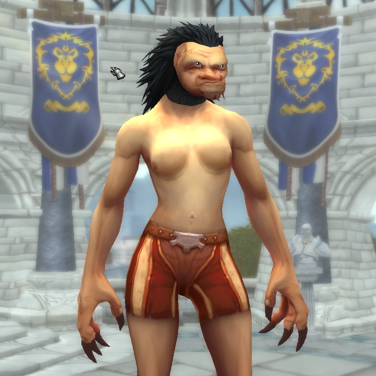
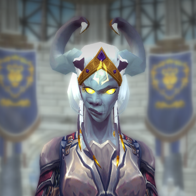
There were many visual bugs we had to iron out over the course of this project:
You can thank the QA team for saving you from this nightmare fuel!
Until Next Time
The Character Creation revamp was a huge collaborative effort involving character artists, animators, producers, test analysts, sound designers, user researchers, and engineers (read their previously published article
here!). We hope to have built a flexible, modern UI that will facilitate the creation of millions of characters in the years to come.
I hope you enjoyed this inside look at how we redesigned the Character Creation screen. Thanks for reading!
Jeff Liu
Senior UI Designer, World of Warcraft
 Yet another Timewalking loot post ( As directed by GM)
 Opened timewalking Cache before hotfix
 The WoW Companion App is Retiring
 MMO-Champion


 Recent Blue Posts
 Recent Forum Posts


") The Void. A force of infinite hunger. Its whispers have broken the will of dragons... and lured even the titans' own children into madness. Sages and scholars fear the Void. But we understand a truth they do not. That the Void is a power to be harnessed... to be bent by a will strong enough to command it. The Void has shaped us... changed us. But you will become its master. Wield the shadows as a weapon to save our world... and defend the Alliance!
The Void. A force of infinite hunger. Its whispers have broken the will of dragons... and lured even the titans' own children into madness. Sages and scholars fear the Void. But we understand a truth they do not. That the Void is a power to be harnessed... to be bent by a will strong enough to command it. The Void has shaped us... changed us. But you will become its master. Wield the shadows as a weapon to save our world... and defend the Alliance!

 Originally Posted by Biomega
 All I ever wanted was the truth. Remember those words as you read the ones that follow. I never set out to topple my father's kingdom of lies from a sense of misplaced pride. I never wanted to bleed the species to its marrow, reaving half the galaxy clean of human life in this bitter crusade. I never desired any of this, though I know the reasons for which it must be done. But all I ever wanted was the truth.


 Reply With Quote


