Yet another Timewalking loot post ( As directed by GM)
 Opened timewalking Cache before hotfix
 The WoW Companion App is Retiring
 MMO-Champion


We already have one and we're already dependent on it as it is. Too dependant on it if you ask me.Originally Posted by MightyWarrior

 Recent Blue Posts
 Recent Forum Posts
-
2022-07-17, 02:55 PM #63261Void Lord


- Join Date
- Jul 2011
- Location
- In some Sanctuaryesque place or a Haven
- Posts
- 44,683
 #TeamLegion #UnderEarthofAzerothexpansion plz #Arathor4Alliance #TeamNoBlueHorde
Warrior-Magi
-
2022-07-17, 02:55 PM #63262Elemental Lord


- Join Date
- May 2014
- Location
- Streets Strange by Moonlight
- Posts
- 8,566
This ship has sailed ages ago. Originally Posted by MightyWarrior
Sometimes, the light of the moon is a key to other spaces. I've found a place where, for a night or two, the streets curve in unfamiliar ways. If I walk here, I might find insight, or I might be touched by madness.
-
2022-07-17, 03:11 PM #63263Elemental Lord
- Join Date
- Aug 2009
- Posts
- 8,295
I noticed some smoothness with some models that almost look disneyfied in a way. Especislly Nozdormu has this. Originally Posted by Arafal
Its different to me.
-
2022-07-17, 03:17 PM #63264Brewmaster

- Join Date
- Nov 2011
- Location
- Yes
- Posts
- 1,488
I feel it's a logical conclusion of WoW wanting to stay stylized with its shaders and shapes instead of wanting to try to aim for realism. Eventually you do just drift towards cartoony or a cel-shaded-style look even if you don't really intend to. A lot of older models kinda glazed over that because they were so jagged and polygonal because of what they could work with at the time, but the smooth-overs were kinda inevitable. Originally Posted by Alanar
I think player models are especially noticeable because of how the original models looked, trying to aim for realism on say, a human with their exaggerate proportions instead of leaning into cartoony would have look uncanny.Last edited by Veluren; 2022-07-17 at 03:20 PM.
-
2022-07-17, 03:19 PM #63265Old God


- Join Date
- Mar 2022
- Location
- Greece
- Posts
- 10,869
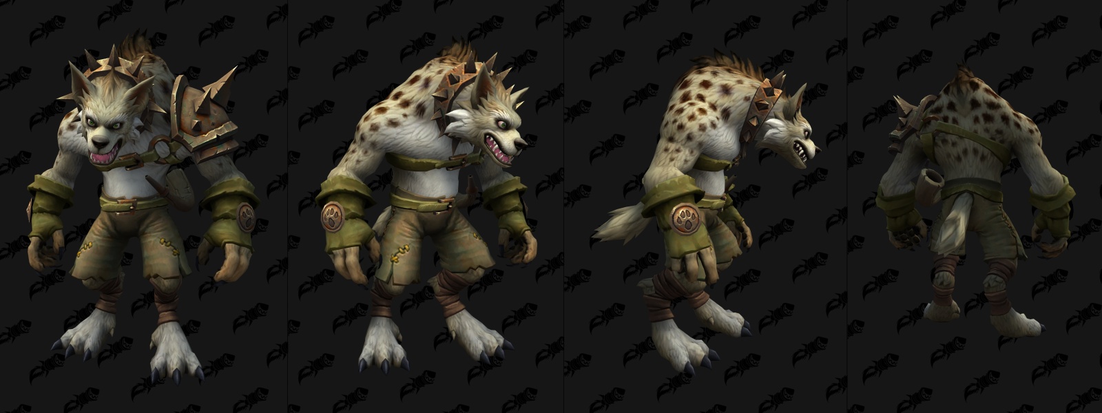
I think the issue was very particular with the gnolls because we got TWO new models. And while one stays in the spirit of the gnoll being feral, the other very much escaped from some furry visual novel. And changing Hogger to look like a plushie is such a poor choice that makes you question art direction. Originally Posted by Veluren
-
2022-07-17, 03:22 PM #63266Void Lord
- Join Date
- Jul 2011
- Location
- In some Sanctuaryesque place or a Haven
- Posts
- 44,683
Pretty sure the icons for gnolls always looked slightly psychotic and like they're about to bash your brains. The old ones from vanilla. Originally Posted by Nymrohd
#TeamLegion #UnderEarthofAzerothexpansion plz #Arathor4Alliance #TeamNoBlueHorde
Warrior-Magi
-
2022-07-17, 03:26 PM #63267Old God
- Join Date
- Mar 2022
- Location
- Greece
- Posts
- 10,869
Yup very much. It needs to look feral, almost rabid. Originally Posted by Aeluron Lightsong
-
2022-07-17, 03:29 PM #63268Elemental Lord
- Join Date
- May 2014
- Location
- Streets Strange by Moonlight
- Posts
- 8,566
It's still there: Originally Posted by Nymrohd
 Sometimes, the light of the moon is a key to other spaces. I've found a place where, for a night or two, the streets curve in unfamiliar ways. If I walk here, I might find insight, or I might be touched by madness.
-
2022-07-17, 03:30 PM #63269Scarab Lord
- Join Date
- Feb 2015
- Posts
- 4,480
To be honest, the Dragonflight Gnoll model resembles artwork like from the Monster Guide or even concept art than the current ones does.
Honestly, they just need to give them more of a hunched back. Their posture is too good.Last edited by Makorus; 2022-07-17 at 03:35 PM.
-
2022-07-17, 03:31 PM #63270Void Lord
- Join Date
- Jul 2011
- Location
- In some Sanctuaryesque place or a Haven
- Posts
- 44,683
At most there might be a weird miscommunication going on in the art team but I am ok with how stylized wow looks and prefer its style then Hearthstone or HOTS or whatever. Also Hogger again looks like he's about to lose his shit and crush my head in.
#TeamLegion #UnderEarthofAzerothexpansion plz #Arathor4Alliance #TeamNoBlueHorde
Warrior-Magi
-
2022-07-17, 03:33 PM #63271The Insane


- Join Date
- Jul 2008
- Location
- Michigan
- Posts
- 19,718
That is really just hyperbole. The old model had a terrible smashed face. Is the new one different? Sure. But it is hardly terrible. At least they look like their own creature rather then a mini-tauren. Could they better reconcile the old vs new or finally give hogger a unique model because of his fame? Sure. Originally Posted by Nymrohd
"Man is his own star. His acts are his angels, good or ill, While his fatal shadows walk silently beside him."-Rhyme of the Primeval Paradine AFC 54
You know a community is bad when moderators lock a thread because "...this isnt the place to talk about it either seeing as it will get trolled..."
-
2022-07-17, 03:36 PM #63272The Lightbringer


- Join Date
- Feb 2021
- Posts
- 3,418
Agreed—I don't mind the cartoonish art style, but I find the new models too "soft". I was always offput by the Drakthyr and was thoroughly convinced they weren't real when they were first leaked because of it. It's all very awkward. Originally Posted by Arafal
-
2022-07-17, 03:40 PM #63273Stood in the Fire

- Join Date
- Apr 2022
- Posts
- 492
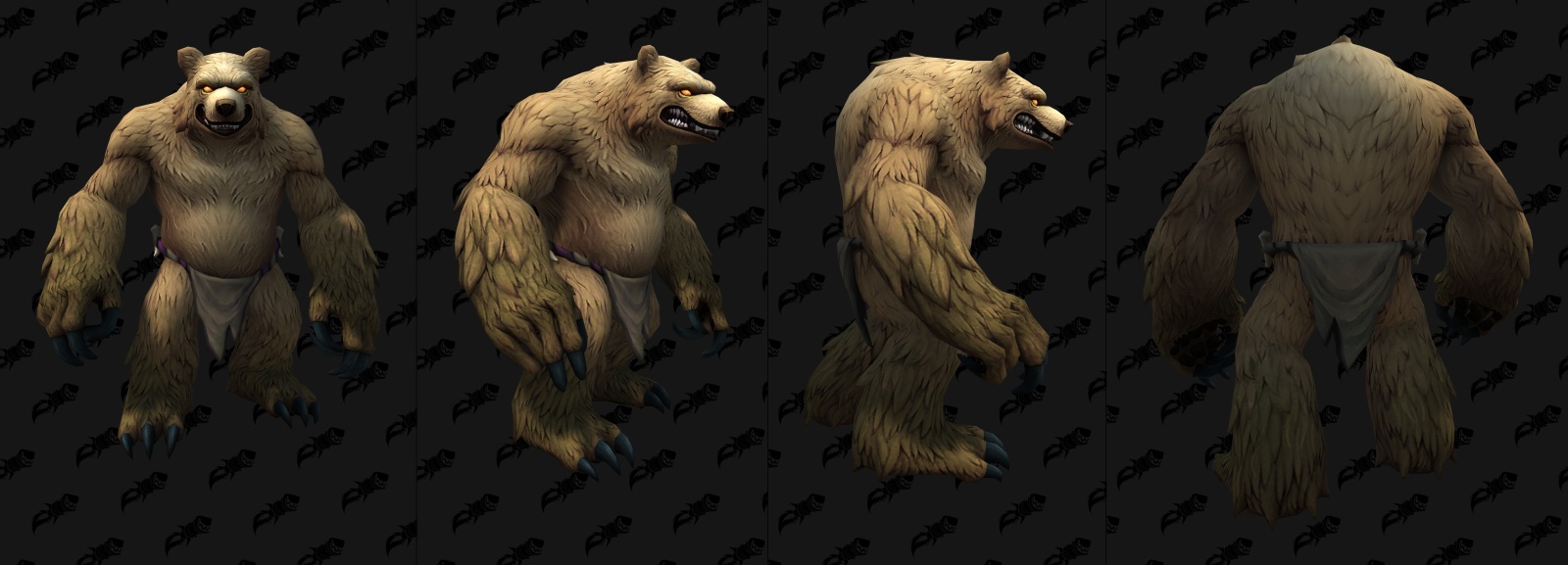
A slight but very noticeable change that Warcraft art has played around with over the years is pupil-less eyes. They really went overboard with this in WC3, presumably due to some kind of stylistic choice as even characters like Thrall just had white orbs in that game. To me it feels like they've been moving away from that recently and we're seeing more models/characters with very human-looking eyes, which I don't think works for the more bestial creatures. Eyes are one of the characteristics we hone in on the most. Take the controversial worgen model update, I agree that they look too tame or outright cute with the regular eyes, but are much improved with one of the new single-color eye options they added in SL. Same applies to the new gnolls; the sage model with the milky white eyes looks more intimidating than the regular model used for Hogger.
-
2022-07-17, 03:43 PM #63274The Lightbringer
- Join Date
- Feb 2021
- Posts
- 3,418
Not a bad observation at all. The pupil-less eyes do add a more alien edge to everything, whereas all eyes having pupils simply makes them seem more traditionally humanlike and consequently recognizable. Originally Posted by Murlocos
-
2022-07-17, 03:44 PM #63275The Insane

- Join Date
- Aug 2015
- Location
- Base Camp
- Posts
- 19,143
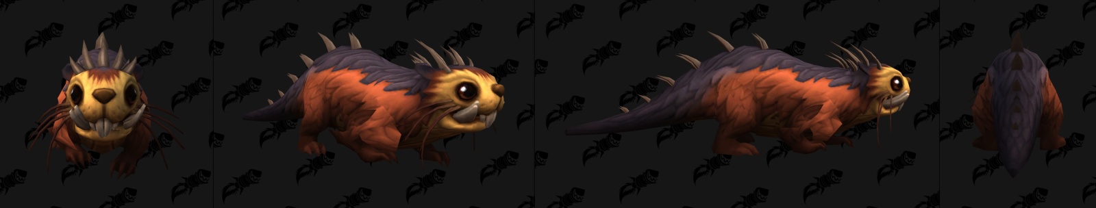
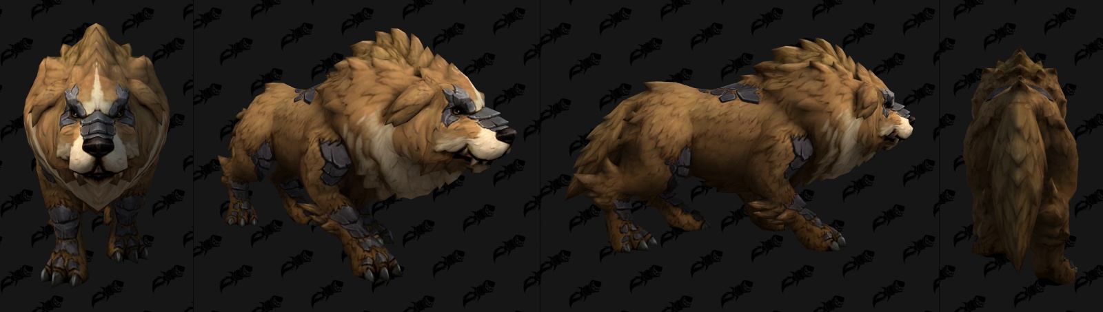
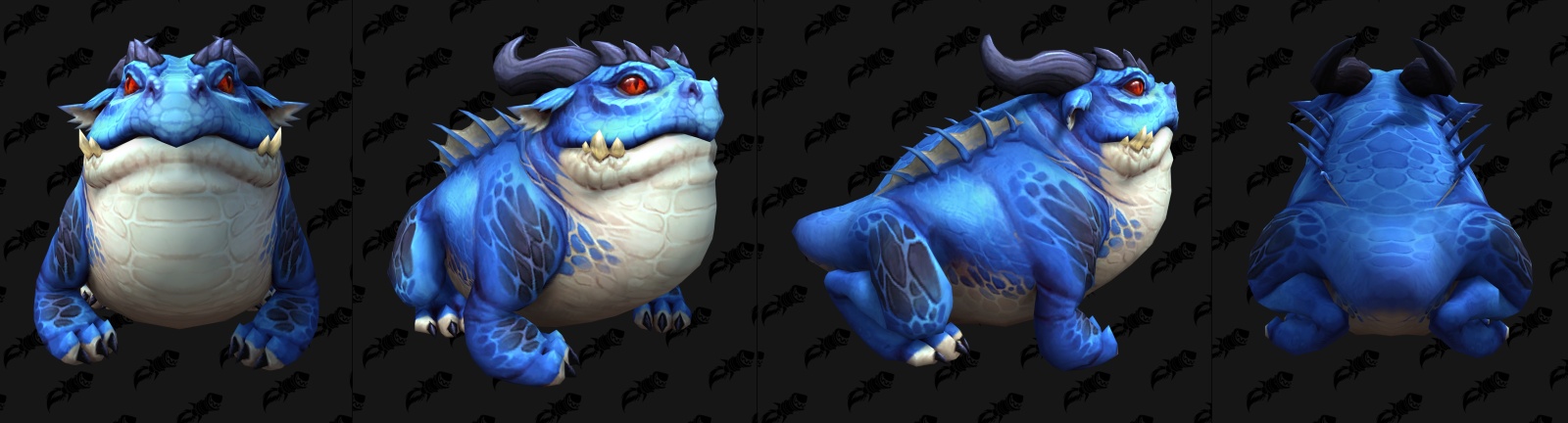
Actually i meant that some new models have very different art direction compared to others. Originally Posted by Alanar
There's the overly cartoony, almost pixar-esque looking models.
Smooth/soft textures, usually big eyes, brightly colored.
Spoiler:
And then you have stuff like this:
Spoiler:
Models with a more rough, realistic looking approach.
Furbolgs and Gnolls make a good example:

Formerly known as Arafal
-
2022-07-17, 03:46 PM #63276The Lightbringer
- Join Date
- Feb 2021
- Posts
- 3,418
I think the hunch and silhouette is generally adequate, but I think it lacks enough sharp edges on its face, especially relative to the armor. Even on the armor, only the bit on its back is actually that pointy, whereas everything else isn't quite pointy enough. The face especially lacks pointed edges, screwing with the shape language, and the teeth are too small and far-apart for them to look dangerous enough. Same with the ears—too smooth at the top, especially the cropped one. The stance is good, and the way the hood frames the face is cool, but other than that it's all still far too soft. Originally Posted by Makabreska
- - - Updated - - -
I very much like the second set—it's a shame that there's no coordination, because I would really like to see Blizzard permanently shift to the latter. Originally Posted by Arafal
-
2022-07-17, 03:53 PM #63277The Undying
- Join Date
- Jun 2008
- Posts
- 33,269
Somebody get Koranos a therapist already. Originally Posted by Arafal
-
2022-07-17, 04:01 PM #63278Void Lord
- Join Date
- Jul 2011
- Location
- In some Sanctuaryesque place or a Haven
- Posts
- 44,683
I see both sets look pretty cartoony if you ask me. Gnolls(or the hogger one) just look more psychotic but based on the old icon, I mean...no shocker but I don't see an artstyle change other then..... contextual difference. Yeah furbolgs might not be psychotic like gnolls are. This all feels like very....... microscopic things to be concerned about. The whole realism part that WCIII reforged(They said they went with a in part realism style which I disagree with heavily but I don't think that is the source of the game's problems).
I still feel like the stylized WC look is still here in WoW and if I noticed something was off or something the devs said I disliked, I would voice it.#TeamLegion #UnderEarthofAzerothexpansion plz #Arathor4Alliance #TeamNoBlueHorde
Warrior-Magi
-
2022-07-17, 04:05 PM #63279Old God
- Join Date
- Mar 2022
- Location
- Greece
- Posts
- 10,869
I mean I did say it, we get two models, one is good. This iteration of the model that you posted is solid. The other version just doesn't do the gnolls justice. Originally Posted by Makabreska
- - - Updated - - -
The devil is in the detail though. And when you are updating material, I think staying true to the original should be your primary goal. Originally Posted by Aeluron Lightsong
And I felt WC3 style did not feel realistic but rather they looked like miniatures we use in wargaming/TTRPGsLast edited by Nymrohd; 2022-07-17 at 04:07 PM.
-
2022-07-17, 04:07 PM #63280Mechagnome

- Join Date
- Apr 2020
- Posts
- 541
Personally, I just wanted the gnolls to look a little more ferocious. Something a bit like this, Originally Posted by Aeluron Lightsong