Recent Blue Posts
 Feedback: Death Knight Updates
 Feedback: Death Knight Updates
 The War Within Alpha - Warbands Feature Overview
 MMO-Champion


Ahh, ok. Can't sleep so im working this rebuild layout (with some slight alterations ofc)Originally Posted by bOOURNS

Screenie of current progress incoming!
Edit: Screens
Party
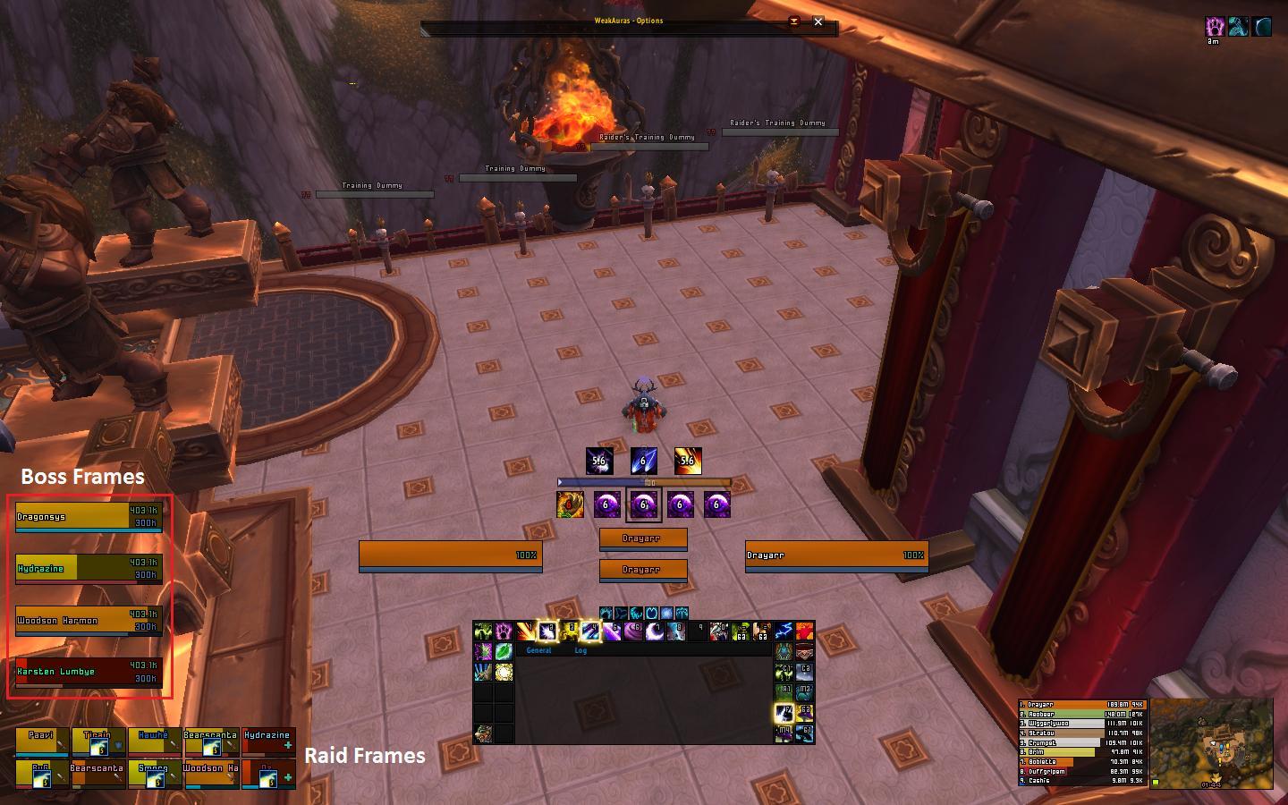
Raid/Boss Frames
Bigwigs Timers/Messages
I know the meter isn't the right size/aligned, working on it/replacing it atm.
 Recent Forum Posts
Thread: Post Your UI
-
2013-01-11, 01:35 AM #9461Epic!

- Join Date
- Oct 2012
- Posts
- 1,559
Last edited by mmocba105e19de; 2013-01-11 at 06:56 AM.
-
2013-01-11, 01:53 AM #9462Blademaster
- Join Date
- Oct 2012
- Posts
- 39
Really like it. The raid frames pop and would really stand out for a healer role. As always good work. Originally Posted by bOOURNS
PS. Who cares about the font, if you like it use it.
PPs. Please keep posting screenshots. You are 1 of the many here who've given me some great ideas and, with out knowing, tips on a good clean ui.
-
2013-01-11, 02:09 AM #9463The Patient

- Join Date
- Sep 2012
- Posts
- 345
Thanks! It was built mainly for healing as that is my main spec, I've just been using LFR for gearing my offspecs so thats why most my screenies are as dps. Originally Posted by Xanafriel
-
2013-01-11, 02:32 AM #9464Epic!
- Join Date
- Oct 2012
- Posts
- 1,559
With regards to ElvUI, anyone know how to remove hide all the buffs/debuffs except for boss specific crap like amber-shaper destabilize stacks
-
2013-01-11, 03:00 AM #9465The Patient
- Join Date
- Sep 2012
- Posts
- 345
I don't know the specifics for every little thing to check and uncheck but. Originally Posted by Drayarr
(assuming you mean for the target frame)
/ec -> unitframes -> target -> debuffs
Then this is where i get confused about auras filtering and probably why i never have bothered with it. I "think" you cant to block everything but whitelist and at the very bottom select "RaidDebuffs" in the Additional Filters.
You can see what auras the RaidDebuff whitelist will show via unitframes -> filters -> select filter "RaidDebuffs" -> Filter Type "Whitelist" -> select spell dropdown menu.
I could be WAY off on all this. I think there is a pretty big thread on the TukUI/ElvUI forums how to config auras that might offer better more accurate help than this though since i could be 100% wrong.
***edit***
BTW interesting approach with your new layout. The chat placement is interesting and i could see that working well if done right. Hope to see your finalized screenie soon!
Last edited by bOOURNS; 2013-01-11 at 03:48 AM.
-
2013-01-11, 07:10 AM #9466High Overlord

- Join Date
- Nov 2010
- Posts
- 194
Seeing that I'm not the only one that thinks that the font does not fit the rest of the UI, you might want to lay off the hostile attitude and just play around with some different fonts? Because I'm not saying your UI is bad, just that it would look better with a different font. Originally Posted by bOOURNS
I use a 27" screen too and it's not about it being too large or small, it's the general look. Pixel fonts also have a specific size at which they look good, and you are not using that one so they have blurred edges and look really fuzzy/blurry. So maybe just take the advice and try something new. Nobody here hates you and wants you to stop posting. I could imagine that something like BigNoodleTitling or a lowercase version of myriad would look good on your ui.Everyone seems to bitch about my font. I think I'm just going to give up posting screenshots cause of this. The font looks just fine on my screen size and resolution. My screen is a 27" so what looks large for probably most people is pretty small on my screen.
Either way, I'm done with screenshots.
-
2013-01-11, 07:30 AM #9467Dreadlord

- Join Date
- Dec 2010
- Posts
- 815
no, they're not. They look just fine to me. Originally Posted by Stanzilla
-
2013-01-11, 07:55 AM #9468The Patient
- Join Date
- Sep 2012
- Posts
- 345
I'm well aware pixel fonts have to be a specific size(I spent days trying out 50+ fonts and this was the ONLY one that worked on my screen) and I am using the correct size for the font I've picked out. Because it is NOT fuzzy or blurry at all on my screen or in my screenshots. Are you even left clicking one time after loading the image so it zooms in to "actual size" and not the defaulted "fit to screen"? You're the only one who thinks it's blurry. Originally Posted by Stanzilla
-
2013-01-11, 08:15 AM #9469DeletedDid you use custom icons in your party frame for the healer/tank/dps? Originally Posted by Drayarr
-
2013-01-11, 01:08 PM #9470DeletedIt's Tidyplates; Threat plates! Originally Posted by Pharrax
Way better than the original ElvUI one's
-
2013-01-11, 01:41 PM #9471DeletedOh okay. I cant really seem to be able to customise the looks of Tidy Plates at all except by changing the built in Layouts. Only things I can change is what information they show and even that is very limited. Also there are no profiles with it which is a shame. I would prefer just to go back to Aloft but still be able to have the debuff icons over the top of the nameplates ability. Originally Posted by Felonidas
Not sure what I'm doing wrong with Tidy Plates then :/
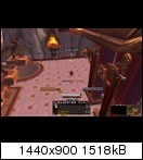
Also here is my UI on my Death Knight that I am currently leveling up:

-
2013-01-11, 02:52 PM #9472Epic!
- Join Date
- Oct 2012
- Posts
- 1,559
Using ElvUI as base, its just the regular raid icon from the Elv raid frames. Originally Posted by zecxx
---------- Post added 2013-01-11 at 03:03 PM ----------
Originally Posted by Pharrax
Really enjoyed using MayronUI Gen2, only issues I had were some lua errors. shoulda taken note of what they were tho so I could have let you know.
I really need a bigger monitor tho, so i can get more screen real estate
---------- Post added 2013-01-11 at 03:13 PM ----------
I was a bit out of it last night, completely forgot to check Tuk/Elv Forums.... Originally Posted by bOOURNS
Could use some C&C on those screens to give me some more ideas, not sure what to do with it now...got a sort of writers block atm :P UIBLOCK!
-
2013-01-11, 05:16 PM #9473High Overlord

- Join Date
- Feb 2011
- Posts
- 137
What about either remove one row of action bars on each side of the chat so you have 12 on top and 6 on each side? Or have 12 on top, 6 on each side and 12 on the bottom. Maybe move the whole chat/action bar mix down a bit so it aligns with your minimap, Party/raid frames. Originally Posted by Drayarr
Also, is that nibEclipse? If so you should mess around with size to make that border nice and crisp instead of the blurry mess you have now.
-
2013-01-11, 05:27 PM #9474The Patient
- Join Date
- Sep 2012
- Posts
- 345
I agree with his idea to drop the actionbars and chat down to align with the raid frames and meters*map. Perhaps put your player castbar or target castbar or both in what would be that new void if you deside to move the bars and chat down. Originally Posted by TellyTop
-
2013-01-11, 07:00 PM #9475Epic!
- Join Date
- Oct 2012
- Posts
- 1,559
Will have a move around see what I come up with, with regards to the cast bars, do you mean like 2 lines say with target and player cast bars running along the top of chat/bar 1 like ========= <-- this kinda hard to describe. Originally Posted by bOOURNS
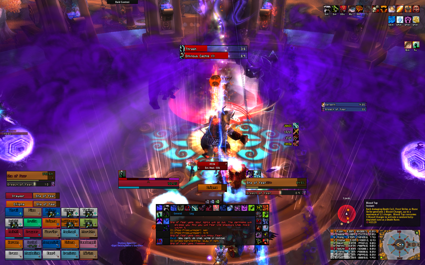
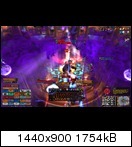
Raid Screenshot (dk alt in LFR)
---------- Post added 2013-01-11 at 07:05 PM ----------
Its Balance Power Tracker, was messing around with it to try and get a nice clean border, didn't manage it, this is WIP atm, will chuck a different texture into the BPT folder to try and sharpen it up Originally Posted by TellyTop
Edit: Do you mean like this for cast bars / moving chat/ab's down?
Last edited by mmocba105e19de; 2013-01-11 at 08:04 PM.
-
2013-01-11, 07:24 PM #9476The Patient
- Join Date
- Sep 2012
- Posts
- 345
Like if you moved you chat and action bars down to align the bottom of all that to match the raid frames and map there will be plenty space made(where the main actionbar is now) to place one or two castbars and match those to the width of the main actionbar if that makes sense. Originally Posted by Drayarr
Kinda like in my UI my player cast is above my raid frames with the width matched and my target cast is above that matching the width of my player+portrait+target frames.
This is all just suggestions as I think if the actionbar+chat is shifted down you'll have a huge hole between the new location and you unit frames, making it a nice spot to fill with castbars.
But play around and experiment. Even when I get things looking how I like I almost always keep playing around just to see and maybe get some creative ideas and find something I never thought of.Last edited by bOOURNS; 2013-01-11 at 07:28 PM.
-
2013-01-11, 07:30 PM #9477Epic!
- Join Date
- Oct 2012
- Posts
- 1,559
Cast bars, chat and actionbars edited.
Starting to favor this over my old layout, will deffo be running with it on sunday night for my raid.
Edit: Cookie for anyone who can help me get a nice 1px black border around my balance power barLast edited by Drayarr; 2013-01-11 at 09:00 PM.
-
2013-01-11, 08:08 PM #9478Deleted
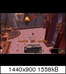
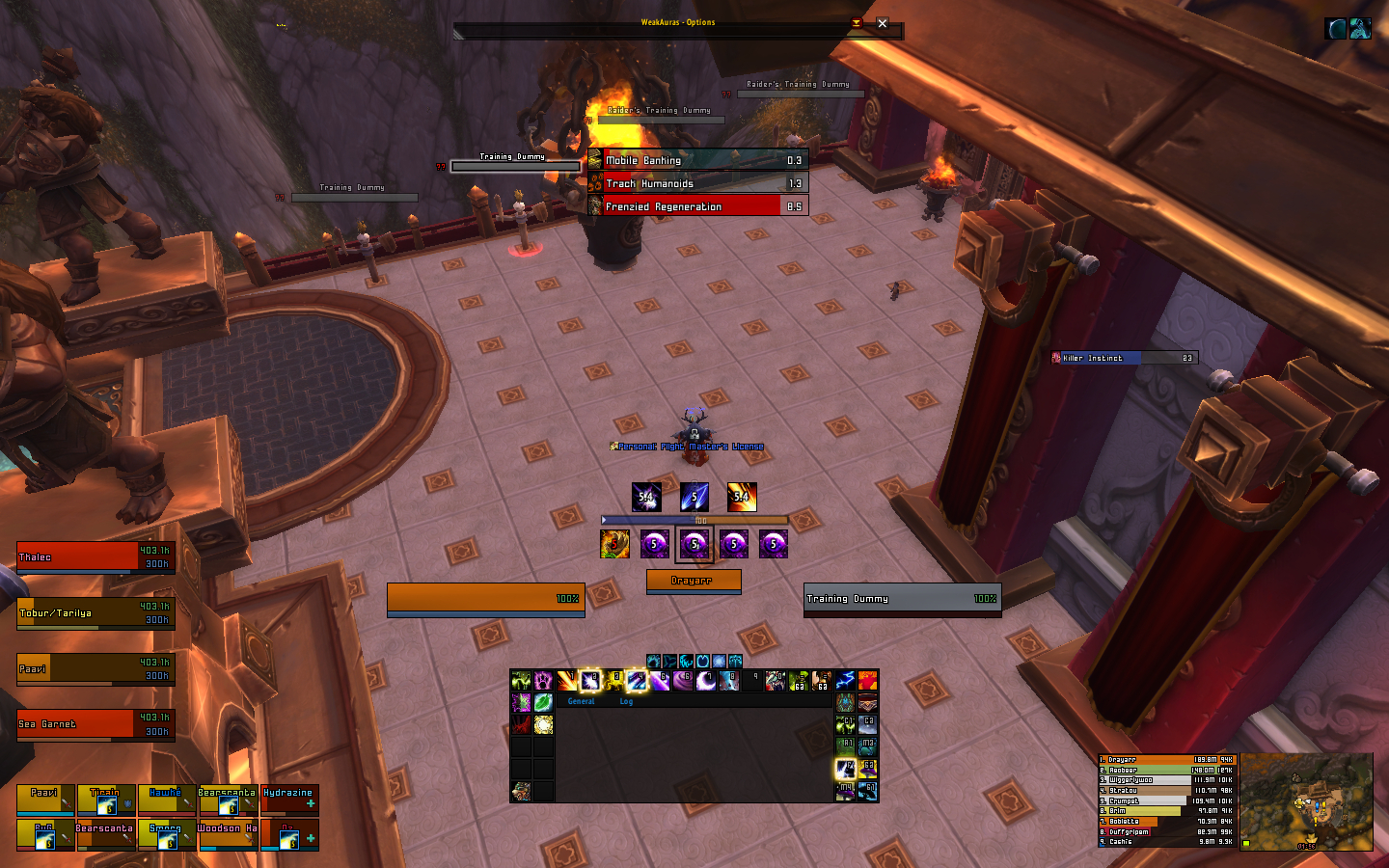
Made myself a new more functional UI, still the same layout tho.
Target debuffs + my important buffs (Rapid fire in this case), castbar and bar 2 to the right which pops up when entering combat

Enemy castbar + focus

Raid with BW, boss frames etc

Does anyone have any ideas on how to add a border to bigwigs timers? Want the same border on them that i use for the rest of the UI (fer09).
To bad there ain't an option for it, heck, you can't even anchor/parent a KGpanel to them
Last edited by mmocf4ab73a1dd; 2013-01-12 at 12:01 AM.
-
2013-01-11, 08:19 PM #9479High Overlord
- Join Date
- Feb 2011
- Posts
- 119
BigWigs already has 2 styles by default(Tuk and Beautycase i think), you can make your own style.. check the code for the styles how they add the borders Originally Posted by Rusk
-
2013-01-11, 09:49 PM #9480High Overlord
- Join Date
- Feb 2011
- Posts
- 137
Took me a whooping 3 minutes to do that. Originally Posted by Drayarr
Open up ingame options, Eclipse Bar, Bar Options, check Show Border, select a bar texture (any will work, even the blizzard ones), change border size to make a nice looking border (I used Blizzard Dialog at the size 2). Then go to Color and change the border color to black.
Now then, the problem is that the border is outside the bar itself. For this you'll have to go into the SavedVariables lua and change insets to 1. Don't forget to exit the game first!
Kablamo, you've got yourself a nice 1px border!Code:["eclipse_bar"] = { ["showInAllStances"] = false, ["ly"] = 0, ["insets"] = { ["top"] = 1, ["right"] = 1, ["left"] = 1, ["bottom"] = 1,
One more thing I noticed. Height and Width has to be even numbers otherwise the border won't show at all after doing this. So Width at 200 works, 201 doesn't.Last edited by TellyTop; 2013-01-11 at 09:52 PM. Reason: Added code and more steps on the way to 1px border


 Reply With Quote