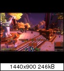
This is my current UI. Well my only UI I can use with ease. The layout was inspired by Pixil and their layout.
http://www.wowinterface.com/download...lvUI.html#info
Thread: Post Your UI
-
2013-06-18, 06:57 PM #11341
-
2013-06-18, 07:03 PM #11342
-
2013-06-18, 07:46 PM #11343Stood in the Fire


- Join Date
- Sep 2008
- Posts
- 441
Ya'll don't be too harsh with Ryas, you have to know his Ui history (like I do) to understand the white borders

I, myself, used white borders once upon a time!
@ Ryas,
I'm sure you can come up with a good solution to include those data texts into the layout, as currently they look lonely pushed away to the bottom all alone
Also, I don't know if the buff bar is working well there, maybe if the timers weren't set outside the icons?
Glad to see you posting again
<3
Ish
-
2013-06-18, 07:56 PM #11344Field Marshal


- Join Date
- Nov 2011
- Posts
- 70
-
2013-06-18, 08:10 PM #11345Stood in the Fire


- Join Date
- Sep 2008
- Posts
- 441
Hmmm, Arena frames...I will take a look and see, send me a pm with the specifics of what info would need to be displayed, my own pvp experience stops at bg's.
-
2013-06-18, 09:09 PM #11346Epic!


- Join Date
- Oct 2012
- Posts
- 1,559
-
2013-06-18, 10:32 PM #11347
Used the same layout as cares UI in Elv. Turned out alright i think.
i.imgur.com/oLIV2aJ.jpgLast edited by kornzy; 2013-06-18 at 10:35 PM.
-
2013-06-18, 11:16 PM #11348Epic!


- Join Date
- Oct 2012
- Posts
- 1,559
@Ish
Downloaded your UI been tweaking it to fit/work @ 1440x900

^-- this is how it looks atm. Just gotten home after a week of night shifts so my brain is a bubbling pool of mess so point out if ive missed anything and ima get on it nice and quick.
Edit: is there any way to get just my debuffs on the target to show like the buffs above the player frame?Last edited by Drayarr; 2013-06-18 at 11:57 PM.
-
2013-06-19, 05:04 AM #11349
I think I've been around as long as your have, hell, probably longer. But that bright of white looks a bit assaulting to the eyes :P. I would still keep them light colored, but make them a bit darker than they are now. I've always loved Ryas' UIs ever since BC.
That picture Saeto drew up on a critique calling him a gold farmer comes to mind xD
-
2013-06-19, 04:26 PM #11350Epic!


- Join Date
- Oct 2012
- Posts
- 1,559
Anyone able to post / repost the code for skada that shortens the damage number - from 1005929503 into like 100.53m
-
2013-06-19, 04:51 PM #11351
I think this is it:
Code:local SkadaFormatValueText = Skada.FormatValueText local function FormatValues(value, enabled, ...) if value == nil then return elseif ( type(value) == "number" or ( type(value) == "string" and value:match("^[-+]?[%d.,]+$") )) and tonumber(value) > 1000 then value = Skada:FormatNumber(tonumber(value)) end return value, enabled, FormatValues(...) end function Skada:FormatValueText(...) return SkadaFormatValueText(self, FormatValues(...)) end
-
2013-06-19, 06:11 PM #11352Stood in the Fire


- Join Date
- Sep 2008
- Posts
- 441
Well, if you've been in the Ui game since 2005 when discord was the shiz and Hal was pumping out quality work like this:
http://smg.photobucket.com/user/Dauk/media/1.jpg.html
then, yes, you've been around as long as I have :P
I miss Rob
-
2013-06-19, 07:25 PM #11353
Well, I'll be releasing an updated version of Ly UI this weekend. However, since Ish released his masterpiece of a UI, I doubt anyone is interested :P
I added a new minimalist bag addon, new data texts, added the quest log from ish's ui (love it), added rogue anticipation charges (because my rogue is now level 90 and ilvl 483, yay!), resized the dot timers so they won't overlap the entire character, and also replaced vuhdo with grid because vuhdo kept being weird. I'll leave my old vuhdo lua files just incase anyone wants to use vuhdo instead. There might be a few more tiny changes too, but I can't think of them now. The base of the design is still the same, though I am contemplating moving down the unit frames maybe 50px or so.
I have one question. I'm using Stuf, and I have the boss' buffs shown under their unit frame, however, each buff has a 2px colored border on each icon. How can I get rid of that border? I'm at work now so I don't really have a screenshot of what I'm talking about, but I'll try to take one when I get home.
-
2013-06-19, 07:43 PM #11354Stood in the Fire


- Join Date
- Sep 2008
- Posts
- 441
@lydude
You could go to:
Interface>Addons>Stuf>media
And change the aura.tga files to just a 1 px black line.
Then include a copy of the tga in a separate location so people can copy/paste it back into the folder if they have to update their stuf file for patches.
-
2013-06-19, 08:19 PM #11355
-
2013-06-19, 09:09 PM #11356
I'm definitely glad BSoDs (black sections of doom) aren't around as much as they used to be

-
2013-06-19, 09:20 PM #11357
-
2013-06-19, 10:15 PM #11358Deleted
-
2013-06-19, 11:28 PM #11359Epic!


- Join Date
- Oct 2012
- Posts
- 1,559
-
2013-06-19, 11:34 PM #11360

 Recent Blue Posts
 Recent Forum Posts
 What WoW foods do you think would smell the best?
 MMO-Champion


 Reply With Quote


