Cataclysm Classic: Leveling in a Shattered Landscape
 Cataclysm Classic: Leveling in a Shattered Landscape
 Do you consider the Horde to be "the bad guys" or is it more complex?
 MMO-Champion


I'm not sure about the bottom bar either tbh, might go back to having the cds/trinkets below the rage bar like in my previous screenshots. Also, I have zero art skills. I just systematically pillaged all the assets on the WoD website lol.Originally Posted by Anzen

 Recent Blue Posts
 Recent Forum Posts
Thread: Post Your UI
-
2014-11-10, 01:51 PM #16041The Patient

- Join Date
- Oct 2010
- Posts
- 204
-
2014-11-10, 02:47 PM #16042Deleted

ElvUI Skullflower Edit + WeakAuras 2
-
2014-11-10, 03:56 PM #16043Epic!

- Join Date
- Aug 2009
- Location
- Missouri
- Posts
- 1,745
The font is the size it is because I play on the big screen tv in the living room. Originally Posted by Snichy
-
2014-11-10, 09:26 PM #16044High Overlord

- Join Date
- Nov 2009
- Location
- TwitchTV
- Posts
- 150
I love this so much, I feel like I got transported back into BC with those Hal textures and the borders. Awesome! Originally Posted by OOMM
Sometimes I go back to old UI threads on Wowace or Elitist Jerks to gain inspiration, from the few images that work anymore.
. The Artist also known as Epiphany .
-
2014-11-10, 09:44 PM #16045Mechagnome


- Join Date
- Nov 2007
- Posts
- 631
Currently writing some small mods for screen notifications.
This screenshot shows the low health notification, the gradient is pulsating. Still working on alpha values.
https://dl.dropboxusercontent.com/u/...014_223824.jpg
edit: for clarification, this is the peak of the pulsating gradient. Normally it isn't that intrusive.Last edited by Lyn; 2014-11-10 at 10:50 PM. Reason: clarification
— oh, honey.
-
2014-11-10, 10:00 PM #16046The Patient
- Join Date
- Jan 2011
- Posts
- 286
This ui needs to be done.. NAUW! Great work.. i might need to copy it xD i don't know if i can wait!!!! Originally Posted by Lyn

-
2014-11-10, 10:04 PM #16047The Patient
- Join Date
- Jul 2009
- Posts
- 321
@mikkis2k - I don't recall Lyn ever sharing the original incarnation of his GW UI so I wouldn't be surprised if he didn't share this new version.
@Lyn - Awesome work you've been doing. It's not quite the kind of UI I'm accustomed to, but both your old and new GW UI are saved in my "UI Inspiration" folders. You use your space mostly wisely and I always enjoy a few simple textures being in the mix to turn something simple into a more graphical UI.
-
2014-11-10, 10:19 PM #16048The Patient
- Join Date
- Sep 2008
- Posts
- 222
Can we see this in combat, and a bigger picture please? Originally Posted by Tecisbeefy
-
2014-11-10, 10:34 PM #16049Blademaster


- Join Date
- Oct 2014
- Location
- Permanently in the wrong
- Posts
- 33
Maybe it's just me, but that seems incredibly intrusive. Maybe fade the blood towards the center of the screen so it's not quite as in your face? Originally Posted by Lyn
-
2014-11-10, 10:43 PM #16050Mechagnome
- Join Date
- Nov 2007
- Posts
- 631
This screenshot shows the peak of the pulse, normally it's not that intrusive. Originally Posted by Aviel Menter
 — oh, honey.
-
2014-11-10, 10:54 PM #16051Stood in the Fire
- Join Date
- Sep 2008
- Posts
- 441
Lyn........
In the top center those two dots look like the eyeballs of a bald gnome with big ears...once you see it...you cannot unsee it...
Also, perhaps the notifications don't need to be around the entire edge of the screen...maybe just the bottom half.
To me, when its being shown on the top half it makes it seem like you are looking through a window at your character, but if its just the bottom half its like your own body is bleeding.
Just a thought
<3
Ish
-
2014-11-10, 11:28 PM #16052The Patient
- Join Date
- Apr 2014
- Posts
- 213
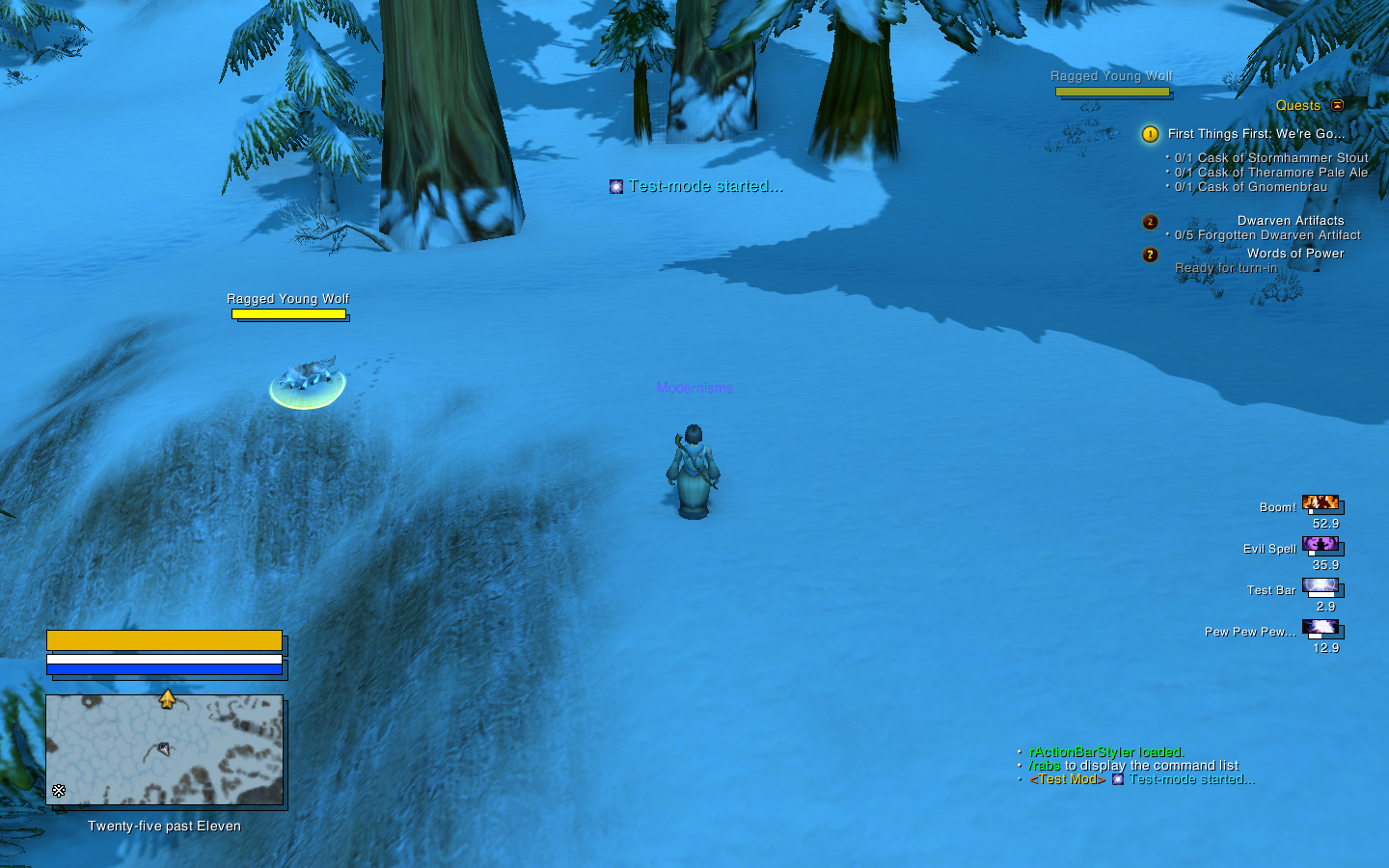
nameplates & DBM
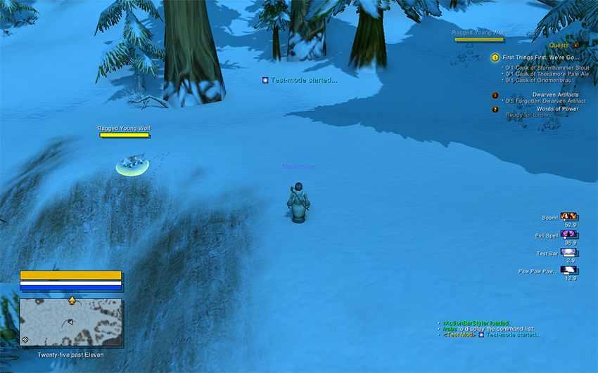
not totally convinced about the former, also need to update reaction colours to match oUF.Last edited by modernist; 2014-11-10 at 11:34 PM.
-
2014-11-11, 12:20 AM #16053Mechagnome

- Join Date
- Sep 2009
- Posts
- 580
I like the DBM look, but I feel the whole offset frames thing looks weird on the map, unitframes, and nameplates. Might look a bit less odd if they were a bit less transparent?
-
2014-11-11, 12:53 AM #16054Keyboard Turner
- Join Date
- Nov 2014
- Posts
- 4
Inspired by tempest420 i made this mage ui... Suggestions/criticisms are welcome!
Out of Combat:
i.imgur.com/3W8rId0.jpg
In Combat:
i.imgur.com/bFA4wCR.jpg
Its a WIP!
-
2014-11-11, 01:07 AM #16055The Patient

- Join Date
- Feb 2011
- Posts
- 252
How are you guys making these awesome UI :/ Originally Posted by savenx
-
2014-11-11, 01:08 AM #16056Keyboard Turner
- Join Date
- Nov 2014
- Posts
- 4
Its simple, im using Bartrender4, kgpanels and WeakAuras... just import textures!
-
2014-11-11, 01:26 AM #16057Blademaster
- Join Date
- Oct 2014
- Location
- Permanently in the wrong
- Posts
- 33
I find it kind of funny that you have these extremely fancy customly textured unit frames, and then the default blizzard border around the minimap. It does make it seem a little out of place.
-
2014-11-11, 01:35 AM #16058The Patient
- Join Date
- Jan 2011
- Posts
- 286
he said WIP... WORK IN PROGRESS... just saying :P Originally Posted by Aviel Menter
-
2014-11-11, 01:39 AM #16059Keyboard Turner
- Join Date
- Nov 2014
- Posts
- 4
Im new at interface building... if someone wants to help me add me on skype: savioasf
thx guys
-
2014-11-11, 01:40 AM #16060The Patient
- Join Date
- Jul 2009
- Posts
- 321
I have the opposite reaction. I like the offset on everything except the nameplates and dbm. I'm definitely partial to really simple nameplates (kui/elv) though, so I wouldn't hold that as a big thing. The DBM skin just looks off though. Originally Posted by Arborus
 .
.
 Reply With Quote