Dark Heart PTR Development Notes
 Dark Heart PTR Development Notes
 The War Within - Alpha Press Preview
 Are we approaching a Solo Raid WoW Experience?
 MMO-Champion
Looks good ish but is that totemtimer or some other totem addon?
 Recent Blue Posts
 Recent Forum Posts
Thread: Post Your UI
-
2012-02-01, 08:05 AM #6221Deleted
-
2012-02-01, 09:53 AM #6222DeletedYeah but I meant for the buffs with lowest duration to be at the end of the row, not the beginning. I guess it's just what you're used too. I hid my buffs and minimap in combat anyway.
 Originally Posted by Muncken87

-
2012-02-01, 10:26 AM #6223DeletedAha the opposite way, i guess im more used this way, need to find a balance between good and user compatibility :P Originally Posted by Led ++
---------- Post added 2012-02-01 at 04:45 PM ----------
I went back to my old fonts and borders, wasnt that user friendly for me atleast,
-
2012-02-01, 05:34 PM #6224Herald of the Titans


- Join Date
- Jun 2010
- Posts
- 2,575
Changed my UI soooooooo much
In combat
Last edited by mmocba105e19de; 2012-02-01 at 06:15 PM.
-
2012-02-02, 01:22 AM #6225The Patient

- Join Date
- Mar 2011
- Location
- Close to the Jersey Shore
- Posts
- 236
Just a concept for now, what do you guys think ?
http://i.imgur.com/oiiAW.jpg
Still deciding where to put buffs/debuffs and raid frames
-
2012-02-02, 01:27 AM #6226Stood in the Fire

- Join Date
- Sep 2008
- Posts
- 441
The chat frame isn't that important :\
-
2012-02-02, 01:36 AM #6227The Patient
- Join Date
- Mar 2011
- Location
- Close to the Jersey Shore
- Posts
- 236
For me it is, I will be frapsing kills and streaming on Twitch, and because of that, I'd much prefer a definite chat frame ontop of which I will overlay my guild name/etc Originally Posted by Ishtara
Hope that made senseLast edited by Lolhand; 2012-02-02 at 01:40 AM.
-
2012-02-02, 10:45 AM #6228Field Marshal

- Join Date
- Jun 2010
- Posts
- 92
Pretty cool, but it will be hard to create good uf's for it
-
2012-02-02, 12:21 PM #6229Epic!
- Join Date
- Jul 2010
- Location
- United Kingdom
- Posts
- 1,661
You should use a pixel font, imo. Originally Posted by Lolhand
and it would be nice to see the unit-frames too.
-
2012-02-02, 04:00 PM #6230Deleted
Munqen was so kind as to give me the download link for his UI and help me on Skype, here's the result:
http://i.imgur.com/olq6C.jpg
-
2012-02-02, 06:29 PM #6231Keyboard Turner
- Join Date
- Jan 2012
- Posts
- 5
Originally Posted by Redtusk
That Looks really nice, very clean.
---------- Post added 2012-02-02 at 06:35 PM ----------
I like that look. Originally Posted by Lolhand
-
2012-02-02, 07:01 PM #6232Grunt
- Join Date
- Oct 2011
- Posts
- 20
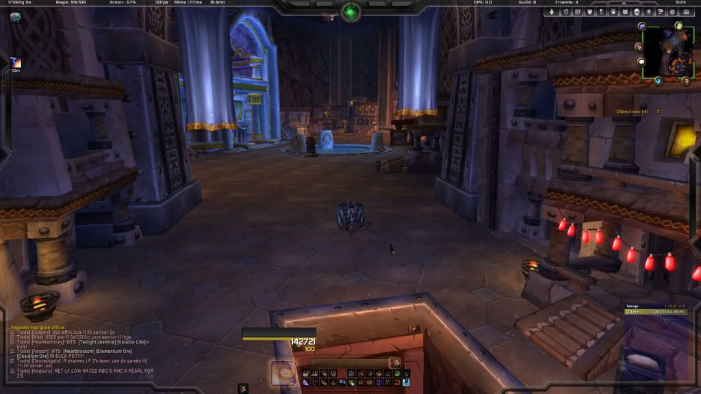
Hey guys! I have edited QulightUI for my own special needs, and would like some feedback and constructive ideas for developing the current setup!
The edit is done mostly through notepad++, so it would be something familiar to a TukUI edit.
First Screen:
The first screenshot is showing the basic layout of the UI. Seen elements are; Player, Target, ToT + Raid.
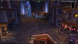
Second Screen:
The second screen is showing the arena unitframes, which I have added an aura timer + trinket timer to. It also shows how the UI uses Aurora for frame customizing.
BTW: You can see that the buff layouts are slightly different at the two pics. The second screen is the one with my current buff layout.
Hope you like it! Please, enlighten me with some ideas to improve my UI! I'm also open to answering any questions you would have concerning my UI.
-
2012-02-02, 07:39 PM #6233The Patient
- Join Date
- Mar 2011
- Location
- Close to the Jersey Shore
- Posts
- 236
I've been thinking about this but have NO prior experience with pixel fonts, and as such I have no idea what the different kinds are. Originally Posted by carebear
Also looking through your ui's, you seem to use em quite a lot. Do you go all out pixel font ? Or just use pixel fonts for SLDT, raven etc
And to everyone asking for UF's, I will be creating them in Stuf today. I have yet to find the proper positioning for UF's, grid, buff's, debuffs. I need to get this done, not allowing myself to play the new Final Fantasy till I'm done
EDIT : Here's an old version of oUF_NIN, I've been thinking of doing something like this
http://s.cdn.wowinterface.com/preview/pvw41452.jpg
Maybe health lost will appear in class color ?Last edited by Lolhand; 2012-02-02 at 08:05 PM.
-
2012-02-02, 08:06 PM #6234Stood in the Fire
- Join Date
- Sep 2008
- Posts
- 441
@Lolhand
If you follow the link in my sig and download the zip for my Ui, inside you will find in the addons folder IshtaraMedia.
Copy/Paste that into your addon folder and browse through the 95-100 pixel fonts in it till you find one you like.
Keep in mind that the size of most of the pixel fonts will need to be set at increments of 8. A couple are 10, but most are 8.
The media folder also has normal fonts for your chat frame and bar textures for your unitframes/meters.
All that aside, I still don't understand why your chat frame needs to be in the center of the screen.
You can still cast with a logo over it when the frame is off to the side.
Are you casting/frapsing/raiding as a Dps, Tank or Healer?
-
2012-02-02, 08:23 PM #6235The Patient
- Join Date
- Mar 2011
- Location
- Close to the Jersey Shore
- Posts
- 236
Ahh thanks, will test out the different pixel font's Originally Posted by Ishtara

For the chat, I might move it over to the right, should I float it over the bottom kgpanel bar or go for the same overlap like I did with the minimap ? I would go overlap just to make it seem like it fits in, but I'd have to make it non-transparent then
EDIT: I'm having a hard time explaining, I'll have a SS in a second here
http://i.imgur.com/0GwSt.jpg is what I'm talking about. Any ideas ?Last edited by Lolhand; 2012-02-02 at 08:31 PM.
-
2012-02-02, 08:54 PM #6236Dreadlord

- Join Date
- Sep 2011
- Location
- Stormscale
- Posts
- 887
I love it, what addons is it? Originally Posted by Noirlama
Edit, was there no one who had confirmed their role or isn't it shown?Last edited by xytech; 2012-02-02 at 08:57 PM.
-
2012-02-02, 09:32 PM #6237DeletedMake like a "carving" down in the bottom bar for where the chat box is, the overlapping looks kind of dull and wrecks the clean theme. Originally Posted by Lolhand
-
2012-02-02, 09:43 PM #6238The Patient
- Join Date
- Mar 2011
- Location
- Close to the Jersey Shore
- Posts
- 236
Yeah I know exactly what you mean, however I have no idea how to do this in kgpanels :/ Originally Posted by Redtusk
Last edited by Lolhand; 2012-02-02 at 10:22 PM.
-
2012-02-02, 11:23 PM #6239Deleted
can do line by line i guess, in kgpanels :P
---------- Post added 2012-02-03 at 12:24 AM ----------
I think just make a new panel with no border, make the background color black, and depending on width or height, make it 9 px and u will get a 1px line like the one u have at ur bottom
-
2012-02-02, 11:36 PM #6240Herald of the Titans
- Join Date
- Jun 2010
- Posts
- 2,575
Changed my UI little.

 Reply With Quote