Righteous Orbs no longer dropping
 Righteous Orbs no longer dropping
 Take a Dive into Plunderstorm’s Plundersurge!
 More permitted video sources
 MMO-Champion


Had to make an account to say this..Originally Posted by Ricen

Please tell me you're going to release this at some stage?
 Recent Blue Posts
 Recent Forum Posts
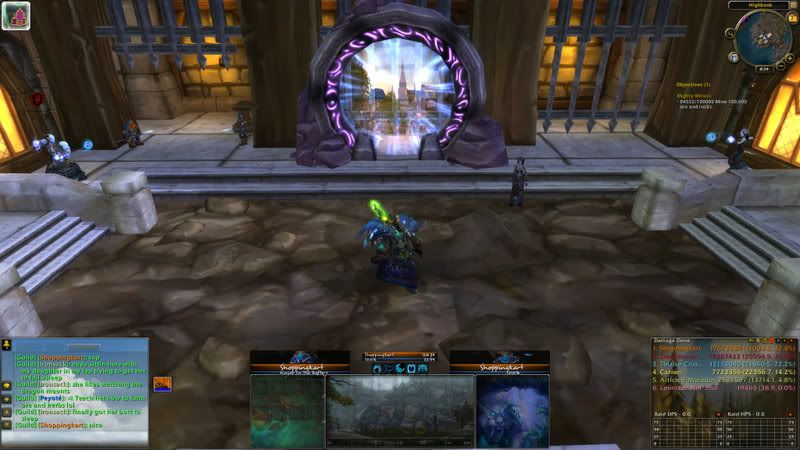
Thread: Post Your UI
-
2012-07-06, 12:02 PM #7181Blademaster

- Join Date
- Jul 2012
- Posts
- 39
-
2012-07-06, 12:08 PM #7182DeletedNot to take any credit away from Ricen as its a really nice UI, but I think you could probably get a very similar UI your self if you tinker some. Originally Posted by birchhh
-
2012-07-06, 03:56 PM #7183Epic!
- Join Date
- Jul 2010
- Location
- United Kingdom
- Posts
- 1,661
I've aligned everything properly, buffs, text all that jazz. Pretty much finished now other than Raid frames but I think I'll just go with grid because I'm lazy.

-
2012-07-06, 03:58 PM #7184Stood in the Fire

- Join Date
- Apr 2011
- Location
- Finland
- Posts
- 387
My UI in it's current state, open to any suggestions to make it better
 Rairu - Mage
gnomemasterrace
-
2012-07-06, 05:11 PM #7185Mechagnome

- Join Date
- Apr 2010
- Location
- Graveyard
- Posts
- 660
No offense taken haha. I have been doing UIs for a super long time just making them look the way I want. I do some LUA editing with SUF. I have released some stuff earlier on. I might upload i guess we will wait and see Originally Posted by Joyful

When a wild forum troll appears
-
2012-07-06, 06:21 PM #7186Stood in the Fire

- Join Date
- Sep 2008
- Posts
- 441
1. The text on your cast bar needs to be bumped up 1 px. Originally Posted by carebear
2. Your color scheme for your uf's is different than your nameplates, which is different from your cast bar, which is different from your exp bar.
A bit of simplification could be applied to make the Ui more coherent.
3. I don't know if its just me or not, but, % symbols drive me insane. If percent is the only value you are displaying for health text, why do you need the % symbol?
And even if you are displaying two texts for the health value, you can use color to differentiate them without needing a % symbol
4. Lastly, your default game font is ugly hehe
<3
Ish
-
2012-07-07, 11:41 AM #7187Fluffy Kitten

- Join Date
- Apr 2009
- Posts
- 17,226
I fixed all major things in the UI it seems, and since i'm satisfied of the layout i started to make the new bars introduced in MoP
Monk - Harmony bar (chi)

It works exactly as combo points, so i decided to make it similar to them. Obviously it switches from4 to 5 depending if you have the talent or not.
Priest - Shadow Orbs


The mechanic again it's nothing fancy, some spells generate orbs, some other spend them - only when you have 3 the border changes color so it's more noticeable. I'm thinking about making the border glow.
Feedback always appreciated - positions of text and such are a little off, i know. I'm working on the laptop so the reso makes the offsets go a little wild. Next step (and final i hope) are the Warlock bars which i'm starting this afternoon.
EDIT: i made thepanel a little more interesting - red border means you're in combat, blue means resting.
@Ish: ohai long time since your last visit
@care: thanks to you, the aura work has become really easier and i expect to finish it soon
Last edited by Coldkil; 2012-07-07 at 11:45 AM.
Non ti fidar di me se il cuor ti manca.
-
2012-07-07, 02:40 PM #7188DeletedFnx UI (0.9 BETA) 4.3
- Don't hate the player, hate the game.
v0.8 BETA

v0.9 BETA

Package contains ?
Chatter - Chatbox
DeBugRunes - Runes/Timmy stacks
Dominos - Action bars
Grid - Raid Frames
MSBT - Combat text
Omen - Don't think I need to explain
OmniCC - Sexy timers on action bar
OneBag3 - Bags
qMinimap - Simple Minimap
Skada - Dps/Healing meter
ShadowedUnitFrames - Unit Frames
Quartz - Castbar
Who to install ?
- First of all I would recommend you copy your old WTF and Interface folder and save it somewhere on your PC in case you want it back
- Unzip the "FNX UI.zip" file to your desktop
- Put the WTF folder into your World of Warcraft folder and rename "ACCOUNTNAME" to what your own account is called
- Do the same with "YOUR SERVER"
- And again with "CHAR NAME"
- Copy the "Font" folder into your World of Warcraft folder
- Log into World of Warcraft
DOWNLOAD LINK: HERE
Last edited by mmoce994820d54; 2012-07-07 at 03:32 PM.
-
2012-07-07, 03:02 PM #7189Epic!
- Join Date
- Jul 2010
- Location
- United Kingdom
- Posts
- 1,661
You're always so harsh to me ): Originally Posted by Ishtara
Looks good, really good work on the new class stuff. How much actually broke on the beta? I haven't been on for a couple of weeks. :s Originally Posted by Coldkil
-
2012-07-07, 04:18 PM #7190Fluffy Kitten
- Join Date
- Apr 2009
- Posts
- 17,226
haste is working on oUF - so obviously it will take time before he makes a stable release, atm it works everything apart from some class things like holypower and eclipse bar.
But to be honest i think most of the breaks depend on the layout. Probably i've been luck and/or the thing i like to make many things by myself made my UI not too much dependant from other addons - and again thanks to haste and other developers on WoWI that helped me with a little debugging.
Tukz for example has already a stable beta for TukUI - only available to supporters though, hence i cannot see much (it would have been interesting to see what solution he had in mind).
As i said if all continues this way the UI work is nearly finished (at least for a usable release) so i can focus on the aura plugins. Obviously olny with MoP live i can enhance the initial concept and work on optimizing - make things better. My totem bar works perfectly for example. The fact is that now totems are mostly defensive/pvp/offensive cooldowns, and they last for like 6 seconds - only a couple last like 30 seconds or one minute. The totembar also has completely disappeared hence i'm think about the real usefulness of the totem timers i made (for this i need the feedback of shamans).
Anyway there are enough things working to make the work fun, and not too much broken things to make it unbearable
Non ti fidar di me se il cuor ti manca.
-
2012-07-07, 04:22 PM #7191Mechagnome

- Join Date
- Nov 2007
- Posts
- 631
It's still WIP .. and I am unsure about different things (fonts, etc pp for example).
https://dl.dropbox.com/u/2051073/WoW...712_181709.jpg— oh, honey.
-
2012-07-07, 05:34 PM #7192Fluffy Kitten
- Join Date
- Apr 2009
- Posts
- 17,226
For a WIP is not that bad.
The only thing is the complete mixture of different layouts/fonts over the screen. None of them is bad taken alone, but a mix of all them makes your UI look like it's unfinished and/or just a compilation of unconifgureed addons.
Probably i just read bad your post (meaning you have put all the layouts and fonts together to choose between them) but imho, focus on one font adn one layout. Asymmetrical things are cool, but the frames need to look like parts of the same thing.Non ti fidar di me se il cuor ti manca.
-
2012-07-07, 05:52 PM #7193Mechagnome
- Join Date
- Nov 2007
- Posts
- 631
The main part I am still struggling are the fonts and player frame. Rest is mostly "ready". Originally Posted by Coldkil
— oh, honey.
-
2012-07-07, 07:59 PM #7194Stood in the Fire
- Join Date
- Sep 2008
- Posts
- 441
Never left, just been lurking about Originally Posted by Coldkil
Regarding your chi counter, I don't know if I really love the current text for it. I think something simpler would be better. Perhaps just use numbers without the "c" or maybe use a symbol for each stack like a " * " or maybe even just using a period for each stack but bump the font size up to 36 or something like that.
Also, I don't love the combat/resting coloration. Perhaps if you were using 3 px borders instead of 1 px borders it would look okay, but, right now it looks untidy
<3
I wouldn't call it harsh, I would call it constructive Originally Posted by carebear
Many <3's for care
-
2012-07-08, 09:02 AM #7195Fluffy Kitten
- Join Date
- Apr 2009
- Posts
- 17,226
Yeah i was feeling the same for chi. Tbh i just copypasted that part form combo points XD I'll try some solutions than post them here. Originally Posted by Ishtara
EDIT: i trid something, but the best combos (probably due to font) are tokens of two chars. Period is out of question, too small.
About the coloring, the jpg format makes them look worse than they are - have you other ideas that could look cool? Like a dot, or a "c" for combat and "r" for resting, the only thing is that i don't know where to put them XDLast edited by Coldkil; 2012-07-08 at 09:12 AM.
Non ti fidar di me se il cuor ti manca.
-
2012-07-08, 12:25 PM #7196Deleted

My current UI not in combat, will try upload one in combat later.Last edited by mmoc0f83dc0846; 2012-07-08 at 12:33 PM.
-
2012-07-08, 04:50 PM #7197Stood in the Fire
- Join Date
- Oct 2010
- Location
- Redding,Ca
- Posts
- 431
Created this for my druid alt, hope you enjoy.
Last edited by mmocba105e19de; 2012-07-08 at 10:19 PM.
-
2012-07-08, 05:02 PM #7198The Patient

- Join Date
- Mar 2011
- Posts
- 266
Your UI is basic and that is no problem. You don't have to be a LUA maestro or anything. Only "advice" I'd give is to drop X-perl as your unitframes. It consumes unnecessary CPU cycles and runs pretty heavy. Alternatives like ShadowedUnitFrames, Stuf, and Pitbull have amazing functionality and actually run lighter than x-perl. If you like the LOOK of x-perl you can simply edit any of those unitframe addons to look like it. Also, moving your Player/Target/Focus/TargetofTarget frames down to around your character's screen location is ideal for resource management and data efficiency. Having your actionbars, castbars, unit frames and other informational items close to the center of the screen where you spend the highest majority of your focus on is immensely helpful. I can see you have had the expansion on farm for quite some time now as I have. If you are interested in tweaking your UI at all(whether it be placement, addon changes, etc.), use this time between Cata and MoP to do that! Who knows, you might enjoy some changes you make, no matter how tiny. Originally Posted by Manarak
Other than that, UI's are completely personal preference and you should use what you enjoy.
-
2012-07-08, 11:08 PM #7199The Patient
- Join Date
- Sep 2011
- Posts
- 233
Vuhdo will. Look through the options, there's an option to hide the different Blizz frames. Originally Posted by lakers01
-
2012-07-10, 01:23 PM #7200Deleted
Split off the whole discussion about "how to make the most annoying UI ever" into a separate thread, since it doesn't really belong into this one.

 Reply With Quote