Recent Blue Posts
 Feedback: Mage Updates
 Feedback: Mage Updates
 Best Villain in the History of WoW
 Rate the transmogrification set above you!
 MMO-Champion


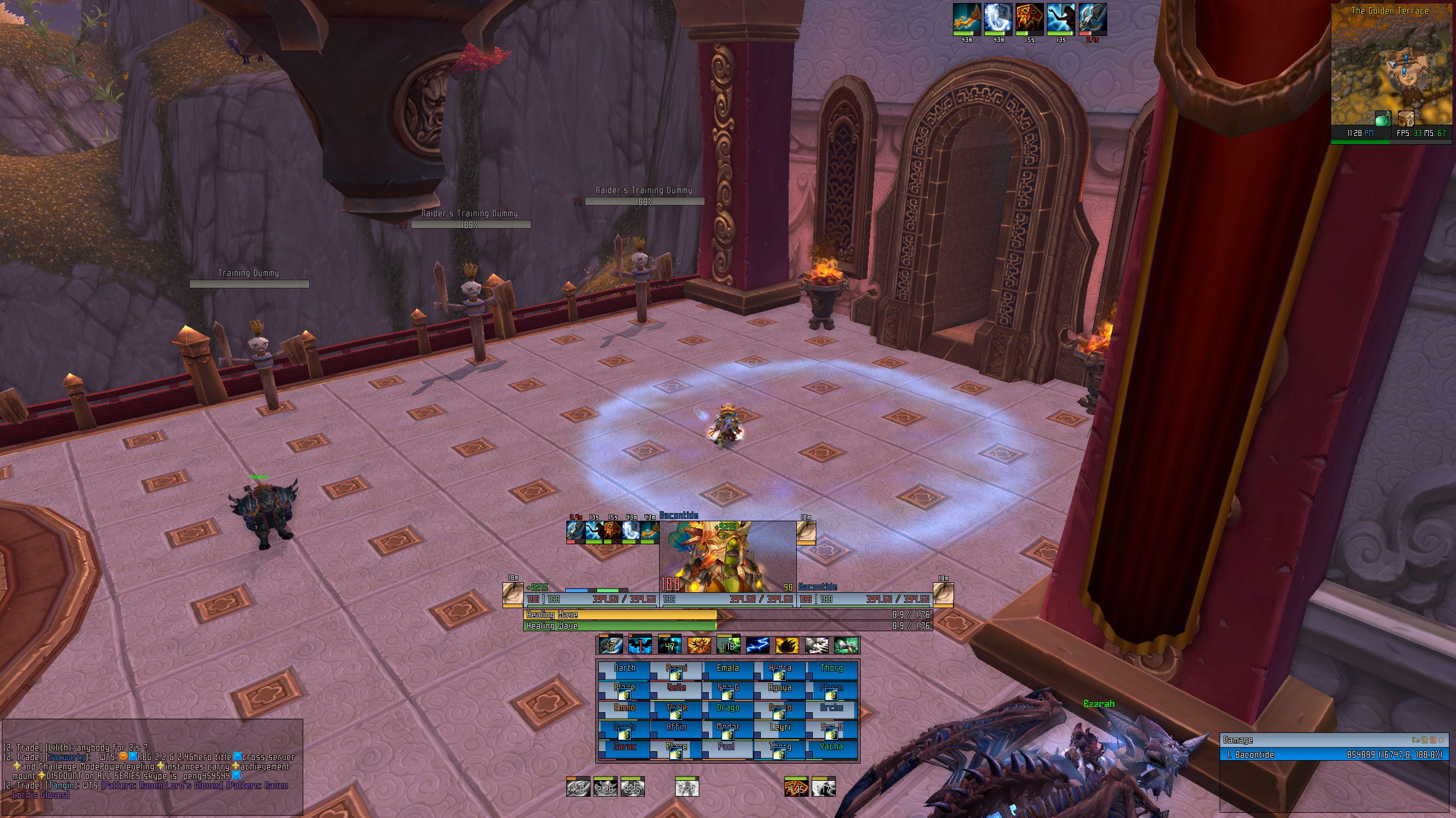
Here I though this would be post your UI, and people would half-arsed or bad UI's like mine(seen in others eyes), But this is atually good stuff.
In any case I would like to present my UI. Trying to keep it as close to standard as possible with as few addons as possible.
Though i can't live without the info from titanbar when I am not raiding.
 Recent Forum Posts
Thread: Post Your UI
-
2012-12-23, 12:36 AM #9201Holy Priest


- Join Date
- Feb 2012
- Location
- Netherlight Temple
- Posts
- 3,353
-
2012-12-23, 10:02 AM #9202Keyboard Turner
- Join Date
- Nov 2011
- Posts
- 3
Did anyone get to download this before fuskbugg.se went down? I been trying ever since I found the post same day a few hours later to download it but the server refuses connections. :/ Originally Posted by Rusk

-
2012-12-23, 10:38 AM #9203Deletedmajor thanks to you ! and ofc the other person that shared it Originally Posted by OriginalVocalMix

Last edited by mmoc093ccd014a; 2012-12-23 at 10:44 AM.
-
2012-12-23, 01:21 PM #9204Deleted
Finally finished my UI (MayronUI Gen2 Version 2.0) and I think it looks really nice but hope the changes I made are good. Created all new art that looks sharper and cleaner as well as tweaked the UI scale and many many more things:
Solo/Preview, Tanking PoV (Warrior), DPS Warlock PoV, 25 Player Raid as Healer (Shaman)


-- Extra Features:
Showing that you can extend the bars:
http://s.cdn.wowinterface.com/preview/pvw58996.jpg
Showing that you can have the chat box in the bottom left corner:
http://s.cdn.wowinterface.com/preview/pvw58997.jpg
Showing that you can customize the art's colours:
http://s.cdn.wowinterface.com/preview/pvw58998.jpg
The Setup Addon I made for it:
http://s.cdn.wowinterface.com/preview/pvw59000.jpg
Resolutions: 1920x1080, 1680x1050, 1600x900 and 1440x900
Downloadable on wowinterface. Link is below!Last edited by mmoc2c0e080e79; 2012-12-23 at 01:25 PM.
-
2012-12-23, 07:08 PM #9205High Overlord
- Join Date
- Feb 2011
- Posts
- 119
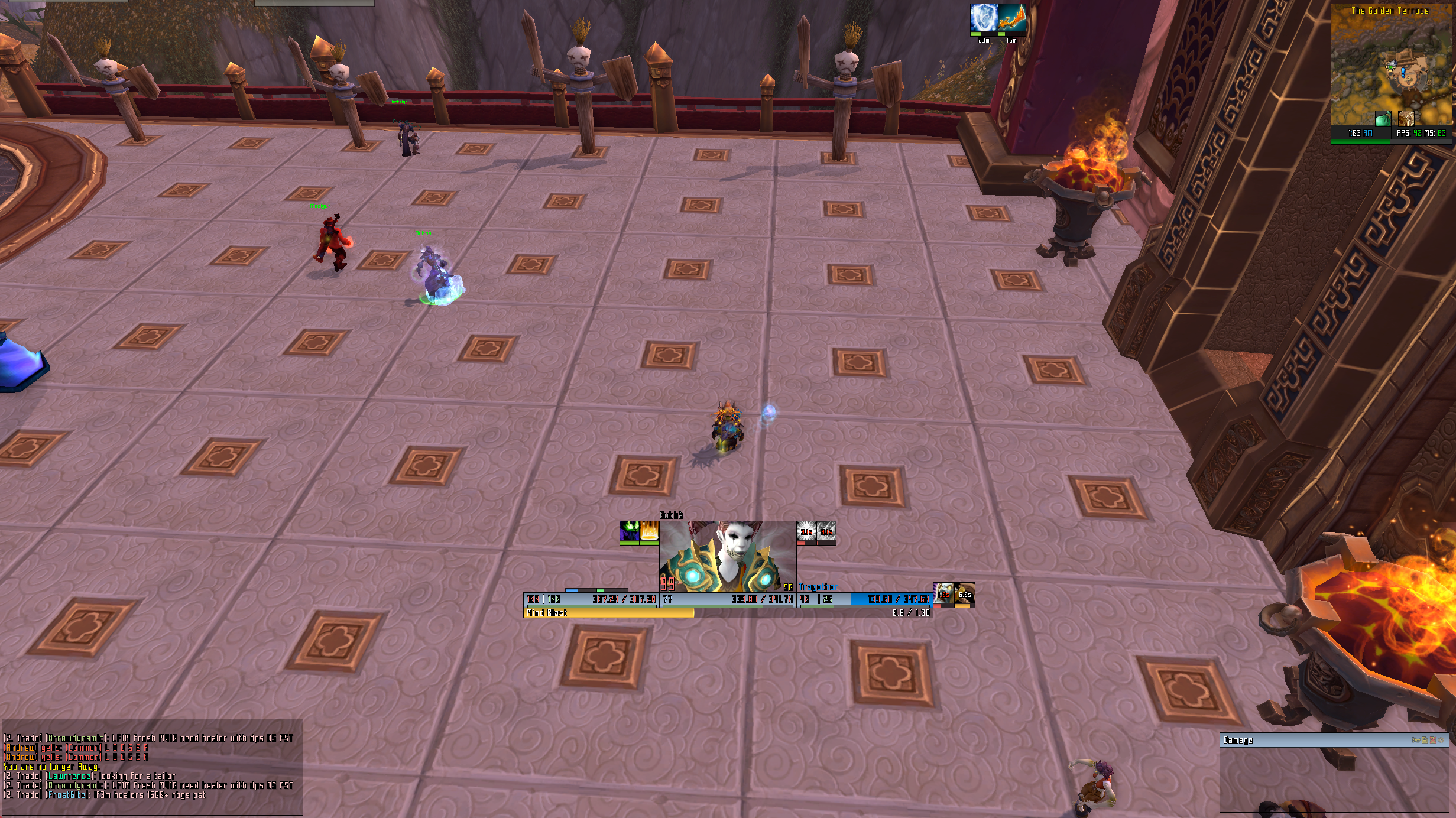
Works for me, though im quite bored of it :P
http://i.imgur.com/3PD5g.jpg
Happy holidays.
-
2012-12-24, 07:51 AM #9206The Patient

- Join Date
- Sep 2012
- Posts
- 345
Been toying around with some changes. ***NOT COMPLETE*** posting to show some progress
The idea behind it is everyone and their dog has some ultra minimalistic. I'm trying to build something different in anyway i can, but still remain relatively clean.
- Rectangle ActionBar Buttons (rarely do i see non square buttons)
- Rectangle WeakAuras CD's to match ActionBar.
- Zero spacings on most things (still need to adjust many things to match).
- Everyone hates Portraits so i added one for target.
- Blue/Grey HP bar color (health deficit is reaction/class color). Everyone seems to have either near black(dark grey) or class color. I had complaints with my previous white so change was made.
Things still on the ToDo list.
- Need to figure out how to adjust Raven's buff/debuff icons to match the rectangle look of the ActionBar/WA CD's
- Need to Figure out how to add in a "Slide up/down" animation on the show/hide of the portrait (similar to how you can have WeakAuras slide in/out animations).
- Finish off putting zero spacing on many elements.
- Many other things i may have forgotten or think of in the future.
I know it won't match the tastes of everyone, but it's my attempt #1 to try something different than the norm.Last edited by bOOURNS; 2012-12-24 at 08:00 AM.
-
2012-12-24, 08:56 AM #9207The Patient

- Join Date
- Jul 2012
- Posts
- 293
I appreciate that this is just a draught but I'll give you some feedback from my perspective. Originally Posted by bOOURNS
I assume that you're "used" to this UI and it works well for you but as a first time on-looker it seems very... *thinks of word* unmanageable (I'm sure there's a better word but I'll try to elaborate)
The rectangle icons - Simply, a lot of people don't use them because they often stretch the actual image (I notice that this is the case in your screenshot). It's not a very good look, which I'm sure a lot will agree with, but if you like it then that's fine!
Zero spacing on most things - The reason people put spacing between frames is so it doesn't look so busy. When I look towards the bottom of your screen it just looks like one big clusterf*ck of information which if I'm honest; it's hard to look at (Mainly referring to the zero spacing between unitframes).
Portrait - I kinda like the portrait idea but it is a bit unnecessarily large! :P Portraits are unnecessary in most cases anyway; but having a huge one is OTT.
Unitframe colours - Much better :P Didn't like the white ^_^ EDITED: As it is blue at the moment - shaman class colour, I was thinking... maybe you could have the bar colour as a very pale class colour. You could say that the current colour is just your class colour but a much paler version. Eg it could be very pale green for a hunter, pale pink for a paladin, pale purple for a warlock... you get the picture :P Just a suggestion.
Another thing I've noticed before (I cannot actually remember if I asked you about it before) is that on your buffs and debuffs you have the shaded spiral animation, a bar showing the duration of the effect, AND timer text. Just wondering why you need all 3?
All in all I can see that you might want to try something different from the MAJORITY (inb4 hate from Lyn for saying all the UIs here are the same :P) of the UIs in this thread but being different for the sake of being different is not often a good thing. Just my 2cents.Last edited by Pixil; 2012-12-24 at 09:01 AM.
-
2012-12-24, 09:19 AM #9208The Patient
- Join Date
- Sep 2012
- Posts
- 345
I appreciate the feedback, but I don't think trying to do something a bit different is a bad thing at all. Sick of seeing posts of "hey look at my so n' so edit of so n' so UI" only for it to look exactly the same as 100 other posts previous to it. Key word being "custom". Originally Posted by Pixil
As for the feed back.
- I know it stretches the images a bit with "rectangle" icons but the amount i went with doesn't bother me one bit.
- Zero spacing, again this is all just something I'm playing around with and may very well change at anytime but for now i like it a lot.
- Portrait is a certain size to also fit in some of the body (i don't like the super zoomed in only on the eyes portraits) again this is all down to taste.
- Unit frame colors. I totally agree with the "pale versions" of the class you play in the UI, it's actually something i thought of while trying to pick a new color.
- buff/debuff redundancies. I agree i took out the CD sweep and now just shows time and bar. (need the time for accurate times and bar is just eye candy)
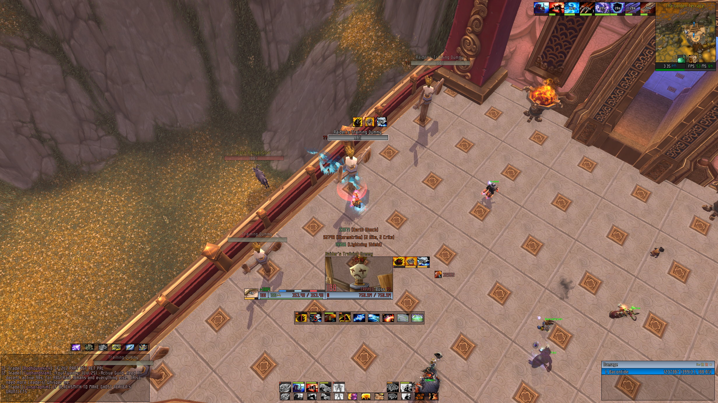
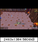
It only looks cluttered cause it shows most of everything at once and since I'm MS heal i'm mostly looking at the raid frames (DPS spec the raid frames are off to the side above Skada)
Here is a SS showing it in a less cluttered state.
Thanks
-
2012-12-24, 09:37 AM #9209The Patient
- Join Date
- Jul 2012
- Posts
- 293
Aye that screenshot looks nice! Is there a reason why you don't have the buffs placed next to the minimap? Originally Posted by bOOURNS
Also I'm very interested in how you managed to put the power bar "inside" the unitframes on your Player, Target and ToT frames (rather than it being the full width of the frame, I mean). I always found the configuration options for the power bar very limited in ElvUI settings but you managed to make it looks great.
I look forward to seeing the final result!
-
2012-12-24, 09:44 AM #9210High Overlord
- Join Date
- Jan 2012
- Location
- New Zealand
- Posts
- 155
Increasing the size of your nameplates by 1 pixel vertically would leave a nice 1 pixel gap between the text and border on both sides. Originally Posted by bOOURNS
-
2012-12-24, 09:46 AM #9211The Patient
- Join Date
- Sep 2012
- Posts
- 345
I was able to get the power bars like that cause i use Stuf unit frames. Been using Stuf for many years now cause they are by far the most customizable ones out there without a ton of lua effort. I continue to use Stuf with ElvUI for that fact that the Elv ones are somewhat limiting and Stuf's you have full control of where to place things. Originally Posted by Pixil
I suppose i can change the direction on my buffs so they start at my minimap. I think they were the way they are in the SS cause i believe the blizz default ones are like that as well. I changed it to start at the map from your suggestion though
Thanks!
---------- Post added 2012-12-24 at 02:50 AM ----------
ElvUI Nameplates. No matter what size the font i have wants to sit low in the bar. I might poke around and see if i can lua edit an offset. Originally Posted by OriginalVocalMix
***got it offset now. A 0.5 offset did the trick***Last edited by bOOURNS; 2012-12-24 at 09:55 AM.
-
2012-12-24, 10:34 AM #9212Epic!
- Join Date
- Jul 2010
- Location
- United Kingdom
- Posts
- 1,661
Changed my font to expressway free because it looks better! Got some pixel borders back but there's a few that still don't want to work.

I'm thinking about making the unit-frames taller as the font likes to take up quite a lot of the space now. I'll have a mess around with it after work. If I don't post again I wish everybody a Merry Christmas for tomorrow!
-
2012-12-24, 10:46 AM #9213High Overlord
- Join Date
- Jan 2012
- Location
- New Zealand
- Posts
- 155
I agree on that. Originally Posted by carebear
-
2012-12-24, 11:12 AM #9214Warchief

- Join Date
- Dec 2010
- Posts
- 2,072
 You might know the answer to my question since you configure ElvUI so much. Originally Posted by bOOURNS
How do you go about increasing the aura size on the elvui nameplates?
Cheers!
-
2012-12-24, 01:04 PM #9215DeletedI like the Expressway RG font way more than this. Originally Posted by carebear
-
2012-12-24, 01:58 PM #9216Epic!
- Join Date
- Oct 2012
- Posts
- 1,559
@bOOURNS; I like that target portrait idea, makes your ui look completely different to pretty much every other ui in here
@carebear; I agree with you the unitframew need a little more height.
Would post a screenie but I have no Internet at home until Thursday, posting from my phone.
Wishing you all a very merry Christmas and a prosperous new year!
-
2012-12-24, 11:49 PM #9217The Patient
- Join Date
- Sep 2012
- Posts
- 345
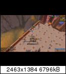
Quick update on my UI
With the help of the amazing author of Raven i got my buffs/debuffs via some edits to match the "rectangle" look from my actionbar and WeakAuras CD's.
-
2012-12-24, 11:51 PM #9218Field Marshal

- Join Date
- Sep 2011
- Posts
- 55
I can see myself in the screenshot! Originally Posted by bOOURNS
-
2012-12-25, 12:51 AM #9219Epic!
- Join Date
- Jul 2010
- Location
- United Kingdom
- Posts
- 1,661
One last update before santa comes!
Made the unit-frames bigger. Got pixel borders on nearly everything but it's annoying the hell outa me that some are broken and not aligned so I shoved multisampling up to 4x and now they all fit in, buuut they look a little bit 'fuzzy' again.

-
2012-12-25, 10:01 PM #9220The Patient
- Join Date
- Feb 2012
- Posts
- 216
Your UI! I MUST have it! what is that chat mod? Originally Posted by carebear


 Reply With Quote