Recent Blue Posts
 Limited PvP -> PvE Free Character Transfers
 Feedback: Hunter Updates
 Dragonflight Season 4 - Awakened Raid Rotation and Rewards
 MMO-Champion


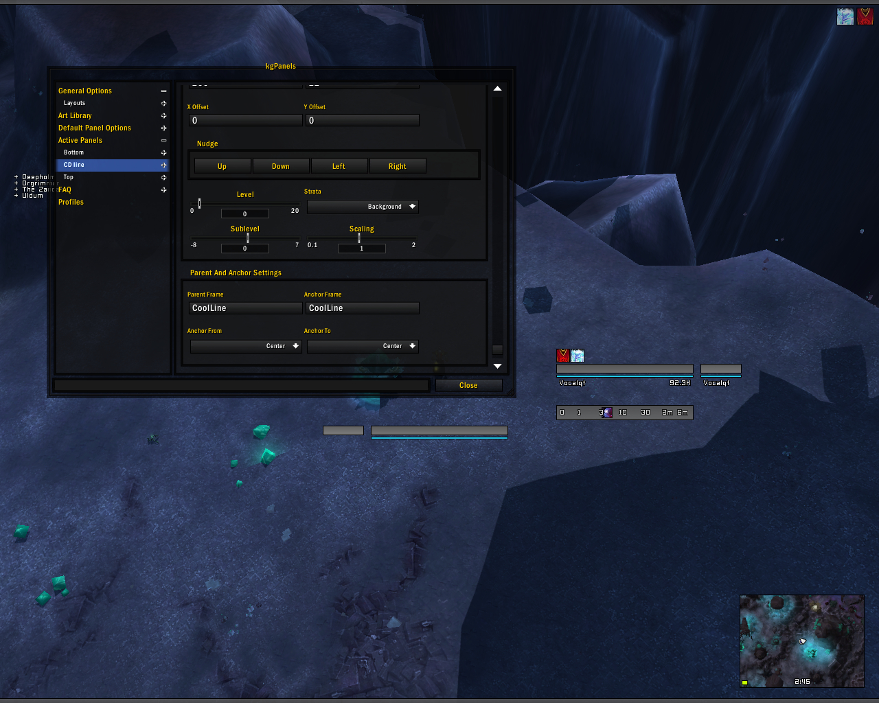
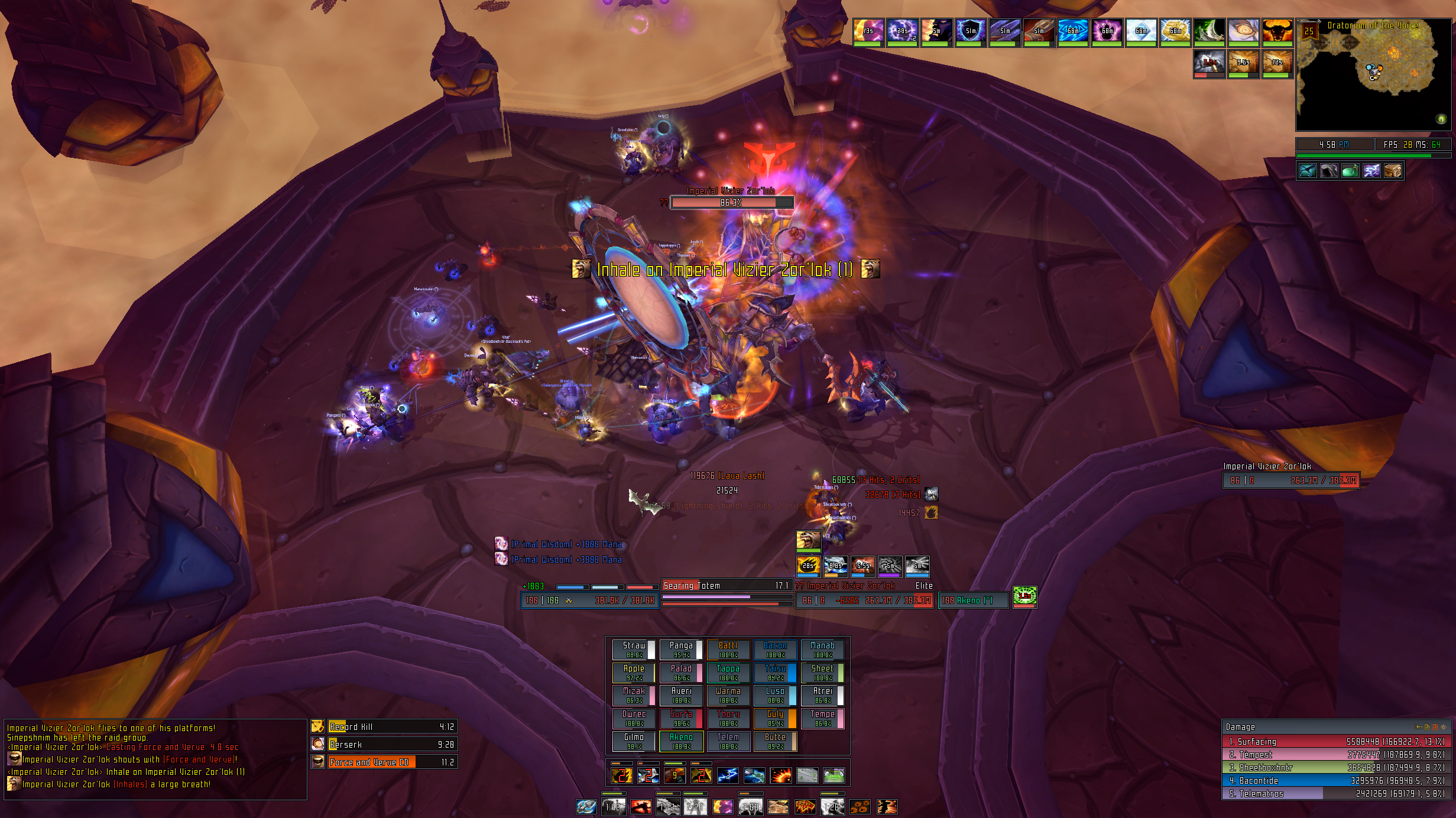
Update on a few changes in my UI.
- Disabled PixelMode in ElvUI (mode that changes borders to black 1px) so now everything matches that same look i created from my unit and raid frames. (raid frames had to be highly edited after turning off PixelMode cause it had created additional borders around the health and power bars. So edited to once again look like it did in PixelMode.)
- Changed the height of my chat frame kgpanels to match exactly the height of my Skada.
- Flame Shock duration and Unleash Elements cd Weakauras moved to inbetween player and target frames. Totem durations are above this. (replaces that portrait i used to have)
 Recent Forum Posts
Thread: Post Your UI
-
2013-01-15, 01:42 AM #9561The Patient


- Join Date
- Sep 2012
- Posts
- 345
-
2013-01-15, 01:50 AM #9562High Overlord
- Join Date
- Jan 2012
- Location
- New Zealand
- Posts
- 155
 Originally Posted by Drayarr

It's as simple as making the parent frame the Eclipse bar.
-
2013-01-15, 08:17 AM #9563Grunt
- Join Date
- Jul 2011
- Posts
- 24
Still not allowed to post links.. Heavily inspired by LED++.
Please give some feedback. I'm trying to get rid of the threat from the unitframes.
Omen only shows in combat and party. (Had that option off now though)
The UI at whole looks better on my other laptop with 1920x1080Last edited by mmocba105e19de; 2013-01-15 at 07:01 PM.
-
2013-01-15, 08:45 AM #9564Deleted
Hey guys!
I've used ElvUI for a long time, but I finaly got bored of it, and decided to build a new UI.
This is what I've gotten so far. Only thing I want to change at the moment are the raid frames, not really happy with these yet.
Please tell me what you think!
Not allowed to post images yet, anybody who can fix the image for me? Thnx!

Last edited by mmocba105e19de; 2013-01-15 at 07:01 PM.
-
2013-01-15, 08:50 AM #9565Epic!
- Join Date
- Jul 2010
- Location
- United Kingdom
- Posts
- 1,661
Looks good! It's a good LED inspired UI. That pixel font is one of the few I like and it fits in well. You just need to sort out your chatbox chat spacing and your omen texture/font placement. I'd also perhaps implement the EXP bar somewhere else. Seems a little out of place dumped at the top of the UI! Originally Posted by saami
Just thought I'd add mine with actionbars. Nothing major just added them at the bottom!

Last edited by Hulari; 2013-01-15 at 09:35 AM.
-
2013-01-15, 10:44 AM #9566Grunt
- Join Date
- Jul 2011
- Posts
- 24
Exp bar is just there for the time being... Originally Posted by carebear
I'll have a look at the omen font and texture displacement.
The fontspacing is a weird weird weird issue.
ElvUI places different channels under different objects. (My guess) Which makes the spacing easy for one object but spacing different channels is... Weird..Code:chat:SetFont("Interface\\Addons\\SharedMediaAdditionalFonts\\fonts\\font.ttf", 8, "OUTLINEMONOCHROME") chat:SetSpacing(3) chat:SetShadowOffset(0, 0)Last edited by saami; 2013-01-15 at 11:40 AM.
-
2013-01-15, 11:14 AM #9567Bloodsail Admiral
- Join Date
- Feb 2012
- Location
- NC
- Posts
- 1,011
So do you literally take everything out of the screen then start to add only what you need whening making these UIs or what? I would love to create a nice looking UI like some of these that are very minimal, but I just get lost in all of it and end up giving up and just going with a premade comp like ElvUI or something.
-
2013-01-15, 11:40 AM #9568Grunt
- Join Date
- Jul 2011
- Posts
- 24
Mine and some others around here are purly ElvUI. Originally Posted by galook
-
2013-01-15, 11:43 AM #9569Bloodsail Admiral
- Join Date
- Feb 2012
- Location
- NC
- Posts
- 1,011
I know that saami. I'm talking about people like carebear, LED, etc.
-
2013-01-15, 11:45 AM #9570High Overlord

- Join Date
- Feb 2011
- Posts
- 137
Personally, no. my UI is the product of many years of doing small changes a couple times a week, adding new addons to take care of a part of the default UI I don't like on the way. Originally Posted by galook
Then a major overhaul once a year or whenever I find out I just don't like how it has turned out in the long run.
What one person hides might be something the next person can't live without. I don't think most of these "nice looking UI's" you're talking about came to life within one day. Nothing is perfect, there's always something you want to change.
-
2013-01-15, 12:19 PM #9571Warchief

- Join Date
- Dec 2010
- Posts
- 2,072
 Hey! Originally Posted by carebear
Was wondering if you'd be able to send me your chat addon, and the changes you made to increase the line spacing and monochrome outline!
Cheers!
-
2013-01-15, 01:14 PM #9572Epic!
- Join Date
- Jul 2010
- Location
- United Kingdom
- Posts
- 1,661
Pretty much this. Just take a look at the link in my signature and you'll see just a handful of my screenshots I've found since Wrath. Originally Posted by TellyTop
I won't be able to give you the chat addon but you can download it yourself. It's PhanxChat from wowinterface. Then all you'll need to do is copy this bit of code anywhere in the core.lua file inside PhanxChat. Originally Posted by solvexx
Code:ChatFrame1:SetSpacing(3) ChatFrame1:SetShadowOffset(0,0) ChatFrame2:SetSpacing(3) ChatFrame2:SetShadowOffset(0,0) ChatFrame3:SetSpacing(3) ChatFrame3:SetShadowOffset(0,0)
That will create spacing for the first 3 chat boxes you have on screen. If you want that many.
-
2013-01-15, 01:17 PM #9573Warchief
- Join Date
- Dec 2010
- Posts
- 2,072
Perfect, thank you very much. Originally Posted by carebear
Last edited by solvexx; 2013-01-15 at 01:23 PM.
-
2013-01-15, 01:26 PM #9574High Overlord
- Join Date
- Mar 2011
- Posts
- 110
That's what I do. Whenever I want to start my UI from scratch, I just get rid of every single addon. Then I install addons 1 by 1. Make sure you completely configure your addon before moving on, or else you'll be overwhelmed quickly. Originally Posted by galook
When you're done with configuring your addons, then just start getting SharedMedia etc and use the same or similar fonts throughout your UI and at the very end, if needed, get KgPanels.
-
2013-01-15, 01:39 PM #9575Epic!
- Join Date
- Oct 2012
- Posts
- 1,559
Yeah, may take a day to setup most stuff, but you find yourself tweaking here and there for weeks. Originally Posted by TellyTop
Perfection is definitely not an easy thing to obtain in my UI at least
---------- Post added 2013-01-15 at 01:41 PM ----------
Looking really nice. Originally Posted by carebear
However, I'm not so fussed on the visible bars, 3 seems a bit much, so used to your UI's not having any bars.
Change alpha in/out of combat? :P
-
2013-01-15, 01:52 PM #9576Bloodsail Admiral
- Join Date
- Feb 2012
- Location
- NC
- Posts
- 1,011
No, I mean getting rid of everything on screen to where there's absolutely nothing to see period in combat or not. Writing from scratch I guess then. Originally Posted by psychoholic123
-
2013-01-15, 02:59 PM #9577Field Marshal

- Join Date
- May 2011
- Posts
- 86
Sorry i'm using different UI now, but still have interface and WTF back up for my old UI. If you want to use it you need to change profile by your self Originally Posted by Lea


-
2013-01-15, 06:25 PM #9578High Overlord
- Join Date
- Mar 2011
- Posts
- 110
You want to remove everything from the screen, then configure/build your UI? Originally Posted by galook
If I understand you correctly, then that shouldn't be too difficult.
Install the main addons you would like to use (Bartender, Shadowed UF and a minimap addon for example), then simply configure these addons to never show anything but also hide the blizzard frames.
Basically, replace every blizzard frame with an addon, set the addon to "hide" and then start configuring your UI. I've never tried that method but it sounds interesting.
EDIT: or just get an addon that will hide blizzard frames automatically, and go from there.
But personally, I would simply go with process of elimination by starting out with the default UI and replacing every component.
-
2013-01-15, 06:39 PM #9579High Overlord

- Join Date
- Jun 2011
- Location
- Scotland
- Posts
- 148
When you say you get "lost" when you try make a minimal UI, I totally understand that feeling. I think if you go out and try to deliberately make a UI that is minimal and nothing else, you're gonna have a bad time. When I was making my own UI, which in my opinion is pretty minimalist, I know that my goal wasn't to make it minimalist. My goal was to make a functional UI that showed me only the information I needed to see in a nice, readable format. The minimalism just sort of came after that. I would worry more about layout and what raw information is being shown first, then worry about making it "minimalist". I'd much rather have a UI that gave me exactly what I needed than one that gave me too little or even too much. Originally Posted by galook
-
2013-01-15, 06:58 PM #9580Epic!

- Join Date
- Oct 2007
- Posts
- 1,562
I like sketching my larger UI projects by hand before I start, but maybe that's just me. Originally Posted by galook
Otherwise; yes. Literary remove everything on your screen, and add back each element by element.
You'd strike more consistency by also adding a 1-pixel border to your Damage Meter, and fixing a proper border to your Minimap. (The current seem awfully blurry. Probably due to poor scaling). Originally Posted by OriginalVocalMix
Also pull up your Eclipse Bar so that it's aligned halfway between the Starsurge icon and Celestial Alignment.
And there's over-lapping text on your Boss frame.Last edited by Cowt; 2013-01-15 at 07:05 PM.

 Reply With Quote