 Dark Heart PTR Development Notes
 Dark Heart PTR Development Notes
 The War Within 20th Anniversary Collector's Edition Coming to Blizzard Gear Store
 Are we approaching a Solo Raid WoW Experience?
 MMO-Champion


So...no timers at all but instead a simple square/symbol that changes color at a determined duration like < 2 secs?Originally Posted by Aves

Could give it a try, but an actual timer is much easier to manage and can bring additional info imho. Worth a try nontheless. Thanks for feedback.
 Recent Blue Posts
 Recent Forum Posts
Thread: Post Your UI
-
2013-01-29, 09:08 AM #9861Fluffy Kitten


- Join Date
- Apr 2009
- Posts
- 17,226
Non ti fidar di me se il cuor ti manca.
-
2013-01-29, 09:30 AM #9862The Patient

- Join Date
- Aug 2010
- Posts
- 220
Its hard to get that done with Grid 2; you need to do some .lua editing. It can be done easy with vuhdo. Hoewer here is a link where i discused with a guy that done that (transparent healt on grid2) => http://www.wowuigallery.com/topic/xzim-ui-v2 In the end i still kept vuhdo, grid 2 didnt mange to give me all options i was looking for.
-
2013-01-29, 10:00 AM #9863DeletedI dont mind, ill try to fix the borders myself. Originally Posted by Shyzhi
-
2013-01-29, 11:02 AM #9864DeletedAh, I see. Very sleek indeed. Originally Posted by Quse
-
2013-01-29, 11:29 AM #9865Fluffy Kitten
- Join Date
- Apr 2009
- Posts
- 17,226
Other questions since my work in timers is nearly finished and i want to do some other tweaks.
- Name/HP: atm the name is in center and changes to missing hp (like -20k3); would it more useful to have the name always displayed (like on bottom) and the hp on top/center of the frame? Also, better to have the number or a % (some boss mechanics favor percentages afaik).
- Incoming heals: are they useful or not? Making them wouldn't be that hard honestly, but it's something i'm not completely sure if it's useful or just clunky and redundant.
@drglenn: yes it works like in QuseUI, didn't find a better idea to come out with.Non ti fidar di me se il cuor ti manca.
-
2013-01-29, 12:19 PM #9866The Patient
- Join Date
- Aug 2010
- Posts
- 220
Name should apear especially if you do lfr or 25men. It may happen that a person has to do some specific tasks like a mage kiting. How do you spot that mage in a 25men raid if there are 5more of them? Ofc you can keep focus etc. Also if you are in a raidleading position you can see who fails for bonus blames:P Originally Posted by Coldkil
% or HP deficit in numbers This depends on healing style. Usually if you know your class well and exact healing output a spell has (in numbers) HP deficit in numbers can help. You see what amount you need and can act fast with the spell that can fill that up. However considering the hectic in nowadays raids you wont realy have time to do basic mats so %hp should be enough.
Incoming heals are usefull so you dont do that much of overheal/manawaste
-
2013-01-29, 01:12 PM #9867Blademaster
- Join Date
- Jan 2010
- Posts
- 35
@Deemaxm thanks for that link, i tried the files and found somewhat the same config as i already achieved with standard grid2 config editing in game, expect for the transparent background on health-deficit. Sadly in that example the health-deficit is still not class colored in that profile. Guess i need to try Vuhdo or (for the challenge sake) edit grid lua.
@Coldkil exactly that is what i meant, i had rejuv, regrowth and wild growth in the corners and lifebloom stacks in the center, replacing the name. I have never found the %Hp or HP missing a useful thing to see. The name and incoming heals however are very usefull what i'm concerned.Last edited by Aves; 2013-01-29 at 01:22 PM. Reason: spelling errors
-
2013-01-29, 01:18 PM #9868Fluffy Kitten
- Join Date
- Apr 2009
- Posts
- 17,226
Thanks again; i think i'm going with an option to choose between hp and % so eveyone will be pleased.
Non ti fidar di me se il cuor ti manca.
-
2013-01-29, 01:26 PM #9869DeletedGorgeous. Nice job. Originally Posted by Jeremypwnz
-
2013-01-29, 02:50 PM #9870Bloodsail Admiral

- Join Date
- Oct 2011
- Posts
- 1,147
Thanks! Originally Posted by Chult

-
2013-01-29, 05:28 PM #9871Fluffy Kitten
- Join Date
- Apr 2009
- Posts
- 17,226
Messed something with my priest - here's the results.
I must say that hp% is way better than missinghp. Anyway i added the option to disable hp text totally. Just wondering if the new format is looking good with vertical bars, i assume that now if it would be better with standard horizontal ones.Non ti fidar di me se il cuor ti manca.
-
2013-01-29, 06:32 PM #9872Stood in the Fire
- Join Date
- Sep 2008
- Posts
- 441
I don't like the # symbol. Have you tried a + symbol? The # symbol at that point size looks like a fuzzy blob.
-
2013-01-29, 06:40 PM #9873Fluffy Kitten
- Join Date
- Apr 2009
- Posts
- 17,226
The # is a placeholder, i could use a symbolfont just in case, but i didn't want to ad a font just for that. Trying with a + anyway, should look better.
Non ti fidar di me se il cuor ti manca.
-
2013-01-29, 07:08 PM #9874Bloodsail Admiral
- Join Date
- Feb 2012
- Location
- NC
- Posts
- 1,011
Think I finally got it to where I want everything. Now I just need to find textures/fonts/etc that I like which I think is harder imo.
And I'm just not liking my weakauras there, any ideas on those?
OOC:

Last edited by mmocba105e19de; 2013-01-29 at 07:18 PM.
-
2013-01-29, 11:10 PM #9875Mechagnome
- Join Date
- Feb 2011
- Posts
- 649
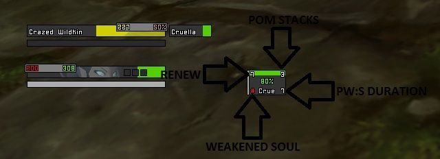
Here is my shot at utilizing healing frames: Originally Posted by Coldkil

While done with Grid, the layout can be adapted in ouf (what I plan to do Soon(tm)).
The basic concept is to have the class defining HoT or spell on the lower half.
For my disc priest it's PW:S amount left layered with the duration of the weakened soul debuff if no shield is left.
For monks it's Renewing Mists duration, druids Life Bloom duration (no stack coloring yet or could color as a refresh notice sub 3(?) sec), shaman Riptide duration, not sure what I put there on my paladin - haven't played him in a while.
-
2013-01-30, 01:36 AM #9876Brewmaster

- Join Date
- Sep 2011
- Posts
- 1,267
Updated stuff

Have a weird gap in my cast bar between the texture and the edgefile. No clue what I'm doing there.
I feel like I need a new place for my duration things that are above my cast bar.
-
2013-01-30, 02:58 AM #9877High Overlord

- Join Date
- Nov 2010
- Posts
- 194
I personally would switch the Weakened Soul indicator to a timer because knowing WHEN you can shield the person the next time is more important than for example knowing the exact number of stacks your PoM has on anyone in the raid. So you could use the +" there. Originally Posted by Coldkil
Last edited by Stanzilla; 2013-01-30 at 05:40 AM.

-
2013-01-30, 03:27 AM #9878The Patient

- Join Date
- Sep 2012
- Posts
- 345
I found at least 20 places where you have the border missing on a side of something, and spots where your borders are 2px thick instead of 1 (2nd column right side and 2nd row bottom side of the huge block of buffs not sure which frame they are for.) Originally Posted by Jeremypwnz
As for the gap in the castbars looks like you have the bg texture inset too much.
-
2013-01-30, 03:49 AM #9879High Overlord

- Join Date
- Dec 2011
- Location
- West Virginia/Maryland
- Posts
- 167

My ui and im proud of it

Last edited by mmocba105e19de; 2013-01-30 at 06:48 AM.
-
2013-01-30, 05:12 AM #9880Brewmaster
- Join Date
- Sep 2011
- Posts
- 1,267
On the cast bar there's a framebd.inset and it does it for everything it seems. I just figured out how to change it up, working on it. Originally Posted by bOOURNS
DBM is dumb with borders, I'll try to change something to see it it fixes anything. I tried using !dbm but the SetFont really doesn't want to change, although everything else works.
Things at certain heights cause things to make the border 2x, like with the focus-buffs which I actually don't really need to know after you pointed those out.

 Reply With Quote


