Recent Blue Posts
 Limited PvP -> PvE Free Character Transfers
 Feedback: Hunter Updates
 Season of Discovery - Limited Free Character Transfers from PvP to PvE Realms
 MMO-Champion


Hi,
Can anyone tell me what the addon is underneath the map of Lanttuftw?
--
Robert
 Recent Forum Posts
Thread: Warlock UIs
-
2010-01-13, 03:06 PM #581Blademaster

- Join Date
- Jan 2010
- Posts
- 35
Re: Warlock UIs
-
2010-01-13, 03:28 PM #582Mechagnome

- Join Date
- Sep 2009
- Posts
- 727
Re: Warlock UIs
Wauw, I just love that addon used on the buttom , Could you perhaps give me the name of that one? ( the purple skulls thingies surrounding your bars and target/player frames) Originally Posted by Jenerena
i guess that goes with AG unitframes and/or bartender? made by Shyama
-
2010-01-13, 03:50 PM #583Grunt
- Join Date
- Jan 2010
- Posts
- 16
Re: Warlock UIs
It's Fortexorcists Healthstone / Soulstone tracker. Originally Posted by Aves
E: typo :P
-
2010-01-13, 05:14 PM #584Legendary!


- Join Date
- Aug 2008
- Location
- Vancouver, BC, Canada
- Posts
- 6,002

Re: Warlock UIs
Jerena - Vertical bars, which addon are those?

R.I.P. YARG
-
2010-01-14, 04:14 AM #585Deleted
Re: Warlock UIs
I believe it's ButtonTimers
http://wow.curse.com/downloads/wow-a...tontimers.aspx
-
2010-01-14, 07:02 AM #586Field Marshal

- Join Date
- Jan 2010
- Posts
- 98
Re: Warlock UIs
Changed a few things:
Edited party frames
hid keybinds
added some more panels :P
edited raid frame fonts
Addons:
Stuf
Recount
Omen
Dominos
Buttonfacade
acbCastbar and forte
=)
-
2010-01-14, 09:08 AM #587Brewmaster

- Join Date
- Aug 2009
- Posts
- 1,456
Re: Warlock UIs
It is button timers. Nice if you're a clicker or you can bind the buttons to save space on your action bars, though this can be complicated if you use your offspec often. Originally Posted by gherkin
@Thurisaz, the skin is a BTex skin, if you download it from here:
http://wow.curse.com/downloads/wow-a...ails/btex.aspx
You can also download extra skins to import though the one i'm using should already be included (can't remember). It is called Demonic and should be on the list of skins you can choose. The default colour is in fact grey, but somehow i made it purple, and i can't remember how, but yea, it's possible. Hope this helps...
-
2010-01-14, 05:20 PM #588Legendary!
- Join Date
- Aug 2008
- Location
- Vancouver, BC, Canada
- Posts
- 6,002
Re: Warlock UIs
Nice, thank you. I've been working on my own mod for quite some time and never got it to work properly. Working examples ftw! Originally Posted by Jenerena
R.I.P. YARG
-
2010-01-14, 05:29 PM #589Mechagnome
- Join Date
- Mar 2008
- Posts
- 537
Re: Warlock UIs

Here's mine
-
2010-01-14, 10:01 PM #590Mechagnome

- Join Date
- Jun 2008
- Posts
- 703
Re: Warlock UIs
Here's mine then.
 - -
- -  - -
- - 
-
2010-01-15, 01:46 PM #591Brewmaster
- Join Date
- Aug 2009
- Posts
- 1,456
Re: Warlock UIs
Took a better example earlier: Originally Posted by gherkin

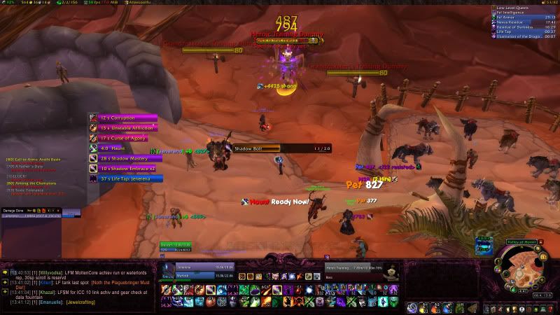
As you can see i have added some debuffs etc, and the bottom one is there for eradication when it procs. You do have to set it up properly however, for each spec. If you have trouble let me know and i'll try my best to help. You can also change the colours etc. I really like it as it's bright, the bars actually scale with time left so you always catch it with the corner of your eye (if you get me), and the bars don't swap around with time left so you get to know which dot is where on the list. I've been impressed with it so far. But like i say, takes some configuring to get right.
-
2010-01-16, 05:06 PM #592The Patient
- Join Date
- Jun 2008
- Posts
- 265
Re: Warlock UIs
What a mess of a UI. In terms of functionality, you have a ton of useless information showing and all the elements of your UI are much bigger than they need to be which takes up room on your screen where you could be watching the rest of the raid. You are also doubling up a lot of information - default floating combat text and an addon for floating combat text, keybinds and shown buttons, shown buttons and SCT telling you when things are off cooldown. In terms of form, its just ugly. The default font for SCT is goofy looking and the default nameplates look very crude. At a glance I can see 6 different addons that have bars - recount, elkano, your dot timer, the unit frame addon, grid and quartz - and you are using 6 different bar textures which makes the whole UI look extremely sloppy. Originally Posted by Jenerena
-
2010-01-17, 02:43 PM #593Brewmaster
- Join Date
- Aug 2009
- Posts
- 1,456
Re: Warlock UIs
Well, that was straight to the point. Originally Posted by Merckx
First of all, i have the attention span of a fish, and having as much as possible available to show cooldowns etc is the only way for me to remember certain things. I could easily hide my bars, but since i use this default ui/bars setup (btex) there's hardly any point...really. I like having a neat ui setup at the bottom, it works great for me. I hardly think that part of my ui is ugly at all.
As for your other points, yes, the rest of the screen is a little sloppy. I don't necessarily need the default CT above the target, but never mind. I don't necessarily need MSBT, but some of it i do pay attention to, some of it i don't. So essentially i use alot of addons but only small aspects of it, that works ok for me. The font of MSBT tells me what i need to know, i don't care what font it is. I have thought about changing the default nameplates but not that fussed. I got rid of the ingoing/outgoing thing on msbt, and changed the font.
I don't care about having all different colour bars, why does that matter? Unless your eyes can only see one colour...
It is all a matter of personal opinion, and i will take into account some of the things you said, but i don't think it looks sloppy myself, and i like my UI at the moment. It doesn't affect my performance, and i can see perfectly well what is going on around me. To be honest, nobody should feel like they have the right to criticise someone elses UI which is their own work, what works for THEM and is their computer screen. I don't care if you don't like it, fact is, i like it and it works fine for me.
-
2010-01-17, 04:08 PM #594Blademaster

- Join Date
- Oct 2009
- Posts
- 32
Re: Warlock UIs
He/she has the right to criticize it. But you also have the right to dismiss it, or rather, take into account what his/her criticism is, but not let it affect you or your UI. Like you said, it is all about personal opinion, and it is all about how it works best for you, but sometimes criticism is helpful and appreciated it, and so he/she should have the right to comment on it. Especially if you're putting it up on a forum for others to see. :P Originally Posted by Jenerena

-
2010-01-17, 05:15 PM #595Mechagnome
- Join Date
- Jun 2008
- Posts
- 703
Re: Warlock UIs
I think the point about the bars weren't the colours, but the textures. For instance, on on that cooldown thing on the middle left the texture is a gradient going from dark to light to dark again, while on your unit frame you have a different texture, a softer gradient going just from dark to light, while your cast bar uses an entirely different one, the LiteStep texture.
Basically it just says that you haven't really fully configured your addons, and maybe you don't care about minor details like that, but the person criticising your UI obviously did. The other points are much to the same effect, using the default settings for a lot of things displayed, you aren't really making a UI then, so much as just dumping some addons into your wow folder. It's a little different to properly desiging your UI to be space efficient and attractive while also being easy to use and show you the information you need.
I am not criticising your UI though, simply explaining what my interpretation of what Merckx meant. Obviously a certain amount is down to personal preference, and while you obviously don't mind different textures and such, I think Merckx did :P
-
2010-01-17, 08:41 PM #596Brewmaster
- Join Date
- Aug 2009
- Posts
- 1,456
Re: Warlock UIs
Funnily enough, my intention WAS to design my ui to be space efficient and attractive...and i think it is. It shows the information i need, and is easy to use...as you said. Originally Posted by Raeli
Don't copy it if you don't like it. But whoever does like it, feel free. Because we all have a different opinion about how a UI should look like. I just posted it so people could get some ideas, that is, people who like the kind of thing i have done, and aren't bothered about it being perfect and perfectly textured/coloured (i don't make videos).
-
2010-01-17, 08:45 PM #597Mechagnome
- Join Date
- Nov 2009
- Posts
- 622
Re: Warlock UIs
@ Jenerena, the reason your UI looks messy, is that (i think) Your Quartz is all the way up there. You could move it further down. Also, the ButtonTimers looks kinda .. random, so if you could find somewhere else it could be, that'd be quite cleaner.
I said cleaner, not clean (:http://www.mmo-champion.com/general-discussions-22/world-of-warcraft-lore-by-richard-knaak-(spoilers)/
-
2010-01-17, 11:04 PM #598Blademaster
- Join Date
- Jan 2010
- Posts
- 43
Re: Warlock UIs
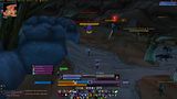
[IMG width=300]http://img251.imageshack.us/img251/9517/picture1yg.png[/img]
Here is mine! I like it to keep it clean so I don't use many interface modifications/screen fillers. My quartz cast bar appears centered above the nameplates and when in raid my party is in the top left and the 25 raid members in the dark area on the bottom right.
-
2010-01-17, 11:05 PM #599Mechagnome
- Join Date
- May 2008
- Location
- Anchorage, Alaska
- Posts
- 696
Re: Warlock UIs

-
2010-01-18, 01:45 AM #600Brewmaster
- Join Date
- Aug 2009
- Posts
- 1,456
Re: Warlock UIs
Better? :P
With action bars...not sure what to do there... feels very naked not being able to see them :-\.
Anything i could do better? I was thinking about moving the frames even further down to create even more space. Not quite sure what i'm doing with grid/omen/recount yet either. Trying skada/threat meter for now.

 Reply With Quote