 Recent Blue Posts
 Feedback: Death Knight Updates
 Feedback: Death Knight Updates
 Has WoW removed the speed limits?
 Are we approaching a Solo Raid WoW Experience?
 MMO-Champion


I'll be honest, the bottom of your previous UI was fine, I think it was just the main playing area that was perceived as a little messy. What with the cast bar's location, and the button timer thingy's location.
As for action bars, well personal preference, I can understand why people might like to show them. Personally though I'd prefer no buttons on screen - unfortunately I don't trust myself binding potions, I always end up hitting that exact key by mistake - I never hit the wrong key until I start binding pots, and then I mash them all the time, god knows why, but I don't really fancy wasting pots, so I have a couple of buttons on screen unfortunately :P
 Recent Forum Posts
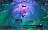
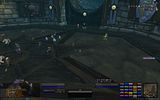
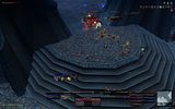
Thread: Warlock UIs
-
2010-01-18, 05:15 AM #601Mechagnome


- Join Date
- Jun 2008
- Posts
- 703
Re: Warlock UIs
-
2010-01-18, 05:29 AM #602Grunt


- Join Date
- Nov 2009
- Posts
- 14
Re: Warlock UIs

Thats OOC.

thats in combat.
Spells that are not on my bars are on invisble bars and menus.
-
2010-01-18, 08:31 AM #603Brewmaster

- Join Date
- Aug 2009
- Posts
- 1,456
Re: Warlock UIs
It was fine, but maybe a little unnecessary. It does look alot more clear. I might show a few things, and hide everything else so i can move them down a bit. The playing areas has been reduced by getting rid of the background (no space for cast bar etc), i got rid of omnicc and am using the cooldown timer, so no need for action bars. Got rid of MSBT as well, don't use it. Originally Posted by Raeli
-
2010-01-18, 10:54 AM #604Deleted
Re: Warlock UIs
Changed the 25-man layout so that the healthbars are the same colour as the others with class-coloured names. Any (well, most) comments or suggestions welcome, run out of things I can think to tinker with.
-
2010-01-18, 11:40 PM #605Brewmaster
- Join Date
- Aug 2009
- Posts
- 1,456
-
2010-01-19, 06:00 AM #606The Patient
- Join Date
- Jun 2008
- Posts
- 265
Re: Warlock UIs
At no point did I mean to attack you personally as a player or a human being, I was just posting my thoughts regarding your UI, I hope you didn't take it personally Originally Posted by Jenerena

I posted in response to someone else's UI earlier in the thread that I think that having too much information displayed actively decreases the amount of useful information you can take in. That's why I mentioned the redundancies I saw in your UI. As for the aesthetic stuff, I specifically mentioned that I was talking about the "form" of the UI - I know that the font and the bar textures aren't going to make you a better play, they are just ways to make the UI look pretty.
I think your new versions look MUCH better than the old ones. I still think that showing your action bars is a waste of space, but I haven't found enough people to jump on that bandwagon and hide everything. I personally only have 1 button showing in my UI - dark pact - so that I know if I am in range of my pet.
-
2010-01-19, 08:47 AM #607Brewmaster
- Join Date
- Aug 2009
- Posts
- 1,456
Re: Warlock UIs
That's ok, i perhaps took it more personally than i should have done.
Which one would you say is better? The second is what i have currently.
-
2010-01-19, 03:58 PM #608Mechagnome
- Join Date
- Jun 2008
- Posts
- 703
Re: Warlock UIs
Well that's up to you :P Originally Posted by Jenerena
I must admit I do like the layout of the second one better though as well.
-
2010-01-19, 04:03 PM #609Mechagnome
- Join Date
- Nov 2009
- Posts
- 622

Re: Warlock UIs
Great UI's! The first one is better IMO! Originally Posted by Jenerena
http://www.mmo-champion.com/general-discussions-22/world-of-warcraft-lore-by-richard-knaak-(spoilers)/
-
2010-01-19, 04:10 PM #610Mechagnome
- Join Date
- Nov 2009
- Posts
- 622
Re: Warlock UIs
http://www.mmo-champion.com/general-discussions-22/world-of-warcraft-lore-by-richard-knaak-(spoilers)/
-
2010-01-19, 04:11 PM #611Titan

- Join Date
- Aug 2009
- Location
- Uk - England
- Posts
- 14,100
Re: Warlock UIs
I've always just used the standard blizzard ui and arrange things such as grid, dbm, omen, recount, coords around the spare space due to using a widescreen monitor.

-
2010-01-19, 04:29 PM #612The Lightbringer

- Join Date
- Nov 2007
- Posts
- 3,397
Re: Warlock UIs
This would be great. Any chance for adding ForteXorcist also? Originally Posted by iLive
-
2010-01-19, 09:21 PM #613Blademaster

- Join Date
- Oct 2009
- Posts
- 32
Re: Warlock UIs
Made a couple of changes to my UI


-
2010-01-20, 03:00 AM #614The Unstoppable Force

- Join Date
- Apr 2008
- Location
- Sweden
- Posts
- 24,644
Re: Warlock UIs
But soon after Mr Xi secured a third term, Apple released a new version of the feature in China, limiting its scope. Now Chinese users of iPhones and other Apple devices are restricted to a 10-minute window when receiving files from people who are not listed as a contact. After 10 minutes, users can only receive files from contacts.
Apple did not explain why the update was first introduced in China, but over the years, the tech giant has been criticised for appeasing Beijing.
-
2010-01-20, 12:45 PM #615Deleted
Re: Warlock UIs
Why do you have skada showing while solo/idle? Looks like it could do with a resize as well. Originally Posted by Bakis
Minimap a bit messy for my liking, you need to see those buttons?
I think unitframe portraits detract from the 'clean' look.
5% Alpha - I can still see 'em.
Map, UF, Skada, Chat... - 1 font to rule them all?
This is the best I can come up with right now. I'll post my current tonight, if you fancy retaliation. Have at you. Noob :P
-
2010-01-21, 02:51 AM #616Deleted
Re: Warlock UIs
-
2010-01-21, 04:16 AM #617The Unstoppable Force
- Join Date
- Apr 2008
- Location
- Sweden
- Posts
- 24,644
Re: Warlock UIs
yea I should fix the font just lazy Originally Posted by ratskinmahoney
 I play on a 26" so I cant really say minimap icons in some corner bothers me. If so your UI showing fps, number of frost badges u got, bagspace bother you I guess
Showing BLZ buffs in default and spamminng nametags on enemies as default is something that clutter gamespace if anything.
Cheers!But soon after Mr Xi secured a third term, Apple released a new version of the feature in China, limiting its scope. Now Chinese users of iPhones and other Apple devices are restricted to a 10-minute window when receiving files from people who are not listed as a contact. After 10 minutes, users can only receive files from contacts.
Apple did not explain why the update was first introduced in China, but over the years, the tech giant has been criticised for appeasing Beijing.
-
2010-01-21, 09:59 AM #618Keyboard Turner
- Join Date
- Jan 2010
- Posts
- 6
Re: Warlock UIs
I downloaded it, but it looks absolutely messed up. How would I make it like yours? Originally Posted by Cherti
http://i45.tinypic.com/es6u1j.jpg
-
2010-01-21, 10:03 AM #619High Overlord
- Join Date
- Jul 2009
- Posts
- 104
Re: Warlock UIs
Read the description.. you probably didnt replace the WTF folders Originally Posted by Melancholy
-
2010-01-21, 10:48 AM #620Keyboard Turner
- Join Date
- Jan 2010
- Posts
- 6
Re: Warlock UIs
I did, looks better now. I think I need to change my resolution accordingly. It doesn't fit, and I don't know how to change it to 1650x1000 or whatever. Any tips?

 Reply With Quote


