 Recent Blue Posts
 Feedback: Mage Updates
 Feedback: Mage Updates
 WoW as Free to Play in the model of Hearthstone
 Rate the transmogrification set above you!
 MMO-Champion
'sup people?
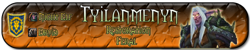
Last week I got my photoshop working. Today, I decided I might try to create my personal signature for use on these forums. Now the signature is done to me, and I would like to ask all of you for your opinion on it.
# Update 1 :
# Update 2 :
# Update 3:
Please note that this is the first signature I've ever made, so be easy on me
 Recent Forum Posts
Thread: My very own Signature image :D
-
2011-01-25, 01:53 PM #1Deleted
My very own Signature image :D
Last edited by mmoc23d8b33cbb; 2011-01-25 at 04:43 PM. Reason: Updated the signature to 500x100.
-
2011-01-25, 01:53 PM #2Deleted
I think I love it, lol.
-
2011-01-25, 01:55 PM #3Bloodsail Admiral

- Join Date
- Jun 2008
- Location
- 127.0.0.1
- Posts
- 1,017
I'm fairly sure it's too big.
Look into the forum rules and have a look.
Other than that, it's rather cool
-
2011-01-25, 02:28 PM #4LOAD"*",8,1

- Join Date
- Nov 2008
- Location
- Legion of Doom Headquarters
- Posts
- 20,245
Aye. Far too big. I'll give you a chance to fix it on your own, but if another mod see's it, it will likely get removed.
-
2011-01-25, 02:36 PM #5DeletedThanks for the headsup, I will resize it before I re-use it as a sig.
 Originally Posted by Fuzzzie

Yeah, I got that aswell, but I couldn't think of anything to make myself that actually looked good on this, so I just took this extremely simple druid-color background. Originally Posted by -Dalliah-
EDIT: I've updated the original post with the new, re-sized 500x100 image, and added a texture to the background, just to see how it looks.Last edited by mmoc23d8b33cbb; 2011-01-25 at 02:46 PM.
-
2011-01-25, 04:09 PM #6Field Marshal

- Join Date
- Jan 2011
- Posts
- 82
I'd kill the bevels your using (or at least the one on the druid cutout) they make the character stand out too much, almost seems like hes floating above the rest of the piece. I'd also consider killing the inner-shadow on the name, its really reducing the legibility (not that the typeface helps, but I can see why you chose it). Other than that, pretty spiffy. May want to rethink the orange-to-yellow gradient on the rest of the text - its kind of getting lost in the background.
-
2011-01-25, 04:28 PM #7Deleted
Thanks, ares1013. I didn't remove the gradient because I kinda like it myself, it's just some generic info, and not that important to be the eye-catcher of the image. Also, it doesn't have inner-shadow on the name, and the text is orange to green :P
Updated again. More constructive commentary is greatly appreciated
-
2011-01-25, 04:35 PM #8Miss Doctor Lady Bear

- Join Date
- Mar 2009
- Location
- San Francisco
- Posts
- 15,651
My main comment would be that the name is difficult to read. Between the strange font and the fade to black, it's not readable at a glance. I'd recommend either changing the font or changing the color (making it all gray, or fading to something lighter than pure black, maybe).
Also, still a bit over the max allowed size because it should be at most 100px high total, including the quote.
-
2011-01-25, 04:46 PM #9DeletedRemoved my Signature quote, so it's just the picture (500x100) now. The name is more light now, but due to it being a WoW sig, I'll keep the Morpheus font on it. Originally Posted by Sunshine
-
2011-01-25, 04:51 PM #10Miss Doctor Lady Bear
- Join Date
- Mar 2009
- Location
- San Francisco
- Posts
- 15,651
Much better
-
2011-01-25, 04:52 PM #11Titan

- Join Date
- May 2010
- Location
- oregon
- Posts
- 11,177

Looks good to me.
-
2011-01-28, 06:30 AM #12Mechagnome

- Join Date
- Sep 2009
- Location
- Evans, GA
- Posts
- 542
Thunderfury! I approve! Originally Posted by Bravehéart
-
2011-01-28, 06:32 AM #13Herald of the Titans

- Join Date
- Dec 2010
- Posts
- 2,844
I really like the 3rd update

-
2011-01-28, 01:44 PM #14Deleted
Glad to hear that it's good now
I'll stick to this then ^_^
Thanks all for your constructive replies =3
-
2011-01-28, 01:50 PM #15Deleted
Not too bad mate
Only thing I'd suggest is maybe using a different glow colour on the smaller text, as yellow doesn't really cause it to stand out so much with it being so close to your background color.
Otherwise thumbs up
-
2011-01-28, 01:55 PM #16Deleted
looks awesome


 Reply With Quote


