 Limited PvP -> PvE Free Character Transfers
 Mythic+ Dungeon Adjustments - 27 April
 Season 4... Just old dungeons and new ilvl?
 MMO-Champion


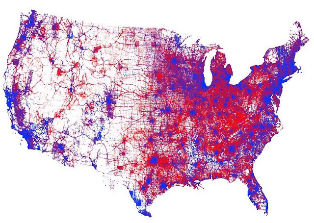
Last week ArcGIS cartographer Kenneth Field posted a quick-and-dirty dasymetric dot density map of the 2016 U.S. presidential election results.
Where one dot equals one-vote.
Showing a much more nuanced picture of the US election than the simpler county or state level maps.
So how to make the map? Well, it's a product of a number of decisions, each one of which propagates into the map. I'll be doing a proper write-up on the ArcGIS blog in due course but, in summary, a dasymetric map takes data held at one spatial unit (in this case counties) and reapportions it to different (usually smaller) areas. It uses a technique developed by the late Waldo Tobler called pycnophylactic reallocation modelling. Those different areas are, broadly, urban. The point of the map is to show where people live and vote rather than simply painting an entire county with a colour which creates a map that often misleads [Waldo sadly passed away recently and I was running the model when I heard of his death a couple of weeks ago. I met him a few times and his legacy to computational geography and cartography is immense].
I used the National Land Cover Database to extract urban areas. It's a raster dataset at 30m resolution. I used the impervious surface categories and created a polygon dataset with three classes, broadly dense urban, urban, and rural. I then did some data wrangling in ArcGIS Pro (more of that in a different blog) to reapportion the Democrat and Republican total votes at county level into the new polygons. There's some weighting involved so the dense urban polygons get (in total) 50% of the data. The urban get 35% of the data and the rural polygons get 15% of the data. Then I got the dot density renderer in ArcGIS Pro to draw the dots, one for each vote resulting in a map with nearly 130 million dots.
Things that jump out at me:
- It's crazy empty between the I-35 and I-5 corridors.
- Border populations are very blue. Build That Wall... not so much.
- Spokane is more purple than I'd thought. Coeur d'ALene not so surprising.
And I miss playing with the GIS workstation at my old job.
 Recent Blue Posts
 Recent Forum Posts
-
2018-03-22, 06:16 AM #1Old God


- Join Date
- Jul 2012
- Location
- Shitposter Burn Out
- Posts
- 10,048
GIS Dot Density Map Of 2016 U.S. Election Shows More Nuance and Blue
-
2018-03-22, 08:02 AM #2Scarab Lord


- Join Date
- Jan 2015
- Posts
- 4,628
I don't know how this guy did this. ArcGIS is the worst program in the history of the universe.
-
2018-03-22, 08:21 AM #3Void Lord

- Join Date
- Oct 2011
- Posts
- 54,072
Well it's synthetic data - the real dataset is at county level and they're using an algorithm to extrapolate from it. Still interesting though.
Yeah Napoleon really ripped you guys off. Originally Posted by Slacker76
 Originally Posted by Tojara
Originally Posted by Hooked
Originally Posted by Tojara
Originally Posted by Hooked
-
2018-03-22, 01:24 PM #4Merely a Setback

- Join Date
- Aug 2010
- Location
- In the state of Denial.
- Posts
- 27,133
Of course it does, because most of the "red" area on the maps Republicans like to toss around is unpopulated nothing, I should know, I live there.
Human progress isn't measured by industry. It's measured by the value you place on a life.
Just, be kind.
-
2018-03-22, 01:48 PM #5Moderator

- Join Date
- Oct 2012
- Location
- The Moon
- Posts
- 32,145
It's pretty easy actually. So to me, this map is awesome lol Originally Posted by Polyxo
It's certainly shows where people don't live well enough

-
2018-03-22, 02:08 PM #6Finally, someone that gets me! Originally Posted by Polyxo
I can't see how it was the program of choice for my university.
-
2018-03-22, 07:13 PM #7Deleted
Dunno about red, but southern blue and northern blue are very different at local level. Not sure if such maps have much point really, would be better to plot maps on particular issues.
-
2018-03-22, 07:26 PM #8Scarab Lord
- Join Date
- Jan 2015
- Posts
- 4,628
It is so bad. It's the single most unstable program I've ever used. It lacks basic functions that like, every program ever should have (like being able to recognize changes in a file system without having to completely restart). I could go on all day. Originally Posted by Crissi
-
2018-03-22, 07:55 PM #9I am Murloc!
- Join Date
- Jun 2012
- Location
- Bordeaux, France
- Posts
- 5,923
Let's not forget Clinton won the popular vote, so if you have a map with actual vote, of course it's going to be balanced, with slightly more blue than red. The electoral map is not representing the popularity of either party with the people.
-
2018-03-22, 08:07 PM #10Elemental Lord
- Join Date
- May 2009
- Posts
- 8,251
Really cool.
The county-by-county map that sometimes gets shown (and is overwhelmingly red) has always struck me as weird, since counties are done by the states, and are mostly rather arbitrary to compare each other. I mean...why does Iowa need like 99 counties? Originally Posted by Vankrys
"We must make our choice. We may have democracy, or we may have wealth concentrated in the hands of a few, but we can't have both."
-Louis Brandeis

 Reply With Quote


