 Limited PvP -> PvE Free Character Transfers
 Mythic+ Dungeon Adjustments - 27 April
 World of Warcraft: The War Within Alpha - New Creature Models
 Affliction changes are alright, but specc still too clunky
 MMO-Champion


They did a new one with more "effort"
https://imgur.com/a/0PkRaIX
 Recent Blue Posts
 Recent Forum Posts
Thread: 9.0 General Discussion
-
2019-09-10, 11:41 PM #1301The Insane


- Join Date
- Oct 2014
- Location
- Darkshore, Killing Living and Dead elves
- Posts
- 19,607

-
2019-09-10, 11:46 PM #1302Titan

- Join Date
- Nov 2015
- Posts
- 12,787
Honestly this looks quite good. Reminds me a bit of the Cataclysm one which hopefully indicates a world revamp (if it'd be real). Originally Posted by Syegfryed

By the way, what are these circles left and right from Warcraft?MAGA - Make Alliance Great Again
-
2019-09-10, 11:49 PM #1303Warchief


- Join Date
- Sep 2010
- Posts
- 2,203
That "Of" being so off center is triggering me. Originally Posted by Syegfryed
-
2019-09-10, 11:53 PM #1304Legendary!

- Join Date
- Aug 2016
- Posts
- 6,989
There's a newish one in 8.3 speculation Originally Posted by Wangming
-
2019-09-10, 11:54 PM #1305The Insane
- Join Date
- Oct 2014
- Location
- Darkshore, Killing Living and Dead elves
- Posts
- 19,607
got me intrigued too, could indicate some sort of "engine", gears or a compass, that would mean the world revamp, like something new Originally Posted by Nyel
- - - Updated - - -
don't mention, im trying hard to ignore that. Originally Posted by Alixie
-
2019-09-10, 11:59 PM #1306Titan
- Join Date
- Nov 2015
- Posts
- 12,787
Originally Posted by Alixie

Well it's not that different from the MoP one when it comes to positioning:

And the "of" in Warlords of Draenor looks different from the MoP one as well:

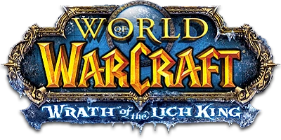
And then we have Wrath of the Lich King...
Last edited by Nyel; 2019-09-11 at 12:02 AM.
MAGA - Make Alliance Great Again
-
2019-09-11, 12:04 AM #1307Legendary!
- Join Date
- Aug 2016
- Posts
- 6,989
Someone link this man that leak post lol Originally Posted by Wangming
-
2019-09-11, 12:18 AM #1308Mechagnome

- Join Date
- May 2010
- Posts
- 630
The comparison to previous instances of "of" in expansion titles is even more damning. Every previous expansion the "of" is in lower case and smaller than the more important words, just stylized to fit in with the font of the rest of the expansion title. The "of" in Age of Awakening looks nothing like that beyond the O being a bit small
But really after the same guy posted it like 4 different times it just screams "I just learned how to use photoshop, give me attention"
-
2019-09-11, 12:24 AM #1309Titan
- Join Date
- Nov 2015
- Posts
- 12,787
All three "ofs" in WotLK, MoP and WoD look different and are in different places. Don't really think the "of" is a thing to immediately call it fake when even Blizzard hasn't a guideline for putting "of" always in the same place in the same font. I agree though, the "of" in Age of Awakening is too far left as well. Originally Posted by TomatoBisque
MAGA - Make Alliance Great Again
-
2019-09-11, 01:01 AM #1310Warchief
- Join Date
- Sep 2010
- Posts
- 2,203
The letters are uppercase instead of lower case. Originally Posted by Nyel
There's too much space to the right, as if the word "the" is missing.
The "O" is way too high, and should be nestled into the lower back of lower case "L".
Capitalizing "OF" is a dead giveaway. And off center.
Edit: "Of" Has always been in serif font.Last edited by Alixie; 2019-09-11 at 01:04 AM.
-
2019-09-11, 01:03 AM #1311The Insane
- Join Date
- Oct 2014
- Location
- Darkshore, Killing Living and Dead elves
- Posts
- 19,607
i think its the distance of the "of" from "age" and "awakening" not being symmetric
- - - Updated - - -
maybe is bigger because "age" is not a big word, they had to fill the gap Originally Posted by Alixie
-
2019-09-11, 01:07 AM #1312Titan

- Join Date
- Sep 2016
- Posts
- 12,704
We had no idea about BFA before its reveal, save for a simple leak hours before Blizzcon. All we ever knew is that Kul Tiras might play a part in it due to a datamined texture which featured an anvil and a map, which fueled speculation as to a South Seas expansion which we kinda got, if in a roundabout way. Originally Posted by TaliaKirana
-
2019-09-11, 01:11 AM #1313Bloodsail Admiral

- Join Date
- Aug 2010
- Location
- QC! but mostly in my head
- Posts
- 1,093
There's no "TM" on the far right upper corner of the title. Originally Posted by Alixie
-
2019-09-11, 01:16 AM #1314Titan
- Join Date
- Nov 2015
- Posts
- 12,787
Maybe because it wasn’t ready to be shown yet? Don’t know and I don’t want to make this real I just think the newest version of it looks awesome and is very well done. Originally Posted by Kagdar
MAGA - Make Alliance Great Again
-
2019-09-11, 01:16 AM #1315Titan

- Join Date
- Jun 2015
- Posts
- 11,912
that's literally an orange colored BFA logo
"You know you that bitch when you cause all this conversation."
-
2019-09-11, 01:20 AM #1316The Insane
- Join Date
- Oct 2014
- Location
- Darkshore, Killing Living and Dead elves
- Posts
- 19,607
its rly not, not even the globe lands Originally Posted by TheramoreIsTheBomb
-
2019-09-11, 01:22 AM #1317Warchief
- Join Date
- Sep 2010
- Posts
- 2,203
Blizzard is always careful to balance the titles of their games. If one word is smaller, they skew the "of the" more to one side, so that it balances the larger word. Mists and Wrath are smaller than "Pandaria" and "Lich King", so "of the" are balanced to the left. Chosing the word "AGE" is unusually small in comparison to their other titles. Unusual enough to have to make the preposition "OF" more important by making it almost as large and capitalized as the rest of the title. Originally Posted by Syegfryed
The visual effect ends up being unbalanced and ugly. Why not chose a visually pleasing synonym for "Age", instead of making ugly compromises? Especially with that giant "O" randomly floating above the line break where Age and Awakening are leveled.
-
2019-09-11, 01:23 AM #1318Mechagnome
- Join Date
- May 2010
- Posts
- 630
This has nothing to do with the location of the word "of" but the size and style of it. Originally Posted by Nyel
Look at the tail of the "f" in the previous expansion logos, it always flows off towards the o, even in WoD's, and the arm of the "f" is about level with the top of the "o"
The "of" in the Age of Awakening logo draws my eyes to it because the O stands out. This is different from every other instance of "of" used in previous expansions. Blizzard consistently makes these words smaller to draw attention away from them: "the" in The Burning Crusade, "for" in Battle for Azeroth, and "the" in Wrath of the Lich King. Even the "of" in the game's title, World of Warcraft, is tucked away inside the O in "world"
-
2019-09-11, 01:23 AM #1319Mechagnome

- Join Date
- Aug 2013
- Location
- Cataguases, Brazil
- Posts
- 692
What bothers me is the detail in the left and right borders of : World of Warcraft, never seen a logo with it on it, but in the same time, zooming in, we can see that it was copy pasted from one side to the other and them flipped.
Opening it up on Affinity to try to determine more things.
-
2019-09-11, 06:16 AM #1320I am Murloc!


- Join Date
- Feb 2008
- Posts
- 5,675
There's also no custom features on the border, unlike the frost for WotLK, the dragons for MoP, and the iron bands for WoD.
Unless you count that weird 'lily' at half-height, which looks quite off-color anyway.

 Reply With Quote


