Cataclysm Beta Test Weekends
 Cataclysm Beta Test Weekends
 Did Blizzard just hotfix an ilvl requirement onto Awakened LFR?
 Blizzard must stop introducing neutral races immediately
 Void Elf starting pet?
 MMO-Champion


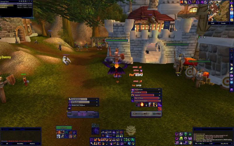
Wow that looks too cluttered for me really. Maybe it is a PvP thing but I actually find that having a bar filled with skills just leads to me searching more often for skills.Originally Posted by cringleburt fistybuns

 Recent Blue Posts
 Recent Forum Posts
Thread: Warlock UIs
-
2012-07-27, 09:33 PM #1501Brewmaster


- Join Date
- Apr 2011
- Location
- South Africa
- Posts
- 1,421
He slipped out of his royal garments, left eternity to enter time, divinity to wrap himself in humanity.
The sea of glass, for the ocean of separation. He left peace, and for the first time felt pain.
Because the very hands that held the stars were now sentenced to wear my scars.
-
2012-07-28, 05:09 AM #1502Mechagnome

- Join Date
- Apr 2010
- Location
- Graveyard
- Posts
- 660
Get rid of porky. Try accidental presidency Originally Posted by CoachBob

When a wild forum troll appears
-
2012-07-28, 05:20 PM #1503Deletedaye its a pretty new alt tbh, i only ever try new UIs on alt before my main, saves a bit of bother if u dont like it.. so yea i need everything visible atm cos warlcok action bar abilities make my eyes bleed ;p Originally Posted by AutomaticBadger
ive scaled it all down now ill pop another creenie on later
-
2012-07-29, 12:55 AM #1504The Patient

- Join Date
- Apr 2010
- Location
- Switzerland
- Posts
- 341
http://i.imgur.com/BuJD5.jpg
That was mine during the last time I seriously raided. After I plan to start doing that again on the MOP release, I want to improve it as far as possible and would appreciate ideas.
I want to cut off any unnecessary hardware usage, so skada and the scrolling combat text have to go, if there are any good alternatives to suf/prat/elkanos/forte (including multi target dot tracker and cooldown timer), please inform me. Also, does anyone know if actually power auras or weakauras is better relating to hardware usage?
Here it is in action:
http://www.youtube.com/watch?v=g5Wy0rqkxQ4&t=30
-
2012-07-29, 01:53 AM #1505Blademaster

- Join Date
- Apr 2012
- Posts
- 28
A great combo for A Forte replacement is OmniCC combined with tell me when which personnally I think also gets rid of haveing to use Powerauras and weakauras I really like shadowed unit frames because if you get into the details you can customise it to do alot of things added with grid. A prat replacemnt would be chatter Originally Posted by Elmi

Signature made by Shyama
WARLOCKS WILL RULE THE WORLD!!(of Azeroth)
-
2012-07-29, 02:46 AM #1506The Patient
- Join Date
- Sep 2011
- Posts
- 221
Here is mine:
http://i.imgur.com/qwjBZ.jpg
I've had variations of this UI for a looong time now. Was thinking of making some adjustments soonish. Not sure exactly what yet though. Suggestions are welcome!
-
2012-07-29, 07:45 AM #1507Deleted
Here´s mine
i47.tinypic.com/mvly4p.jpg
-
2012-07-30, 07:26 AM #1508Stood in the Fire

- Join Date
- Jan 2011
- Posts
- 400
@ Coachbob: Looks like you're using Elvui, in which case, you can have MSBT use the elvui font, to make it somewhat clearer.. I'm a bit font police
 and dislike having too many different fonts on a UI.
Likewise, i'd change the shadowing on the unit frames, and move trade chat to a different tab of the left panel, hide the right panel, then embed your damage meter, so that it sits where your trade shows now.
Edit to show who the hell i'm replying too....
-
2012-07-30, 05:50 PM #1509The Patient
- Join Date
- Apr 2010
- Location
- Switzerland
- Posts
- 341
Almostly finished on reworking mine:
http://i.imgur.com/qCMoK.jpg
http://i.imgur.com/Ld7MZ.jpg
The visible Buttons on the right will go as soon as i can get hold of a Logitech G600. Don't know what else I could do/add to further improve it to my kind of playstile.
Addonlist: Bartender 4, DBM, Elk Buff Bars, Forte, Grid, Grid Mana Bars, Grid Status Raid Debuff, Grid Status Raid Icons, kg Panels, Minimap Button Frame, Move Anything, Omen, Prat 3, Quartz, Shadowed Unit Frames, simple Minimap, Tell Me When, Tidy Plates, Tidy Plates Threat Plates, Weak Auras
/edit: The exclamation marks track my procs and stuff, the focus and focus-target frames fit between the player frame and the 4 buttons bar on the right.Last edited by Elmi; 2012-07-30 at 05:59 PM.
-
2012-08-04, 09:27 AM #1510Mechagnome

- Join Date
- Sep 2009
- Posts
- 727
Well unfortunately I have quitted & uninstalled the game (got bored and started reading forums again haha Originally Posted by Mamut
 )
)
So i cannot post the exact UI that I used.
What i can say is that all my triggers were made with powerauras and somewhere in the last 8-ish pages i think i posted a rudimentary version of the auras (i do note there were some tiny mistakes in it, i think in the decimation one but you would have to try it out for yourself)
anyways before i quited i revamped my UI and changed the looks of the triggers, altough i still used the same triggers for the same function. i got the idea from cyner (he used it for dot timers, anyways Thank You Cyner!!!) since i really love clean UI's
this was it: (I still used the tri-symbol for my decimation charges but it's not active on this SS)
http://i.imgur.com/Br71T.jpg
EDIT:
I found the post: http://www.mmo-champion.com/threads/...1#post15341561 Now keep in mind there were a few little errors i found out afterwards, but it should point itself out once you started using it. (could be u have to disable/enable one of 'm) if you have any problems. feel free to PM. i'll try to answer.Last edited by Elysia; 2012-09-21 at 11:14 PM.
-
2012-08-04, 10:01 AM #1511Deleted
This is just very roughly designed for now as im upgrading to a 27 inch screen from a 19 inch in the next 2-3 days, but you get the general idea.
Out of Combat
http://i46.tinypic.com/2whnker.jpg
In Group Setup
http://i48.tinypic.com/25zt8o1.jpg
By 'Resource bar' i mean embers / runes / holy power, this is my default UI for all of my toons so i just disable that bar if it is not required.
Currently i am not playing my warlock and am waiting for mists of pandaria, that is why my resource bar is empty as i have not searched out a 'soul shard' addon.Last edited by mmoc77bb2b62ef; 2012-08-04 at 10:53 AM.
-
2012-08-04, 04:34 PM #1512Mechagnome
- Join Date
- Sep 2009
- Posts
- 727
If i learned 1 thing, the smaller your screen, the more original you become in filtering useless info Originally Posted by AjayxD
. I made alot better UI's when i downgraded from 21 inch to 16 inch (PC--> laptop for university))
-
2012-08-04, 04:46 PM #1513DeletedId like to think i only keep the really necessary info on my UI and i make sure it is not duplicated anywhere. Originally Posted by Thurisaz
That bar along the bottom with my spells, the original idea for that was to make anything without a CD not appear on that and put it on an invisible bar somewhere so ye i totally agree with you on the info filtering : )
What do you think of the UI itself
-
2012-08-04, 05:34 PM #1514Mechagnome
- Join Date
- Sep 2009
- Posts
- 727
I'd say it's very structured which makes it good to use + it looks pretty good so a solid 8/10. Originally Posted by AjayxD
However i don't think it's necessary to see long buffs (such as BoK & MotW) near ur portraits. (and i don't like that black colour but that's just personal preference).
on my UI i only let buffs show in the middle/bottom that have a stacking purpose or are procs ( such as trinkets stacks or power torrent/ potion procs)
-
2012-08-04, 07:01 PM #1515Deleted
Thanks for the feedback, ill let you know if you end up changing my mind on any of it ;p
-
2012-08-04, 09:55 PM #1516Blademaster

- Join Date
- Jan 2009
- Posts
- 44
-
2012-08-06, 09:03 PM #1517Dreadlord

- Join Date
- Feb 2010
- Posts
- 782
A few pointers without being too nit-picky: Originally Posted by AjayxD
- I personally dislike black (or any other view-blocking colour) backgrounds, just seems to get in the way of what could have been more view. Essentially it's unnecessary info since it takes up space without returning anything useful.
- Limited amount of buffs displayed without and filtering, that just means most of the time you will only see those buffs that aren't interesting at all, you could just as well have removed buff display completely as you're not getting much use out of that.
And then the nit-picky aesthetic pointers:
- So much space between buffs and raid frames. Are you trying to make gaps to make sure nothing gets hidden behind it? In any case feels kind of awkward.
- Different fonts and font outlines everywhere. Also different bar textures used on raid frames, other unit frames and that timer in the middle. Consistency would make it look more neat and planned.
- The addon used to gather minimap icons succeeded in removing clutter from the minimap, but failed at tidying them as it just made a new clutter with the icons randomly scattered next to it.
- Some personal opinions on what information you need on health/mana text on unit frames. On player frames I'm only interested in current health and current mana, on target frames I'm interested in current health, health percent and current mana, pet frames only thing that might be remotely needed is current health though general health in terms of the bar would be enough, target of target and focus frames same as pet frames. Maximum values are only interesting for "fun to know the boss' max health" or to see a rough estimate of item level of players.
-
2012-08-06, 09:23 PM #1518Deleted
Thanks Sak, i did say that was only a really rough version of what i was planning and i will have my 27 inch screen tomorrow so ill post the finished product then, be sure to come back and tell me what you think.
-
2012-08-15, 10:14 AM #1519Deleted
http://i46.tinypic.com/sb3da9.jpg
Nothing big to it, shows all I need it to show.
All the trackers/cds/internal are created by Tellmewhen.
-
2012-08-15, 10:26 AM #1520Blademaster
- Join Date
- Feb 2011
- Posts
- 27
Didn't want your ERP guildchat showing? Originally Posted by Zikito
How are the James'? Originally Posted by Wapetufo

 Reply With Quote