Recent Blue Posts
 Addressing Children’s Week Issues
 Addressing Children’s Week Issues
 Blizzard must stop introducing neutral races immediately
 Rank the Dragonflight Dungeons (beyond knee-jerk reactions)
 New gaming PC doesnt look right
 MMO-Champion


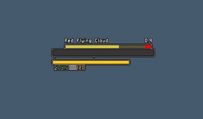
Yeah, also i definitely need to to add a background to the castbar too. Do you think i should get rid of the text shadowing? (probably yes)
Other things i have in mind:
- the "connectors" between health and power can be better, i know it for sure. Thinking of a good layout and accepting suggestions aswell.
- tied to the above,another possibility is to make the castbar border always visible and make powerbar "mirrored" (same size, aligned to the left)
- i was thinking about the minipanel; it's been a distinctive trait of my UI from the very beginning and just ditching it dosn't feel quite good. So i worked a little on paint on your image Ish and this is what i've come up for that.
- probably portraits will need a separate frame now instead to be overlapped over the healthbar; i want to try non-flat textures for staturbars.
Feels "more" ColdUIThanks as always ^^
---------- Post added 2013-02-16 at 01:54 PM ----------
found the texture!!!! /happyface
Going to try it this afternoon.
---------- Post added 2013-02-16 at 03:04 PM ----------
The texture looks crap. Oh well, i'll stay with current media, i'm finding myself at ease and i don't want for next release to lose everything about my UI.
anyway, nearly final layout for player/target, enjoy (suggestions always welcome)
 Recent Forum Posts
Thread: Post Your UI
-
2013-02-16, 05:09 AM #10021Fluffy Kitten


- Join Date
- Apr 2009
- Posts
- 17,226
Last edited by Coldkil; 2013-02-16 at 02:05 PM.
Non ti fidar di me se il cuor ti manca.
-
2013-02-16, 03:36 PM #10022Deleted
 Originally Posted by Rusk

Do you play with a screen magnifier?
-
2013-02-16, 05:19 PM #10023Field Marshal


- Join Date
- Mar 2012
- Posts
- 70
Can you upload your ui ? its very nice hehe Originally Posted by Coldkil
-
2013-02-16, 05:42 PM #10024Fluffy Kitten
- Join Date
- Apr 2009
- Posts
- 17,226
I would if i still had it Originally Posted by davidrm15
Anyway, after much tinkering, i think i'll stay with the classic layout. The new concept was only going in a bad way, making things more complicated (not for me to code, for the end-user) without any reason.Non ti fidar di me se il cuor ti manca.
-
2013-02-16, 09:09 PM #10025High Overlord
- Join Date
- Sep 2012
- Posts
- 169
My current UI - It's a merged version of Mayron UI Gen 2, ElvUI, a few custom edits, and some addon changes/additions:
Normal walking around:
Most UI elements unlocked - never will all of these be shown at the same time:

In combat:
Last edited by mmocba105e19de; 2013-02-16 at 11:15 PM.
-
2013-02-17, 05:00 AM #10026Legendary!

- Join Date
- May 2010
- Location
- Weeping Squares, Vilendra, Solus
- Posts
- 6,621
Mein UI.
 ⛥⛥⛥⛥⛥ "In short, people are idiots who don't really understand anything." ⛥⛥⛥⛥⛥
 [/url]
⛥⛥⛥⛥⛥⛥⛥⛥⛥⛥⛥⛥⛥⛥⛥⛥⛥⛥⛥⛥⛥⛥⛥⛥⛥⛥⛥⛥⛥⛥ ⛥⛥⛥⛥⛥⛥⛥⛥⛥⛥
-
2013-02-17, 11:13 AM #10027High Overlord

- Join Date
- Jun 2008
- Posts
- 188
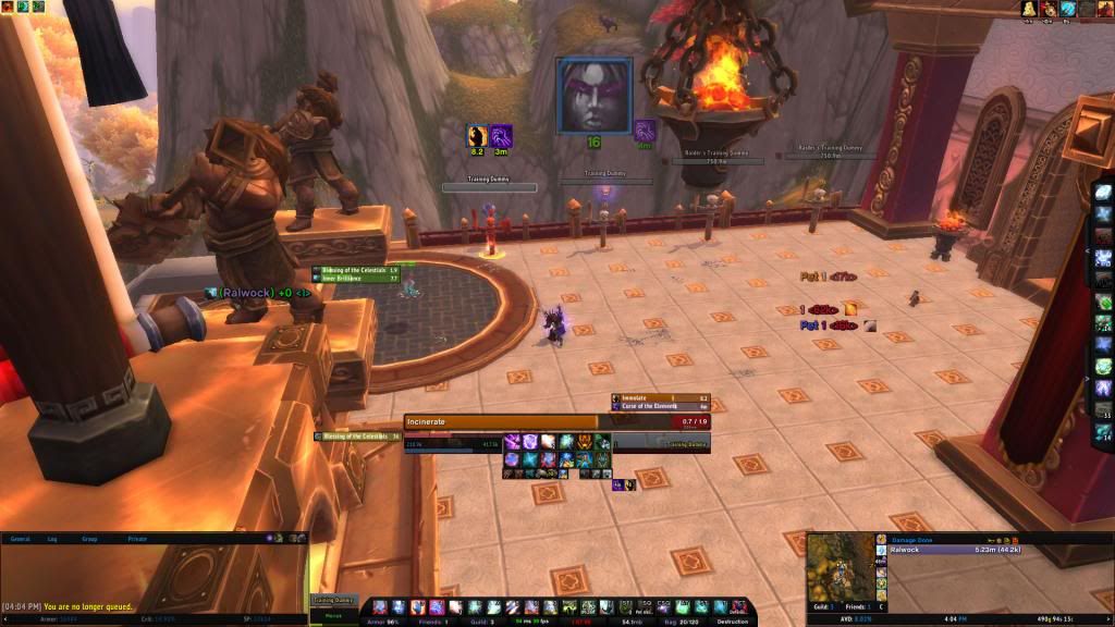
Working on improving my UI; not done except for my new WeakAuras setup.

-
2013-02-17, 01:06 PM #10028Deleted
i'm using Altz UI with modified textures and fonts right now
http://i.imgur.com/uZd80SJ.jpgLast edited by mmoc990e325208; 2013-02-17 at 01:08 PM.
-
2013-02-17, 03:25 PM #10029DeletedHilarious post. Guy asks for suggestions, Ish actually gives him suggestions with arguments design and functionality wise. If you don't want to see good advice because you THINK most of it is personal preference, then don't post in this thread really.You come off very.. Self righteous.
If UIs were a religion you'd be the head preacher whose opinion is always correct.
-
2013-02-17, 03:37 PM #10030Dreadlord

- Join Date
- Apr 2011
- Posts
- 850
Right now it's a cheaty half-ass bar behind it. Just played with the opacity until it looked good. Originally Posted by cabibi64
Working on a way to combine them into eachother though.
-
2013-02-17, 04:26 PM #10031Deleted
Done for now, the only thing i really don't like is the border on the bigwigs timers (pic 2), i have no clue how to make them pixel perfect with a black/grey/black border, same goes for the buffs on my target.
There's also a small pixel error on the right side of the raid, been moving it around, resizing it and played with the spacing but i just cant get it right unless i move the whole raid to another position which i don't want to
Raid with bar 2 to the right that pops up in combat

Focus, castbars and bigwigs timers

Config mode to show the bossframes that are located under the minimap

Last edited by mmocba105e19de; 2013-02-17 at 06:00 PM.
-
2013-02-17, 04:37 PM #10032Stood in the Fire
- Join Date
- Sep 2008
- Posts
- 441
@ Rusk,
Other than some font size issues and font outline inconsistencies, it looks great! A bit too monochromatic for my personal taste, but overall well done
<3
Ish
-
2013-02-17, 05:34 PM #10033Epic!
- Join Date
- Oct 2012
- Posts
- 1,559
[QUOTE=Rusk;20246313]Done for now, the only thing i really don't like is the border on the bigwigs timers (pic 2), i have no clue how to make them pixel perfect with a black/grey/black border, same goes for the buffs on my target.
There's also a small pixel error on the right side of the raid, been moving it around, resizing it and played with the spacing but i just cant get it right unless i move the whole raid to another position which i don't want to
Raid with bar 2 to the right that pops up in combat
<snip>
Focus, castbars and bigwigs timers
<snip>
Config mode to show the bossframes that are located under the minimap
<snip>
Upload please!
What Ish said bout fonts, love it tho.
Will this work on 1440x900?
I dont have a supermassive monitor like you
Last edited by mmocba105e19de; 2013-02-17 at 06:00 PM.
-
2013-02-17, 05:55 PM #10034Mechagnome
- Join Date
- Jul 2011
- Posts
- 570
I agree.TBH it's a lot i'm thinking about an "only text" UI, but actionbars are really good - immediate information with a glimpse of an eye.
I think you could do something like "action bars made of text". For example consider powerline (a plugin for the vim text editor). Imagine if we made a font that had icons for major spells. Maybe one "box" glyph in the background, then one "skull" glyph on top of that, and finally a small pixel-font marker in under that with a 5-7 letter "name" -- something arranged to look sort of like a period table of elements…
Someting as simple as setting foreground and background color (I realize wow doesn't do background color on text) lets you create interesting displays

With a little effort I think you could make a really light-weight UI that looked good. Then again, wow's got a really crumby text renderer so it might be hard to get enough detail out of text to make it look good.
-
2013-02-17, 07:01 PM #10035DeletedAfraid not, it's built for a 1920x1080 resolution=/ Originally Posted by Drayarr
-
2013-02-17, 07:30 PM #10036Epic!
- Join Date
- Oct 2012
- Posts
- 1,559
Ugh, Max Reso I can get upto is 1440x900 Originally Posted by Rusk
Don't have the disposable income to get a bigger monitor right now /sadface
Would you mind uploading anyway, I could play around with it to see if I can make it fit
-
2013-02-17, 07:31 PM #10037DeletedYou would have to redo the size of every KGPanel and everything else to get it to fit and there is around 55 kgpanels hehe;p Originally Posted by Drayarr
-
2013-02-17, 07:36 PM #10038Fluffy Kitten
- Join Date
- Apr 2009
- Posts
- 17,226
There is an oUF layout that does exaclty that tbh, i looked at it bu as far as i remeber it's made through other means than lua code, so it's something that i'm not that good. Would like to try anyway. Originally Posted by evn
---------- Post added 2013-02-17 at 08:39 PM ----------
If you parent the panels to actual frames you won't need to adjust anything. Originally Posted by Rusk
Also, a correct anchors usage makes the ui usable on nearly any resolution - the issue is mostly to make it fit to smalle screens. That's why i made my frames draggabe^^ i play on my pc at 1680x1050 but also on my laptop at 1280x800.Non ti fidar di me se il cuor ti manca.
-
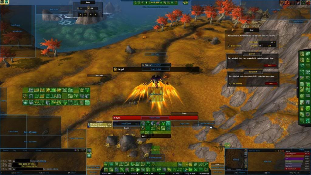
2013-02-17, 07:54 PM #10039High Overlord

- Join Date
- Mar 2012
- Posts
- 121

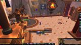
What do you all think? good? bad?Last edited by mmocba105e19de; 2013-02-17 at 07:59 PM.
-
2013-02-17, 08:12 PM #10040Mechagnome

- Join Date
- Nov 2007
- Posts
- 631
Beautiful Terminal theme. Originally Posted by evn
— oh, honey.

 Reply With Quote