 Limited PvP -> PvE Free Character Transfers
 Mythic+ Dungeon Adjustments - 27 April
 Mythic+ Dungeon Adjustments - April 26, 2024
 Official PvP Video Thread
 MMO-Champion


--------
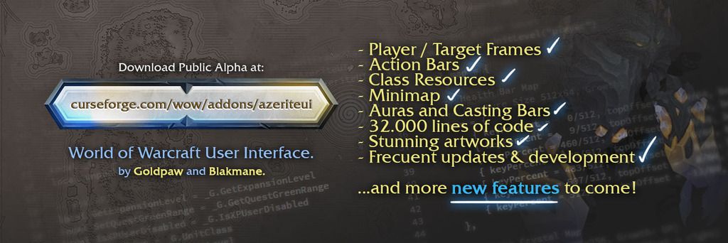
Hello MMOChampion community, Goldpaw and I, want to share with you all an AWESOME project we've been developing for a long time now with me at the design & concept lead and Goldpaw as the boss-level coding developer, enjoy!
The project is still at early stages but is close to the main release before BfA!
You can follow and join us at: discord.gg/TCuN9PM
... also find us on Facebook and Twitter as @azeriteui
Thanks for checking it out! Have fun people!
-------- A bit of the story of how this UI came to be:
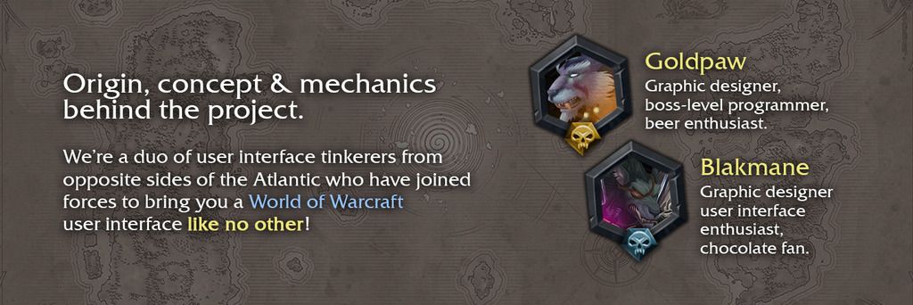
My name is Daniel, I'm from Venezuela and I've been a graphic designer for about 12 years now, have worked with UI and user experience design, illustration, motion graphics and branding design. At the same time, I've been playing Blizz games since I was like 10 years old, always loved their art style and level of detail and love on their games.
After a few years playing World of Warcraft, I started tinkering the UI here and there with existing addons, often adding my own custom artworks, then, I discovered Power Auras and THEN, WeakAuras which is pretty much an unofficial UI editor at this point LOL, that addon is like the Thanos of WoW addons, it allowed me to completely redo the UI to whatever I wanted, so, around 2016, during Legion, it allowed me to prototype all by myself (well.. hehe also with lots of help in LUA from users here in MMOChampion actually!) a complete UI concept I named Felslate UI (you can check the project here at Behance: be.net/troko).
Then I took it to another level and improved the artworks, got myself a new Wacom tablet and started illustrating more in detail what I wanted, then the first prototype of Azerite came to exist for me, privately. Since I REALLY loved the result, I got in contact with Goldpaw, from Norway, whom I think makes the most incredible UIs for wow, the man has over 30 years of coding expertise (yes! over 30 years, he's been coding since he's a child really) and is an avid graphic designer too. This is how two guys from opposite sides of the planet united to create Azerite UI.
Goldpaw loved the idea and concept behind the prototype, the layout, the way the UI is all bulky and sturdy looking which fits Warcraft's art style and how it doesn't need to be right on the screen in front of us 100% of the time but only when needed because the game WORLD is our main dish here, and.. you know if you going to see a UI then let's make it at least beautiful and Warcraft looking, right?.
We love video games and like graphic design and coding so you can bet this project is made with lots of care and just for the sake of making cool UIs for a game we've played for over a decade now, that's why there will be just a few configuration options, because this is a 2 years project (from me at least) and around 6 months for Goldpaw, but hey! we both gonna make more UI projects so stay tuned!
 Recent Blue Posts
 Recent Forum Posts
-
2018-08-06, 04:28 PM #1The Patient


- Join Date
- Apr 2013
- Location
- Azeroth
- Posts
- 296
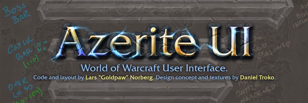
 Azerite UI - by Lars "Goldpaw" Norberg and Daniel Troko
Last edited by Blakmane; 2018-11-07 at 04:10 AM.
-
2018-08-06, 04:49 PM #2Stood in the Fire
- Join Date
- Feb 2012
- Posts
- 498
Will have to check it out Thanks for the hard work you put into it!
"How you build your character is not a feature of a MMORPG, it is the feature. Everything else is secondary even the gameplay itself is secondary to building your character, its the kind of stuff you think about when you are at work or school and couldnt wait to go home to play WoW or Diablo 2. We have all done it." ~Into, 2016
-
2018-08-06, 07:01 PM #3Dreadlord

- Join Date
- Nov 2014
- Posts
- 883
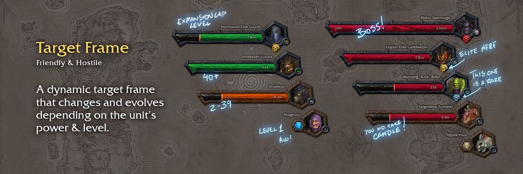
just some feedback on the screenshot on the curse page:
the buffs and debuffs are much too dark on the icon to be able to be readable. the action bar icons are also pushing it. i dont think they need both the thick graphical border and also the dark shadow on the inside.
-
2018-08-06, 07:03 PM #4The Patient
- Join Date
- Apr 2013
- Location
- Azeroth
- Posts
- 296
Feedback appreciated! Thanks, mate! Originally Posted by kheath812

-
2018-08-07, 01:48 AM #5Bloodsail Admiral
- Join Date
- Mar 2011
- Posts
- 1,104
Certainly interesting. Checked it out, have a few thoughts on it.
There needs to be more action buttons, it's just not enough. Maybe you could have a second row underneath, or another row above between the health and map area.
Cast bar blends in too much, also doesn't say what's casting. Maybe the colour should be inverted? Not sure.
Icons, runes, buffs/debuffs, etc are all too faded? Not talking about border, but the icons themselves. I feel like it would be better if they were a lot brighter as they would stand out more at a glance but currently you could think something is still on cooldown.
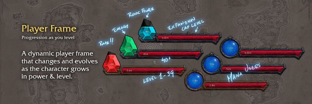
Personal resource bar is also too faded, and in fact fades out more when you target something else even when in combat. The only time it's ever not faded is when your targetting yourself.
-
2018-08-07, 08:29 AM #6The Patient

- Join Date
- Dec 2010
- Location
- Kristiansand, Norway
- Posts
- 346
Dude, Daniel! Put your own name first, not mine! You're the designer, I'm just the guy chained to the keyboard writing the code! Don't make people think I made this, I'm simply not that pro!

Anyway, did a few minor changes in the latest build (1.0.30-Alpha), making personal resource display always fully opaque when shown, and slightly shrunk the aura borders and enlarged the icons equally much. I can't say I agree if anybody should still think anything here is hard to see after this update. Feedback is always appreciated, though, as sometimes where it may seem like major work is needed, often a subtle adjustment it all it takes!
And we can set gamma, brightness and contrast in the advanced graphics settings in the game now, just in case somebody has a general problem with everything being too dark on their exact screen, or if they're playing in bright daylit rooms on a monitor that's not really that bright. Or if they're located in Australia with WoW being synced to the US realms(?) and thus having night in the game while it's daylight in the real world. Because the UI can't fix those things. I personally think it always should be night in WoW, because Azeroth is better at night. But I guess the UI can't fix that either!
These latest changes are in build 1.0.30, and as of writing this it hasn't become available on public CurseForge/Twitch, yet. But probably will soon enough:
https://www.curseforge.com/wow/addons/azeriteui


-
2018-08-07, 01:09 PM #7Pit Lord


- Join Date
- Oct 2008
- Location
- Boat to the Dragon Ilses
- Posts
- 2,307
Awesome job on the artwork!! Somehow it has a console feel to it.
-
2018-08-07, 01:37 PM #8The Patient
- Join Date
- Dec 2010
- Location
- Kristiansand, Norway
- Posts
- 346
Well that IS the idea! Originally Posted by shade3891
-
2018-08-07, 11:04 PM #9Grunt
- Join Date
- Jan 2017
- Posts
- 17
How do you access options for this in-game?
-
2018-08-07, 11:29 PM #10The Patient
- Join Date
- Apr 2013
- Location
- Azeroth
- Posts
- 296
Hello, we're still on alpha phase but a small config panel will be available (soon) for the UI with some minor options. Originally Posted by Slaygeist
Check our Discord channel to follow the development or check the updates on curse!
-
2018-08-07, 11:36 PM #11The Lightbringer
- Join Date
- Dec 2016
- Posts
- 3,255
I never used any UI addon,but since Blizzard decided to kill the old Blizzard UI and replace it with utter trash,I just might
And this one looks pretty nice honestly.....I just may end up using it
May I ask how runes are displayed? And if you can use % health display(and both % and number,if possible)
-
2018-08-08, 03:05 AM #12The Patient
- Join Date
- Apr 2013
- Location
- Azeroth
- Posts
- 296
Awesome! Check the UI out, you might enjoy it a lot. The rune system we have for Azerite follows the same pattern as all the other point based resources, they're displayed in the center next to your character, they just deplete as you use them and you can easily see them recharging there, think of our rune system as "reverse" combo points. Originally Posted by ONCHEhap
The values and different informations in the current panels are a design choice, is a concept UI so you might want to give it a try first and how it works by default, you might find it useful as it is. Thanks for checking it out! Have fun!
-
2018-08-08, 05:23 AM #13Legendary!
- Join Date
- Sep 2009
- Location
- Not in Europe Anymore Yay
- Posts
- 6,931
It's beautiful, but it doesn't feel very functional. I took it for a spin on some mount farming runs.
First impression is holy shit the gorgeous UI elements are huge. Things need to be movable / resizable imo. With the unit frames taking up two entire opposite corners that's too much space to keep track of important things. If I could shrink the unit frames and move them closer to each other in a more central location, or even putting the target and target's target on the button, that would be much more manageable.
Also with the player frame, target frame, and minimap being so huge that doesn't leave much room for other important things like WeakAuras, damage meter, or the chat frame. The chat frame sticks out like a sore thumb in this UI unfortunately. More options for action bars would be good as well.
It's absolutely beautiful, I especially love the rune icons for DK, but until there is the ability to resize and move the UI elements I don't think I could ever use it unfortunately. Also the mail icon is huge and doesn't line up with the text underneath it. Have I mentioned how gorgeous the UI is?AchaeaKoralin - Are you still out there? | Classic Priest
-
2018-08-08, 05:40 AM #14The Patient
- Join Date
- Dec 2010
- Location
- Kristiansand, Norway
- Posts
- 346
Well the UI is based around a concept, it's not meant to be a theme over what everybody else is using. It's aimed at a simplified playstyle and a more console-like manner. So it's not for everybody. Originally Posted by RoKPaNda
-
2018-08-08, 05:51 AM #15Legendary!
- Join Date
- Sep 2009
- Location
- Not in Europe Anymore Yay
- Posts
- 6,931
In that case I don't think it fits that theme at all. Part of a console UI in a game is being clear and concise, which at present this really isn't. Having your player frame and your target frame on complete opposite ends of the screen isn't practical, it doesn't matter what you're doing. That's why most UIs have the unitframes and all relevant information somewhat close together. What sort of playstyle do you envision this UI being used for? Originally Posted by Goldpaw
It's beautiful, and that's great, but if you're not planning on giving options to customize it to be practical then I can't really see anyone actually using it. I'd like to use it, but it's not practical for anything that I do from World Quests to Mythic raiding. That's a shame. Even the default Blizzard UI in all of it's ugliness is more practical unfortunately. I was hoping that was just because this was in alpha.AchaeaKoralin - Are you still out there? | Classic Priest
-
2018-08-08, 05:58 AM #16The Unstoppable Force

- Join Date
- Mar 2011
- Location
- Orgrimmar
- Posts
- 20,656
Gonna download it and check it out. Might be a few days before I can provide feedback.

-
2018-08-08, 06:03 AM #17Deleted
Great work... Just a question tho. Why green for energy?
-
2018-08-08, 06:06 AM #18The Unstoppable Force
- Join Date
- Mar 2011
- Location
- Orgrimmar
- Posts
- 20,656
Took a quick peak before bed. Is there going to be a way to customize it?
Looks like it would be great for playing on a tv.
Would potentially work great with Immersion questing addon, and console port for controller support.
-
2018-08-08, 06:15 AM #19The Patient
- Join Date
- Dec 2010
- Location
- Kristiansand, Norway
- Posts
- 346
It's organic. Originally Posted by Slejhy
-
2018-08-08, 06:29 AM #20Deleted
If i could use only the target frames i would love to use it, if i have to change my bars aswell it ruins it for me.
Great work tho!


 Reply With Quote


