 Floral Fancies Festoon May’s Trading Post
 Limited PvP -> PvE Free Character Transfers
 Blizzard must stop introducing neutral races immediately
 Did Blizzard just hotfix an ilvl requirement onto Awakened LFR?
 MMO-Champion


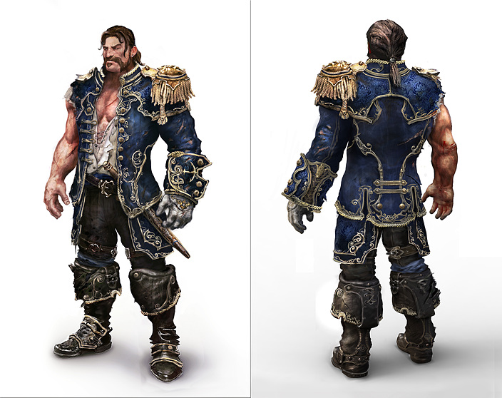
The new one looks low ress as fuck
 Recent Blue Posts
 Recent Forum Posts
-
2019-02-14, 10:34 PM #61The Lightbringer


- Join Date
- Dec 2011
- Posts
- 3,212
-
2019-02-14, 10:35 PM #62Bloodsail Admiral

- Join Date
- Sep 2010
- Posts
- 1,070
Defo prefer the toned down version, og one didn't suit the Kul Tiran Theme
-
2019-02-14, 10:38 PM #63Over 9000!

- Join Date
- May 2012
- Posts
- 9,394
https://tvtropes.org/pmwiki/pmwiki.p...edItNowItSucks Originally Posted by Pebrocks The Warlock

I'll just leave this here.The most difficult thing to do is accept that there is nothing wrong with things you don't like and accept that people can like things you don't.
-
2019-02-14, 10:39 PM #64Spam Assassin!

- Join Date
- Oct 2010
- Location
- Tralfamadore
- Posts
- 32,405
Garbage is now the word to use for anything that has mild changes that you might not care for.
I'm OK with either version. I think I like the new a little better although I like long coats."...money's most powerful ability is to allow bad people to continue doing bad things at the expense of those who don't have it."
-
2019-02-14, 10:39 PM #65Over 9000!
- Join Date
- May 2012
- Posts
- 9,394
I remember the old Flintlocke comic from back in the day. One of the first comics had the narrator character asking Flintlocke if he was a dwarf or some kind of colorful japanese hard candy. Flintlocke responded that he had a gun and the narrator didn't bring it up again. Originally Posted by Thelxi
The most difficult thing to do is accept that there is nothing wrong with things you don't like and accept that people can like things you don't.
-
2019-02-14, 10:41 PM #66Pit Lord

- Join Date
- Mar 2014
- Location
- US
- Posts
- 2,456
I dont mind the duller colors, makes me think of them being a bit weathered from being out at sea.
-
2019-02-14, 10:42 PM #67The Lightbringer

- Join Date
- Jul 2008
- Posts
- 3,632
*Blizzard makes a minimal change* iT’S gArBaGeEeEeE. Go to bed, kiddo.
-
2019-02-14, 10:46 PM #68Titan

- Join Date
- Jun 2011
- Posts
- 11,574
The new one looks better.
My only wish they would have made the shoulders asymmetrical and more similar to the sailor from MoP since that was clearly the inspiration
-
2019-02-14, 10:48 PM #69Brewmaster

- Join Date
- Nov 2010
- Location
- Poland
- Posts
- 1,490
#team_old_one
S.H.
-
2019-02-14, 10:49 PM #70Titan

- Join Date
- Jan 2009
- Posts
- 13,134
It definitely wasn't. Also he only had asymmetrical shoulders because the other one was torn off. Originally Posted by Khaza-R
-
2019-02-14, 10:52 PM #71Mechagnome


- Join Date
- Mar 2018
- Posts
- 588
ugly shoulders , shorter coat and no cool anchor design ? damn it's garbage now
i wanted to make a kultiran just far that swagger long coat , guess not then .
-
2019-02-14, 10:52 PM #72Titan
- Join Date
- Jun 2011
- Posts
- 11,574
Sorry, I meant overall the tasseled shoulders should look more like his. But having two of them would look kind of goofy. So maybe one with tassels and the other just more simple. I am aware his untattered uniform was likely not asymmetrical Originally Posted by Hitei
-
2019-02-14, 10:55 PM #73Titan
- Join Date
- Jan 2009
- Posts
- 13,134
The "it definitely wasn't" was aimed at the MoP sailor somehow being inspiration when both are just wearing general sailor uniforms. Originally Posted by Khaza-R
-
2019-02-14, 11:12 PM #74The Unstoppable Force

- Join Date
- Sep 2009
- Posts
- 23,090
Looks great on the guys, shoulders a little too big on the females. Most important change being the hat not making her bald I'd say.
-
2019-02-15, 02:27 AM #75Scarab Lord

- Join Date
- Sep 2012
- Location
- New Jersey
- Posts
- 4,620
Colors are fine. Coat is too short though.
-
2019-02-15, 02:27 PM #76Pit Lord

- Join Date
- Aug 2009
- Posts
- 2,410
Definitely. This is (one of) the biggest overall problems with appearances in the entire game IMO. Originally Posted by Powerogue
-
2019-02-15, 03:00 PM #77Scarab Lord

- Join Date
- Jul 2013
- Location
- Over There
- Posts
- 4,453
I hate the new coat, but love the new hat.
-
2019-02-15, 03:50 PM #78Pit Lord
- Join Date
- Aug 2009
- Posts
- 2,410
Fixing helm baldness across the board would go a far ways towards making every character look better overall. Originally Posted by Lime
-
2019-02-15, 04:48 PM #79The Insane

- Join Date
- Jun 2010
- Location
- Δ Hidden Forbidden Holy Ground
- Posts
- 19,105
My only complaints about the new armor are that it lost the Proudmoore Admiralty emblem on the back of the coat, I preferred the off-center buckle, and I liked the brighter colors. But otherwise the update doesn't bother me much, it still looks pretty great imo.
That being said, it'd be cool if we got variants for each Kul'Tiran faction so you could play yours as a member of the Proudmoore Admiralty, Tidesages, or Order of Embers, for example. Much like how Mag'har can choose their heritage armor based on clan.Be seeing you guys on Bloodsail Buccaneers NA!
-
2019-02-16, 05:42 AM #80Blademaster

- Join Date
- Nov 2018
- Posts
- 44
Amazing that they invest so much effort into creating something so bland and ugly.

 Reply With Quote


