Floral Fancies Festoon May’s Trading Post
 Limited PvP -> PvE Free Character Transfers
 Could use good seasonal affixes again
 MMO-Champion


you allready asked about this once. Give the dude some time lol..Originally Posted by Magnata

 Recent Blue Posts
 Recent Forum Posts
Thread: Post Your UI
-
2016-08-18, 01:41 AM #21021The Patient

- Join Date
- Jan 2011
- Posts
- 286
-
2016-08-18, 01:45 AM #21022Blademaster


- Join Date
- Jul 2016
- Posts
- 49
sorry, I'm excited about this addon lol. How i can delete it?
-
2016-08-18, 02:08 AM #21023Blademaster
- Join Date
- Aug 2016
- Location
- New Orleans, LA
- Posts
- 40
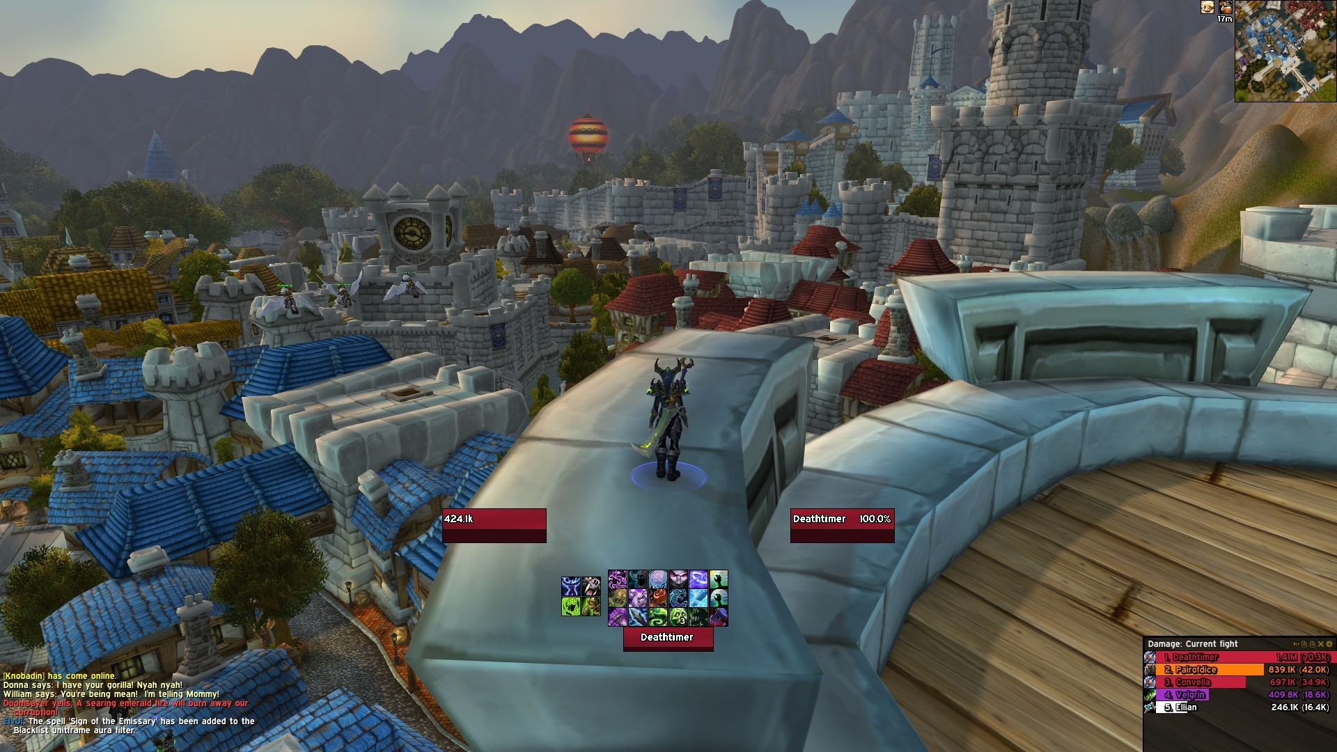
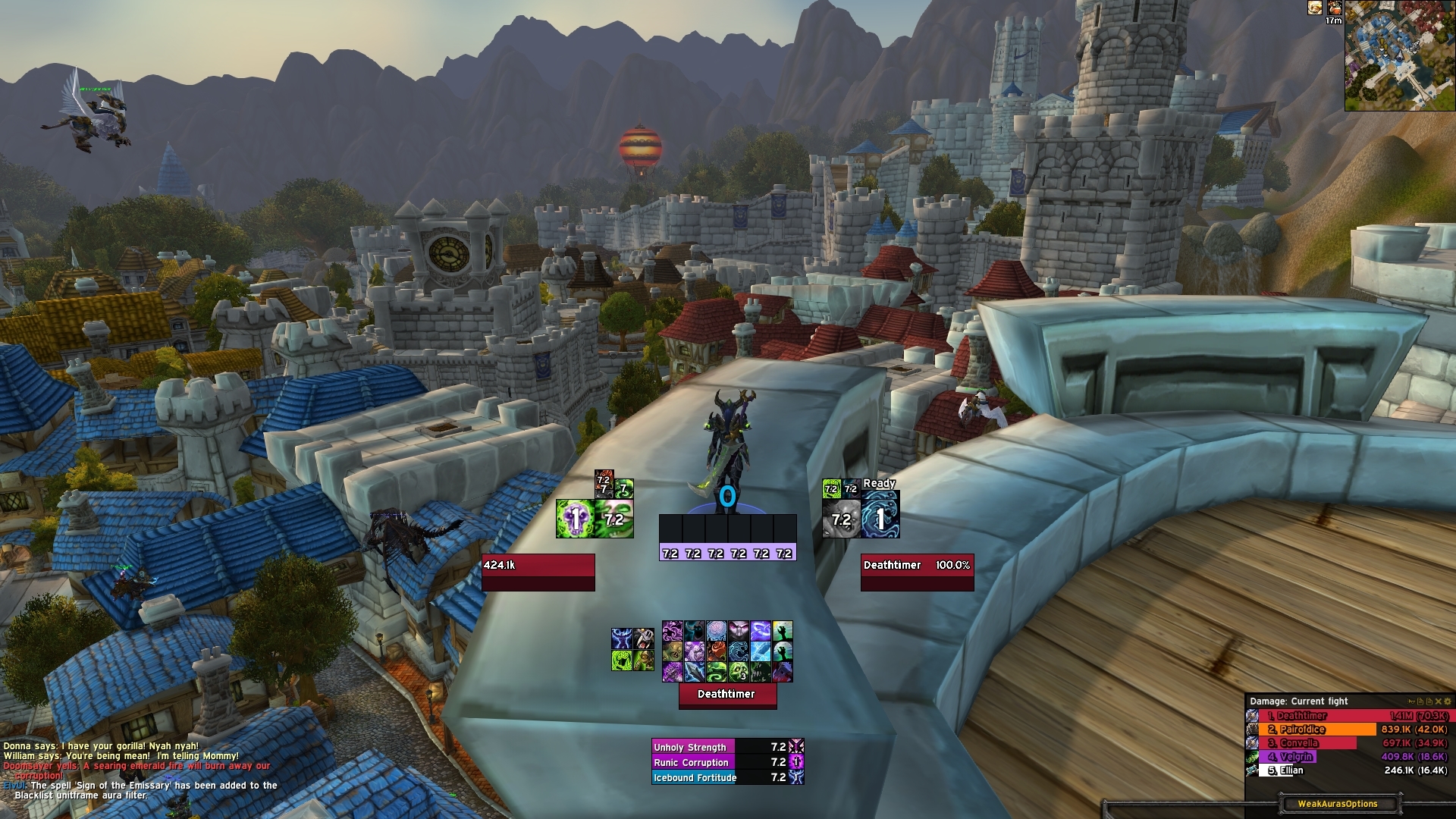
Hi sorry about that. If you are asking about the unit frames it's Elvui with a skullflower texture. Originally Posted by Magnata
-
2016-08-18, 03:06 AM #21024Blademaster
- Join Date
- Jul 2016
- Posts
- 49
Ty, i love your profile. Any chance to upload it?
-
2016-08-18, 03:34 AM #21025Field Marshal
- Join Date
- Jul 2012
- Posts
- 52
Originally Posted by Bluesparkks
I feel like the corners are comfortable (balance/zen), but not efficient. If you were dead set on clear area around your character so you could see ground/players/pvp/etc, then I'd try a more "diamond" arrangement of UI elements. I think this would reduce eye travel time (better than corners, worse than grouped), while still feeling open. Maybe if I'm so inclined, I'll explore the concept.
If you're going to stick to it, then I'd just focus on tidying up.
- You have buffs showing both time remaining and a bar; you don't need both.
- Skin the boss frames with your UF addon.
- Hide mana bars on raid frames
- Cut down on action bars by either hiding in/out combat, or replace some buttons with OPie or other addon
- Hide minimap buttons anyways :P
Diamond
--X--
X---X
--X--
-
2016-08-18, 03:56 AM #21026Mechagnome

- Join Date
- Sep 2009
- Posts
- 580
I actually tried something kind of similar a while back, with stuff along the very bottom/corners, but having stuff centered has felt way better to me in the long run. Originally Posted by Bluesparkks
As far as centered elements obscuring ground effects, it doesn't happen unless things are truly centered, but by placing things close enough that you can see them without looking around at all while having the area around your character clear isn't terribly difficult to achieve. I have ~10 yards of clear area around my character currently.
As far as nameplates for DoT information, I find it works pretty well as long as you're also using something like boss frames to track them on longer-living targets. For example, tracking Sunfire on Hellfire Assault mobs or Gorefiend stuff is pretty easy with nameplates, but tracking DoTs on say...High Council is much easier with boss frames.
-
2016-08-18, 04:23 AM #21027Field Marshal
- Join Date
- Jul 2012
- Posts
- 52
Originally Posted by Arborus
I posted my work in progress UI, but I very specifically ensured that I had my feet/immediate character area visible, while centering player/target elements and raid frames; essentially what you're saying is possible, but in a different way than your screenshot.
Originally Posted by klaxce
Last edited by klaxce; 2016-08-18 at 06:03 AM.
-
2016-08-18, 10:57 AM #21028Grunt
- Join Date
- Jul 2016
- Posts
- 15
Looks good, can you please let me know which modules you edited to put the target box on the top and the length of the playerbar? Originally Posted by naisz
-
2016-08-18, 11:21 AM #21029High Overlord

- Join Date
- Apr 2015
- Posts
- 149
y, why not. But please write me a PM next time, this thread is for UI Screenshots and not support discussion! Originally Posted by hsjyes
L354:
self:SetWidth(426)
L1176 and following:
spawnHelper(self, 'player', 'BOTTOM', 0, 196)
spawnHelper(self, 'target', 'TOP', 0, -60)
spawnHelper(self, 'targettarget', 'TOP', -142,-110)
-
2016-08-18, 12:31 PM #21030Grunt
- Join Date
- Jul 2016
- Posts
- 22
I am trying to finish up the new version of my UI. You can toggle between the ye olde iron horde look aswell - but here's a little teaser =)
I tried to keep it similiar to the default UI as in minimap, raid/party/boss/arena frames, action bars positions , but giving it a drastically different look and feel.
-
2016-08-18, 12:36 PM #21031Deleted
I used to play with the stock Blizzard UI with some Quality of Life enhancing Addons, now since Legion knocks on my coffin I decided to play with it and made this.
http://imgur.com/a/ogAOg
-
2016-08-18, 02:35 PM #21032DeletedMan, I find this to be clean and amazing! Originally Posted by slothington
Did you use ElvUI? How did you make the target name to be abbreviated (A.M. instead of archmage..)?
What's the addon to manage and filter debuffs on target?
Any chance you'll upload this setup? :)
-
2016-08-18, 02:38 PM #21033Pit Lord
- Join Date
- Sep 2013
- Location
- Unites States
- Posts
- 2,471
This is Legion now. No need for all those actions bars anymore Originally Posted by Kondik
 .
.
I must admit it was hard for me to chop off an entire bar.| Fractal Design Define R5 White | Intel i7-4790K CPU | Corsair H100i Cooler | 16GB G.Skill Ripsaws X 1600Mhz |
| MSI Gaming 6G GTX 980ti | Samsung 850 Pro 256GB SSD | Seagate Barracuda 1TB HDD | Seagate Barracuda 3TB HDD |
-
2016-08-18, 03:05 PM #21034Deleted
Thought I'd post mine after a few months of work on Alpha, Beta and eventually pre-patch. I tend to do a complete UI re-work including WeakAuras every expansion.
I'm a raider so I have to keep it functional and tone down on a lot of the pretty stuff a lot of the UIs have on here. I'm a big fan of minimalist UIs only showing what you need, so I've toned down/removed as much as I could whilst still keeping the UI as a whole functional and easy to read at a glance.
Out of Combat:
Spoiler:
With Weak Auras:
Spoiler:
Raid:
Spoiler:
Party/Dungeon:
Spoiler:
Addons Used:
ElvUI
ElvUI Enhanced (Legion)
ElvUI AddOnSkins
Skada
DBM
Font: Expressway
Bar Textures: ElvUI Norm/Blank
-
2016-08-18, 03:18 PM #21035Field Marshal
- Join Date
- Apr 2013
- Posts
- 57
Lyn or someone using his UI: do the Blizzard Raid Frames sometimes show up? It doesn't happen to me all the time but sometimes i join a raid a *pufff* there they are :s
-
2016-08-18, 03:20 PM #21036The Patient
- Join Date
- Jan 2011
- Posts
- 286
No, if its a new char ive not raided with then yes, but not with a char that has been configured to hide the raid frames. Originally Posted by Madstrike
-
2016-08-18, 03:54 PM #21037Pandaren Monk

- Join Date
- Oct 2011
- Location
- California
- Posts
- 1,775
Yup. Skada Chat Frame Integrator. I'm a big fan of putting meters into chat tabs. Originally Posted by Minnifer
That is not dead which can eternal lie.
And with strange aeons even death may die.
-
2016-08-18, 04:11 PM #21038The Patient

- Join Date
- Dec 2015
- Posts
- 310
I use to do this, but it would get buggy and in the end I just got rid of it. Probably because all my characters have slightly different sized chats lol. Originally Posted by shanthi
-
2016-08-18, 04:29 PM #21039Field Marshal

- Join Date
- May 2011
- Location
- Dreamscape
- Posts
- 55
I'm considering doing an almost-complete revamp now, so thanks for the feedback ^^. I'm not dead set on having clear central area, it's just what I'm used to at this point. Might be worth the transition to something more efficient now, I really don't know. Diamond setup seems a bit weird; I'm thinking about a UI mostly clustered in the bottom-center, but I haven't figured out an efficient / effective layout that includes the minimap and raidframes. I'll keep thinking on it. Originally Posted by klaxce
As for tidying up, I agree with your points except for hiding mana bars--as a healer, I like knowing how my fellow healers are doing on mana, because it helps me make better decisions. The bars at the top of each frame show roles normally (blank for DPS, green for healer, red for tank) but double as timer bars for specific buffs (Renewing Mist, new Atonement).
...and that, yeah. Haven't figured out where to put everything if I just cut a bar out. Originally Posted by Arbiter
Yeah, I'm thinking about it. I'll get back to you guys when I think of something that'll actually work. Originally Posted by Arborus
Fair enough. I don't play DoT classes enough to know. /shrug Originally Posted by Arborus
[Spider Dance - Toby Fox] [♫] [t] [Splinterfox | MW/BM | Tanaris-NA]

[OSaS A1 ~ 80% Completion] ~ [Thank You, MLP] ~ [ ??? ]
-
2016-08-18, 05:02 PM #21040Bloodsail Admiral
- Join Date
- Sep 2010
- Posts
- 1,189
Bitch please, this is Skullflower UI. You're even using the Textures I asked him to create for the Light version. Originally Posted by Veilyn

 Reply With Quote