Flightstone weapon breakdown costs
 The Cataclysm Classic Pre-Expansion Patch Arrives 1 May
 Developer Thoughts - Plunderstorm Game Mode and Feedback
 MMO-Champion


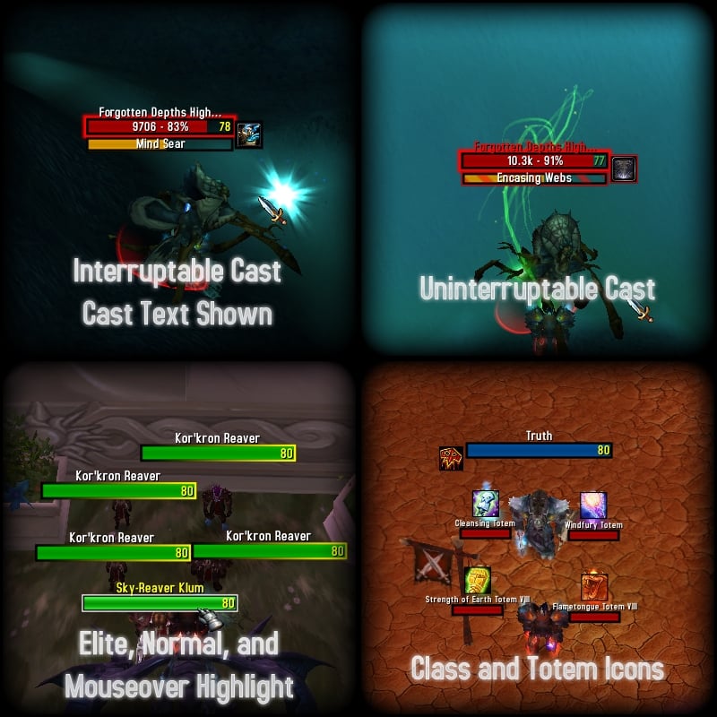
Asked a couple of the addon authors if they mind whether I release edited versions of their addons / layouts.
All going well I could have an updated release by the weekend! I need to filter out some addons though, I'm sure you guys don't want mario wow sounds!
 Recent Blue Posts
 Recent Forum Posts
Thread: Post Your UI
-
2011-08-05, 01:24 AM #4681Epic!

- Join Date
- Jul 2010
- Location
- United Kingdom
- Posts
- 1,661
-
2011-08-05, 12:26 PM #4682DeletedGreat news, looking forward to it!
 Originally Posted by carebear

-
2011-08-05, 10:51 PM #4683Deleted
Some feedback to WindLeader:
-You have two party/raid frames showing. You can hide blizzard frames by using HideRaidFrame-addon. It also allows you to hide whole Raid Manager if you do not need it.
http://wow.curse.com/downloads/wow-a...raidframe.aspx
- You have scrolling battle text and floating battle text enabled, chose one. Now you see same things twice. I prefer scrolling since it keeps my screen clean. You can disable floating text from Blizzard's interface settings. Also reconsider placing of your mana/money/spell gain spammy thing. Do you really need all that information? Does it really need to be at center of screen?
- Your map is kind of messy with all addos adding buttons there. You can either remove those buttons from addon settings (most of them have possibility not show minimap button) or you can instal minimap addon. I use BasicMinimap. It is up to date and light.
http://wow.curse.com/downloads/wow-a...c-minimap.aspx
Wink to make your nameplates super cool and informative: Instal Tidy Plates & Threat Plates. Yes, two addons for nameplates. Threat Plates is pre-configured so you do not really need to change anything.

http://wow.curse.com/downloads/wow-addons/details/tidy-plates.aspx
http://wow.curse.com/downloads/wow-a...at-plates.aspx
-
2011-08-06, 12:19 AM #4684High Overlord

- Join Date
- May 2010
- Location
- Los Angeles, CA.
- Posts
- 173

Last edited by mmocba105e19de; 2011-08-06 at 12:34 PM.


-
2011-08-06, 02:29 AM #4685High Overlord

- Join Date
- Oct 2010
- Location
- Australia
- Posts
- 118
I Like this one the best good job mate. Originally Posted by anti-wow

-
2011-08-06, 02:33 AM #4686Brewmaster

- Join Date
- Jul 2009
- Location
- If you hit the train tracks you've gone to far.
- Posts
- 1,494
I won't post it because it's just a standard ElvUI skin but damn every time I come here I want to stop being lazy and make my own. I had a really good one till I had some computer issues and just ended up using the default frames, lost the saves for it when I got a new computer and just said screw it and got an already made UI. Maybe today will be the day :<
-
2011-08-06, 02:52 AM #4687Blademaster

- Join Date
- Jul 2011
- Posts
- 35
Any suggestions or advice are welcome.
Idle:

Combat:

Raid: (sorry, best i've got.)

Left to right is player frame - target frame - target of target frame.
The focus up top from left to right is Focus - Focus target.
I have my action bars hidden and have separate bars with spells that have cooldowns. My micromenu and bags reveal on mouseover. (:Last edited by mmocba105e19de; 2011-08-06 at 12:41 PM.
-
2011-08-06, 05:18 AM #4688High Overlord

- Join Date
- Mar 2011
- Posts
- 143

Love it.Last edited by mmocba105e19de; 2011-08-06 at 12:42 PM.
| Armory - Akii |
-
2011-08-06, 10:44 AM #4689The Patient

- Join Date
- Jan 2009
- Posts
- 201
@Kyza
Very clean Ui, and an interesting idea going without any player unitframes and relying on Hud.
But I would adjust your party frames a little.
They do not fit so well into your ui, I'd say a more minimalistic approach would be better.
Hide the portrait, make the energy bar thinner, or get Grid.
If you really love it, stick to it, but my ui's are always in a neverending process, that's what i love about building Ui's
-
2011-08-06, 01:27 PM #4690Dreadlord

- Join Date
- Jun 2010
- Location
- Chicago
- Posts
- 856
Throw me some feedback.


Two in-combat and one idle.Last edited by mmocba105e19de; 2011-08-06 at 01:40 PM. Reason: now with thumbnails!
Former raider of Accession [US-Stormreaver]
-
2011-08-06, 06:09 PM #4691Deleted

-
2011-08-06, 06:45 PM #4692Field Marshal

- Join Date
- Jan 2011
- Posts
- 94
It's definitely still a work in progress, I'm not happy with the way the Stuf boss frame isn't showing anything but the main boss (ignoring ryolith's legs, and shannox's dogs, hatchlings on alystrazor). And how the blizzard boss frames are still popping up, Im still looking for a solid buff bar mod as well.

Last edited by mmocba105e19de; 2011-08-07 at 01:02 PM. Reason: image link was broken
My Monk: Refrigerator - http://us.battle.net/wow/en/characte...gerator/simple
-
2011-08-06, 08:40 PM #4693Blademaster
- Join Date
- Jul 2011
- Posts
- 35
@.Aen
Reminds me of my own, in a way.
the only suggestions i have would be to make your micromenu reveal on mouseover, it just looks a bit cleaner.
-
2011-08-06, 11:59 PM #4694DeletedEverything looks tidy and clean EXEPT the minimap, that looks completely shit compared to the rest of the UI witch is really really nice. Originally Posted by Evisiling
-
2011-08-07, 02:50 AM #4695Stood in the Fire
- Join Date
- Sep 2008
- Posts
- 441
A situation where "sexy"map looks shitty...imagine that.
On topic: Evisiling, all your pixel fonts are incorrect sizes.
Although im sure you just haven't noticed that yet seeing as how I doubt you can draw your attention away from that monstrosity in the top right corner of your Ui. Oh look, here we are going off topic again. /sigh
-
2011-08-07, 04:42 AM #4696Epic!
- Join Date
- Jul 2010
- Location
- United Kingdom
- Posts
- 1,661
My UI should now be available to download! Click the link in the sig.
-
2011-08-07, 04:42 AM #4697High Overlord
- Join Date
- Jan 2011
- Posts
- 143
What tidy plates theme are you using? Love it. Originally Posted by Raht
-
2011-08-07, 05:36 AM #4698Grunt

- Join Date
- Apr 2011
- Posts
- 19

The general setup of my latest UI. With rebirther being class colored now and a few other cosmetic touches in itLast edited by mmocba105e19de; 2011-08-07 at 01:03 PM.
-
2011-08-07, 06:47 AM #4699Deleted

An update, you probably wont see much of a difference but is there if you look closely
Last edited by mmocba105e19de; 2011-08-07 at 01:03 PM.
-
2011-08-07, 08:50 AM #4700High Overlord
- Join Date
- Aug 2009
- Posts
- 117

Feedback?Last edited by mmocba105e19de; 2011-08-07 at 01:04 PM.

 Reply With Quote