Hey all, we just did a full redesign of our website using wordpress and a custom theme. Would appreciate any feedback or thoughts on how you might change it.
Ultimately we've just found wordpress to be worth the effort to stand out more from traditional enjin/guildportal, but it IS a lot of work.
Needs more pictures for such a white plain background.
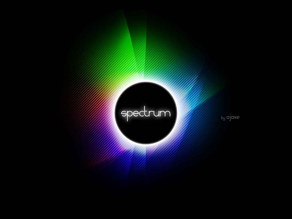
Also, I'm offended that you started your logo off with red and ended it with red. The end of "Spectrum" should be in violet. I barely see the orange in there too.
Are you guys deadset on the current logo? Your site overall is very clean and polished looking, and having a "grungy" logo feels out of place in my opinion.
I think something similar to this (found via Bing image search) would be more fitting.
You could also apply a color spectrum overlay on the dragon image used in the lower area of the main page as your logo.
That said, i really like the layout of your site. It is clean and concise. The only thing I would personally change would be to adjust the contrast a bit on the gray fonts. I think a shade or two darker would be easier to read. That could just be my issue, as I have a very bright screen.
 Mythic+ Dungeon Adjustments - 27 April
 Mythic+ Dungeon Adjustments - April 26
 Dragonflight and Season of Discovery Hotfixes - April 25, 2024
 MMO-Champion


 Recent Blue Posts
 Recent Forum Posts


 Reply With Quote
