Limited PvP -> PvE Free Character Transfers
 Mythic+ Dungeon Adjustments - 27 April
 S4 + catalyst + Dreamsurge Coalescence = what the heck?
 Did Blizzard just hotfix an ilvl requirement onto Awakened LFR?
 MMO-Champion
@Carebear: Imo the pixelfonts are better. These textures for some reason also look less crispy, so overall the UI gives me quite a non crisp feeling. Me no likey. Not a fan of the portraits in the UF's. I don't know, it doesn't stick out like your other UI's.
 Recent Blue Posts
 Recent Forum Posts
Thread: Post Your UI
-
2012-12-14, 09:36 AM #9001Deleted
-
2012-12-14, 10:18 AM #9002The Patient


- Join Date
- Sep 2012
- Posts
- 345
Here is what I've been playing around with over the last couple days. Not everything is finished and like a lot of people it really never is.

-
2012-12-14, 12:29 PM #9003DeletedWhat minimap? What unitframes?? What did you use to skin the buffs?!! (Actually, icons overarall)
 Originally Posted by OriginalVocalMix

Sorry for the questions but it looks amazing, and I want to, quite blatantly, copy the style.
-
2012-12-14, 01:24 PM #9004Deletedno thx give me acherus every day Originally Posted by frantik
-
2012-12-14, 01:42 PM #9005The Patient

- Join Date
- Jul 2012
- Posts
- 293
Originally Posted by carebear
I agree almost entirely with Led ++. Not a fan of the font and not a fan on the borders. Adding to the list of things I'm not a fan of is the blue bar beneath your player frame. Is that exp/reputation? It looks really odd just floating around underneath your combo points :\ I'm a strong believer of having the exp/reputation bar on the edge of the screen, or somewhere out of the way, such as under the minimap or under chat. Originally Posted by Led ++
The thing that I like which Led ++ doesn't, is the portraits in the unitframes. I don't have them on my UI at the moment (I used to) but I think it adds 'something' to an otherwise boring texture.
Overall though, I think you're taking a step in the wrong direction, but that's just my opinion. Not the end of the world! (I mean, it's only 14/12/12, still got 7 days left huehuehue. I kid, I kid. :') )
-
2012-12-14, 02:37 PM #9006Pit Lord


- Join Date
- Sep 2008
- Location
- Montreal, Quebec, Canada
- Posts
- 2,259
Started to clean mine up >.< After looking at the posts on here and all teh UI's started to realize mine got really cluttered with so much useless junk!
Willing to take positive negative etc etc critisism... it's all good as it leads to a better ui

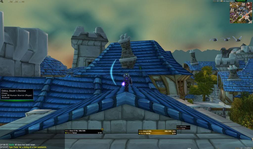
Sigh just realized I didnt get an in combat / raid pic Will need to wait till tonight for that but comments on the OOC look thus far much apreciated!
ugg trying to get thumbnail to work
Last edited by mmocba105e19de; 2012-12-14 at 04:27 PM.
Youtube Chan : http://www.youtube.com/user/eqbobyboucher
Armory : http://us.battle.net/wow/en/characte...Odina/advanced
-
2012-12-14, 02:52 PM #9007Field Marshal
- Join Date
- Oct 2012
- Posts
- 88
my current ui as resto shaman, raid frames are just above the cd timer.
tell me what you guys think.

-
2012-12-14, 02:54 PM #9008Mechagnome

- Join Date
- Nov 2007
- Posts
- 631
Funny, I think I am the only one thinking he is - finally - goin' in the right direction. Except for the portraits. Originally Posted by Pixil
— oh, honey.
-
2012-12-14, 03:28 PM #9009Deleted
http://media-wowstead.cursecdn.com/a...3086019059.jpg
My warlocks UI
Feel free to give criticism!
-
2012-12-14, 03:30 PM #9010Pit Lord
- Join Date
- Sep 2008
- Location
- Montreal, Quebec, Canada
- Posts
- 2,259
I like it allot. It looks very clean but for myself there are 3 things standing out Originally Posted by Velthari
1) You are trackign the same buffs in 3 different locations. I would sugest picking the one you prefer the most and removing the 2 others to reduce triple information.
2) hid the minimap buttons that are super imposing on your buffs to the right of you minimap and have them set to a "show on mouse over" and it will clean that area up allot
3) Your damage frame seems to dip down into the "black bar" at the bottom of your UI. As well the "non locked arrows" stick out from the rest of the UI. I would sugest adjusting the size or placement then locking it as well as changing the color of the status bar on it to match your unit frames rather than pure black.
Other than Me gustaYoutube Chan : http://www.youtube.com/user/eqbobyboucher
Armory : http://us.battle.net/wow/en/characte...Odina/advanced
-
2012-12-14, 04:08 PM #9011Epic!
- Join Date
- Jul 2010
- Location
- United Kingdom
- Posts
- 1,661
Cheers for all the comments guys! I won't be able to please everybody as everybody has different tastes and opinions!
I'm going to keep messing around with both sets of fonts and I think I will be switching between both for a while.
Lyn, I use PhanxChat but I also have this piece of code in there:
Code:ChatFrame1:SetSpacing(3)
-
2012-12-14, 04:21 PM #9012DeletedWhile you're at it linking code, can you please give me your unitframe setup, the one with the pixel or non-pixel font, doesnt matter Originally Posted by carebear
-
2012-12-14, 05:57 PM #9013Mechagnome
- Join Date
- Nov 2007
- Posts
- 631
Funny, when I use THIS, it fucks up my chat. The upper lines are spaced, the lower are not. Originally Posted by carebear
— oh, honey.
-
2012-12-14, 05:58 PM #9014High Overlord
- Join Date
- Feb 2011
- Posts
- 119
Im on your side , if that's of any comfort :P Originally Posted by Lyn
Portraits covering important parts such as healthbars are just plain bad, in my personal opinion ofc, depends if you make your ui for performance or looks. i used to make it for looks.. today i make mine a lot more for performance.. and with performance i don't mean how much cpu or stuff like that my addons use, things that actually improve my gameplay.
@Carebear
The borders right now looks like they're just the wrong size.. can't tell if you are using a fuzzy border on purpose or a just 1-2 px one that looks off.. a crisp 2px border would look great, and maybe size up the frames a little bit could make the font fit better.
All in all, i like the change! <3
-
2012-12-14, 06:03 PM #9015Mechagnome
- Join Date
- Nov 2007
- Posts
- 631
<3 Originally Posted by twin2
(finished with off topic now, keep the screens coming)— oh, honey.
-
2012-12-14, 07:48 PM #9016DeletedBitch please, what do you know. :P Originally Posted by Lyn
I liked your older UI's more too ^^
-
2012-12-14, 08:41 PM #9017Mechagnome
- Join Date
- Nov 2007
- Posts
- 631
Enough, I guess. :P Originally Posted by Led ++
My older, yes, maybe. I like my new one, it's nice to play with. Sometimes I "miss" some of my old ones, true, but tbh, cba to make a new one atm. Just too lazy.— oh, honey.
-
2012-12-14, 08:50 PM #9018High Overlord
- Join Date
- Jan 2012
- Location
- New Zealand
- Posts
- 155
Minimap: QuseMap Originally Posted by Sagryth
Unitframes are STUF with this guide used for 1 pixel borders.
CleanIcons Thin skins SBF and everything else too.
Hope this helps.
-
2012-12-14, 09:08 PM #9019Epic!
- Join Date
- Jul 2010
- Location
- United Kingdom
- Posts
- 1,661
they're supposed to be a shadow border that looks fuzzy, just like the UI that I used during firelands! Originally Posted by twin2
My new monitor is 2560x1440 and for some reason the pixel perfect border doesn't work on it right now and I'm too lazy to spend ages fixing it so I just went back to this. We'll see what happens over the next few days. (Or tomorrow, I have a day off so I won't be moving very far from my chair!)
-
2012-12-15, 03:37 AM #9020High Overlord
- Join Date
- Jan 2012
- Location
- New Zealand
- Posts
- 155
Cheers, works perfectly. Had to make a trial account just to test as I'm out of game time. Originally Posted by twin2

 Reply With Quote