 Limited PvP -> PvE Free Character Transfers
 The Cataclysm Classic Pre-Expansion Patch Arrives April 30
 Why is it so hard to find a Mythic raiding guild that isn't full of toxic people?
 Did Blizzard just hotfix an ilvl requirement onto Awakened LFR?
 What's the state of PvP like today?
 MMO-Champion


Originally Posted by Sidonis

Do you see what I did there ?
 Recent Blue Posts
 Recent Forum Posts
-
2011-02-22, 01:00 PM #221The Patient

- Join Date
- Apr 2009
- Location
- Catalonia
- Posts
- 234
-
2011-02-22, 01:03 PM #222Epic!


- Join Date
- Oct 2010
- Posts
- 1,699
Boubs post says: Originally Posted by Nastified
At least it says it was taken care of. But you are right since we dont really know that much how this statistics were made exactly doubting what they are implying is a valid.Deleted/transfered characters were removed from the stats.
-
2011-02-22, 01:03 PM #223Deleted
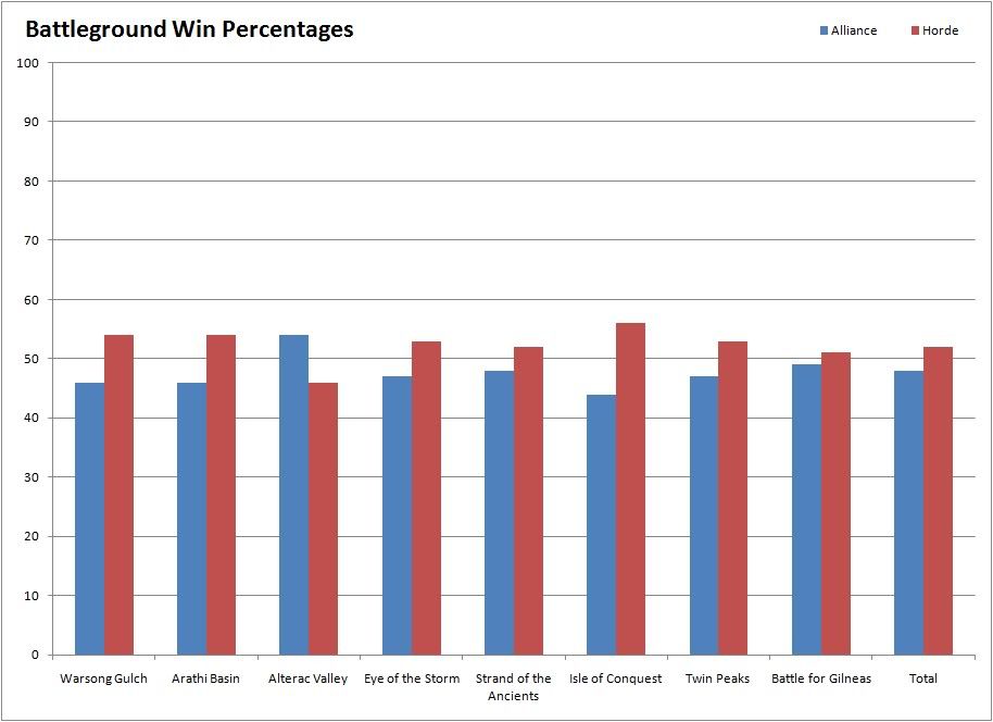
I didnt read any comments so I dont know if this was said before from someone who know how to read graphs. Anyway I have always played alliance and I can say the graphs are a bit misleading since the left bar should be scaled from 0 to 100%. The way it is now the difference between horde vs alliance seems huge. It may be true that horde winds more, the percentage might indeed be unfair but the difference is not as huge as it seems only by wathing the bars of the graphs.
-
2011-02-22, 01:06 PM #224Deleted
well, you should check ratios on spanish servers too xD.. We (ally) lose 3 out of 4 most of the times. But i have to say, we get some strong mornings/deepnight bgs

-
2011-02-22, 01:06 PM #225The Patient

- Join Date
- Aug 2009
- Posts
- 326
Except now it looks like a gigantic difference between Horde and Alliance in every form of Battleground, making it even more ridiculous. Originally Posted by inyu
What's so hard to understand about how bad these graphs are?
Worst case scenario, make a table like the post below me shows, where it's far, far easier to read and less misleading. If you really can't see how bad the original graphs are...I'm not really sure what to say.Last edited by Hateful; 2011-02-22 at 01:08 PM.
Who knows what secrets hide in the dark?
Ah yes...*I* do...
-
2011-02-22, 01:07 PM #226Mechagnome
- Join Date
- Dec 2009
- Posts
- 563
http://img405.imageshack.us/f/grapho.jpg/
For people who want to see the graph on a scale from 0-100 (like it should have) and see how the difference is much smaller then on the original graph even tough it is the same numbers. I just took the graph on above, you can do the same from the lower graph if you want.
Also you have to take into count that armory doesn't know who has faction changed over the last year, who are playing the same characters etc. So those two points bias those graphs.
-
2011-02-22, 01:14 PM #227Data Monster

- Join Date
- Nov 2008
- Location
- FL, United States
- Posts
- 10,410
It looks pretty silly tbh. Originally Posted by inyu
0-60% would be much better than 0-100%.
Either way, it hardly matters at all. Everyone besides what... 2 people (?)... have understood the graphs before posting.Last edited by Simca; 2011-02-22 at 01:27 PM.
-
2011-02-22, 01:18 PM #228DeletedAnd since the merger with German/English realms it has gotten worse, at least in the ally side Originally Posted by JaheraMinahonda

-
2011-02-22, 01:19 PM #229High Overlord

- Join Date
- Oct 2008
- Posts
- 140
too bad they didnt include wintergrasp. while sneaking in there our ratio was like 94% horde wins.
-
2011-02-22, 01:21 PM #230Deleted
To much emotions here.
Fact is that the largest pooled data set of WoW PvP shows a significant win difference in favor of Horde. And the difference is slightly larger than I think a games developer is willing to live with. The problem is ofc that one reason might be the fact that horde is considered more PvP for many realms and hence a positive selection of players rather than racials and BG design (scratches head).
-
2011-02-22, 01:21 PM #231Stood in the Fire
- Join Date
- Apr 2010
- Posts
- 350
Well that doesn't say anything. I glanced over the bars at first and was like 'wtf!' and then looked closely to the numbers, I don't think everyone will look at those numbers and just draw conclusion. Originally Posted by Simca

-
2011-02-22, 01:25 PM #232Brewmaster

- Join Date
- Feb 2009
- Posts
- 1,283
On high level arena the Alliance racials are considered far far superior. Originally Posted by Jon
-
2011-02-22, 01:25 PM #233Deleted
They scanned millions of bg wins and losses, 1% in these graphs is a lot.
-
2011-02-22, 01:26 PM #234Stood in the Fire
- Join Date
- Apr 2010
- Posts
- 350
Well it isn't as major as everyone said, people claim they lose 75% of the time Originally Posted by Zarod
-
2011-02-22, 01:27 PM #235Bloodsail Admiral

- Join Date
- Oct 2009
- Location
- Barcelona, geek paradise
- Posts
- 1,199
Worgen, Human, Dwarf and Nelf say hello2) Horde players have better racials for PvP
-+1% passive crit, racial dash, reduced disease time
-EmfI, weapon bonuses bonuses
-StoneSkin (10% dmg reduction+cleansing of venom, bleeds & diseases), cuteness, frost resistance, weapon bonuses
-Shadowmeld (kinda FD) 2% chance to MISS attacks
Name an horde race beside Goblins with better racials
-
2011-02-22, 01:28 PM #236Data Monster
- Join Date
- Nov 2008
- Location
- FL, United States
- Posts
- 10,410
Yeah, me too, but I meant before posting - fixed. Originally Posted by Device
-
2011-02-22, 01:28 PM #237Mechagnome
- Join Date
- Oct 2010
- Posts
- 570
Yeah, a pie chart or something would have been a better view IMO. Just to illustrate, Isle of Conquest, the one that the bar graph makes it look like Alliance is just being slaughtered repeatedly looks like this on a pie chart.
So the one that Alliance is doing "worst" at isn't really even all that bad.
All in all, it is pretty close on most of the battlegrounds.
-
2011-02-22, 01:29 PM #238The Patient
- Join Date
- Aug 2009
- Posts
- 326
Yes, 0 - 60% would be best case scenario, but frankly the ones on the front page at the moment really just look terrible. They're very misleading, and the initial response of just about everyone is "Holy shit, that's a massive imbalance". You wouldn't NEED to have the disclaimer "read the values" if the bars were displayed in a good manner. How many people who just read this site for the news are going to now complain about this? Originally Posted by Simca
Sure, it's their own stupid fault for not being able to read a graph, but I'd be tempted to say some of the blame definitely falls on the original graphs - they could have been made alot better, and it just makes whoever made them look like a real amateur at both graphs and Excel. Don't take that as an insult, it's just how it comes across to those who look at it.
Putting min/max values on a very close % makes the gap look exceptionally larger than it actually is, and that's why a 0-100% graph still gives a better overall picture of the win % in BGs, rather than some bars with a gigantic visual difference between them - even if the numbers themselves are correct.
It's good that the compilation of data has been done and it's very interesting, don't get me wrong, it's just poorly presented. That's all people are really saying. For a news site that thousands of people visit daily, it's not great form, at least in my opinion.Last edited by Hateful; 2011-02-22 at 01:33 PM.
Who knows what secrets hide in the dark?
Ah yes...*I* do...
-
2011-02-22, 01:29 PM #239Bloodsail Admiral

- Join Date
- Oct 2010
- Location
- Costa Rica
- Posts
- 1,084
I pvp as alliance and i can tell that this is graphic, at least in my case is true
Most allys dont like to team up, or listen to the other people
And we always got a ton of bots because of the BG insta-queues, I counted 4 bots on the last WSG i participated
But yeah, boub must redo these graphics really quick cause i see them already all over the official forums in QQ threads, so prepare for the flame fest incoming :S
-
2011-02-22, 01:30 PM #240High Overlord
- Join Date
- Feb 2010
- Posts
- 163
lmao...this made me laugh for a while Originally Posted by Ash773


 Reply With Quote


