 Recent Blue Posts
 Feedback: Paladin Updates
 Feedback: Paladin Updates
 Dragonflight: Dark Heart Arrives on May 7
 MMO-Champion


I really like that.Originally Posted by Rusk

Keep it up I want to see the whole thing!
 Recent Forum Posts
Thread: Post Your UI
-
2013-02-14, 12:06 AM #10001Epic!

- Join Date
- Oct 2012
- Posts
- 1,559
Last edited by mmocba105e19de; 2013-02-14 at 06:30 AM.
-
2013-02-14, 12:13 AM #10002Blademaster
- Join Date
- Jun 2012
- Location
- ellinois
- Posts
- 42

I figured if I'm showing my UI, might as well show off a few other things
Last edited by mmocba105e19de; 2013-02-14 at 06:31 AM.
-
2013-02-14, 02:53 AM #10003The Patient
- Join Date
- Dec 2011
- Posts
- 201
Just to be contrary - that texture is what I think makes your bars 'pop'. It adds a depth to them that is missing in similar 'flat' textured bars. That said, I find that I LOVE a lot of things in screenshots, but once I try them in-game they just don't work out. Originally Posted by Ishtara
 Should you share these publicly someday, I hope this doesn't turn out to be the case!
-
2013-02-14, 05:44 AM #10004Mechagnome
- Join Date
- Jul 2011
- Posts
- 570
I think you can make a strong case for simple things like borders or font choices being good or bad. The thing is: it doesn't matter. The game runs a slow enough pace that a UI that's "half as good" as ideal is still is efficient enough to do the job. You can be "sub optimal" in order to serve some aesthetic preference and it doesn't actually matter.
Think about it like qualifying for a race. You have to do one lap in at most 1 minute. If you're doing it in 30 seconds then you have plenty of time you can trade for "strutting" for the fans, taking it easy so you don't pull a muscle before the race, or just half assing because you're hungover from the per race party. So long as you can hit the qualify time it doesn't matter. Some people want to set a record qualify time, some want to look cool for the press. To each his/her own.
It's kinda funny to talk to "real nerds" with tweaked out Vim/zsh/etc setups. We can type at 120 words/minute, the editor is optimized to cut any action down to 5 keystrokes or less, but then we write maybe 5000 characters in an 8 hour work day. 95% of your day is waiting on compiles, tests, or thinking about what to do next. Just like wow-UI people super nerds like to justify it in terms of "more efficient" but really it's just fun to tinker and the gains are impossibly small or non existent. I'm guilty of it with my track bike (and I suspect everybody else that goes to secret street just likes to tinker and cant really tell the difference between an eigth turn of adjustment on their rear shocks too).
I wonder why we find it so hard to admit that this is just fun to play with and sometimes we do dumb things because we think it looks cool?
I recorded the first of a new UI series today: why my tank UI sucks and what we can learn from it. My new series will probably be a healing UI but I need to find a new guild to play with for 5.2 or it might end up crappy.
-
2013-02-14, 07:48 AM #10005Stood in the Fire

- Join Date
- Sep 2008
- Posts
- 441
A good designer wants an interface to be as functionally efficient as possible, regardless of what the minimal requirements are to "do the job" that the interface is created to do.
Some people are satisfied with mediocrity and having the mindset that something is just "good enough."
I am not one of those people, I want something to be as good as it can be
As a side note, you have a nice voice for instructional videos :P
<3
Ish
-
2013-02-14, 08:30 AM #10006Warchief

- Join Date
- Dec 2010
- Posts
- 2,072
 Originally Posted by Ishtara
You come off very.. Self righteous.
If UIs were a religion you'd be the head preacher whose opinion is always correct.
OT: I believe regardless of textures it's not really anyones place to say they don't like their textures to the point of creating paragraphs as to why what they've chosen is wrong.Last edited by solvexx; 2013-02-14 at 08:42 AM.
-
2013-02-14, 08:34 AM #10007High Overlord

- Join Date
- Apr 2011
- Posts
- 136
Originally Posted by Crummy
How did you do the GCD bar?
-
2013-02-14, 10:10 AM #10008DeletedThe texture will remain, i love that one (fer 34) but thanks for noticing the spacing between the weakauras and the enemy castbar text, will get right on it Originally Posted by Ishtara
And with the background im using on my unitframes the visual representation is not a problem, here's a pic ->

Thanks, should be done in 1-2 days, just raidframes and bossframes left, will post a pic when it's done. Originally Posted by Drayarr
Im also thinking about uploading this UI on wowinterface for those who are interested.Last edited by mmocf4ab73a1dd; 2013-02-14 at 10:13 AM.
-
2013-02-14, 12:24 PM #10009Epic!
- Join Date
- Jul 2010
- Location
- United Kingdom
- Posts
- 1,661
But that's the way these threads work. The whole point of a thread like this is for people to suggest things and those things are going to be anything and everything. You can't post in a post your UI thread and expect everybody to think it's the best and that there's nothing wrong with it. Everybody has their own personal taste and will suggest them to a user because they do think it's better than the one that is used and they also believe that it will improve the UI. It's usually the little things that make the biggest difference to some, so they'll suggest all the little things. Originally Posted by bOOURNS
It's down to the person creating and posting the UI to change what's suggested or keep it the way it is. You say you've stopped posting because you used too many peoples suggestions and the UI was no longer yours. That means you're the one responsible for the changes made. You don't have to use peoples suggestions because you can't please everybody. I've been told endlessly that the 3D portraits on my frames don't look right and the plain black texture looks better. I don't agree with it and I think the portrait adds a nice texture to the frame so I have kept them.
It's still my UI and it's still my decision on how I do things, I don't have to follow every suggestion posted, I just like to know what people think as I am sure most people who post their UI do.
-
2013-02-14, 03:46 PM #10010Stood in the Fire
- Join Date
- Sep 2008
- Posts
- 441
That's rather rude, I'm sorry you feel that way. Plenty of people in Ui forums have strong opinions, not sure why I am the one being singled out for just trying to help others. And I don't feel like my opinion is always right (as you will see below when I respond to Rusk) Originally Posted by solvexx
And I assume your OT comment is directed at evn, as I don't create "paragraphs" in posts telling people they are wrong.
As my own OT: I like your accent
I love fer's texture pack as well, we were good friends back in the day. Originally Posted by Rusk
Seeing this new picture with the hp background showing, I def agree that the texture you currently have looks great! I wasn't expecting the contrast to be so high, I like it
This is why people should post combat screenshots, we could have avoided this whole texture mess all together hehe
Can't wait to see the rest!
<3
Ish
---------- Post added 2013-02-14 at 10:51 AM ----------
Jesus, so much QFT in care's entire post! Originally Posted by carebear
I don't know how many times I (and others *looks at Led*) have told care to lose the portraits, but he keeps them because he likes them and if it works for him then great, it doesn't make me like his Ui any less.
ps. care, lose the portraits :P
mucho <3
Ish
-
2013-02-14, 05:30 PM #10011DeletedYes! Do it! Originally Posted by Rusk
-
2013-02-14, 08:19 PM #10012
-
2013-02-15, 11:12 AM #10013The Patient

- Join Date
- Oct 2010
- Location
- Sweden
- Posts
- 268

Tried to make a good pic yesterday during progress, best shot I got
AddOns:
ElvUI
Big Wigs
Vuhdoo
HolyTrinity
TellMeWhen
Skada
MicScrollingBattleText (MSBT)
Oops could someone fix the size of the pic, didnt know it would bug like that.Last edited by mmocba105e19de; 2013-02-15 at 03:25 PM.
-
2013-02-15, 03:18 PM #10014Fluffy Kitten

- Join Date
- Apr 2009
- Posts
- 17,226
I really REALLY want to redo this layout
http://img193.imageshack.us/img193/5...2910110118.jpg
Any suggestion to make it actually usable?? I need to find the textures/fonta again (it's and old project of mine, with an edited oUF_Caellian). Need halp in finding teh resources
Non ti fidar di me se il cuor ti manca.
-
2013-02-15, 06:23 PM #10015Stood in the Fire
- Join Date
- Sep 2008
- Posts
- 441
The thinner font seems to be: http://www.dafont.com/font-comment.p...&text=glancing
edit*
The thicker font could be: http://www.dafont.com/hotel-coral-es...e=l&text=34+5mLast edited by Ishtara; 2013-02-15 at 06:28 PM.
-
2013-02-15, 06:36 PM #10016Fluffy Kitten
- Join Date
- Apr 2009
- Posts
- 17,226
I know the texture is from another oUF layout, and probably also the big font - need to do some deeper search; i was thinking to mix some things up with my ui (probably not fonts)
Non ti fidar di me se il cuor ti manca.
-
2013-02-15, 08:02 PM #10017Epic!
- Join Date
- Jul 2010
- Location
- United Kingdom
- Posts
- 1,661
Go non-pixel like I did! Originally Posted by Coldkil
-
2013-02-15, 08:19 PM #10018Mechagnome
- Join Date
- Jul 2011
- Posts
- 570
I've been playing around with Adobe's Source Pro and Source Code Pro: two very similar fonts with a variety of weights. One fixed width, one proportional. I'm quite a fan of source code pro (I replaced my text editor font with it: which says a lot because I actually shelled out the $80 for a copy of Pramatta Pro).
It's nice that the fonts are free and open source. You can easily modify it to include glyphs from other fonts (IE: UTF symbols for arrows, skulls, fire, rain drops, etc) which might mean you can make "graphical" displays easily. Just loot stuff from wing dings (or whatever) and replace the ® –· etc. characters. Include the "partially" filled star symbols from Lucida Grand and you can easily make a little combo point tracker that looks graphical but is actually just a few letters. Easy to align, edit, and incorporate into unit frames etc. It needs a condensed and black variant but otherwise it's not a bad set.
I'm not saying that type of font style suits everyone -- but looking into font modification seems like it could be full of potential. I was doing it for powerline (a vim plugin that puts a status bar along the bottom of your screen) and realized that it probably has application in wow.
Imagine how much lighter you could make your UI if you had no graphics at all - just carefully position text!
-
2013-02-15, 08:20 PM #10019Fluffy Kitten
- Join Date
- Apr 2009
- Posts
- 17,226
Non pixel would be fun, but i need a font that looks good at small sizes - i'm too used to pixel fonts so everything i do to use the standard ones just looks so incredibly huge and occupies a lot of space Originally Posted by carebear

But i really want to try to edit my UI and start using normal fonts again - it leads to a lot more customization. I like the arial-narrow-like fonts. Help me find some cool
EDIT: looking also for some suggestions about the unitframes. mainly Player/Target since party/raid frames are pretty much standard.
---------- Post added 2013-02-15 at 09:23 PM ----------
TBH it's a lot i'm thinking about an "only text" UI, but actionbars are really good - immediate information with a glimpse of an eye. Originally Posted by evn
---------- Post added 2013-02-16 at 12:46 AM ----------
Small concept tinkering with borders and fonts. I'm still using a pixel one since i cannot find any non-pixel which lookks good at small sizes. Accepting suggestions all-around.Last edited by Coldkil; 2013-02-15 at 08:27 PM.
Non ti fidar di me se il cuor ti manca.
-
2013-02-16, 12:51 AM #10020Stood in the Fire
- Join Date
- Sep 2008
- Posts
- 441
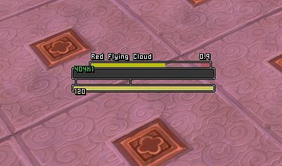
I feel like the power bar doesn't need to be the same length as the health bar and the health text overlap looks super busy with the castbar up. Originally Posted by Coldkil
Maybe shorten the powerbar but still align it to the left like it is now and put both the texts overlapping the powerbar.
<3
*edit*
Kinda like dis:

Last edited by Ishtara; 2013-02-16 at 04:28 AM.

 Reply With Quote


