World of Warcraft: Cataclysm Classic Patch 4.4.0 Notes
 Realm Restarts Scheduled — Wednesday May 1
 Developer Thoughts - Plunderstorm Game Mode and Feedback
 MMO-Champion


I like it, looks quite similar to mineOriginally Posted by Arborus

Suggestions
Tracking more CD's, stuff like pot duration, traps, T16 4p, hero/lust, beast cleave etc etc.
Threat on target probably isn't necessary in a huge window like that, i can agree that you will occasionally get threat on trash but that can be baked into name plates and the like.
would like to see a SS with bossmods :3
 Recent Blue Posts
 Recent Forum Posts
Thread: Post Your UI
-
2014-07-16, 01:00 PM #14681Blademaster

- Join Date
- Aug 2013
- Posts
- 33
-
2014-07-16, 01:08 PM #14682Deletedgief that UI simple and beautifull Originally Posted by Rockxana

-
2014-07-16, 02:33 PM #14683Mechagnome

- Join Date
- Sep 2009
- Posts
- 580
Things like that are tracked via WeakAuras. Originally Posted by Tranklol
The window isn't normally on threat, it's just what Skada happened to be on in the screenshot. Nameplates highlight on aggro, or turn green if I'm tanking.
I would have one, but forget to record/capture any of the raid last night. I'll see if I can get anything tonight, probably on something like Nazgrim.
-
2014-07-16, 03:13 PM #14684DeletedI'm not actually completely sure since I seem to have deleted the profile already, but I think I used the cabaret1 texture and also set Grid's class colors to be 0.5 times the default values (e.g. 0, 56, 111 instead of 0, 112, 222 for Shaman) to get the bars to be darker. Also I have no idea why I thought a pixel font on Grid was a good idea there. Originally Posted by Soil
Edit: Apparently cabaret1 is not part of the regular SharedMedia, and I don't know where you would get it, but it's basically just a flat texture. Minimalist or Smoothv2 or whatever should look about the same.Last edited by mmocf531e475c8; 2014-07-16 at 03:15 PM.
-
2014-07-16, 05:56 PM #14685The Patient

- Join Date
- Oct 2013
- Posts
- 206
http://i.imgur.com/vquS0Z6.jpg?1
Mine is fairly plain interface wise. But oh well.
-
2014-07-16, 06:16 PM #14686Stood in the Fire

- Join Date
- Sep 2008
- Posts
- 441
All of those textures are in IshtaraMedia :P Originally Posted by Constie
<3
-
2014-07-17, 05:00 AM #14687DeletedSorry i don't share this personal edit of ElvUI. Try to rebuild it Originally Posted by easkyy
-
2014-07-17, 07:36 AM #14688Deleted
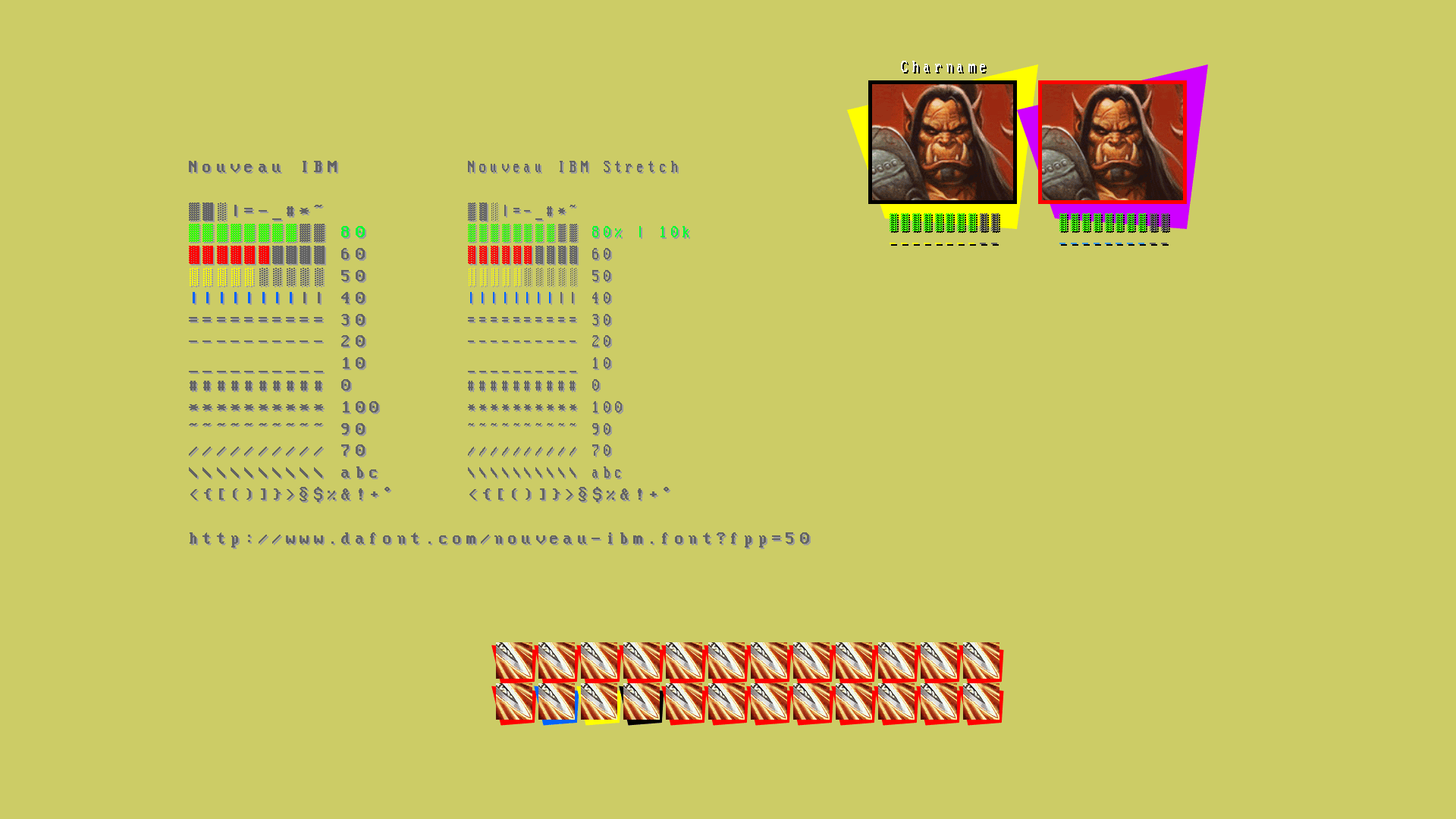
ASCII UI test

-
2014-07-17, 08:00 AM #14689Deletedwhy you are mean to me? =( i will try it :P can i ask for your help atleast if i need anything? :P Originally Posted by Rockxana
starting on addon list? :P just elvui?Last edited by mmoc43857bbac9; 2014-07-17 at 08:04 AM.
-
2014-07-17, 09:12 AM #14690The Patient
- Join Date
- Apr 2014
- Posts
- 213
cor! I remember seeing your first experimentations with these on wowI and loving them. Originally Posted by zorker
-
2014-07-17, 11:21 AM #14691Deleted
Yeah I stopped playing WoW shortly after that. So my oUF_Ascii project is yet unfinished.
-
2014-07-17, 11:31 AM #14692Fluffy Kitten

- Join Date
- Apr 2009
- Posts
- 17,226
Lol happened the same for me, when i was experimenting with text lines after you helped me with a lot of things. Don't know if i'll actually return, atm i don't have anything worth enough to pay my sub again :P Originally Posted by zorker
Non ti fidar di me se il cuor ti manca.
-
2014-07-18, 03:58 AM #14693Blademaster
- Join Date
- Oct 2009
- Posts
- 29

Last edited by dougy4t; 2014-07-18 at 04:05 AM.
-
2014-07-18, 01:28 PM #14694Stood in the Fire

- Join Date
- Sep 2010
- Posts
- 442
Hey guys,
I re-subbed just to do some UIs. Here is my initial sketch, inspired by the UIs of Transistor and Wildstar. I think I want to do something that isn't full-on minimal for a change. It's mostly in Photoshop atm. Loads of work still to do.

-
2014-07-18, 01:48 PM #14695Grunt
- Join Date
- Dec 2013
- Posts
- 17
The texture doesnt really fit with WoW... But i like it alot. Looks nice. Not sure about the unitframes and bars fitting but im guessing you arent finished yet. Still nice work!
-
2014-07-18, 02:37 PM #14696Stood in the Fire
- Join Date
- Sep 2010
- Posts
- 442
Ye it's a fair point. It has started to go a tad too techno. Transistor's UI has a nice kind of semi organic techno look, and it seems that while ripping it off I kind of lost the organic half. I might re-do it. Originally Posted by Krevaan
EDIT - like this maybe:

Last edited by Kaitain; 2014-07-18 at 03:30 PM.
-
2014-07-18, 03:32 PM #14697Deleted
Nice one.
-
2014-07-18, 03:34 PM #14698Grunt
- Join Date
- Dec 2013
- Posts
- 17
First one was better. Go with that look. Not sure if you understood my comment :P But it's really nice textures. Kinda like Aurora im guessing? If you manage to pull out a complete UI with that kind of look ill surely give it a try. Your work is fantastic :P
-
2014-07-18, 03:43 PM #14699Deleted
'Ello there UI people!
Having played with the same UI since late WotLK I thought it was about time to throw all that boring symmetry overboard and try something new:
Idle (no, that's not alt-z )
)
+ Target

Wanna farm! Can haz minimap?!
Raid Action
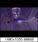

I didn't want to plaster my screen with icons, timers, counters to keep track of my rotation, so I borrowed Stuf's custom texts to build those indicators in the middle. Specifically these are for (from top) arcane missile procs, arcane charges and any mage bomb on the current target (one mark for every third of a second remaining).
The UI is fully functional (for my mage at least) but there are still a few kinks and details to work out. I've no idea yet how to get certain addons to print their messages in my 'combat chat' instead of the default 'chat frame 1' for example. And by now I've changed the layout and position of my raid frames so often, I don't even know what to think anymore...

€dit
@Kaitain
Great concept! I like the second one better actually. Those curved elements seem like a nice mixture of Sci-Fi and 'Arcane'. Fits WoW better than the pure tech look imho.Last edited by mmoca13ec27692; 2014-07-18 at 04:07 PM.
-
2014-07-18, 04:40 PM #14700The Patient
- Join Date
- Oct 2010
- Posts
- 204
@Kait very slick, I personally love the techno look
@Kurokawa very cool, will have to refer back the next time I look for inspiration

 Reply With Quote