Limited PvP -> PvE Free Character Transfers
 Mythic+ Dungeon Adjustments - 27 April
 Seasonal Poll: What Playable Race would u like to have in World Soul saga?
 More permitted video sources
 MMO-Champion


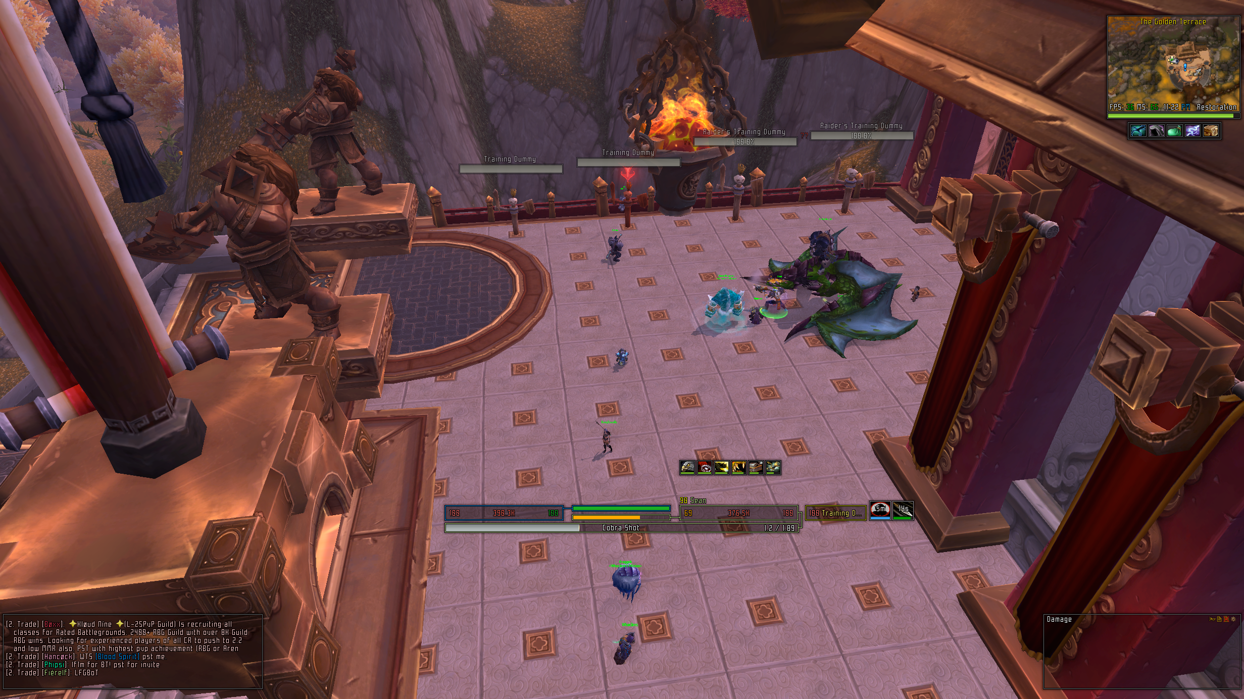
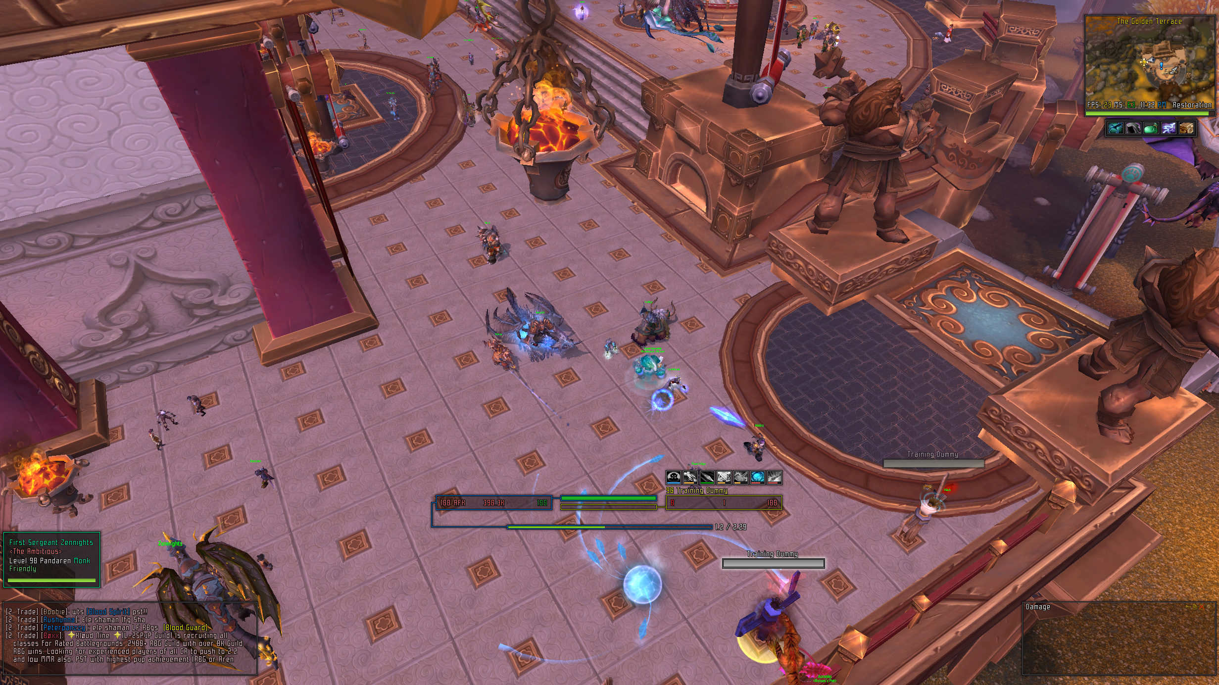
Alrighty, finally got most stuff kinda done lol. Trying out this non-pixel font thing to see how I like it
Def not done polishing a lot of stuff, but its been fun working with a not-boring texture so far
<3
Ish
 Recent Blue Posts
 Recent Forum Posts
Thread: Post Your UI
-
2013-02-04, 04:11 AM #9921Stood in the Fire

- Join Date
- Sep 2008
- Posts
- 441
-
2013-02-04, 05:31 AM #9922High Overlord


- Join Date
- Nov 2009
- Location
- TwitchTV
- Posts
- 150
I really like that font, is it one of the Avant Gardes? And the borders look a little bit too thick for my taste, maybe it would work if they were just a shade or two darker. Originally Posted by Ishtara


. The Artist also known as Epiphany .
-
2013-02-04, 06:19 AM #9923Grunt
- Join Date
- Feb 2012
- Location
- NY
- Posts
- 21
I recently offset the names on my raid frames and really dig it; although it feels a little out of place since I can't offset much other text from being centered. Wondering if you guys have played around with this much or if you have criticism.

-
2013-02-04, 08:59 AM #9924Fluffy Kitten

- Join Date
- Apr 2009
- Posts
- 17,226
- i'd cut the hp values; better to have them truncated/rounded so they will have a fixed width. Originally Posted by Ishtara
- is the font shadow OUTLINE or THINOUTLINE? I like more the second (personal preference though)
- you absolutely need to tell me how to do that merged borders
Anyway, good work as always Non ti fidar di me se il cuor ti manca.
-
2013-02-04, 09:33 AM #9925Bloodsail Admiral
- Join Date
- Feb 2012
- Location
- NC
- Posts
- 1,011
New UI, trying to keep it simple. On my shaman that I'm currently leveling. Still working on the weak auras and such.

Last edited by mmocba105e19de; 2013-02-04 at 03:16 PM.
-
2013-02-04, 10:30 AM #9926DeletedI can help you with that. Originally Posted by Coldkil
Make a KGpanel without any border and that has the same color as the border, then make it as big as the "inner" border and choose a higher strata on it then what the border has, done.
Top - kgpanel in place (right side)
Bottom - moved it out

Last edited by mmocba105e19de; 2013-02-04 at 03:16 PM.
-
2013-02-04, 12:01 PM #9927Fluffy Kitten
- Join Date
- Apr 2009
- Posts
- 17,226
Thanks, always wondered if that kind of borders would suit my ui....it reminisces of tuk/elv anyway and i want to detach from them.
Non ti fidar di me se il cuor ti manca.
-
2013-02-04, 08:52 PM #9928Stood in the Fire
- Join Date
- Sep 2008
- Posts
- 441
Uhmmmmm, I guess that's one way you could do it if you wanted to make plenty of unnecessary panels :P Originally Posted by Rusk
Using that process for your unit frames would require up to 8 panels to finish each one when all you really need is 4.
You need one panel for your health bar black outline, one panel for your power bar black outline, one panel for the gray behind both health bar and power bar and then one more panel for the black outline behind the gray panel.
@cold
Regarding the "merged" borders, as long at the panels are on the same strata they will merge visually when you try to overlap them.
On the party frames for example, each one has 3 panels.
panel 1: black @ strata 3
panel 2: gray @ strata 2
panel 3: black @ strata 1
As long as you keep the same strata scheme for each unitframe, they will visually "merge" when you overlap them.
<3
Ish
-
2013-02-04, 09:56 PM #9929DeletedThat sure is easier Originally Posted by Ishtara
The 2 in the screenshot is however my healthbar and my pets healthbar so i need to do it the way i wrote for that since i dont have a pet up at all times, i will do it your way for my target tho, thanks!
-
2013-02-05, 12:30 AM #9930Stood in the Fire
- Join Date
- Sep 2008
- Posts
- 441
That makes no sense to me lol
-
2013-02-05, 06:52 AM #9931Fluffy Kitten
- Join Date
- Apr 2009
- Posts
- 17,226
Thanks Originally Posted by Ishtara
Do you think that a border like that would be cool for my UI? i'm not completely sure about it.
EDIT: reasoning over it, i don't think it would be possible - because of the panel over the HP bar.Last edited by Coldkil; 2013-02-05 at 10:15 AM.
Non ti fidar di me se il cuor ti manca.
-
2013-02-05, 10:39 AM #9932DeletedWhat doesn't? Originally Posted by Ishtara

If i would only use 3 panels for my healthbar/pet healthbar it would be an empty space right in the unitframe on chars that dont use a pet or when i don't have mine up
Now i use 3 panels for my healthbar and 3 panels for the pets healthbar which are anchored and parented to Stuf.Units.Pet, so when there's no pet up they aren't visible.
-
2013-02-05, 10:51 AM #9933Fluffy Kitten
- Join Date
- Apr 2009
- Posts
- 17,226
I have an idea for my unitframes. Though it's too soon to share anything (i have to put some work on it) but i hope i can do what i have in mind. Obviously it's about borders.
Non ti fidar di me se il cuor ti manca.
-
2013-02-05, 01:04 PM #9934Deleted
Currently testing some stuff on the PTR.

Added optional orb value fading on mouseover.
Plus I found a new superb animation to use: "red chocolate". Those marble stuff is like lava. Constantly moving and swirling. Looks pretty awesome (displayid: 47882).Last edited by mmoc48efa32b91; 2013-02-05 at 01:07 PM.
-
2013-02-05, 03:31 PM #9935Stood in the Fire
- Join Date
- Sep 2008
- Posts
- 441
Because if the paneling shares the same respective stratas it shouldn't matter...post a pic with and w/o your pet frame up lol Originally Posted by Rusk
-
2013-02-05, 03:33 PM #9936Warchief

- Join Date
- Dec 2010
- Posts
- 2,072
 Wow that looks amazing. Originally Posted by zorker
The orbs look boss, can't wait to see it in action.
-
2013-02-05, 03:37 PM #9937Stood in the Fire
- Join Date
- Sep 2008
- Posts
- 441
Morning zorkie Originally Posted by zorker
My s/o just started playing wow and I downloaded your Ui for them because they had played D3 before playing wow and they love your Ui
It made it a lot easier for them to pick up the new game
Question, on the bottom set with the opal-esque health orb, what is the animation for that one?
My first impression (other than loving the red chocolate) is that the opal orb doesn't need those white whispies in front, they degrade the quality.
It could just be because its a still image of something animated, but the background is so beautiful that I think the cloud overlay is over-complicating the orb.
<3
Ish
-
2013-02-05, 06:19 PM #9938Deleted
@Ish
Animations are premade. I cannot change them. They are kind of like small videos.
The animation id for the planet is 31 in the config. http://code.google.com/p/rothui/sour...config.lua#743Last edited by mmoc48efa32b91; 2013-02-05 at 06:21 PM.
-
2013-02-06, 07:42 AM #9939The Patient

- Join Date
- Sep 2012
- Posts
- 345
All this talk of "connected" borders, i decided to mess around with that and changed a couple things around.
target w/cast
player cast
-
2013-02-06, 08:01 AM #9940Fluffy Kitten
- Join Date
- Apr 2009
- Posts
- 17,226
Here's the concept i had in mind - no time to code yesterday so i used the image Rusk provided me. What do you think? Hopefully today i'm going for some coding and a new layout. I really like the connected borders, but i don't want to lose the minipanel on player/target.
EDIT: i realize it's not a very visible thing :PNon ti fidar di me se il cuor ti manca.


 Reply With Quote